Desktops
12 piecesIn this section
pages
The Golden Rule of Switching to Linux: Restructure Your Life
Desktops · 8 min · p. —
KDE Plasma 6.4 is out
Desktops · 11 min · p. —
Actually, what is a Freedesktop Portal?
Desktops · 7 min · p. —
Ghostty in review: how's the new terminal emulator?
Desktops · 8 min · p. —How KDE and GNOME do design
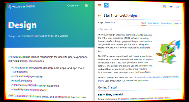
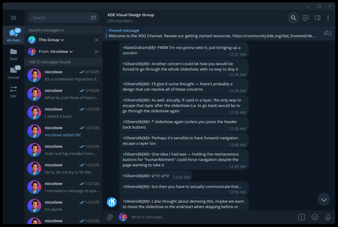
I've been part of the KDE VDG ("Visual Design Team") for many years, though I'm not very active there anymore. Nonetheless, as a quick metric, I've written more than 16 thousand messages in the VDG chat, and I'm still somewhat in the loop as far as design goes.
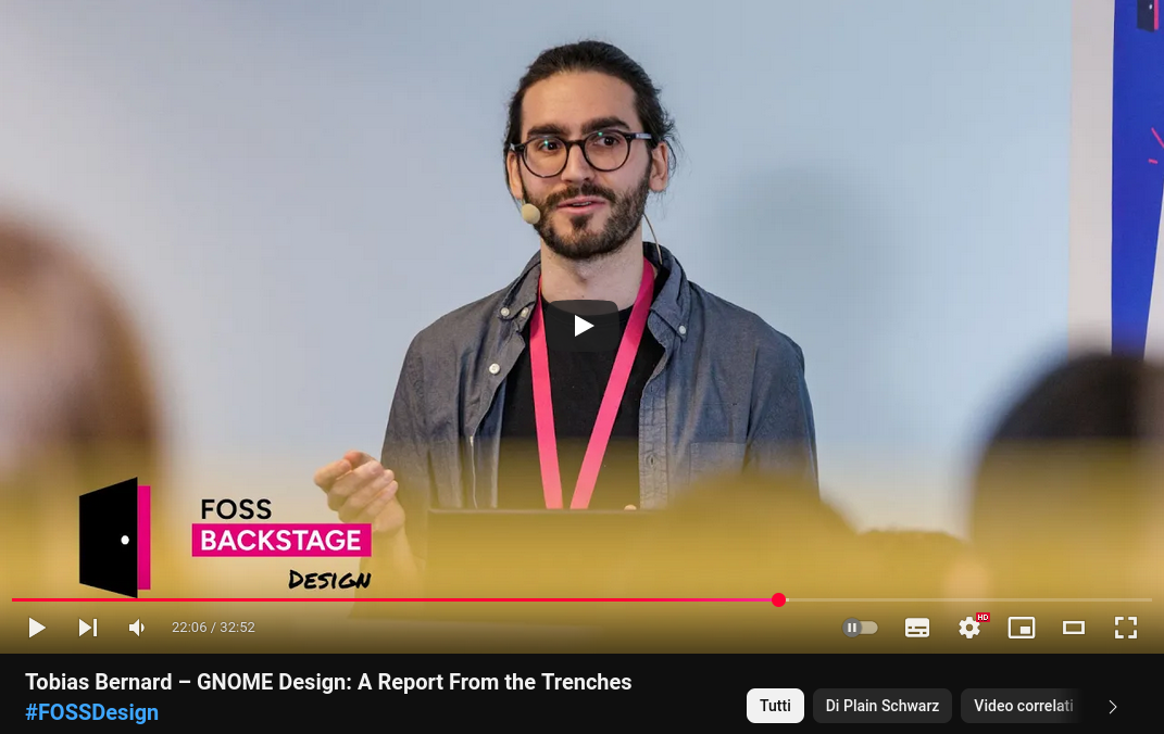
I've never been part of the GNOME Design team, though. That said, Tobias Bernard has recently held a talk called "GNOME Design: A Report From The Trenches", which gives us some insights into them. I have also done some further research, and I'll do my best to accurately represent their processes.
Design Teams
Let's start with the teams themselves.
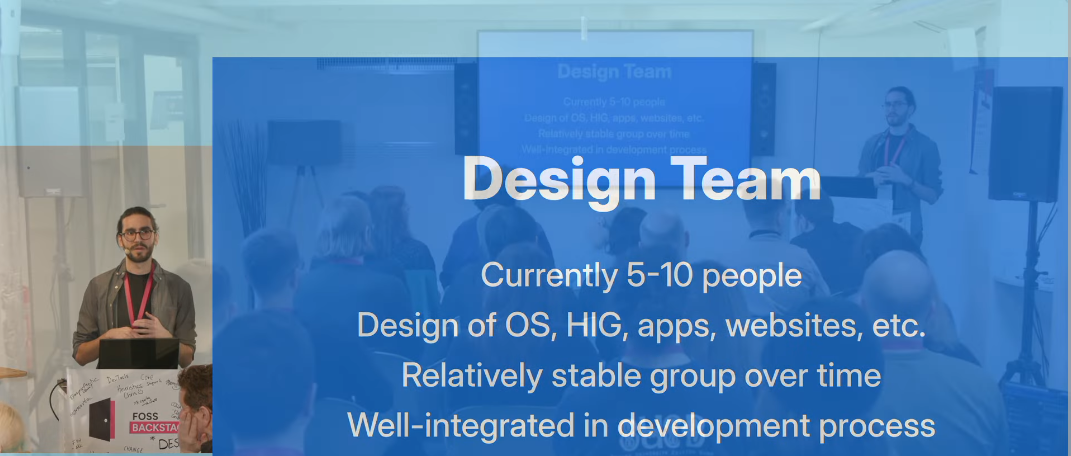
Over the GNOME side of things, there's a Design team. According to Tobias, it's currently composed of five to ten people ("depending on how you count them"), with a mix of full-time employees and volunteers, and it has been somewhat stable over time.
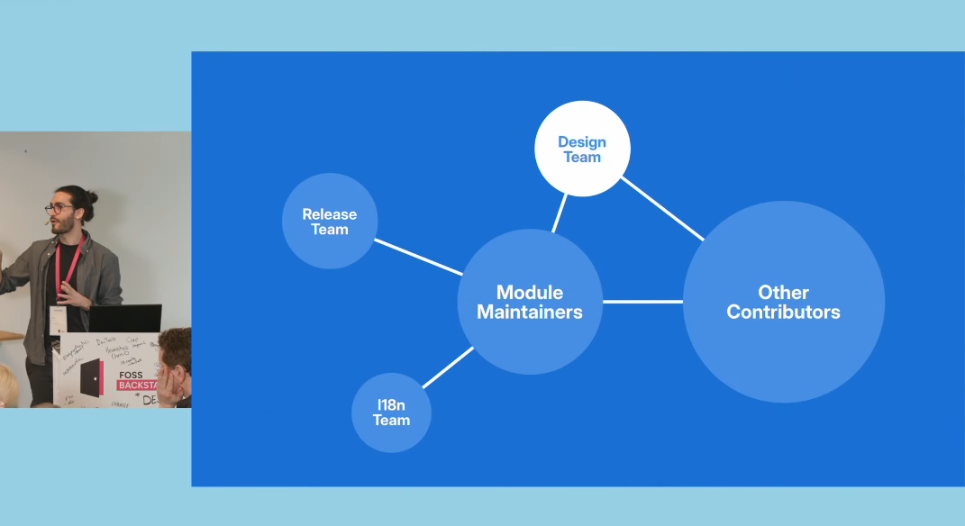
As a rough explanation of how the Design team operates within the larger context of GNOME, Tobias explains that at the core there are the modules, such as the desktop and the apps, then there are other contributors on the outside, and other teams that coordinate specific areas. If a change that affects the UX is required, the Design team is involved in some way, and "everyone understands that to be the case" - which, believe me, is noteworthy.
Simple enough. On the KDE side of things, we have the Visual Design Group or VDG. It's been around for various years, and - akin to the three-body problem - it has stable eras (with various active contributors) and chaotic eras (when the situation is not as good).
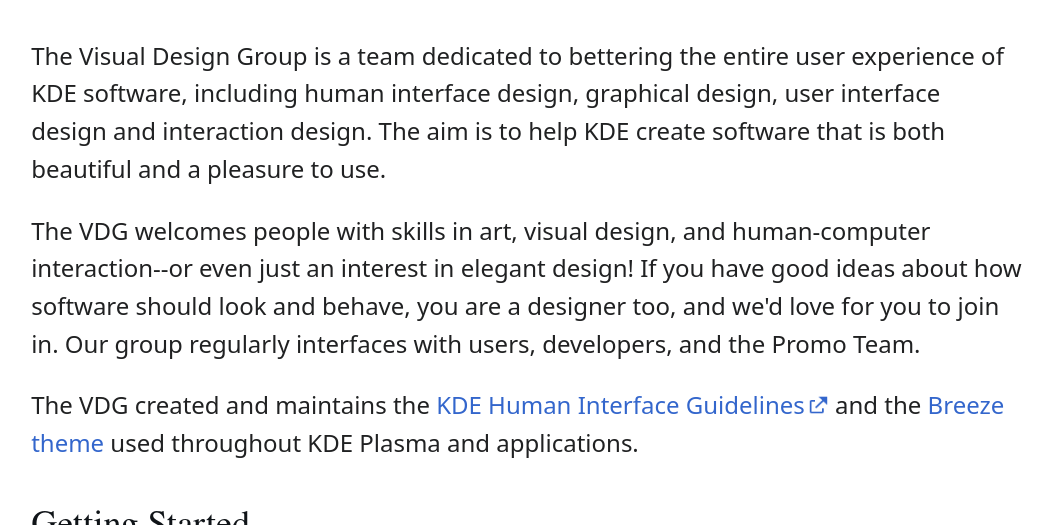
I think we're currently in a Chaotic Era. There's no one that's specific to the VDG, and all those working within it are application developers that somewhat re-invent themselves as designers too, out of need. Formally, around thirty people are subscribed to the group, but it doesn't feel like so. We certainly don't have anyone working fulltime on it.
Due to this bad state of things - in my opinion - a second design team has formed within KDE, and it's called KDE Next. I did a video about the project a few months ago. They describe themselves as
a designer-led effort to revamp KDE's Plasma desktop. We share mockups, ideas, designs, thoughts, etc. We also work on icons, design systems, and much more.
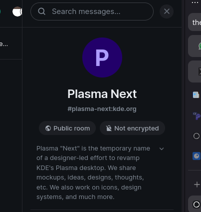
Plasma Next has one to two regularly active members and a few more occasional ones. They're still all volunteers, which limits the amount of available time they have. De facto, the team is driven forward by Andy, who's the only designer-only regularly active person in KDE right now. Which isn't great.
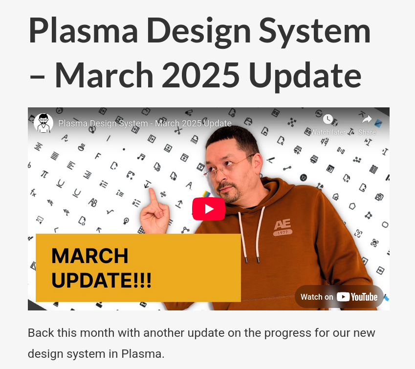
Now, it's easy to make fun of KDE, saying things like "you can see there's no design team!", but that wouldn't be very honest. This situation is somewhat recent, and just a few years ago the Visual Design Team was much more active, and great design work was done. Some of the people who were in the VDG are still active KDE contributors, though they interact in other spaces.
Matrix and Gitlab
Both GNOME and KDE heavily use Matrix and Gitlab for internal communication within the two teams.
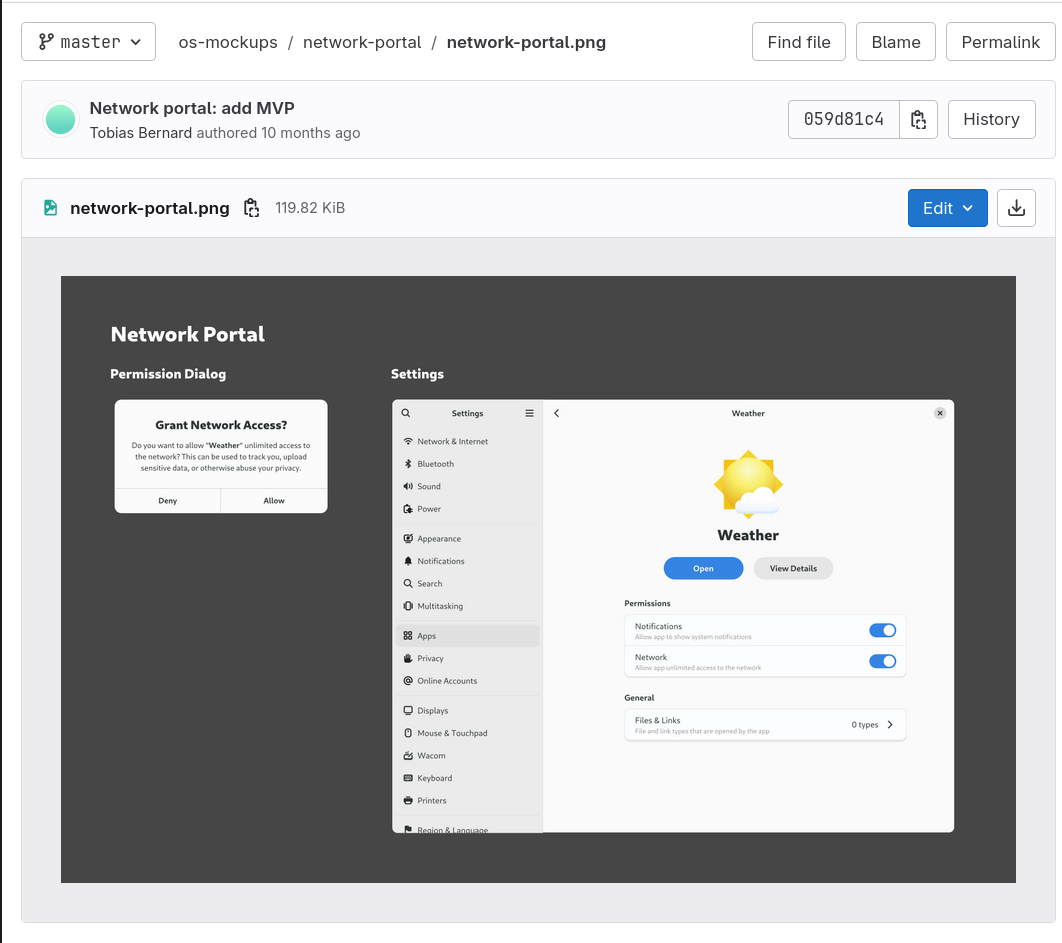
But GNOME does it better. The Design team's Gitlab has dozens of projects, ranging from apps and system mockups to resources helpful for creating mockups to sounds, icon references, and more.
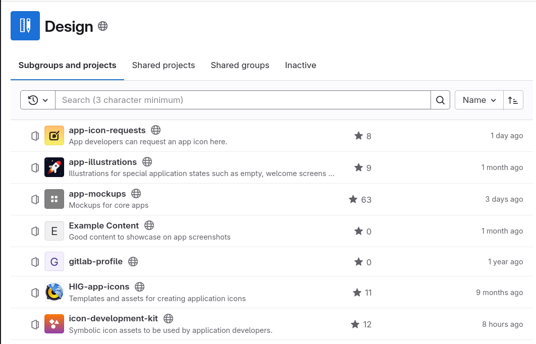
These work as a somewhat centralized source of design information and references; there's a place to see how other designs intended components, and from which developers can take inspiration.
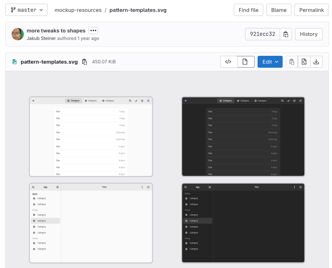
There's also SVG files with templates; however, these aren't kept up to date, and when a designer uses Inkscape for their designs, they generally copy assets they've made in previous mockups instead of a template file. This somewhat raises the barrier to entry for designers.
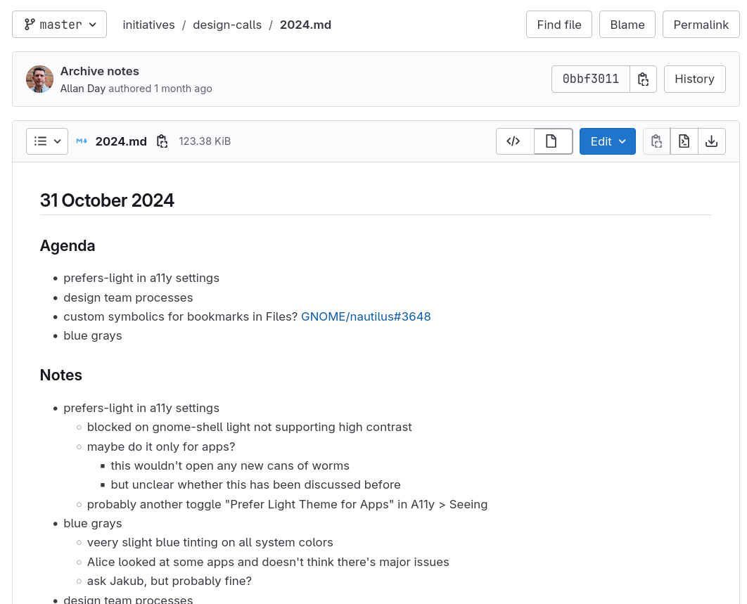
The GNOME Design team also holds weekly calls to discuss plans for the future (open merge requests, big initiatives, design proposals, and so on), and - even better - the notes for each call are archived in a design-calls folder within the - you guessed it - same GitLab team, so that everyone can see them.
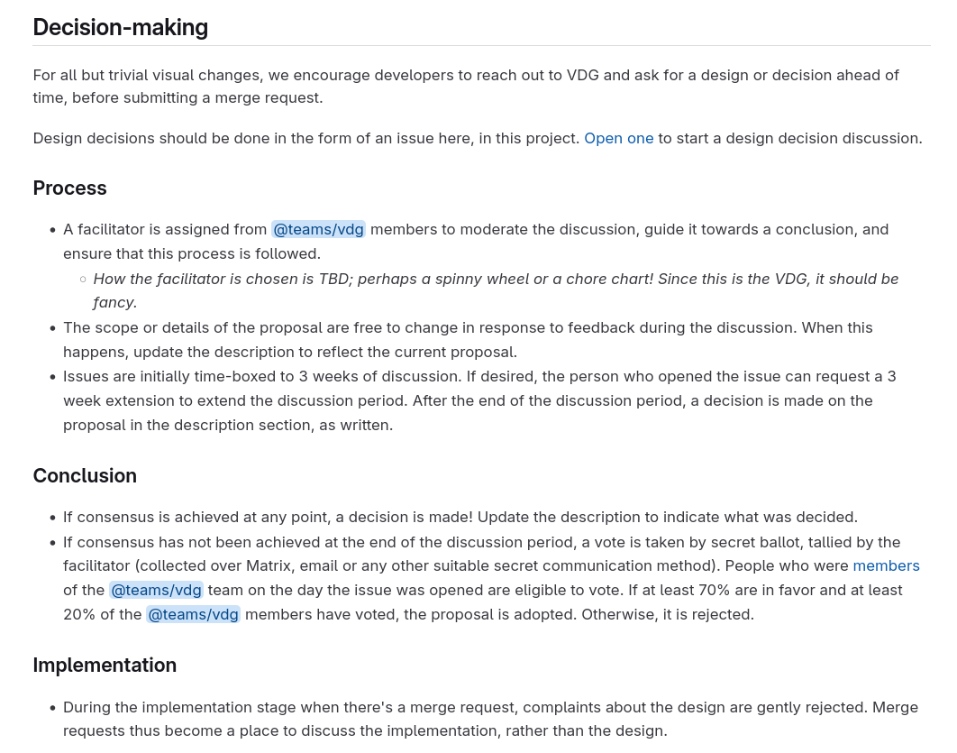
By contrast, the KDE VDG GitLab project only holds two projects, Issues and Device Assets.
The former is used for Design discussions, and it details a precise decision-making process. For each issue, there's a facilitator assigned by the team, and there's a discussion for three weeks. At the end of that, a decision is taken either by consensus or by voting (still through the facilitator).
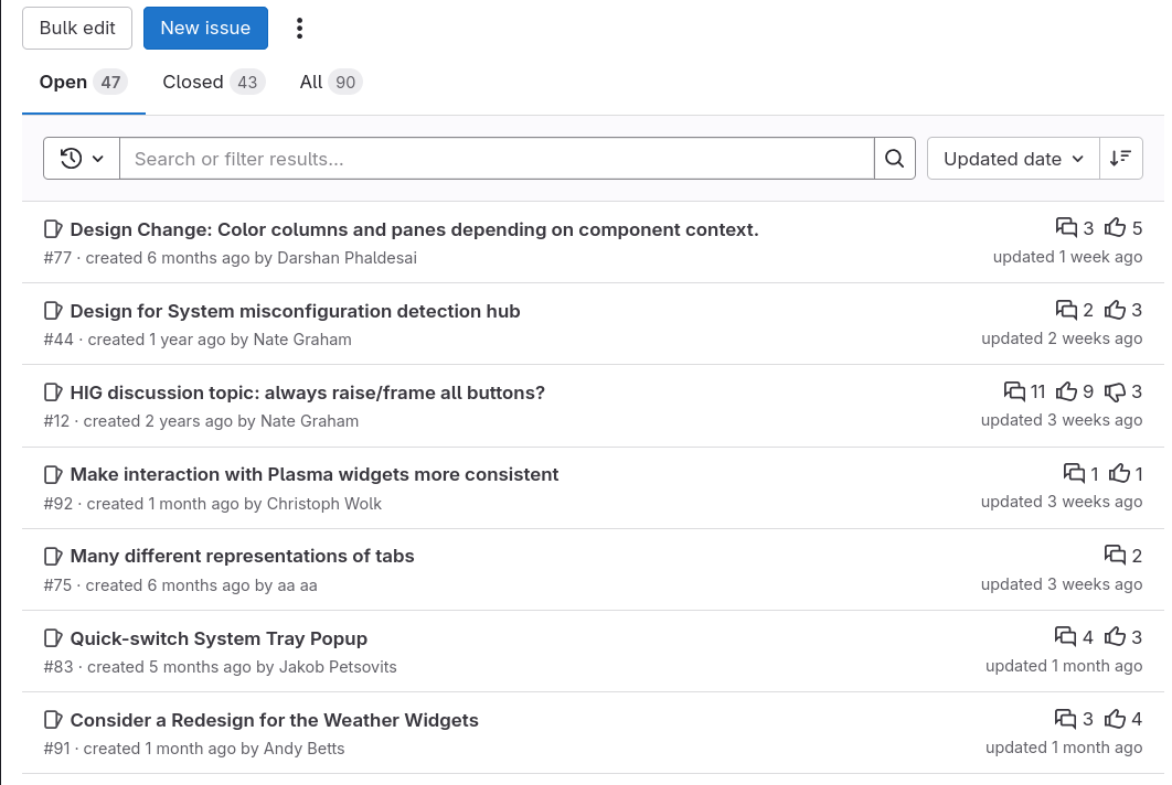
That said, I haven't personally seen this process much in action. Most of the issues are currently hanging: from proposed redesigns, user requests, and so on; only a few are actively in discussion.
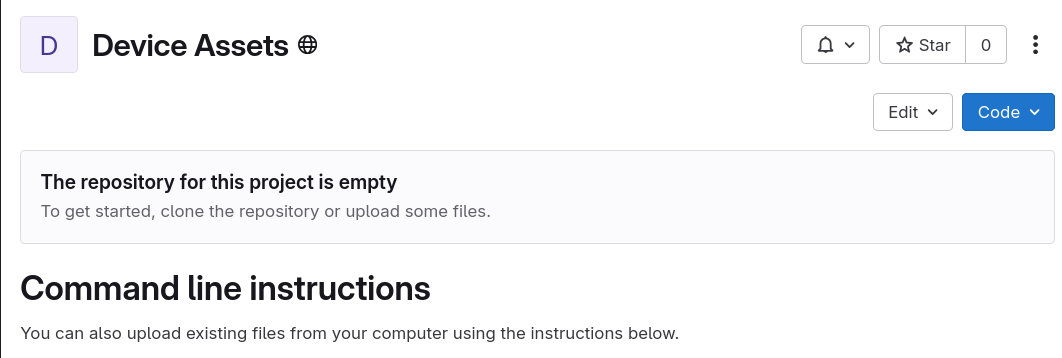
The "Device Assets" repository, on the other hand, is completely empty. Whops!
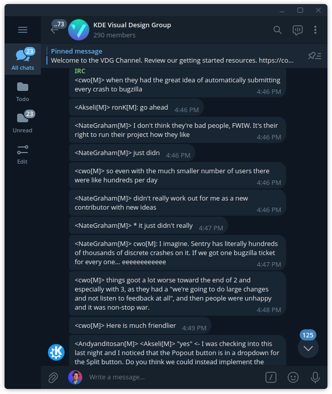
As mentioned, both projects also use Matrix as the official communication channel. That said, it's worth noting that KDE's VDG is also bridged to Telegram, which might make it a bit easier to join if you already have an account there. It sure helped me a lot to get involved.
Design Apps
I've briefly mentioned mockups. Which applications are used to create them? As far as I understood it, both KDE and GNOME are in the same boat here, so I'll make a general overview here.
Currently, there's no clear standard to design applications in the free and open-source world. One appealing option, which is the one I usually go for myself, is Inkscape.
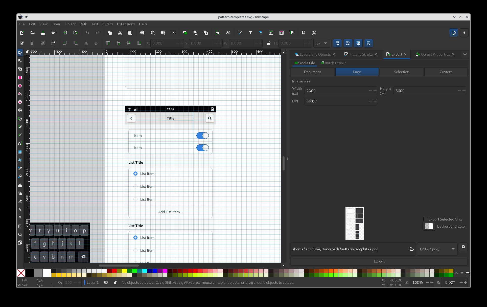
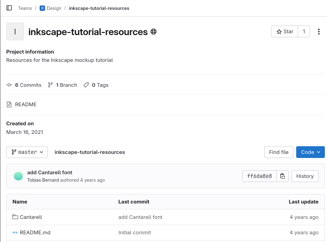
Indeed, you can see that the mockup files provided by GNOME are SVGs, and they also offer inkscape tutorial resources (it does not seem very up-to-date, but still).
However, Inkscape is not the correct tool to do application design. You can't easily add standard elements, such as drop shadows and correct borders, nor a proper way to have templates, and so much more. It's not a Figma alternative.
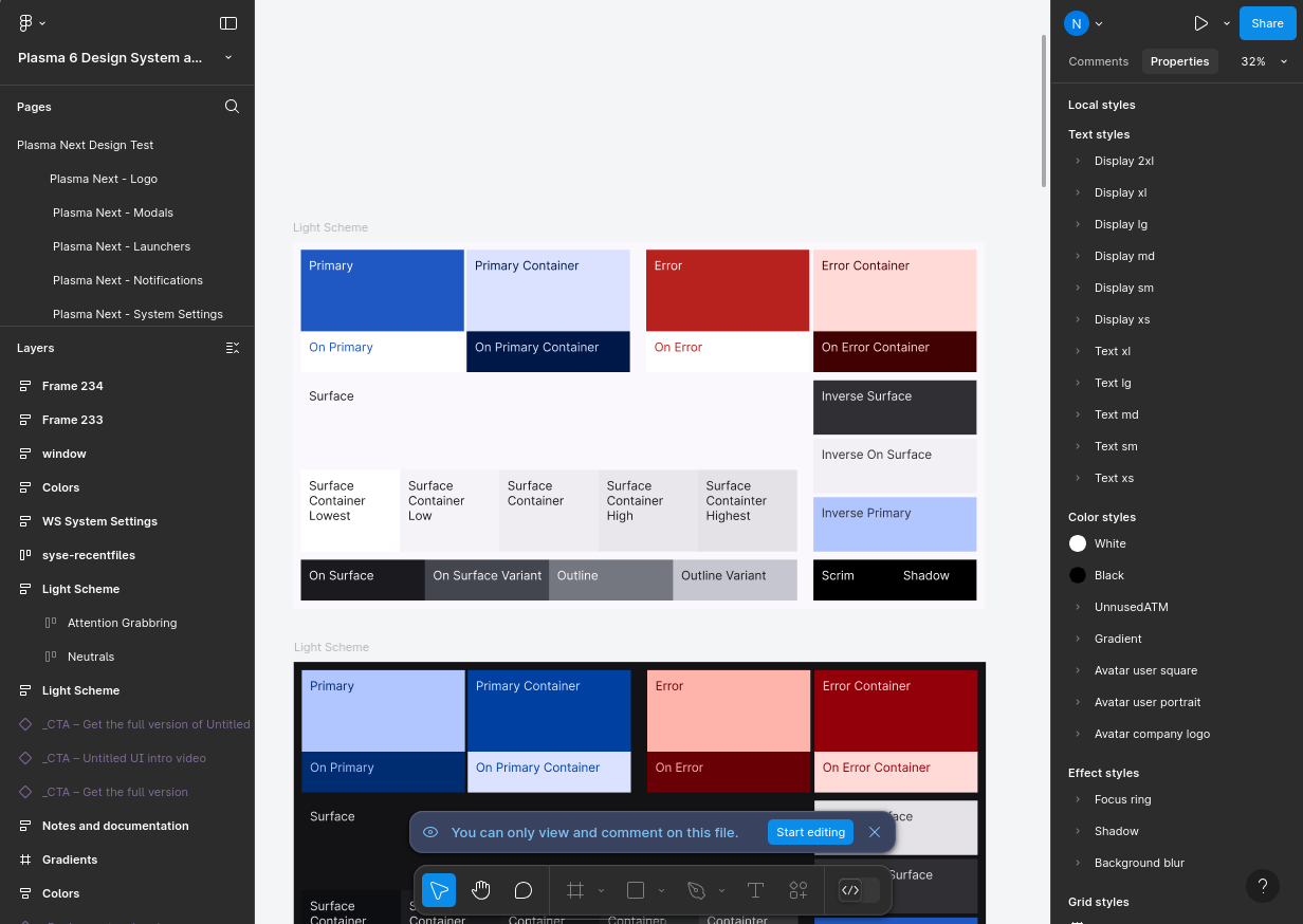
Then, there's Figma. It's used by some people and designers; as an example, both Manuel and Andy use it, on the KDE side of things. It's the status quo for this type of things, but it's also proprietary, and we would all prefer to avoid it.
Finally, there's Penpot. They're an open-source alternative to Figma, and they're developing quickly; KDE is trying to move to it over time, but they still lack many of the necessary resources to replace a tool like Figma. However, the team is very reactive, and they're collaborating with the KDE Next project to address those missing features.
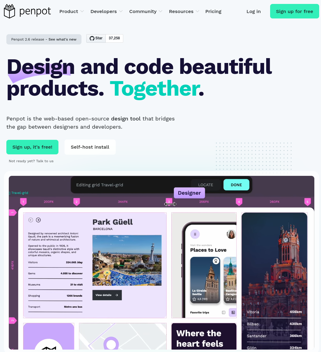
There are no formal plans for GNOME to move to Penpot, however. There are a couple of fans of it who want to push for it more, but most designers will probably be stuck on Inkscape for a while longer.
If you want more details specifically about KDE Next and Penpot, I've talked more about it in my video about KDE Next specifically, but you can also go check Andy's youtube channel for more.
Guidelines
Both KDE and GNOME have something called Human Interface Guidelines. These are supposed to contain some reference information on how to develop designs for their respective ecosystems. Cool.
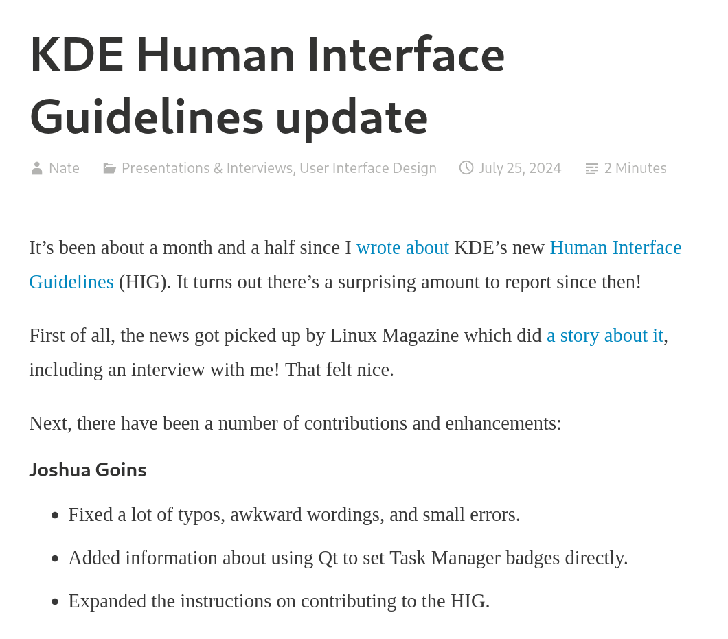
KDE's guidelines have been recently rewritten by Nate Graham, and has been then further developed by many others.
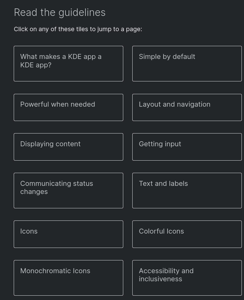
It begins with some "philosophical" instructions (what makes a KDE app a KDE app, how to be simple by default but powerful when needed); then, the categories you'd expect: layout and navigation, displaying content, getting input, communicating status changes, text and labels, icons, and accessibility.
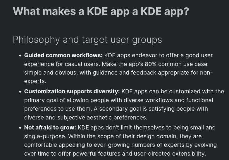
If you were wondering what makes a KDE app a KDE app, it's allowing for diverse workflows and adapting to preferences, and not being afraid to grow to cover multiple different usecases. Keep these sentences in mind, as you'll see that the GNOME guidelines have a somewhat different take on them.
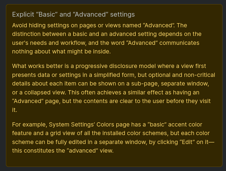
You can have some fun going through these sections; as one example, the KDE guidelines recommend against distinguishing between "Basic" and "Advanced" in an app's UI. This is because the word "Advanced" communicates nothing about what might be inside that section, and the distinction between "Basic" and "Advanced" depends on the opinion of the user.
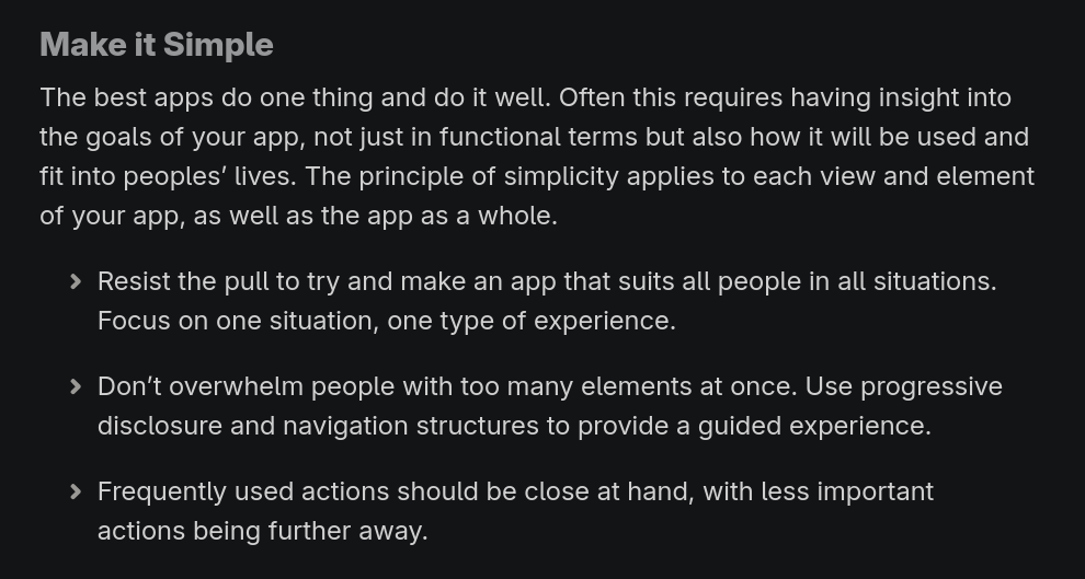
GNOME's guidelines also begin with design principles. These are: Design For People (and thus, accommodating different physical abilities, cultures, and device form factors); also, Make It Simple: "resist the pull to try and make an app that suits all people in all situations. Focus on one situation, one type of experience", and "The best apps do one thing and do it well". This seems radically different from KDE's principles.
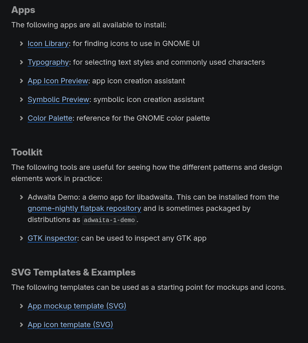
GNOME's guidelines also include tools and resources. The former include applications to find icons, select text styles, preview app icons and symbolic icons, and a reference app for the color palette. There's also a GTK inspector (like the web browsers ones, but for GNOME apps), and a demo application for libadwaita. Ah, and the above-mentioned app SVG templates.
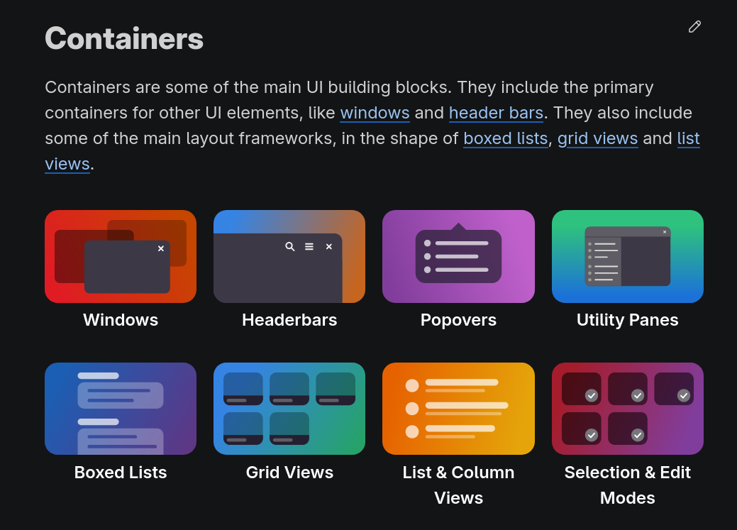
The rest of the guidelines (that is, most of them) are divided between a subsection called "guidelines" (yes), "patterns" and "references". Unsurprisingly, the patterns very closely reference libadwaita, the library that GNOME uses to build applications. They also have very nice graphical elements to indicate the various chapters.
App Ecosystem
Let's talk (third-party) app ecosystem. Though this topic isn't strictly about design, its quality is often a direct consequence of it. Are available APIs easy enough for new developers to start using? Do they have sensible designs out of the box? Are developers able to build more complex apps with it?
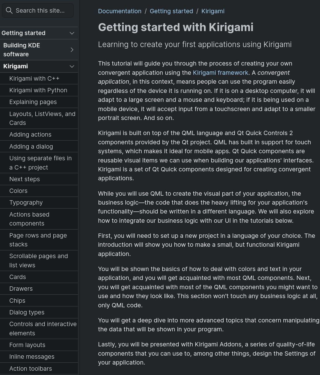
This will be the topic of another video, but quickly: KDE offers a library of application components called "Kirigami". These include front-end UI elements from pages, to buttons, actions, drawers, cards, form layouts, inline messages, and so on; but it also includes spacing, colors, typography, and so on.
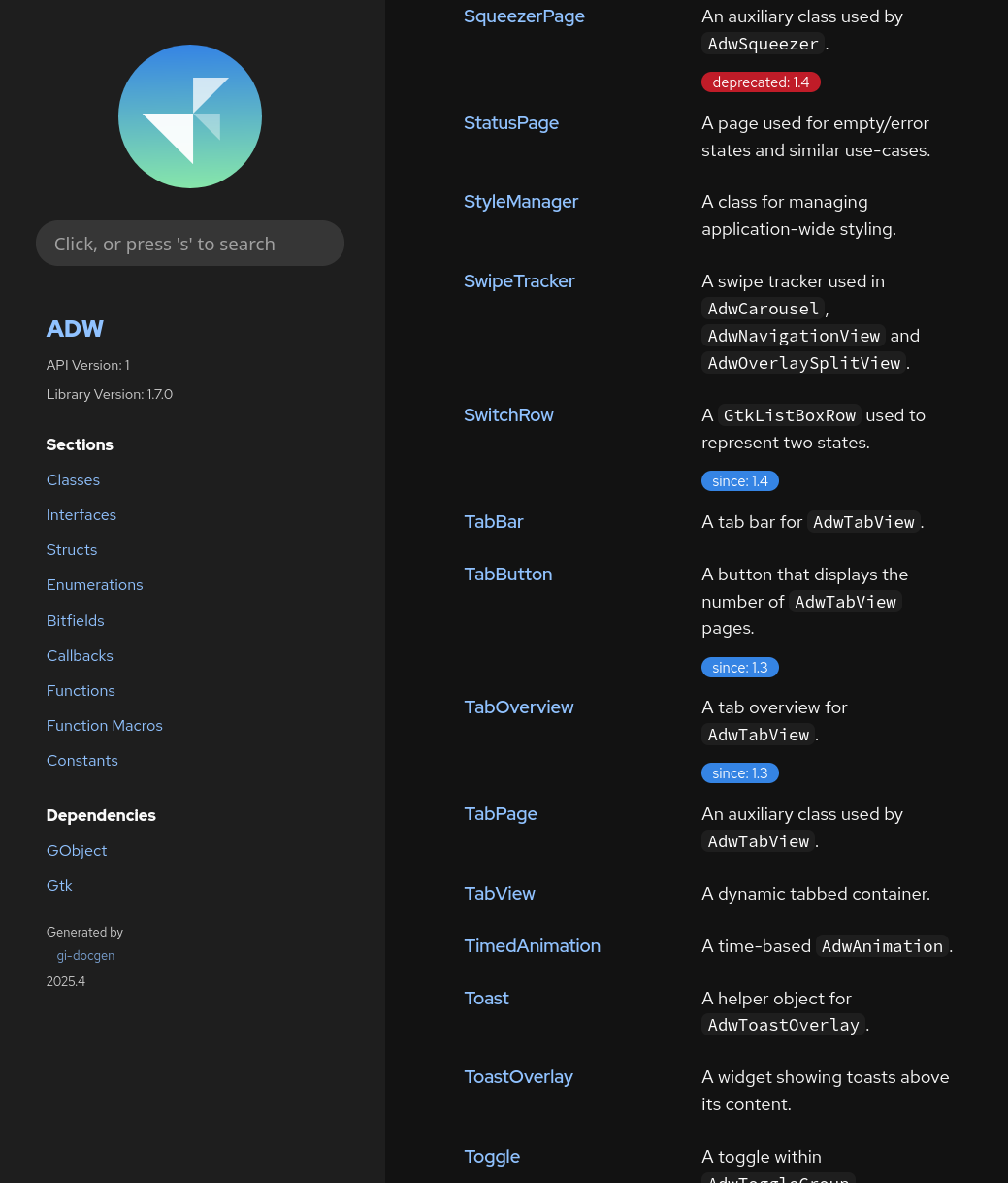
Similarly, GNOME offers a set of components called Libadwaita. This also comes with a variety of UI elements, which are often direct implementations of their human interface guidelines. Libadwaita thus makes it real easy to create third-party apps following the GNOME design.
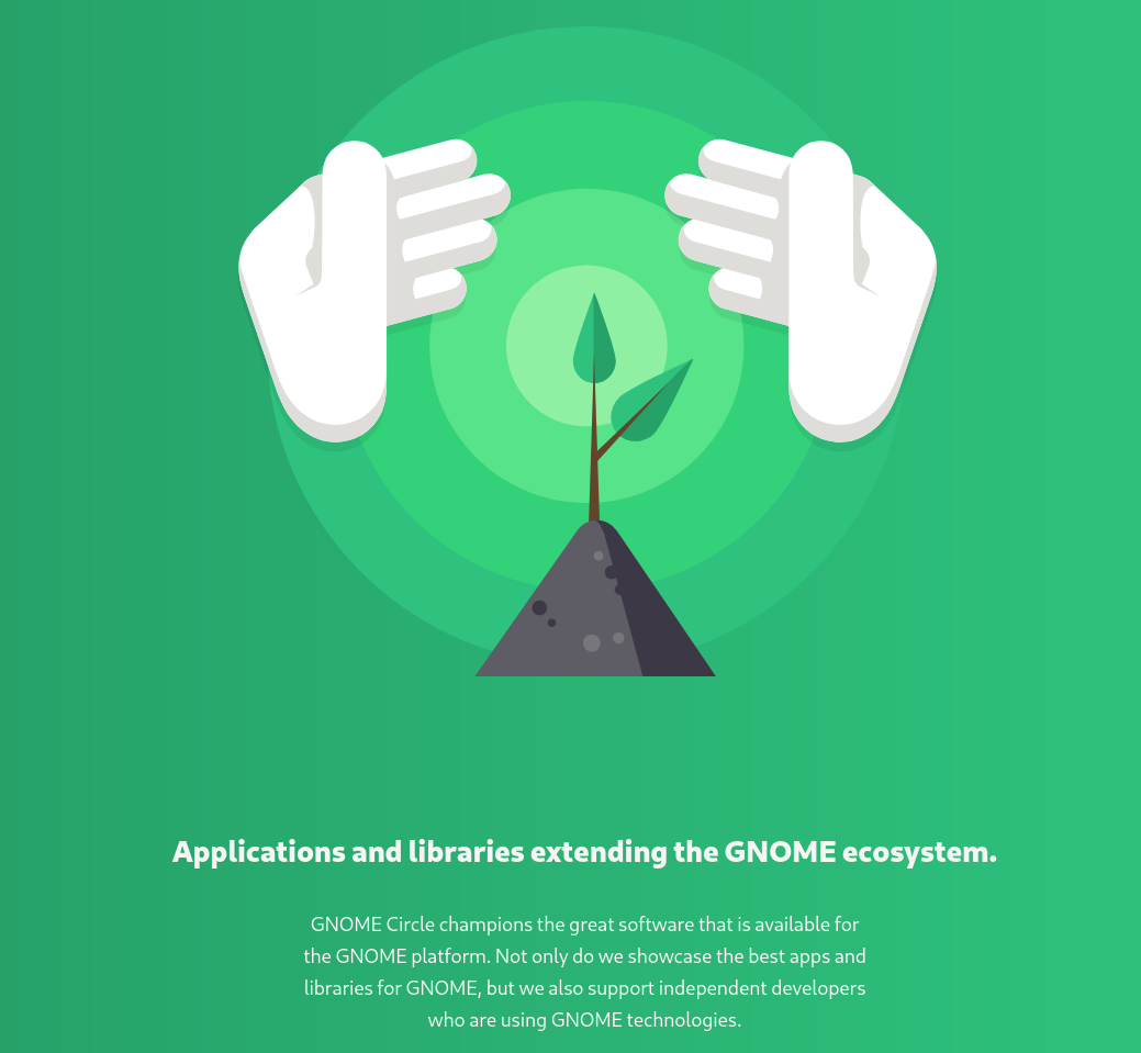
So far, I feel like GNOME is somewhat winning this battle, featuring a wider selection of applications with consistent design. They've also started an initiative, called GNOME Circle, which is used to give direct feedback to third-party app developers to steer them toward the GNOME way to do things, and rewarding them with more resources.
Telemetry
Finally, to do design, it's often very useful to have some data about how users interact with a certain system. This is called telemetry, and proprietary applications have no trouble inserting it everywhere; open-source projects, less so.
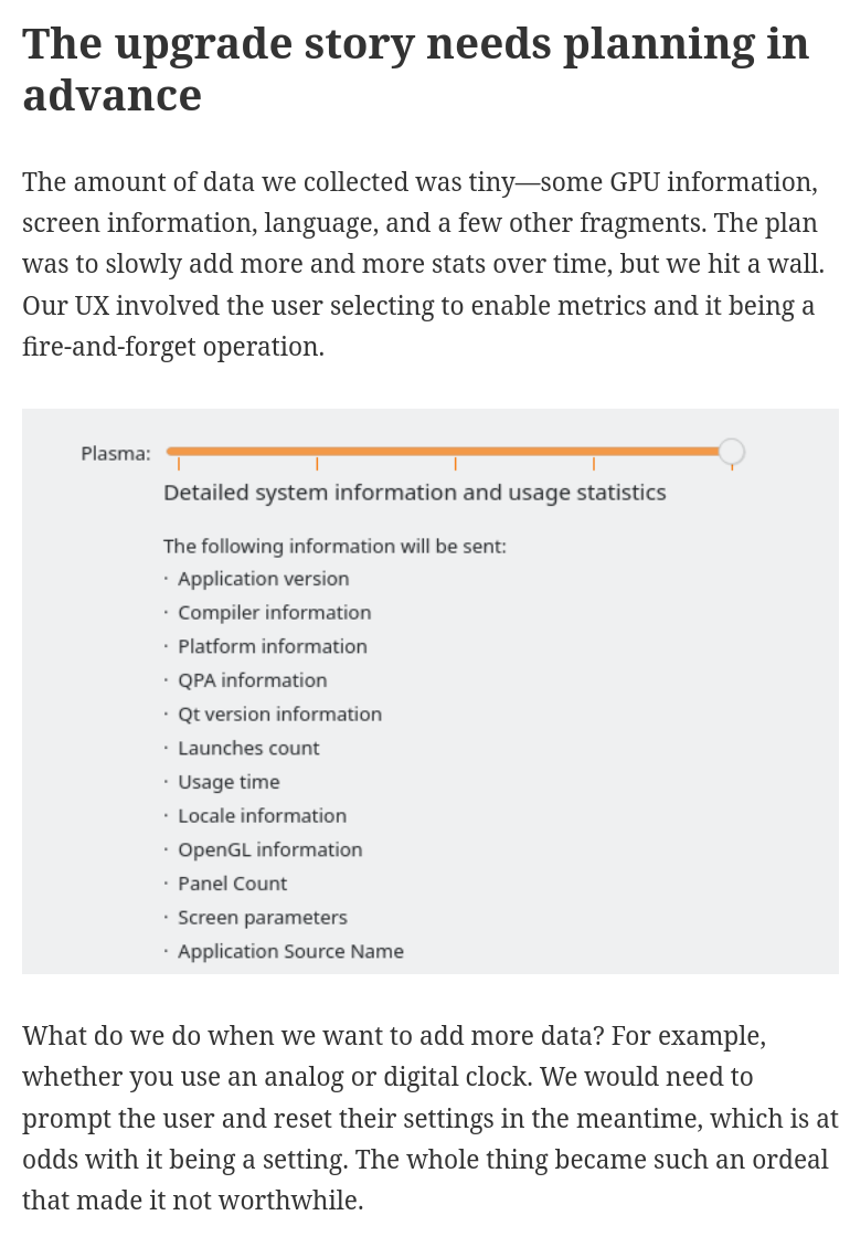
KDE has an opt-in telemetry system called KUserFeedback. User-wise, it's a slider (again, off by default) that lets you choose how much to share with KDE, and provides a list of exactly what is being shared.
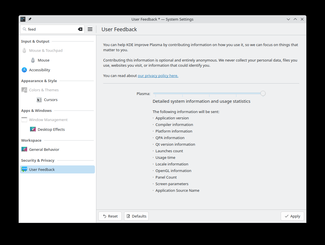
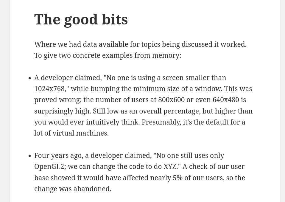
Developer David Edmunson shared a few conclusions that were obtained thanks to these data. As an example, one time a developer claimed that "no one is using a screen smaller than 1024x768", but was then quickly proved wrong by the data. Similarly, "no one still uses only OpenGL2" was disproven by a 5% that were.
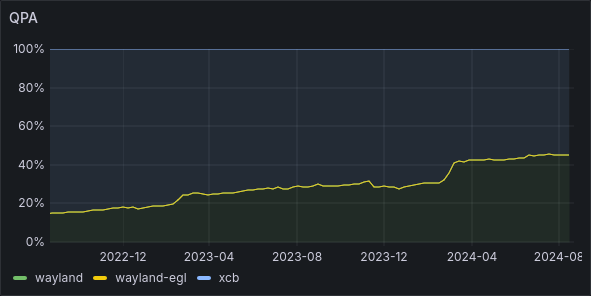
It also allowed KDE to track the usage of X11 vs Wayland; as you know, Plasma 6 recently switched from the former to the latter. Did the user agree with this, or had to switch back? Well, overall, the percentage of Wayland users is only at 45%, though it's increasing over time:
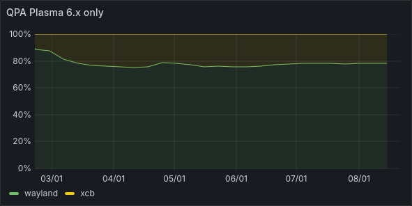
However, if we filter for Plasma 6 users, we see that only 20% decided to change the default from Wayland back to X11.
There are a few criticisms of this method too. One that I have myself is that the VDG does not really use it, or only uses it extremely rarely. For privacy, only a few members have access to the data (as an example, I don't).
Secondly, it's really hard to add new data to be tracked; to the users who already opted-in, what should happen? Should they be automatically opted-in to the new tracking too (which wouldn't be honest towards them)? Should they have to go back to settings to change the setting? Should they be notified and asked upon upgrading? It's not clear.
GNOME had a few more mixed feelings about telemetry. A while ago, they published a script called gnome-info-collect that users could intentionally download and launch on their systems to share - as a one-time favor - some data to GNOME. Two and a half thousand people did so.
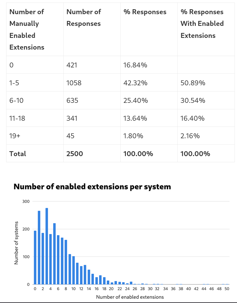
Turns out, most of the people who run the script use Fedora (Arch is a distant second) and use a Lenovo computer. Half use the Online account's features, mostly to connect to Google. 93% have Flatpak installed, and 73% use Firefox as their default browser. Also, only less than 17% did not have any extension installed.
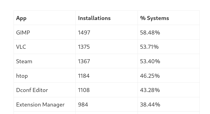
They also looked for which extensions were installed, and which apps the user had on their systems. The most common ones were GIMP, VLC, and Steam.
Overall, this feels like a very interesting exercise in data collection, and one that might even result more useful compared to KDE's current telemetry system. However, for it to continue to provide feedback, it would have to be run once in a while. There are benefits and issues on both sides, I would say.
Conclusions
Overall, I'm not completely happy about the status of the KDE design team, and I think we have something to learn from GNOME in this aspect. I hope that we will be able to attract more design-first contributors, and maybe the Plasma Next initiative by Andy, who's also working on better Figma / Penpot design kits, might help that.
KDE Board Member Nate Graham announces for-profit company
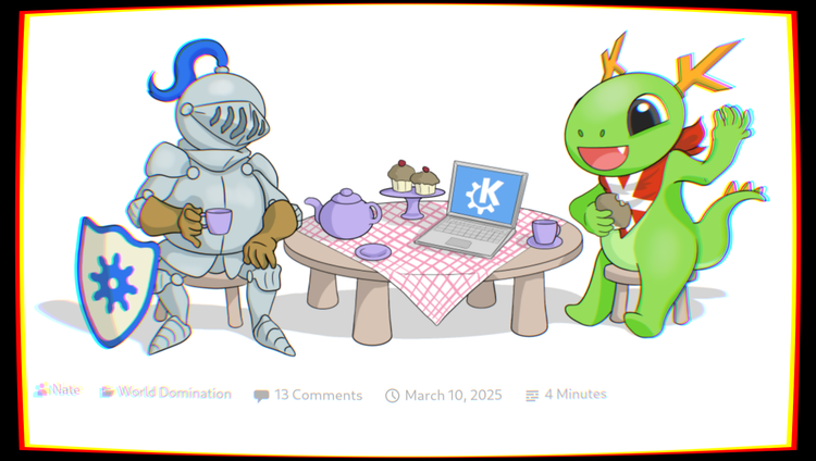
Nate Graham is widely known in the KDE world; he is a board member of the KDE e.V., the non-profit company that supports KDE development. He also writes the "This Week in KDE" blogposts, has done various interviews talking about KDE software, and so on.
Yesterday he has announced that he created a for-profit company that hire various KDE developers, and that will become a KDE e.V. Patron as well. The company is called Techpaladin, and it's co-owned by David Edmundson, another very public developer (who's also given interviews on KDE!).
On top of that, I'm happy to announce that I am one of the contractors of Techpaladin, and I'll be continuing my KDE Plasma development work with them. This might sound exciting, but - as usual - to understand the full scope of this news we need a few additional bits of context.
Firstly, both mine, Nate's, and David's previous employer was Blue Systems. BS is a German company that actively works (or, worked) on projects such as KDE Plasma, Netrunner OS, Plasma Mobile, Manjaro, KDE Neon, MAUI, the Calamares installer, and more.
Blue Systems was founded by the German businessman Clemens Tönnies Jr. If you just search that name this guy will pop up, and you'll discover that he own 46% of a meat processing industry, and has an estimated wealth of around 1.6B dollars. This is the senior Clemens, not the junior, who is his nephew.
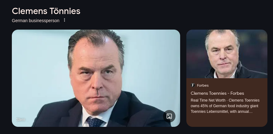
Clemens Tönnies Jr. left the meat processing company by transferring his shares to the brother, and there's very few public information about him. He has given an interview back in 2012 to "golem [dot] de", and back then he was a 36 years old computer scientist and self-described philanthropist.
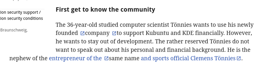
Clemens started sponsoring the KDE e.V. and, back then, even hired Johnathan Riddel, who packaged releases of Kubuntu, after Canonical discontinued support for that distribution.
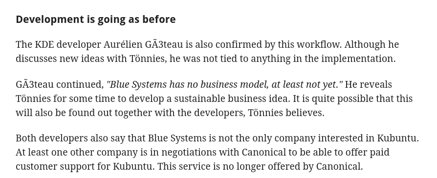
In 2012, Blue Systems "had no business model, at least not yet". However, more recently, they had added Valve's SteamOS to the list of official collaborations; as I have previously covered on this channel, Valve had decided to sponsor KDE development work through Blue Systems, which led to many KDE developers becoming contractors for Blue Systems whilst sponsored by Valve.
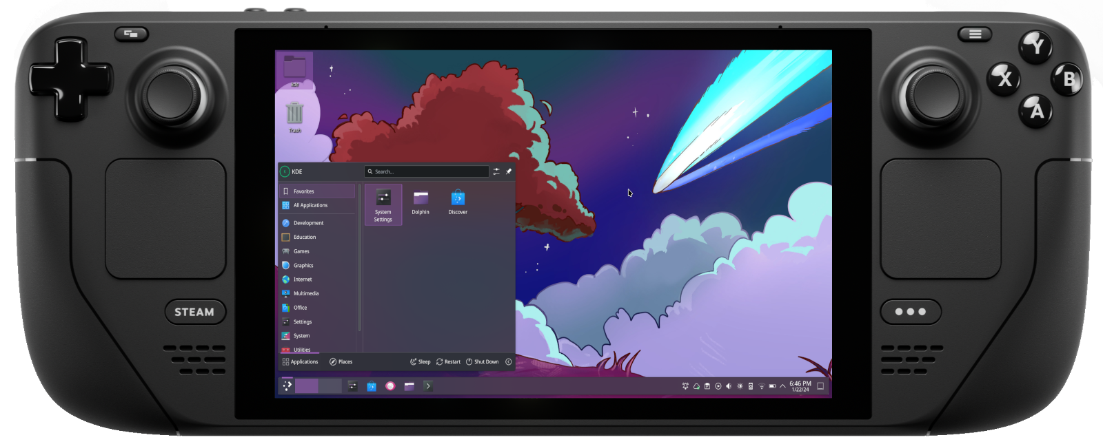
As I - somewhat privately - announced a bit less than two years ago, this also included myself; I've been a contractor for Blue Systems, sponsored by Valve, for quite some time now.

To be clear, Blue System was not the only Valve-sponsored company. As another example, Igalia also had (and, I think, still has?) a contract to work on the graphic stack of the SteamDeck.

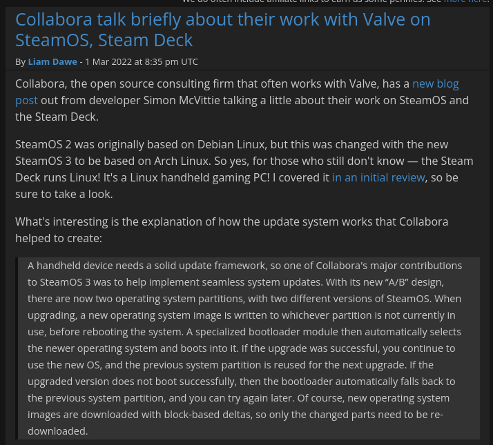
Yet another example is Collabora, who also briefly talked about their work with Valve regarding SteamOS:
But then, what happened to Blue Systems? According to Nate, about a dozen of Blue Systems' current people moved to the new Techpaladin company; this comes after six years of BS employing Nate.
The reason for the change is not stated, but according to Nate it has not been any kind of "hostile takeover", but rather a "mutual decision made between the owner of Blue Systems, myself and David Edmundson, and Blue Systems' other personell who are moving over".

We currently know that the company has more than a dozen contractors and employees "sread across 7 countries and 2 continents", plus a co-owner.

This is not the first time that Nate runs a company; he also talks about the fact that from 2011 through 2014 he had a two-person 3D printer company, named - hold for it - Techpaladin Printing. They sold parts and kits, and according to Nate, it was his first exposure to the Free and Open Source Software movement.
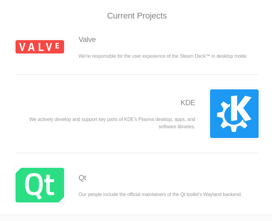
According to the Nate, TechPaladin also inherited the Valve contract that Blue Systems had, as their first (and currently, only) client. As they say on their webpage (or should I say, our webpage) "we're responsible for the user experience of the Steam Deck in desktop made".
Techpaladin seems to also be currently looking for other clients. As Nate says, if you see an awful bug that you're experiencing, you can get in touch and the company will help you sponsor that bug fix, or maybe a new feature, or any kind of custom development.
Most likely, Techpaladin is also looking for other corporate clients; following Valve example, other companies that use KDE Plasma on their hardware might benefit from paying Techpaladin to improve the desktop specifically for their devices.
Nate will be running the business, and he's also currently a KDE e.V. board member, but he plans to still publish This Week in Plasma, still do technical work, review other people's merge request, triage bug reports, and so on. So, the work is not stopping.
Really, what this means is that, from now on, the contract that Valve has to improve KDE Plasma is now in the hands of, well, KDE developers (Nate and David). It will be interesting to see how this company grows, and how it will maintain its relationship with the KDE e.V. non-profit.
And, if you know anyone who wants to sponsor some feature, or any company that needs KDE development of any kind, feel free to reach out to Techpaladin to get those things done!
GNOME just got way smoother thanks to Triple Buffering
If you have ever used the GNOME desktop for any length of time on any weak or underpowered laptop, you might have run into some performance issues. The main problem you will have noticed, though, is probably that the animations were not smooth, and there was a lot of noticeable lag in them.
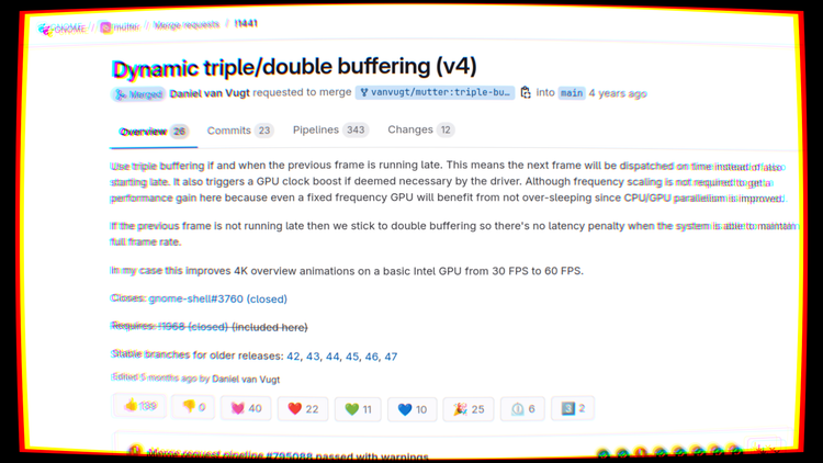
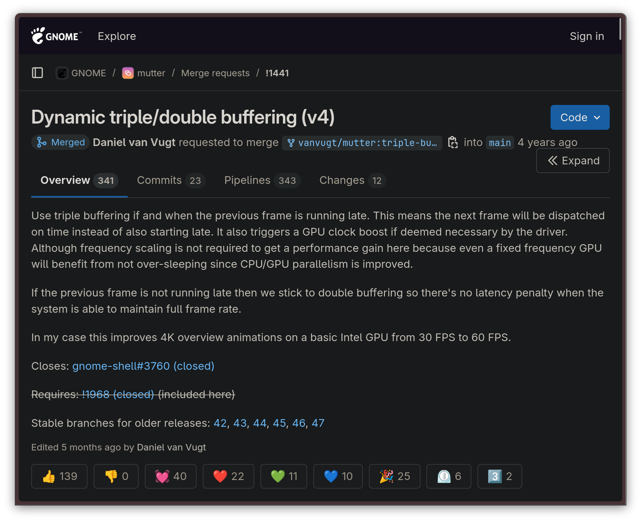
While the GNOME desktop has undergone many performance optimizations during the past few years, the real root cause of the issue was solved just a few days ago with the introduction of the triple buffering functionality in Mutter.
As usual, though, let's take a step back first.
What is triple buffering?
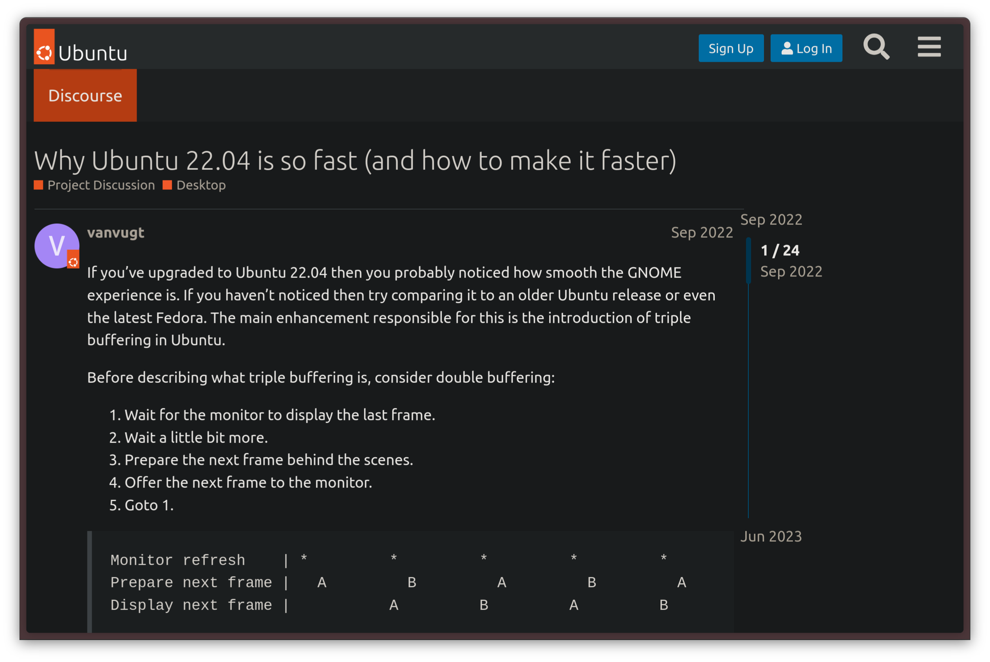
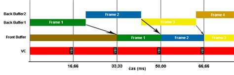
Triple buffering is a common trick in the book of pretty much every OpenGL implementation. When triple buffering is used for graphics rendering, rather than rendering the entire graphical pipeline on one buffer, three buffers are allocated in RAM and used in parallel. These buffers are allocated as follows, according to Intel's documentation:
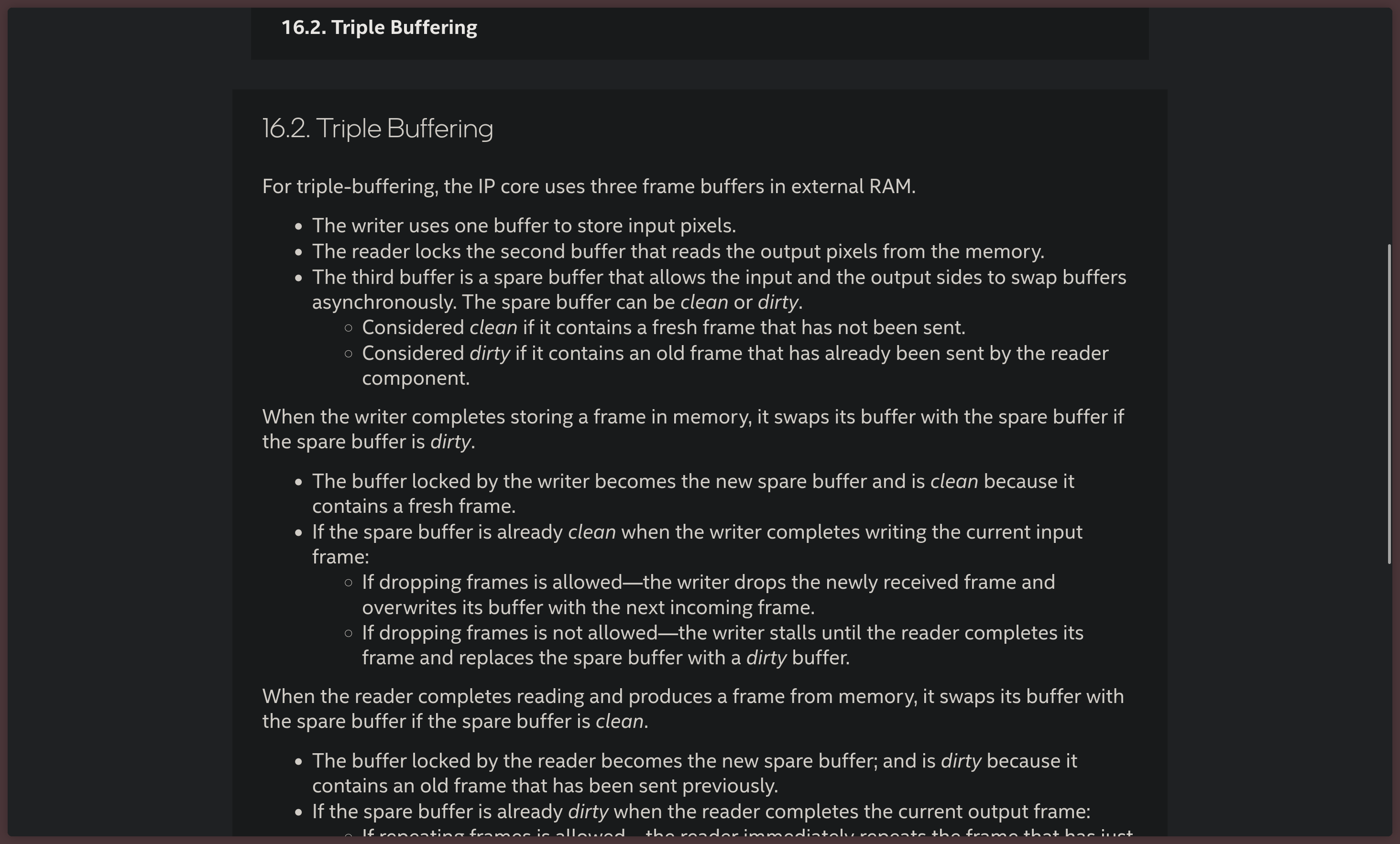
- The writer thread uses one buffer to store the pixels that will be part of the frame as input
- The reader process listens on the second buffer which reads the pixels the frame is made of from the memory
- The third buffer is used as a spare, which allows the input and output threads to swap their buffers asynchronously.
The advantage of this approach is that the graphical output tends to be smoother because the GPU can begin rendering the next frame without necessarily waiting on the two main front and back buffers to be done with the current transaction. The third, spare buffer, can be used to calculate a new frame early. The only real drawback of this approach is that, in some implementations, it causes latency.
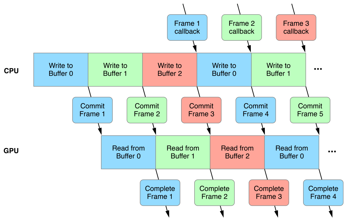
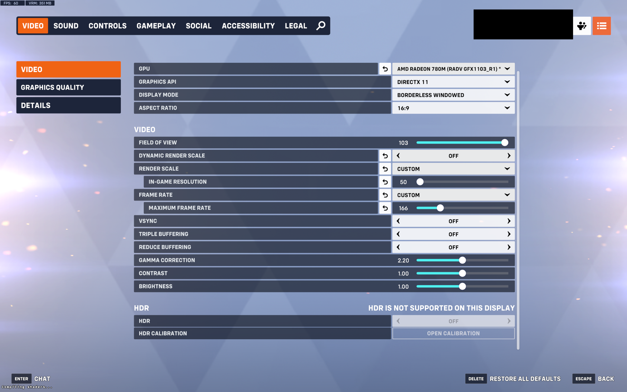
This technique is already widely used in plenty of video games, as it comes free with every modern OpenGL implementation. The only reason why GNOME didn't use it yet lies in some Mutter architectural quirks.
Let us now move on and talk about what happened to GNOME itself.
Triple buffering and GNOME
Going back to GNOME. Remember how we talked about the problem with slow and laggy animations earlier? Well, the entity that led the efforts to find and resolve the root cause that caused this symptom was none other than Canonical, the company behind Ubuntu Desktop.
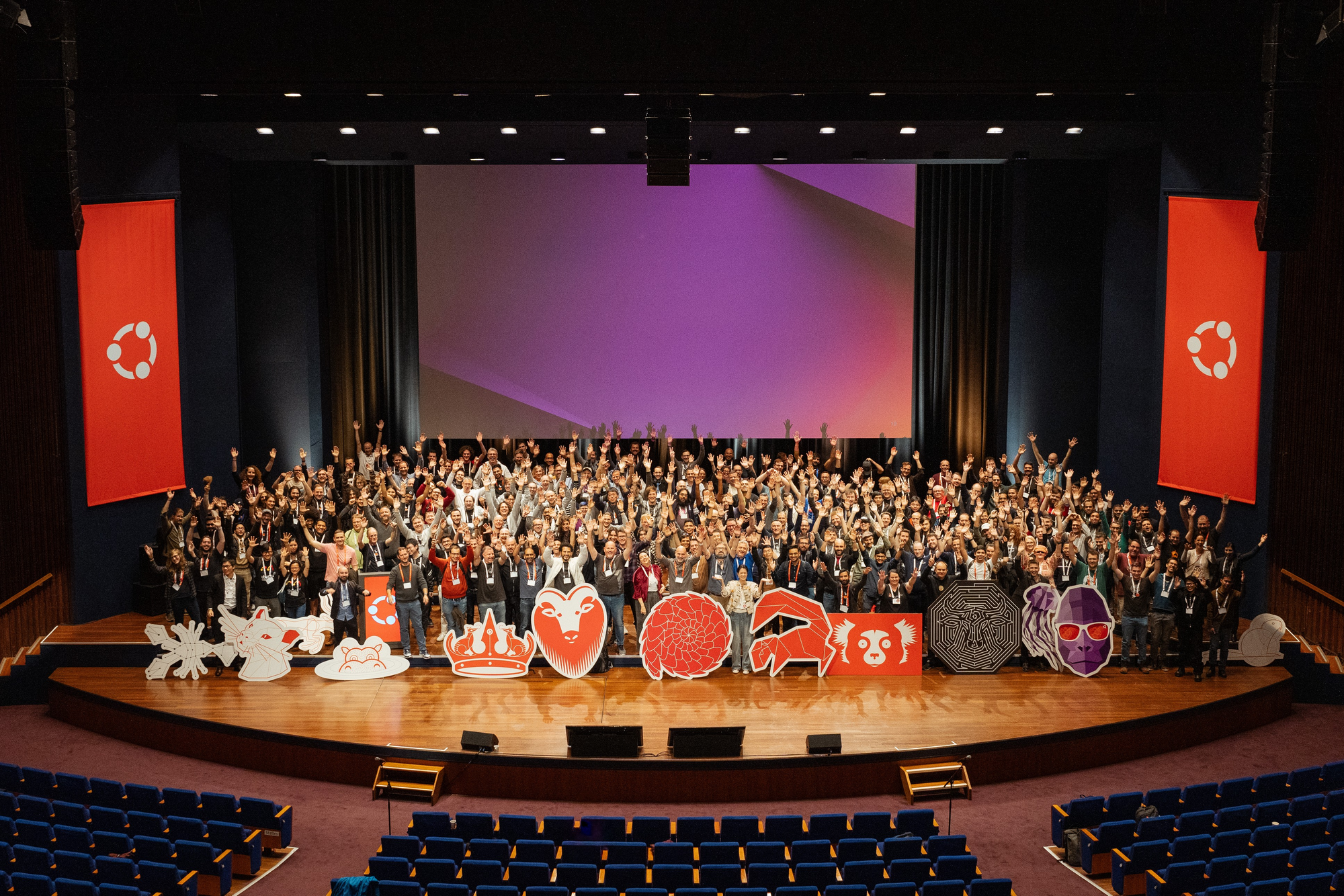
Canonical contributing heavily to GNOME is nothing new: since the Unity desktop was abandoned in favor of GNOME starting from the release of Ubuntu 17.10, Canonical has become a very important contributor to the GNOME ecosystem, consistently contributing upstream in meaningful ways, and working together with the GNOME team to bring Ubuntu users a Canonical-branded GNOME experience with the Yaru theme in a such a way that existing GTK applications that rely on the Adwaita theme would not break on Yaru.
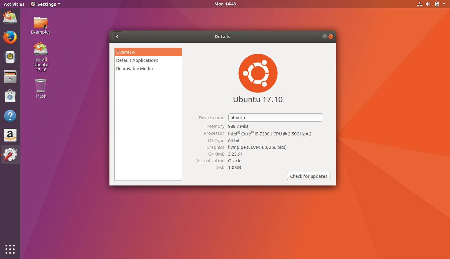
Particularly, Canonical's focus has been on improving the performance of the GNOME interface — so, there is no surprise that the work on triple buffering was led by them. Collaboration wins, at the end of the day, and when multiple distros standardize on the same set of desktop environments, good things come out of it. Just think of all the good that came to KDE Plasma after Valve decided to use it on the Steam Deck: while not directly comparable, this is a similar story.
How Canonical found out
While it has been known for a while that the GNOME desktop suffered from some performance issues, the root of the issue was identified in more rigorous tests around 2020. The Ubuntu team was playing around with GNOME, trying to experiment with further eye candy, when they found out that, the more eye candy they added, the more the shell would slow down. What's more puzzling was that the cause of the lag did not appear to be inadequate computational power on the machines where the lag happened — on the contrary, the hardware was perfectly capable, but the GPU was under-utilized while the lag occurred.
The root cause of the problem was identified to be in the way Mutter renders its frames. Rather than using triple-buffering, it runs all the rendering into a single-threaded loop, which, by design, has a very limited throughput. It was apparent from there that this was the limitation to work around to help with the performance concerns.
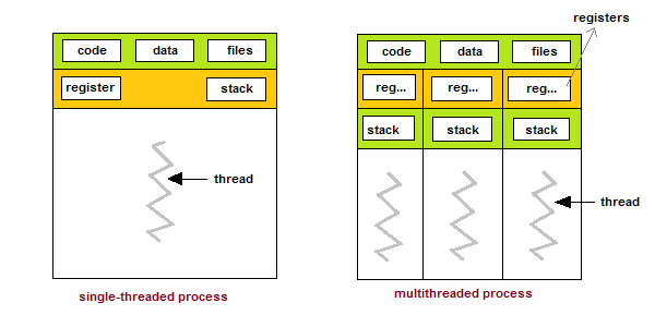
Initially, work on making the rendering event loop multithreaded with a triple-buffered architecture started with the X11 session and frame clock changes. That initial part of the work was the more manageable part since it came free by relying on GLX — an X11 protocol that bridged the gap between X11 itself and OpenGL graphical APIs — which is also triple-buffered.
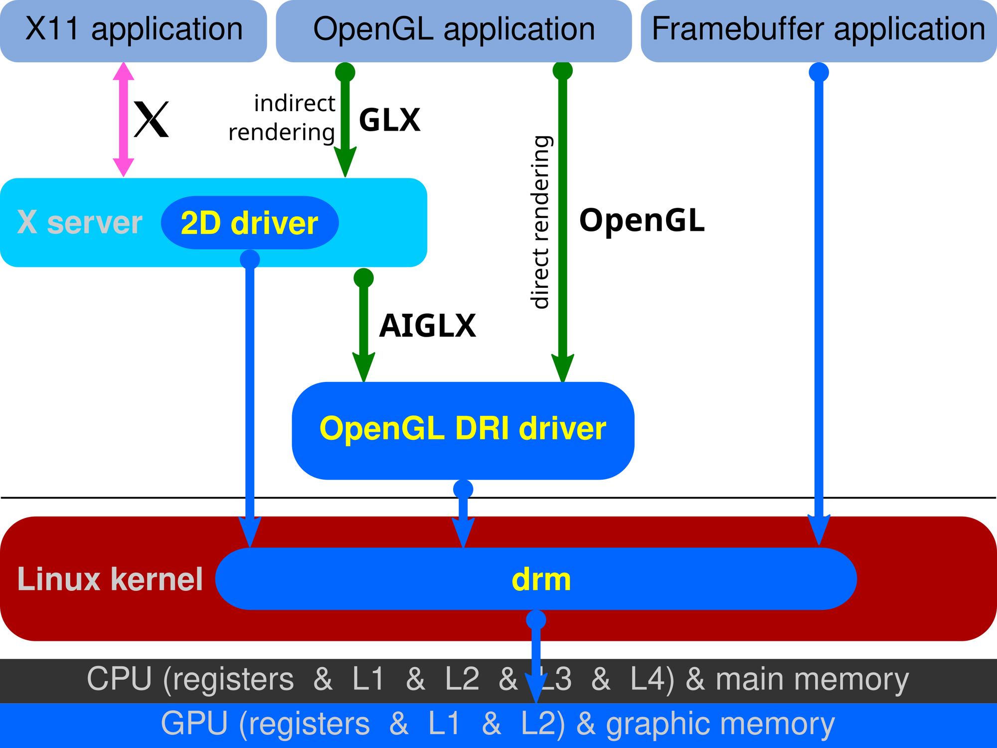
The limitation with that implementation was, of course, the fact that it was limited. GLX is an X11-specific extension: it is, hence, not portable to Wayland. For tasks that used to require GLX, modern Wayland implementations use EGL, a different API, instead. Besides, rather than being based on a client-server architecture like X11, Wayland is just a protocol implemented by compositors, such as GNOME's Mutter. Porting this fix over to Wayland would involve dealing with actual Mutter code, with no shortcuts.
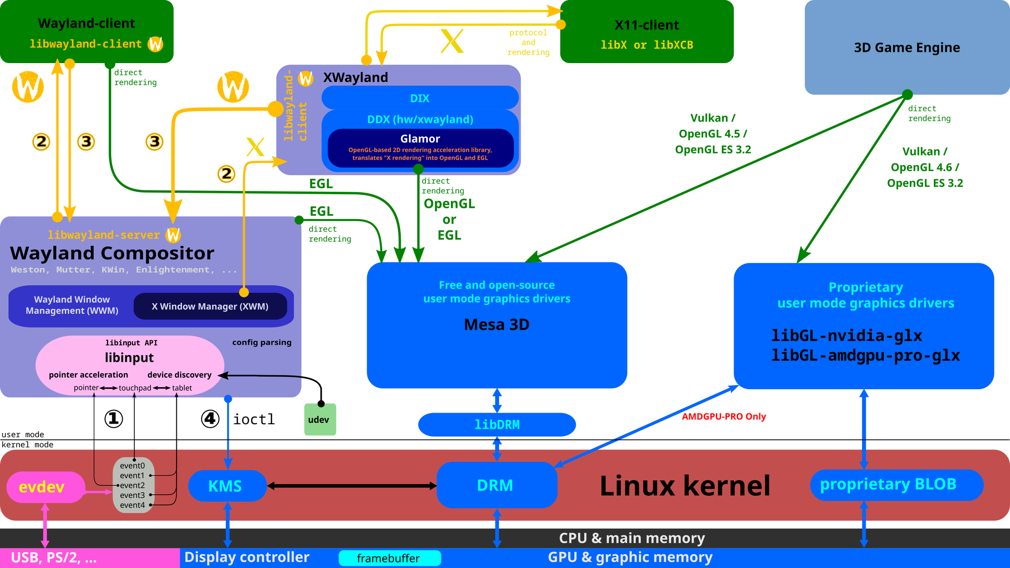
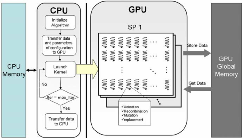
From late 2020 up to early 2022, Canonical worked on implementing triple-buffered rendering on the Wayland backend. A higher-effort rework to Mutter's architecture had to be done to achieve the same result, to make Mutter able to cope with multiple frames in-flight simultaneously. What this means is that, fundamentally, the compositor needs to constantly be one step ahead. Before the GPU is done carrying out the work on rendering the previous frame, the CPU has to already be working on the next one. This works well because the CPU and the GPU are separate entities and, in a standard non-GPGPU architecture, all the GPU does is take orders from the CPU, which acts as the central orchestrator of the entire operation.
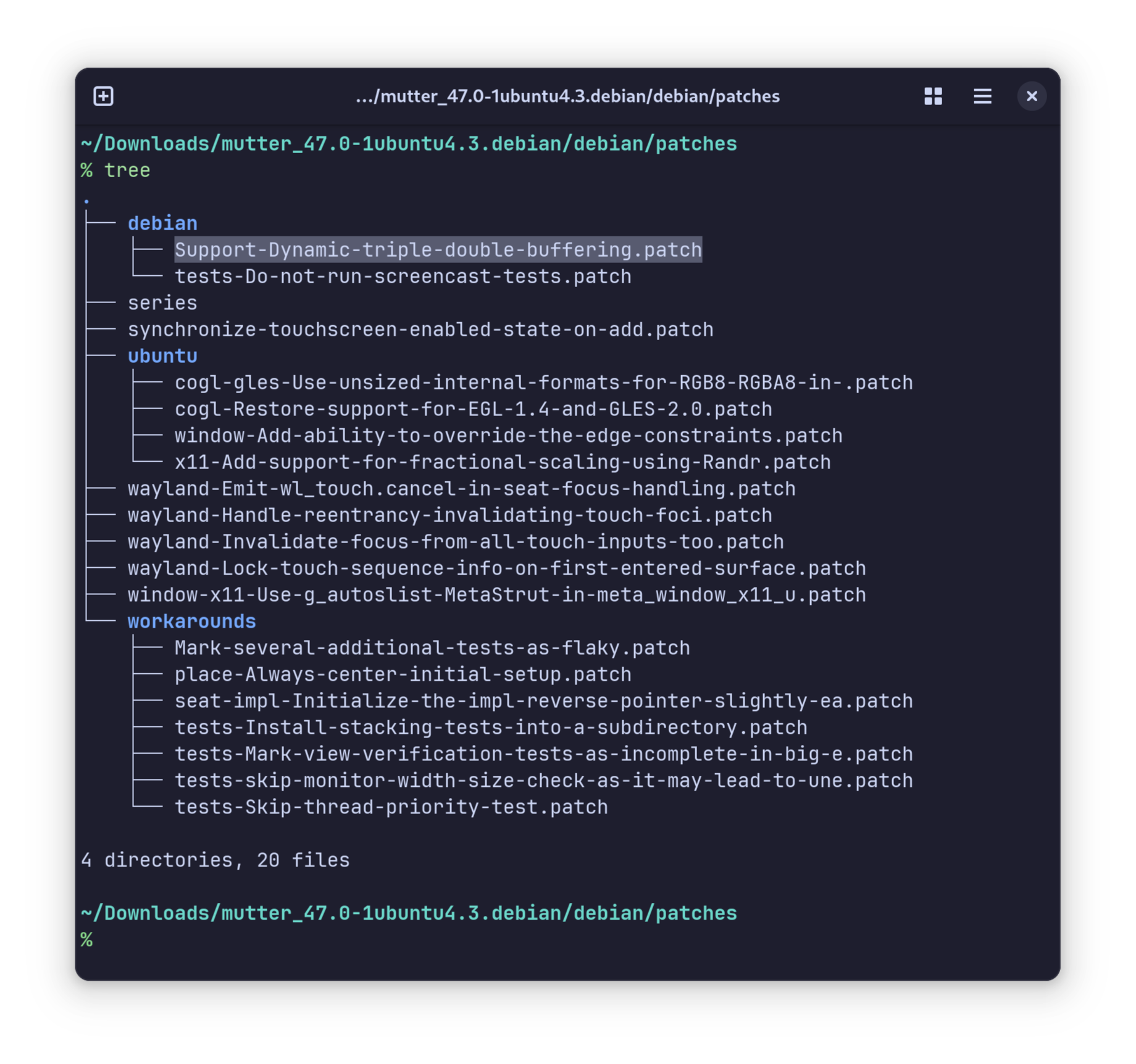
At that point, the work had reached a point where it was stable enough that, while upstream GNOME had not accepted it yet, the result started to be shipped in Canonical's own Ubuntu Desktop 22.04 LTS. You should know that Ubuntu does not ship a copy of GNOME that is exactly, 1 on 1 the same as upstream GNOME, but several downstream patches are applied to it by Canonical and Debian. What this means for those of you who are running Ubuntu is that you have been enjoying the fruit of this labor for the past two or three years - while, by default, that was not true for other distros.
At last, in 2025, here we are. The patch has been accepted by GNOME and it has made it into GNOME 48, where it will bring a fundamental performance improvement to all distros.
It needs to be specified that the extent of the performance improvement varies between various hardware configurations. However, it never makes things worse, and it is only a range between a slight and a noticeable improvement. As usual, by the time GNOME merges a merge request, it manages to be mature enough that no regressions are introduced by adding it.
But what about latency?
Those of you who are more keen on competitive online games will have been asking themselves: “will this not increase the input lag”?
The answer is, in short, no — not in this implementation. Differently from most triple-buffering implementations that are found in games, this one sticks to double buffering in all cases, unless when the system is unable to deliver the expected performance, and then, only then, does the algorithm naturally transition to triple buffering.
Trying to make it simpler - triple buffering is only ever used when it is truly needed. This is a big part of the reason why this implementation does not regress and does not make things worse on existing hardware. If you have been happy with the standard behavior, and your system always renders GNOME animations at your monitor's frame rate, then you don't have to worry about it: odds are, the triple-buffered rendering behavior will never, or very seldom, get triggered on your device. If that is not the case, though, triple buffering will just come in clutch whenever your system cannot keep up — giving you a subjectively smoother experience, all things considered.
So, are we done?
According to Canonical — no, not really. Implementing triple buffering at the compositor level is a great milestone, but it is not quite the be-all-end-all. Several applications still need to do some work themselves to enable triple buffering and reap the full benefits from it. For example, Canonical notes it seems like Firefox struggles to render the first few frames of the touchpad scrolling physics when flung with a touchpad smoothly, unless the machine is set to performance mode. There is nothing your Wayland compositor can do about this issue — it is wholly Firefox's domain here, and they are expected to come up with a comparable solution to work around this limitation eventually, just like GNOME and Canonical did for Mutter.
So, are there any limitations?
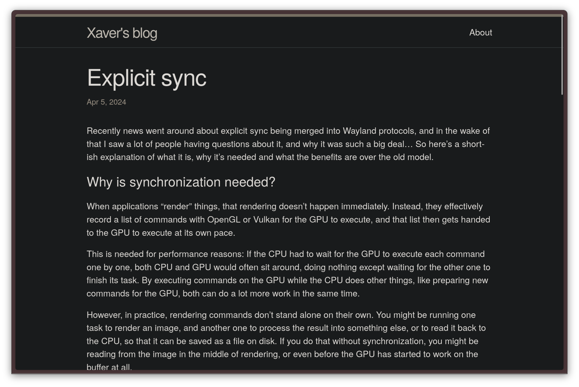
While triple buffering seems to be overwhelmingly good news, yes, there are sadly some limitations to this approach. The main one is that… you guessed it. Come you, you did. If your system is running an NVIDIA GPU, odds are you will not be reaping the full effects of this performance improvement. The reason is that the NVIDIA driver is, as always, very different from standardized mesa implementations, and only supports explicit sync — which is completely synchronous — whereas every other GPU driver also supports implicit sync — which is asynchronous. When implicit sync is supported, you can pass buffers around without waiting until the GPU is done rendering them, which can result in a healthy performance speed-up, and is essential for this patch to work well. Since NVIDIA does not support this, however, you will not be getting the same level of performance on those cards. You should probably read Xaver's article on Explicit Sync to know more.
 Xaver Hugl
One rare limitation is that users who run Linux on a virtual what machine with software rendering will only get some benefit from this implementation, but not nearly as much as non-NVIDIA physical GPUs will. Besides, Canonical recommends running desktop environments that do not rely on any graphical APIs like OpenGL at all on sessions without graphical acceleration whatsoever, since it is more expensive for a CPU to emulate a GPU with llvmpipe than it is to run a non-accelerated graphical session.
This OS runs in your browser
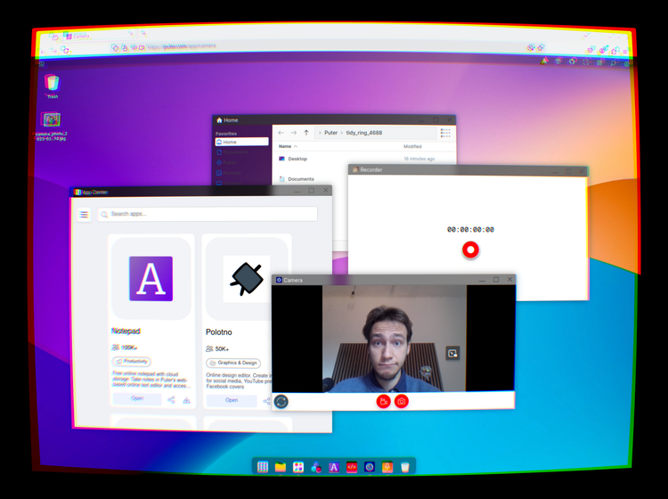
This is Puter, and it's an implementation of a full desktop within a browser.
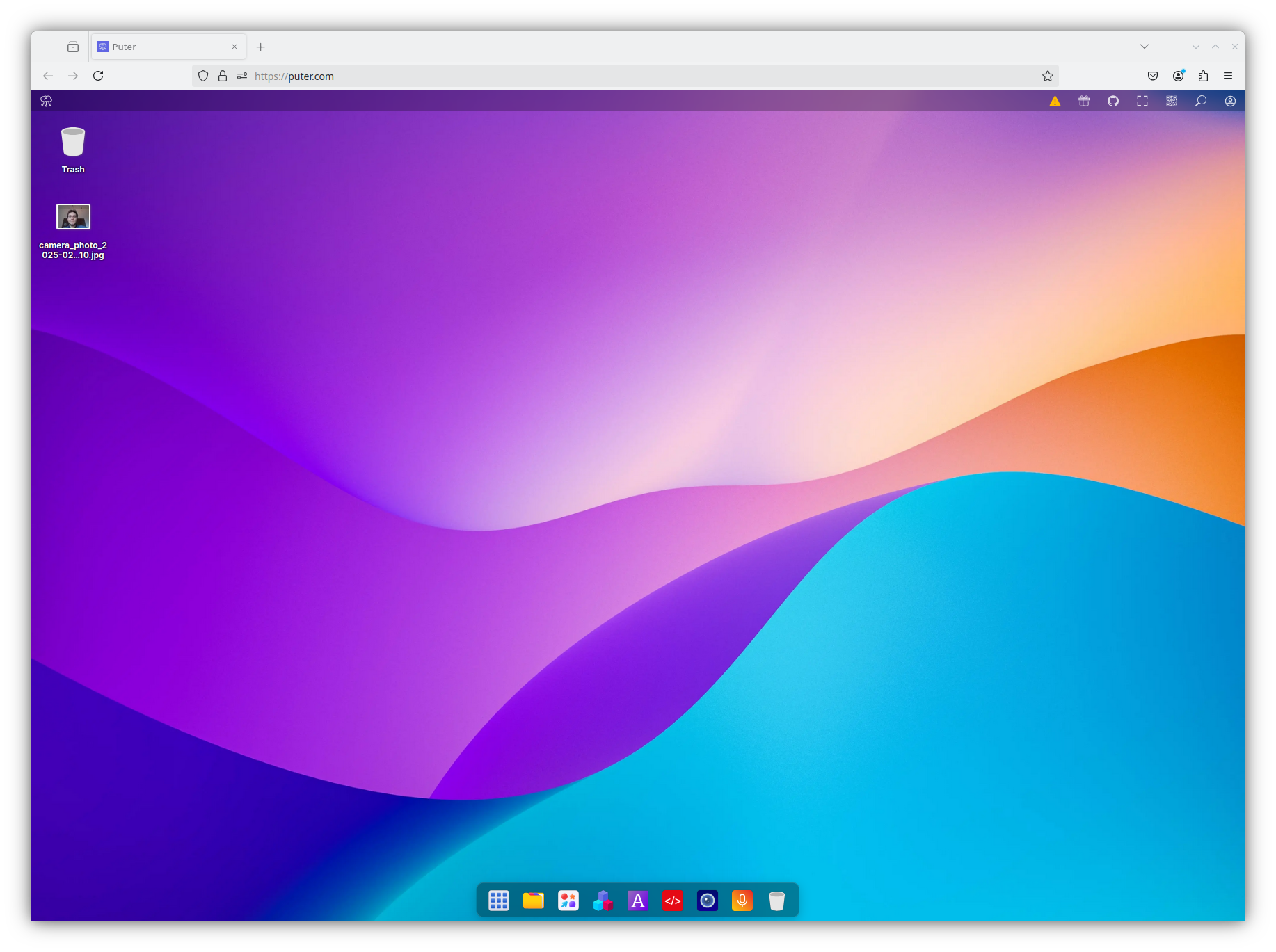
You might not be sold on this idea yet.
Though I'll go through this in more detail later on, I will immediately: this includes a file manager, a picture editing application, a simple IDE, a camera, a recorder, a PDF reader, a web browser, and more. It's at worst a useless but impressive product, and - at best - something that's actually useful.
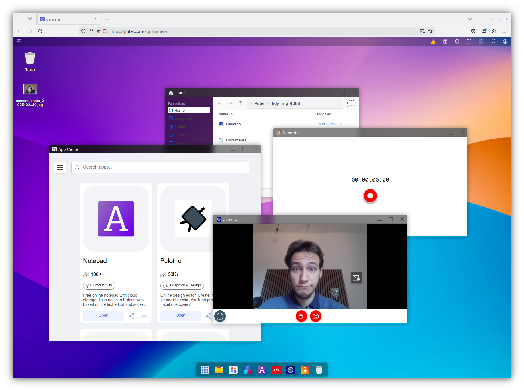
Before we fully dive into this desktop's capabilities, let's start with the basics. How can this be useful if we lose all of our data as soon as we close the browser?
Well, there's no such worry. You can very quickly create an account (which only requires an email, a password and nothing else, not even to click on a confirmation link).
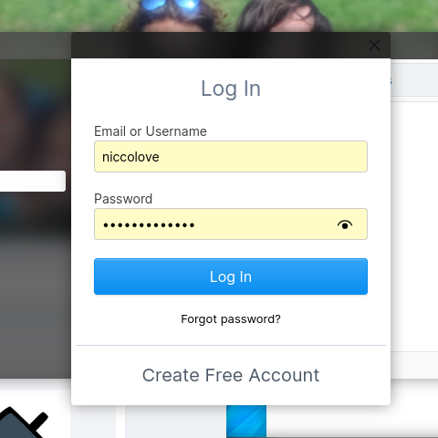
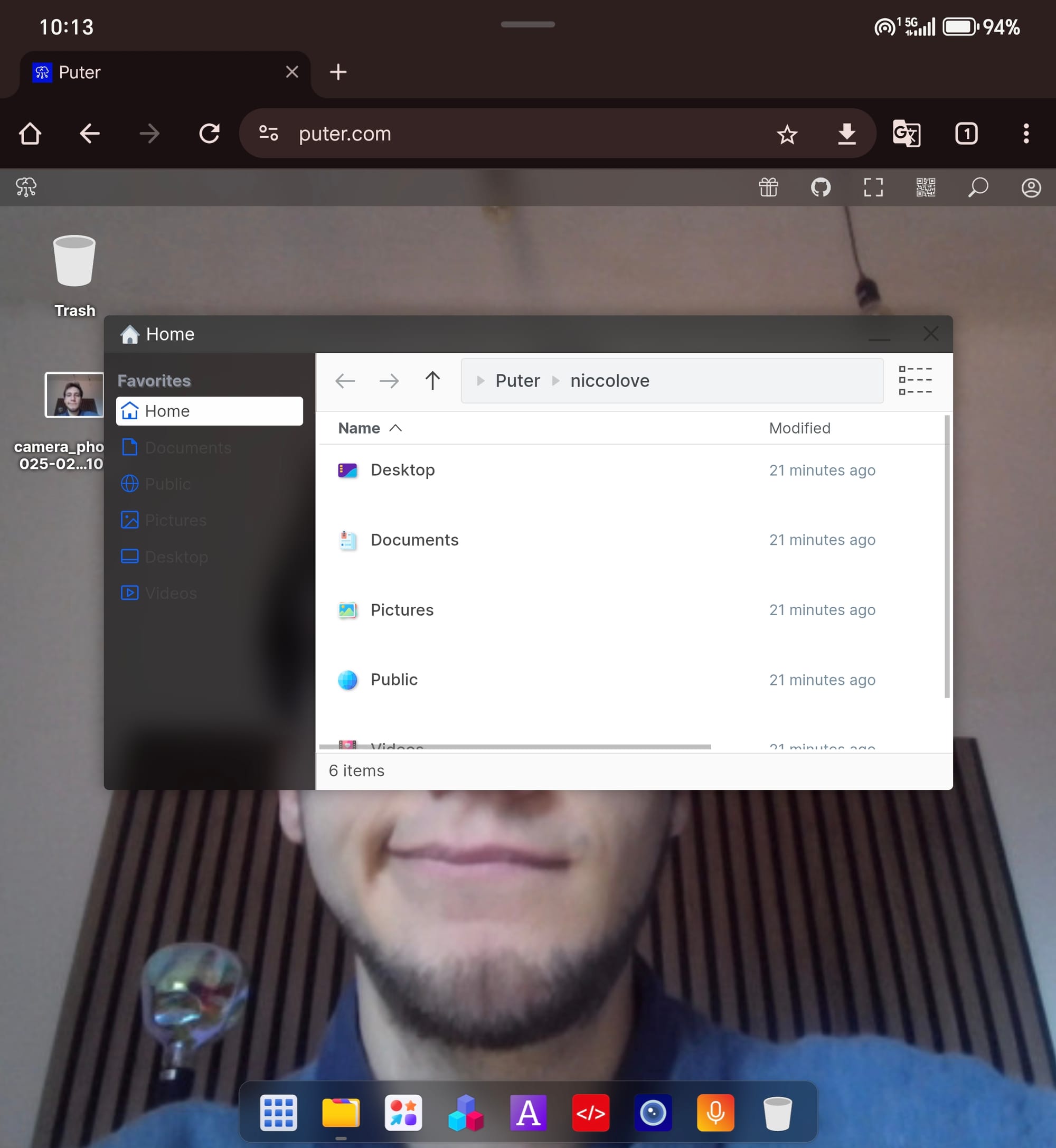
This will make your data persistent throughout sessions, and even devices: just by opening my phone and logging in, I could find all of my pictures and customizations already applied.
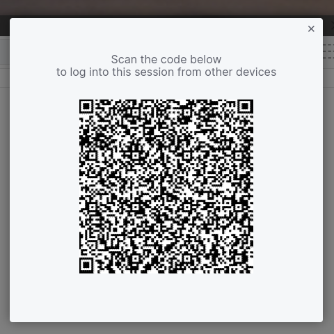
Even better, if you don't want to copy over your information, Puter provides a QR code that you can scan from your phone – and voilà, you'll be logged in on any other device, instantly.
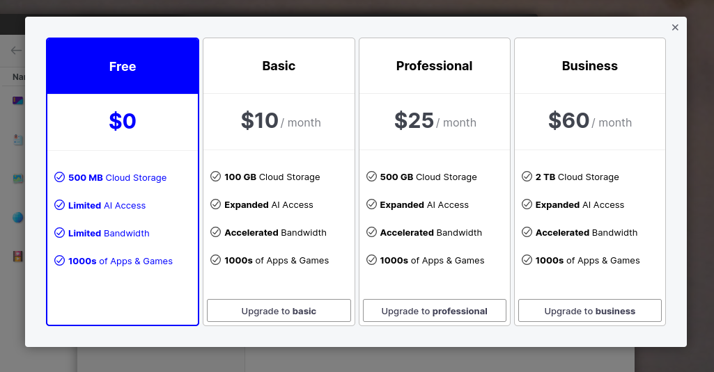
By creating an account, you get 100MB of storage out of the box (and 20 AI Chat Completion, which – thanks, but I won't be needing those).
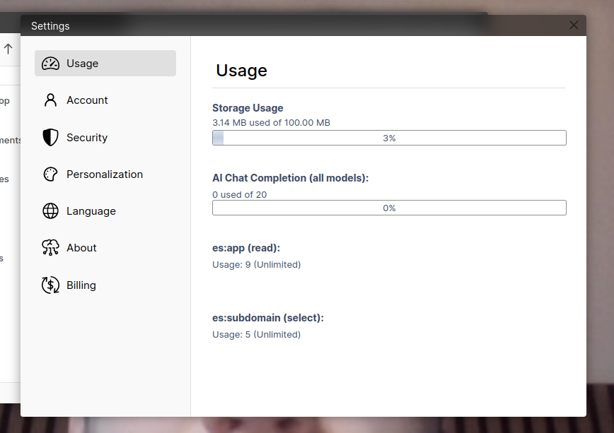
You can get another GB of storage by inviting a friend to make an account, and you can also buy additional storage, starting at 100GB at $10 a month. So, yes, this OS does come with optional subscriptions out of the box – we already have something that most Linux distributions lack out of the box.
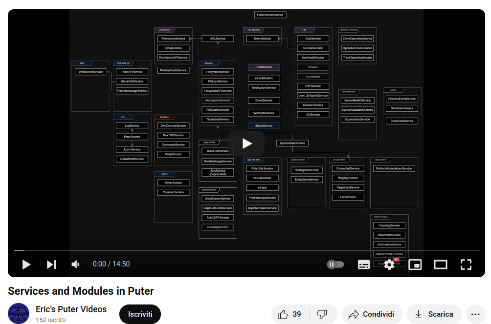
Ah, and of course, the website is open source on their github; the developer even publishes videos on how the infrastructure works, though I would not even dream of understanding anything about that. I only know that it's made entirely in Node, which (I think) is a terrible crime against humanity!
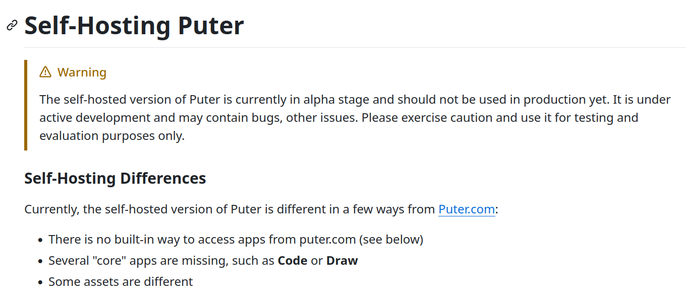
Since it's open source, you can also self-host it if you want, which - I can only guess - will allow you to use your local storage directly instead of relying on the cloud. You could wonder if that runs without an internet connection, but - as we will see - even if it could, you wouldn't want to.
But why? What can you do with this? Well, there are a few nice features to talk about.
Firstly, you can quickly create and publish websites. If you open the File Manager, right-click on any folder, and select "publish as website", you will be given a random subdomain puter.site that will point to that specific folder.
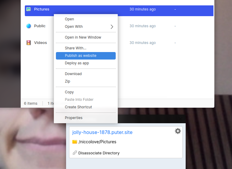
You can add a index.html file to change the look of the webpage and allow users to download files within; it updates pretty much instantly.
Okay, that looks fancy, but would you be able to do anything productive on the OS itself?
Puter comes with an App Center out of the box, which includes a lot of applications. Though each app has a download button, it merely adds the link to the app to your launcher: all apps are this sort-of-webpages, so you can just click "open" and they will open, which feels a bit like magic.
These seem to be re-embedding of other webpages within Puter, which does make sense – though, there's no visible performance overhead and they all behave quite well. Context menus and UI elements are extremely inconsistent, but that's understandable.
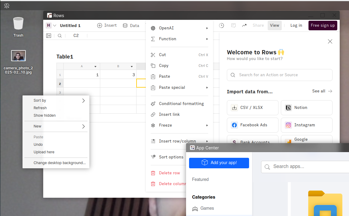
One thing I would like to see here is some additional transparency on each of these applications. Who made them? Who embedded them? Can I find them on their own website?
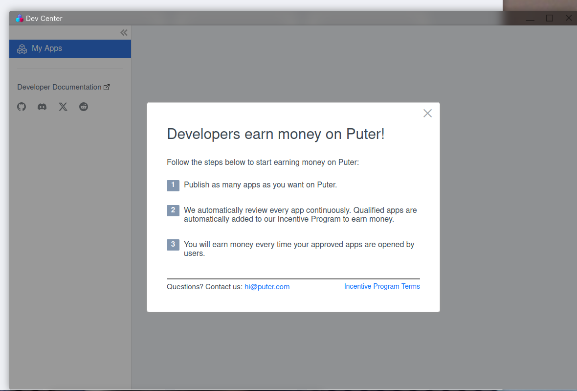
You're allowed to publish as many apps as you want in Puter, though they are reviewed, and you will even receive money every time they are opened. I have to say, I'm impressed here – though, this makes my "more transparency, please" request even more pressing.
In the store, we can find a barebone video editor. Though, it's not that barebone – it allows you to cut away parts of a video, yes, but also crop it, rotate it and flip it, apply various filters to it, change brightness/contrast/saturation/…, annotate the video (with lines, arrows, text, …), resize it, and more. I'm not going to switch to this as my video editing device, but still, it's more than what I was expecting.
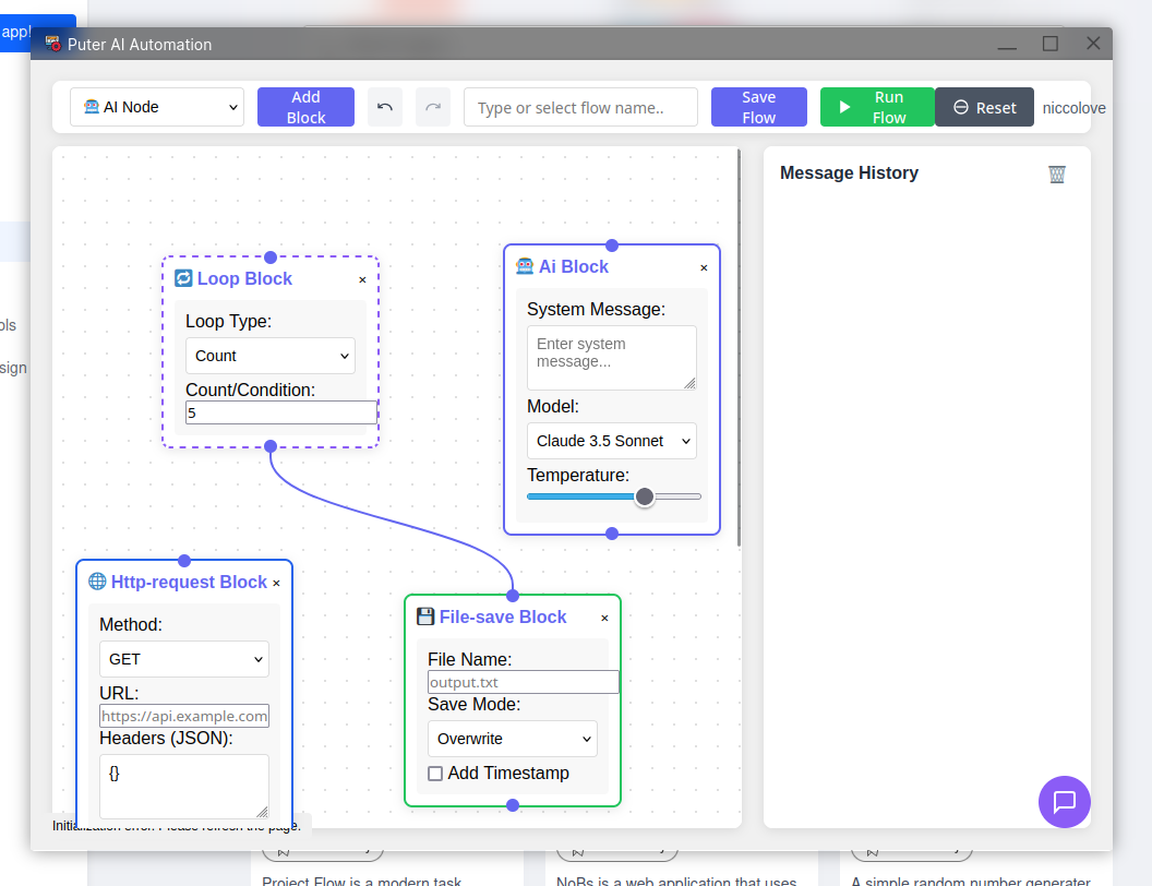
There's a Puter Automation application that allows building, well, automations using a drag-and-drop blocks interface. It's barebone (again) but not something I expected to find at all; of course, in this day and age, it's called the "Puter AI Automation" and the default block is an AI one.
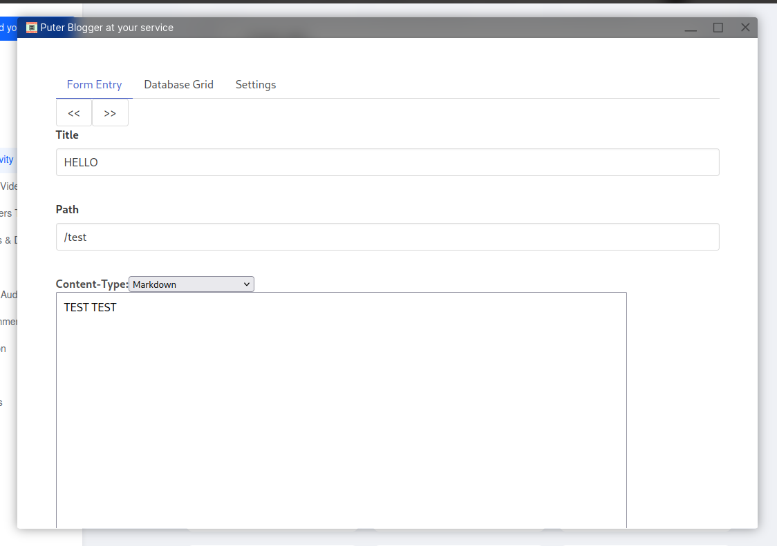
There is a Puter Blogger application that will create a blog within puter.site. It doesn't exactly feel nice to use, but it does allow to publish markdown posts – and, who knows, it might improve significantly over time.
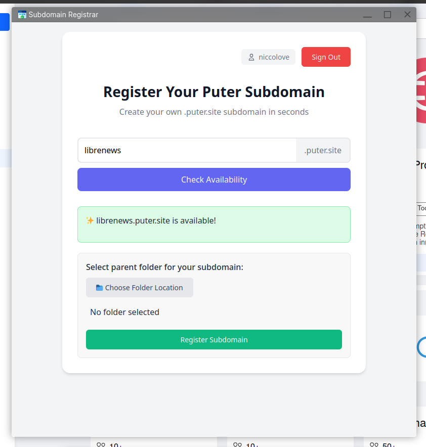
There's even a "Subdomain Registrar" application that allows you to check for the availability (and to reserve) of puter.site subdomains. As an example, I have just registered the website librenews.puter.site, though I'm not sure what I'll do with it.
Design-wise, one available application is "Polotno" (which, again, you could also access independently as a website). It allows to create even somewhat complex designs, though these third party website embedding won't really save anything on your Puter file manager, which - in my opinion - renders them at least somewhat pointless.
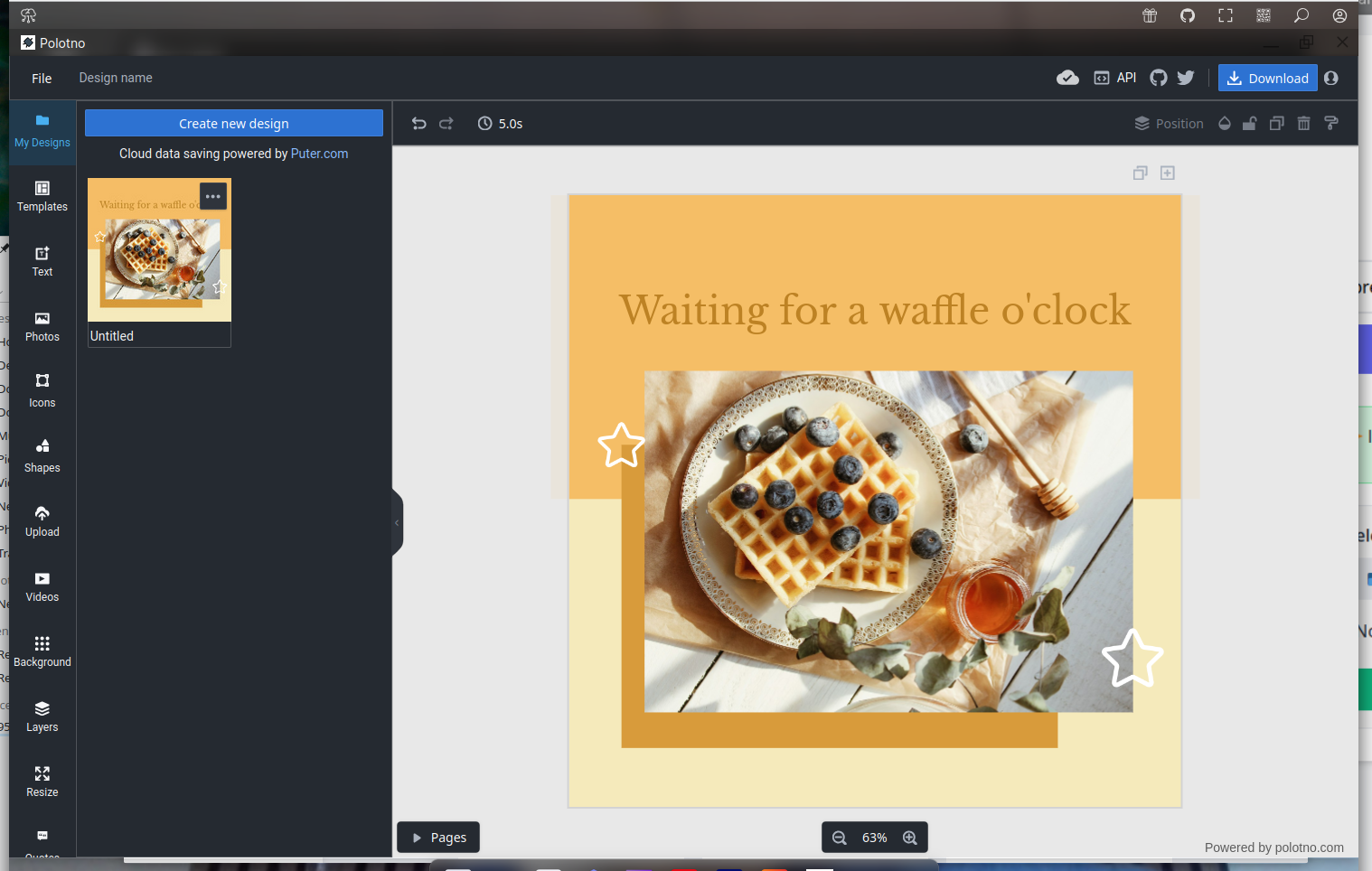
However, the data is associated to your Puter account, meaning that it should also survive when switching from a device to a different one. That's at least something!
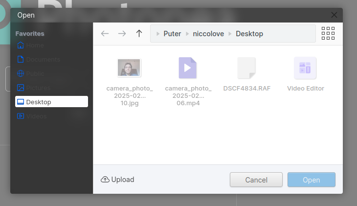
There's also Photopea, to edit RAW images. I love that "Open From Computer" will open the Puter file manager, and not my computers', but somehow Photopea won't accept my Fujifilm raw images, which is sad.
I could go on, but you can kind-of guess what the rest of the app center is: full of applications, mostly well-integrated third-party web apps embedded into Puter, covering a wide range of scoper, from musing making, to book-writing, expense tracker, and so on.
Oh, and I almost forgot: you can customize things a bit. Sorry, as a KDE developer, I just had to mention that. You can change the background (obviously), but also the UI colors and their transparency:
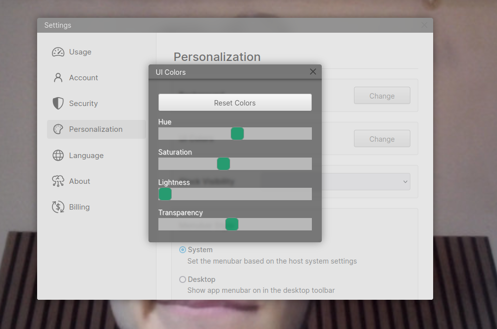
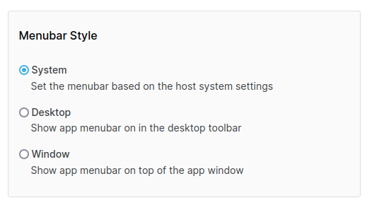
You can also hide/show a clock on the bottom-right corner of the screen, and choose whether you want the menubar to be part of the application or embedded in the desktop top panel. All of these settings update instantaneously.
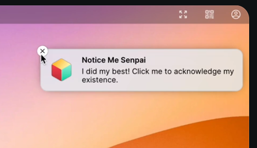
Puter also includes notification support, though I have yet to see an application using one. Again, I would say that the greatest weakness of this OS is the fact that so many applications are just third party websites embedded in Puter, and won't follow Puter's API.
Of course, this still hardly beats your own OS right now. All of these applications could be accessed just as well as websites, and tools like Nextcloud could provide the same level of sync between devices that Puter offers.
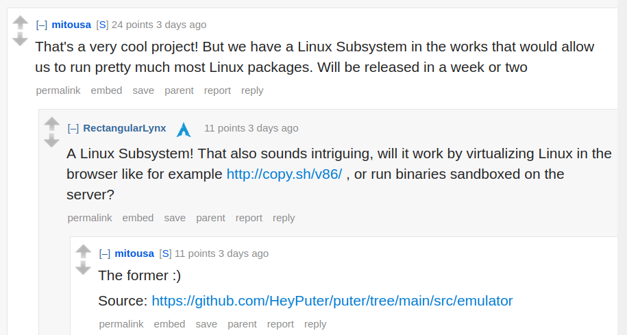
Though, one thing that I'm looking forward is this promise by the Puter developer. They are working to include an emulation application that will virtualize Linux applications on the web, and allow you to interact with them. If that works, it means that Puter will also allow you to run Linux apps – though, I'd expect a significant performance overhead. All of that, by the way, would still run locally on your device.
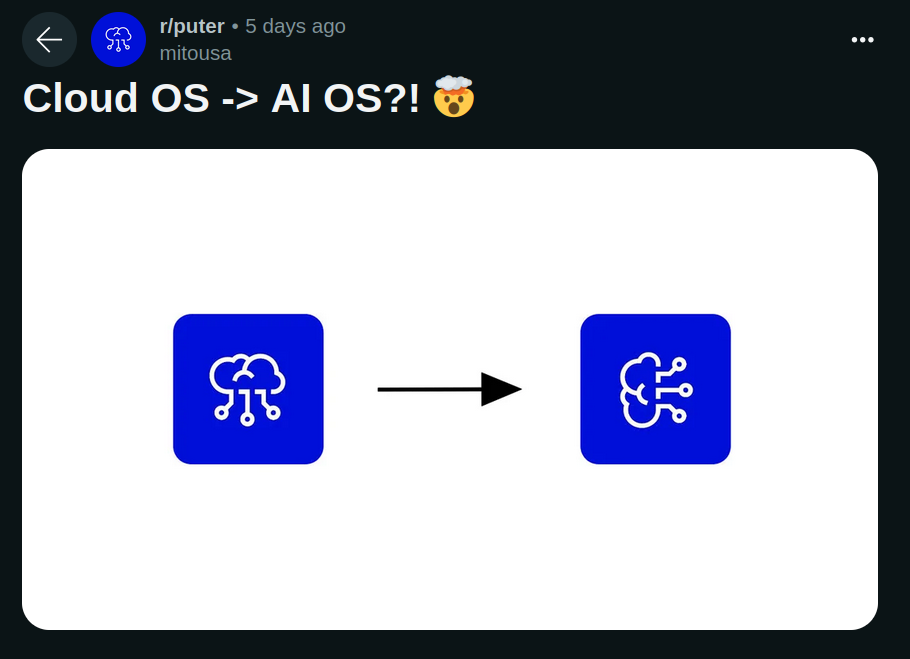
Now, I have to say that the developer is a bit too obsessed with integrating AI everywhere (he recently posted an image with the title "Cloud OS -> AI OS?! 🤯" on his subreddit, which I hope was a meme).
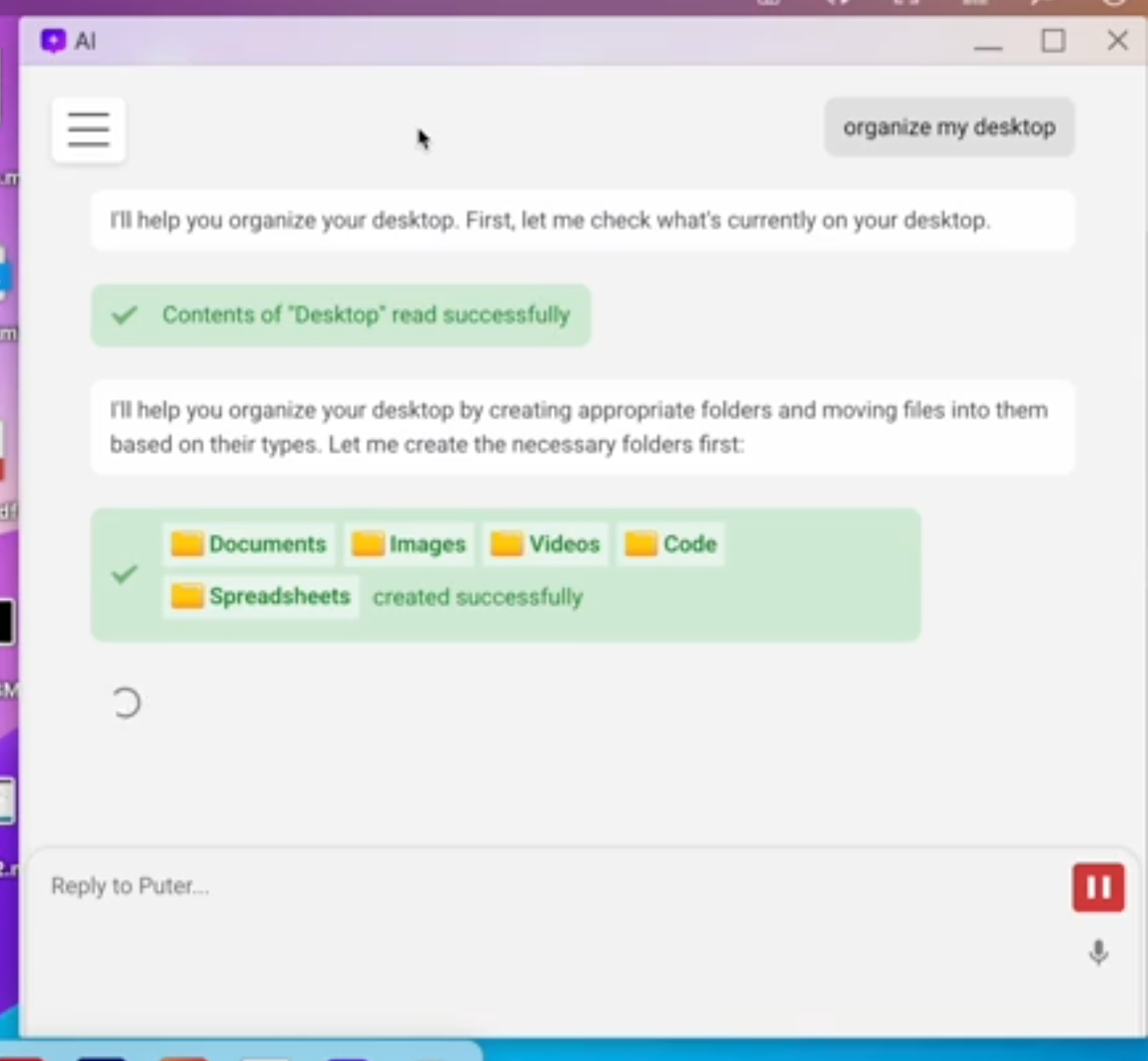
However, one proof of concept he has shared looks pretty cool: by having a standard API that's exposed to a language model, you can use natural language to perform even complex actions on Puter; as an example, you can just ask to organize files and folders on your desktop.
There's also work ongoing for thing such as a command line interface to interact with puter; this program allows you to log-in to your account, upload or download files, and more. Ideally, this would mean that you could keep a local folder in sync with a Puter one, which would finally start to make sense to me.
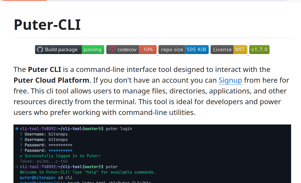
It would mean that I could use Puter as a Nextcloud alternative, but where I have an entire OS in the browser, which integrates with lots of other web applications, to see and do light work on my data from any device but still with the same interface, whilst still keeping serious business on my local machine.
Though, that's still far from reality. Maybe one day? For now, I'll stick to Nextcloud.
Matrix and FreeDesktop are calling for help
Let's start with some brief context.
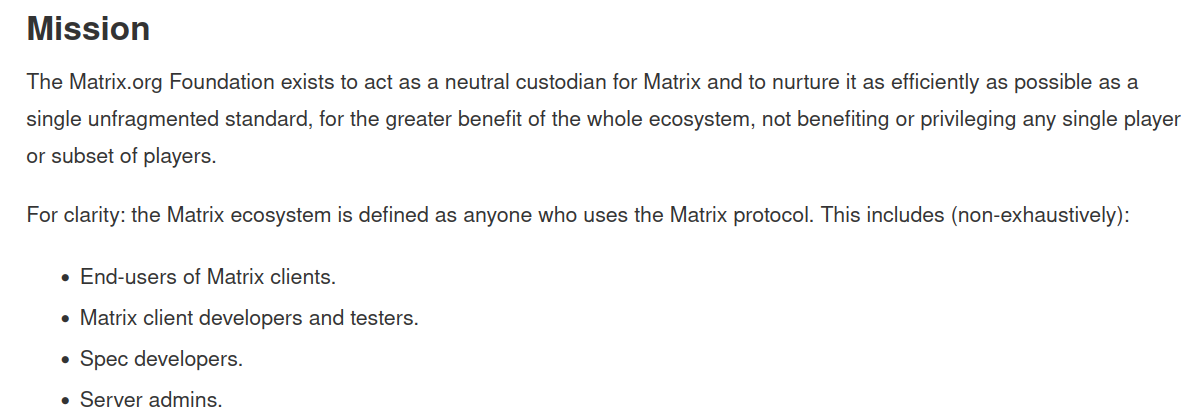
The Matrix Foundation is a community interest company founded in early 2019 that acts as a neutral custodian of the Matrix decentralized communication system.
This is distinct from Element, a for-profit company that builds "flagship products and services" built with Matrix. Element was set up by the creators of Matrix, and has been developing most of Matrix infrastructure for the last eight/nine years, and they sponsored the Foundation for a while too.
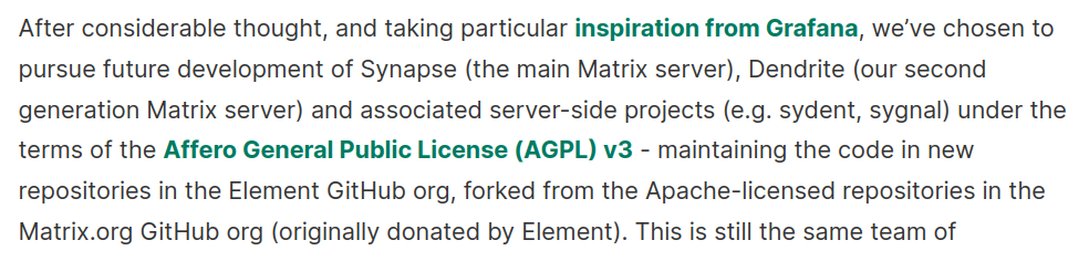
Just over a year ago, Element forked Synapse and Dendrite, two Matrix home servers, changed the license from Apache to AGPL v3, and continued development on them themselves, to speed up work. The Foundation, which retained the old Synapse and Dendrite, had announced that they did not have the resources needed to continue development on their own.
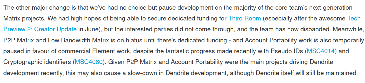
On top of that, the Foundation also explained at the same time that they had to abandon some project they had been working on:
We’ve had no choice but pause development on the majority of the core team’s next-generation Matrix projects. We had high hopes of being able to secure dedicated funding for Third Room, but the interested parties did not come through, and the team has now disbanded. Meanwhile, P2P Matrix and Low Bandwidth Matrix is on hiatus until there’s dedicated funding - and Account Portability work is also temporarily paused in favour of commercial Element work.
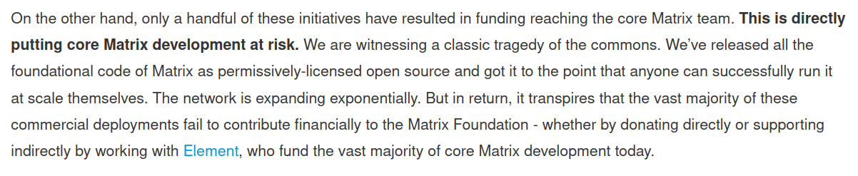
This follows directly from the previous year "distress signals" that the Foundation gave; to quote their 2022 holiday update:
On the other hand, only a handful of these initiatives have resulted in funding reaching the core Matrix team. This is directly putting core Matrix development at risk. We are witnessing a classic tragedy of the commons. We’ve released all the foundational code of Matrix as permissively-licensed open source and got it to the point that anyone can successfully run it at scale themselves. The network is expanding exponentially. But in return, it transpires that the vast majority of these commercial deployments fail to contribute financially to the Matrix Foundation.
And, even worse,
This is completely unsustainable, and Element is now literally unable to fund the entirety of the Matrix Foundation on behalf of everyone else - and has had to lay off some of the folks working on the core team as a result.

Both in their 2022 and 2023 blogposts, they asked individuals and companies alike to donate and sponsor the project so that they could resume longer-term projects, though it seems like these words have not had the impact the Foundation was hoping for.

We're now in early 2025, and the Matrix Foundation has published an article titled "We're at a crossroads".
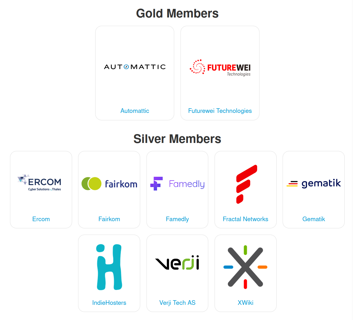
They explain that the Foundation, previously entirely funded by Element, now has half of its budget covered by its funding members. Namely, these are: Element (obviously!), Automattic, and Futurewei, plus the ones that you see on your screen as Silver members.
However, as they mention, having half the budget covered by them means that half of the budget isn't, and they are burning through their reserves. What's the deadline? We're given one.
Either the situation changes by the end of March 2025, one month from now, or they will have to cut costs again. This time, they will be shutting down all remaining bridges hosted by the Foundation, and abandon their development.

They ask for $100k by then; however, this would only extend their runway by one additional month, which would give them time to work on "landing grants and new members". Last year, their revenue was $561k and expenses were $1.2M, a $639k deficit. This year they are expecting roughly the same deficit. As you can see, the $100k would only make a dent in the yearly budget – and yet, it's still a somewhat ambitious goal to reach in a short timeframe.

Talking about organizations and companies, they are asking for people to join a membership, which starts at just $2k/year and then scale up to $500k/year (only Element pays that much, right now).
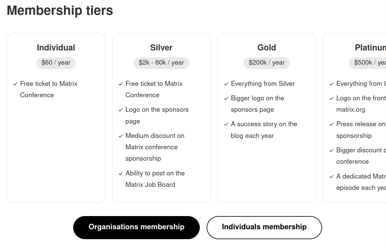
I currently only count 11 entities in their membership list, which makes me think that they have not managed to find new ones yet. I have to admit I'm quite tempted to make LibreNews join with a Silver membership, but this channel also has a negative cash flow right now, so maybe that's not such a great idea.
However, the Foundation is also asking for individual donations to support the project. These are either Donorbox, Patreon, or LiberaPay donations, and we can publicly see how many they received.
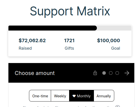
On Donorbox, they have a $100k goal and have received 72% of it, though it's not clear in what period they achieved this.
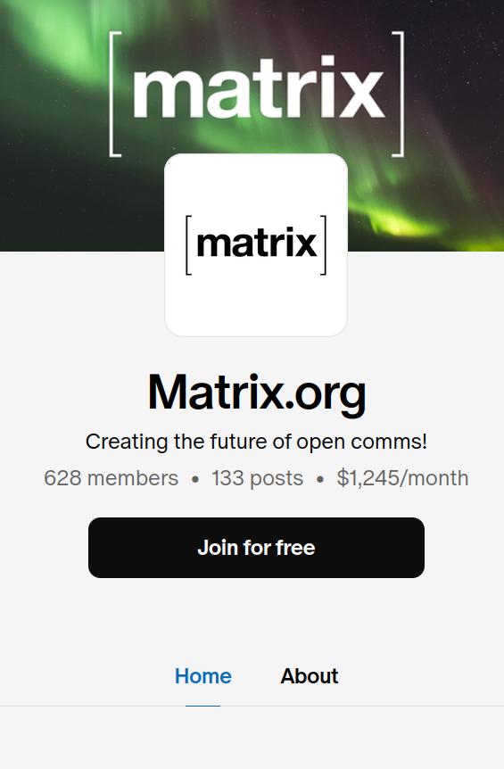
Between Patreon and LiberaPay combined they receive a total of $26k yearly, something I would classify as "not much, honestly".
What's next for Matrix if they do manage to raise the funds that they need? Well, they want to resume the longer-term project that they've shut down over time, but the first area to see increased funding will be the Trust and Safety team. That's the current biggest expense, but they are still under-resourced: they are under a lot of pressure to deliver protocol improvements, better tooling for server admins, and more.

In the hope that I've now convinced you to help them out if you can, I'll now switch my focus to the situation around FreeDesktop. First, some context.
Freedesktop is not a company or an organization, but rather it's a project that aims to define various standards that should be respected between desktop environments and such.
It's been around since 24 years ago, which - by the way - is more than what I've been around, and it was founded by Pennington, a GNOME developer working for RedHat.
They now provide hosting for a variety of cross-desktop projects: from Wayland to Mesa 3D, Poppler, the X.Org server, …
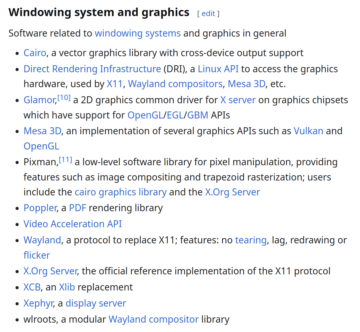
…, D-Bus, libinput, PulseAudio, PipeWire, systemd, and many more.
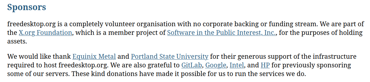
Freedesktop does accept donations and sponsors, though the project has "no corporate backing or funding stream". To do so, they are part of the X.Org Foundation, but they're driven forward by volunteers only.
However, they recently had some significant issues concerning hosting. Their GitLab "burns through around 50TB of bandwidth per month", and though it was previously running on Google Cloud free credits, they ran out of them in 2020 and sought some other sponsor.

They found one: Equinix. They are "the largest global data center and colocation provider for enterprise network and cloud computing".

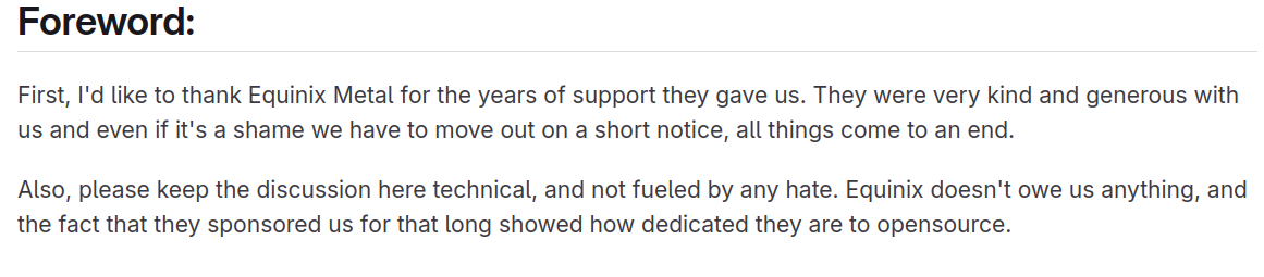
They hosted freedesktop.org's GitLab completely for free since 2020, but now they have decided to shut down the Equinix Metal team, which was hosting freedesktop. They have done so on somewhat short notice, meaning that freedesktop is now pressed to find a new home, and quickly so.
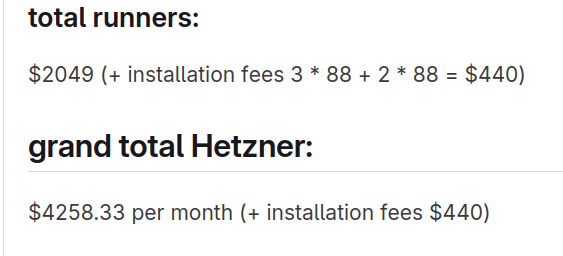
How much money are we talking about here? Well, the expenses on Equinix are $288k a year, but less expensive servers could probably bring that down to around $120k-180k.
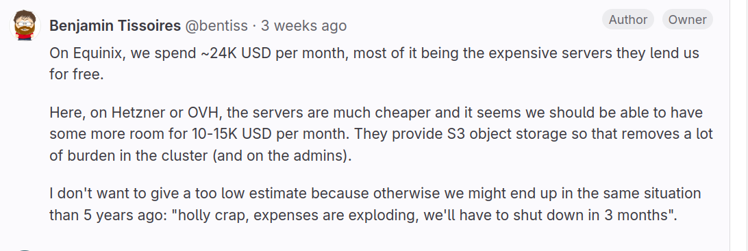
Some further math brought that potentially down to $48k a year using Hetzner, even assuming no sponsorship from them.
After much discussion, Daniel Store announced that, and I quote,
We've made what we think is a good decision on hosting and network. We're just in the final stages of getting this fully arranged now, and are looking forward to announcing it - with a more concrete timeline - in hopefully the next couple of weeks.
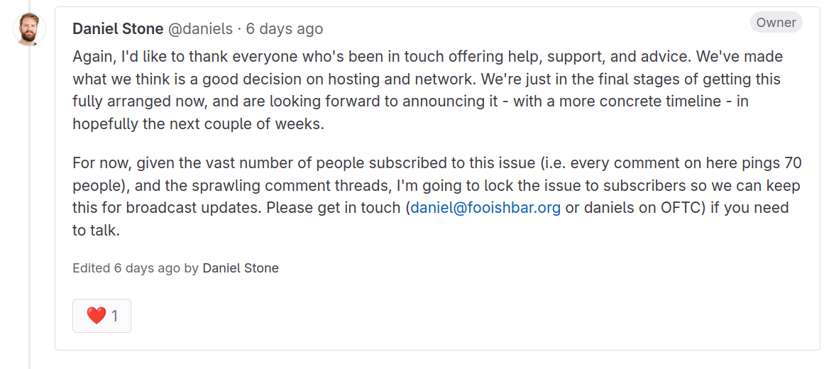
Now, both the tentative date they want to transition by and what they have chosen as the host are publicly available on their GitLab. However, the issue specifically asks to "not advertise this a lot", so I think I'll just shut up and let you search for this information if you really really want it.
Now, I briefly mentioned earlier that this channel has a negative cash flow, but there are a few more words that are relevant to this story.
When building the LibreNews website, where you can find this video in article format, I needed some help, and blahaj.land reached out. They are not only hosting the website but also helped me build it. So, I think they deserve some of my money and a shoutout, so let me tell you what they do.

They offer all-in-one free services, from Nextcloud, to Git forge, to Matrix chat, secure file sharing, a well-federated fediverse instance, and much more.
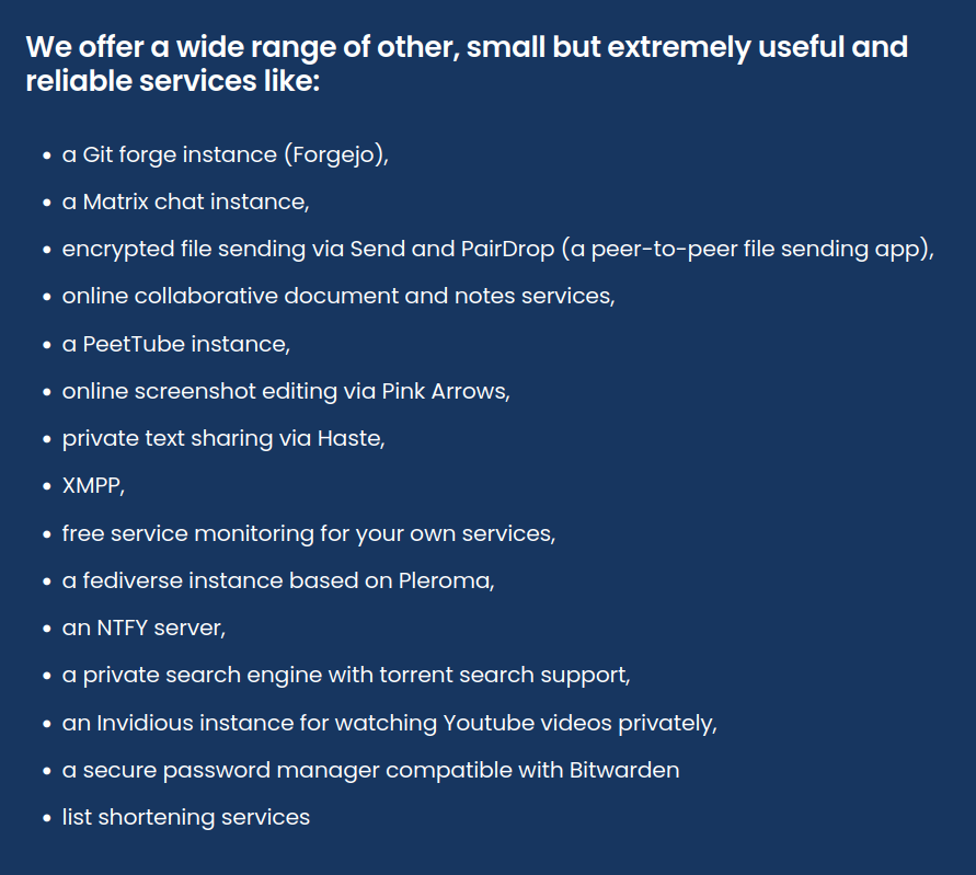
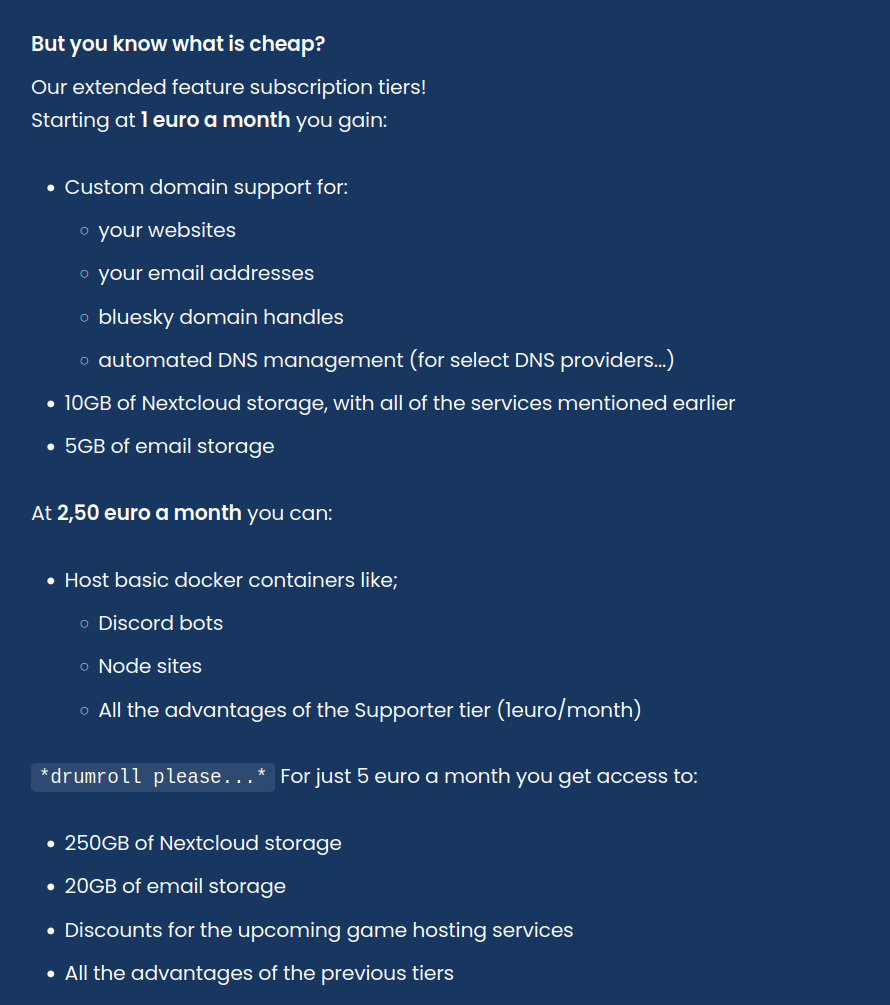
They support multiple upload methods (like SFTP, private dashboard, Git integrations) so that hosting is as simple as possible regardless of the website you're running; and, their premium features are priced at just 1 euro a month (which includes custom domains, extra storage, and automated DNS management).
They are currently looking for contributors, so if you are a tech enthusiast you can go ahead and give them a hand build all of this – this isn't some random company, it's a community of very passion-driven individuals, I can safely attest that.

And, finally, they've just opened registration, so you can go ahead and create an account, all links in video description. They've helped me a lot to make the website, so they definitely deserve some love. Go give it to them.

Anyhow, freedesktop is in a bit of a better situation compared to the Matrix Foundation. However, do let me say a few words: I don't think it was by chance that we had two major open-source projects threaten to shut down unless given more resources, all in the same month.
I believe that this should probably prompt us to reflect on the bigger fundraising situation within the FOSS world. The open-source projects that are thriving seem to be those that are made to be for-profit, such as Nextcloud, and only few non-profits manage to raise enough to foster operations.
In the past few weeks, here at LibreNews, we've both covered individual project funding through donation campaigns, bringing KDE and Kdenlive as examples, and the idea of allowing payment to buy FOSS applications on Flathub. This article is another piece in the puzzle of the relationship between open-source and, well, capitalism.
 Luca Bramè
 Niccolò Venerandi
The Future of KDE Styling and Design
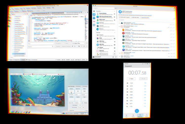
I hadn't talked about this yet, but there has been work going on behind the scenes to completely revamp the KDE theming system.
In this article I will cover how this new amazing setup works, and it does already work(-ish), plus what the future of KDE styles and themes could look like; but first, this will mean nothing to you if I don't tell you why is this even necessary, what's wrong with our current setup.
Our current setup is sort of a mess.
The Issue
Firstly, we have Plasma Styles. These only apply to Plasma, your shell, and everything else completely ignores it.
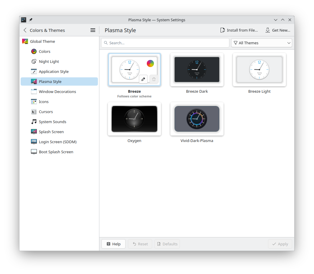
They are implemented via SVG files, which have benefits and drawbacks. Mostly drawbacks. Sure, they might be very easy to make, lots of people know how to use SVG, but they are very hard to maintain, they not very fast - because you have to render out entire images - and there's no easy way to expose configuration options.
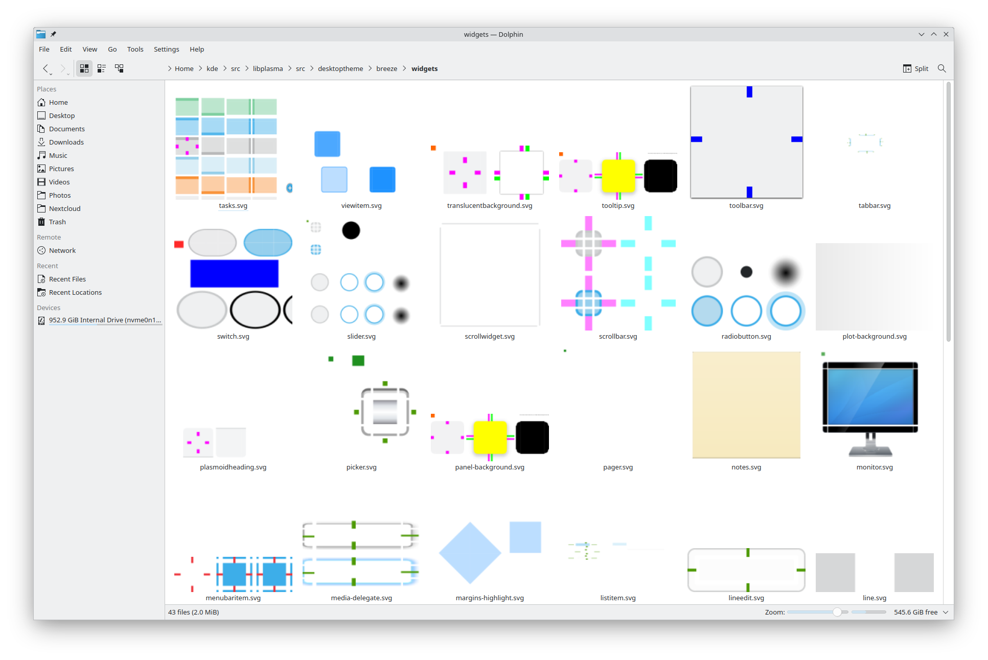
Which is why you will see the SVGs to be full of these little colorful blocks that are not actually displayed anywhere, but the parser checks whether they exist or not to know whether to turn on and off a certain flag. It's a bit hacky and overall I don't like it.
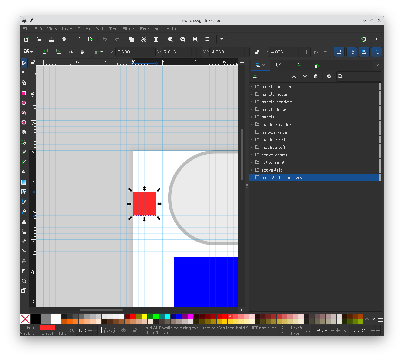
Fair enough. But this is purely for Plasma. What about other themes?
Well, next up we have Application Styles. They are directly used by all QtWidget applications, which is the type of UI toolkit used by apps such as Dolphin and Gwenview. As you can see in the screenshot, there's no download button.
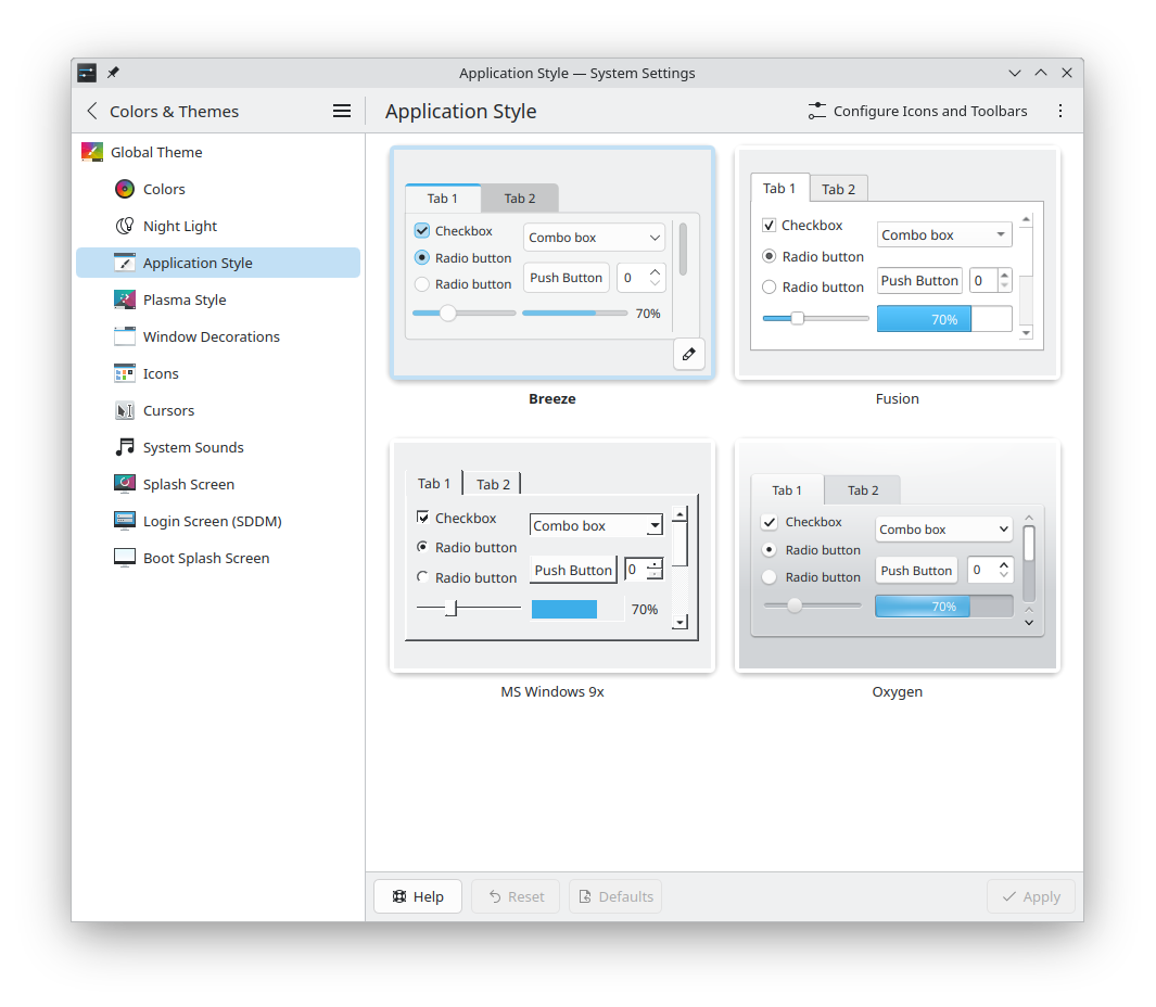
That's because Application Styles are written in C++ and have to be compiled to be used. The only way to get them is either by, well, compiling them yourself, or if they're shipped in your preferred package manager. On top of that, they're extremely, extremely difficult to make. There are a few third party projects out there who try to branch off Breeze, but starting from scratch is not something you can just do.
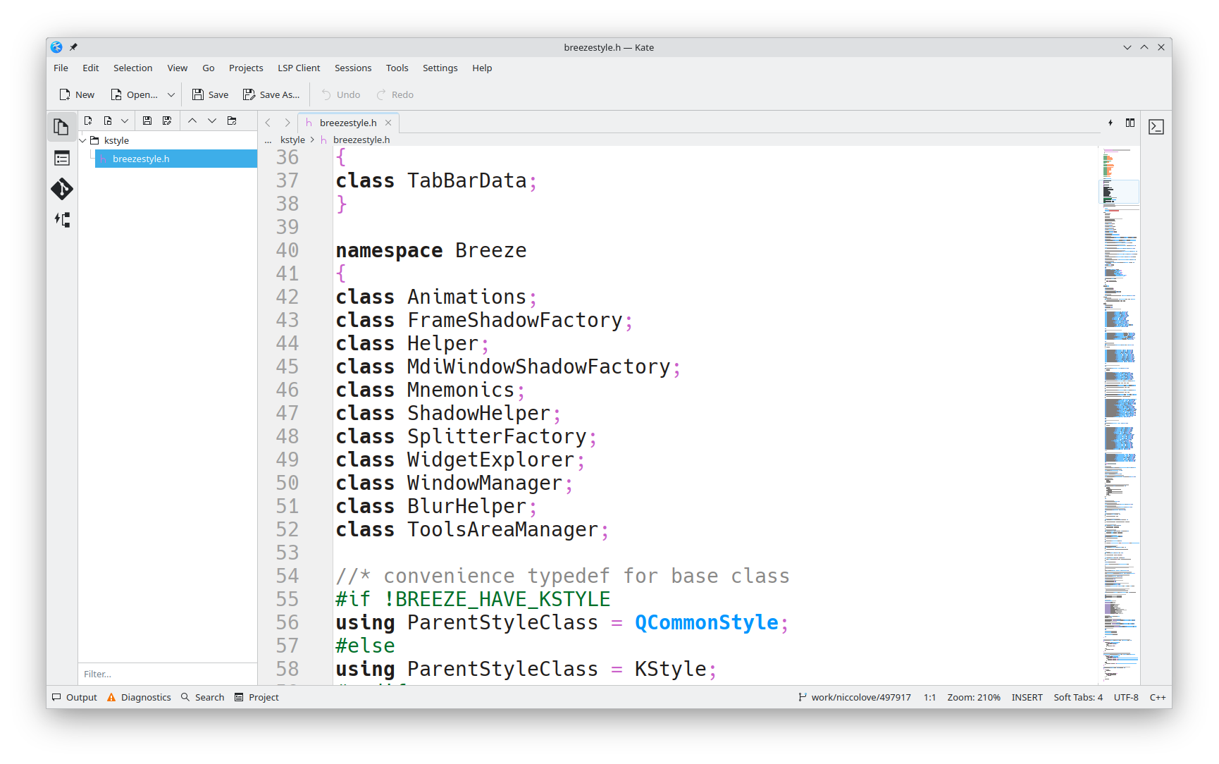
Which is why a lot of unixporn users use something called Kvantum.
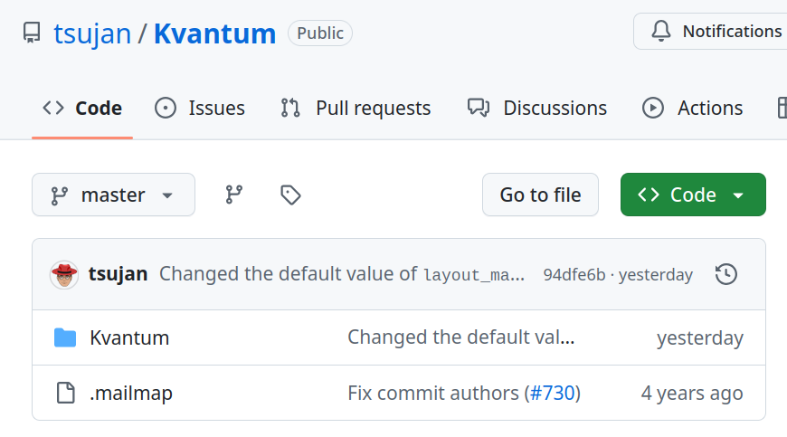
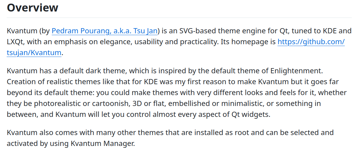
Kvantum is an Application Style which - to put it very simply - converts a SVG file to a style. Basically, it draws an SVG on the screen. You're again missing out on performance by choosing this, but it does make it much, much easier to create custom Application styles.
But then we have QtQuick Control styles. Many KDE applications, like Discover, are not written in QtWidgets, but in QML, a markup language that has its own style. (Of course it has).
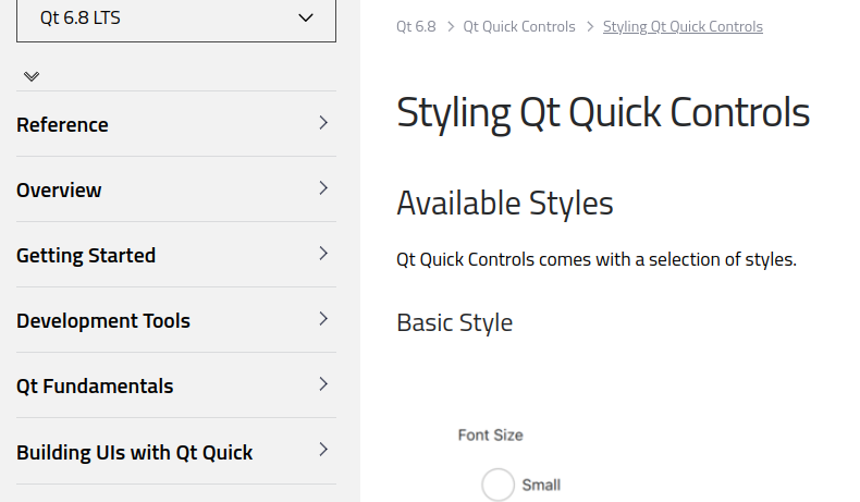
To repeat: Application Styles, which are actually called QStyles, apply on QWidget applications; whereas QtQuick Control styles apply to QML applications.
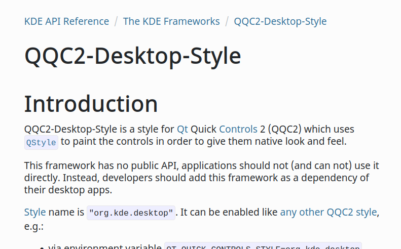
Well, in order to simplify this whole thing, KDE developed a QtQuick Control style called "Desktop", which uses - bear with me - the QStyle to draw the QtQuick Control style; basically, it uses the same stile that QWidget applications use, but it applies it to QML applications.
This way, if you select "MS Windows 9x" as your Application Style, all of your KDE applications will use it, regardless of whether they are QtQuick or QWidget ones.
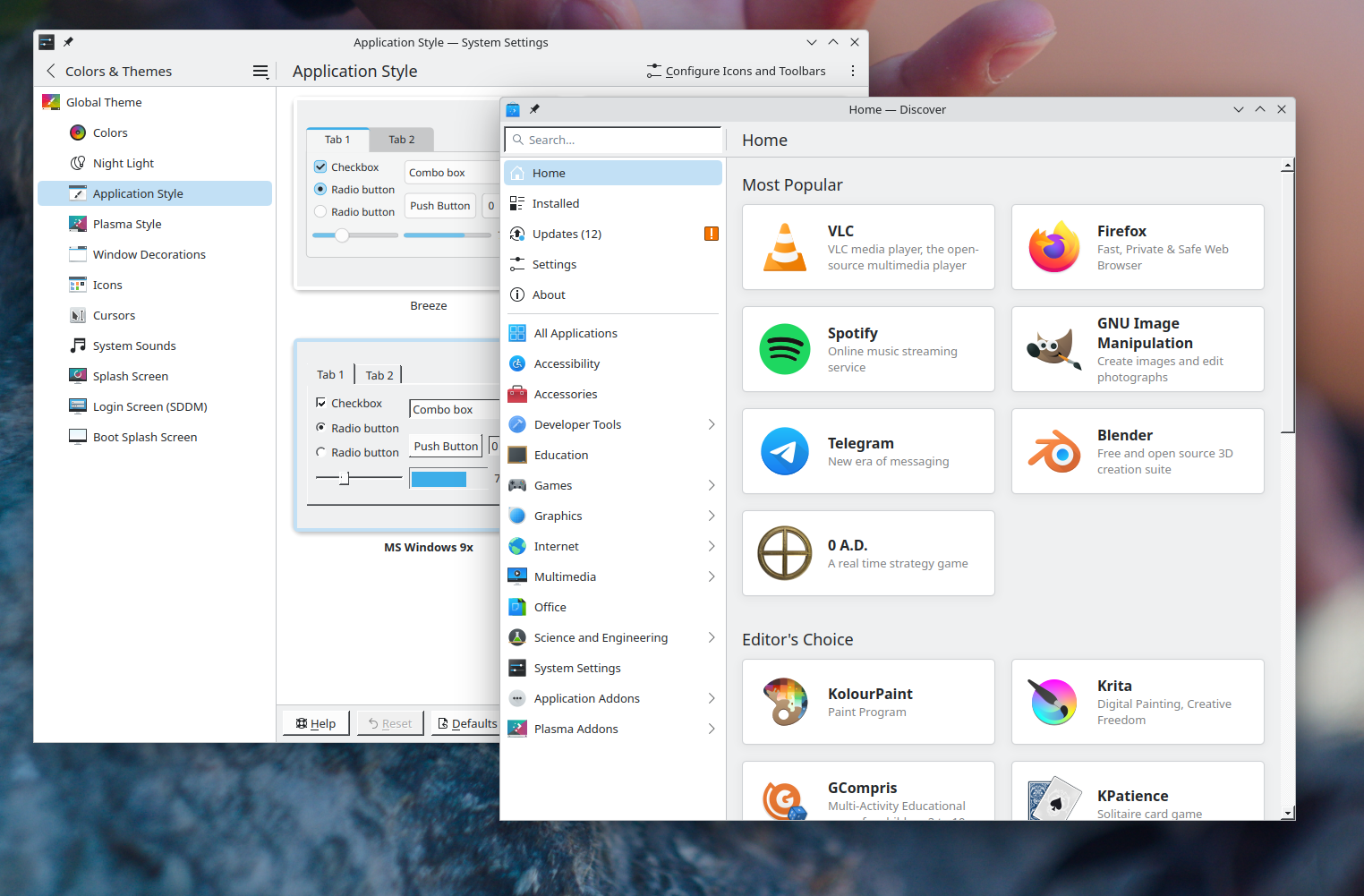
But this is also hack-ish. It does not work very well; a lot of the UI of QML applications still does not really follow the QtQuick style at all. This is especially noticeable if you use Kvantum; you will really notice how QML apps stick out in a bad way.
But there's worse (yes, there is). If you decide to switch to Plasma Mobile, you'll find out that mobile applications do not follow the QStyle, but they have their own QtQuick style, written by scratch, and ends up being inconsistent with the other themes.
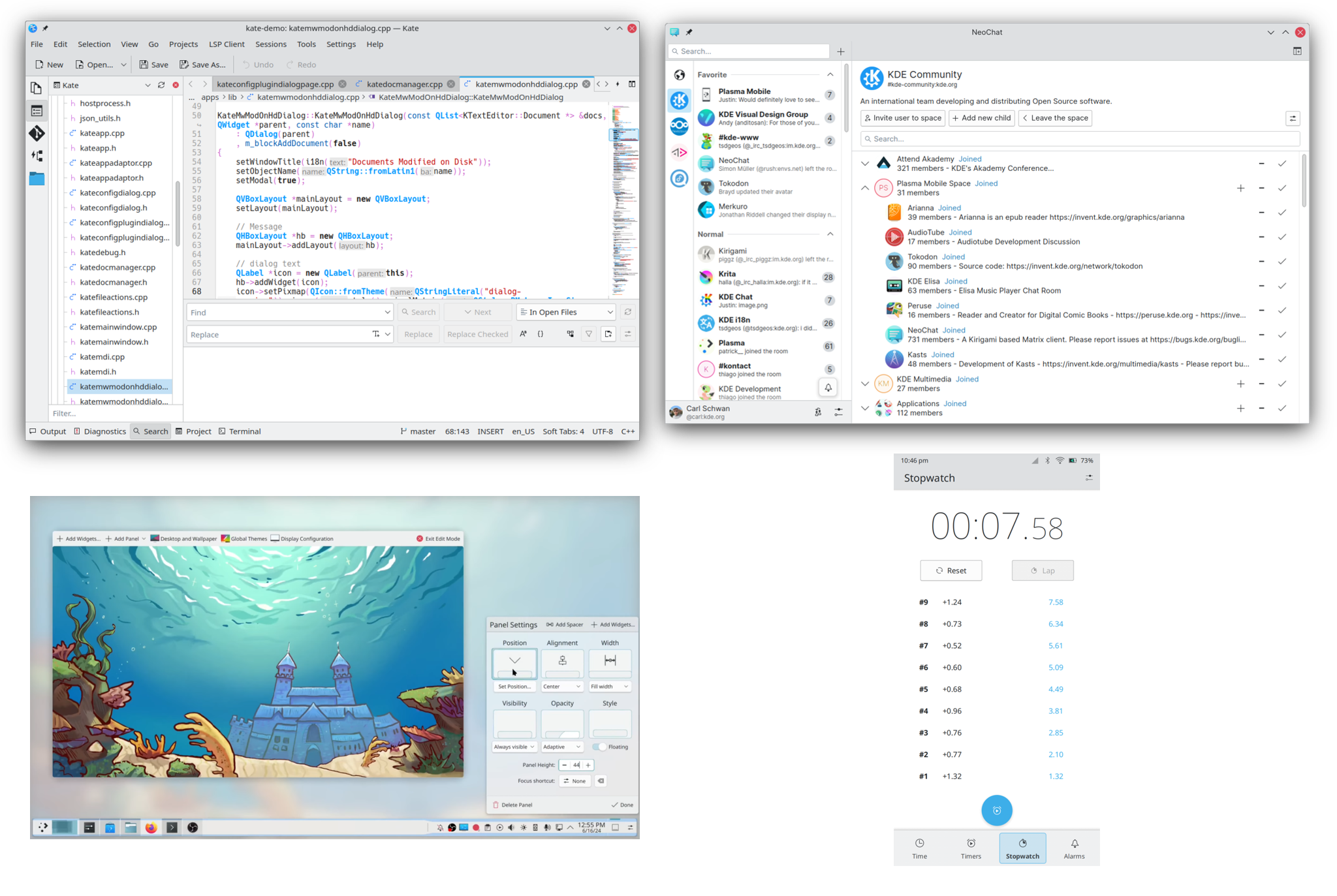
Why did we do this? Well - hear me out - the QStyle is software rendered, whereas QtQuick supports hardware acceleration, meaning the former won't be as performant on a mobile phone.
So, this is the situation. We have three different type of styles (Plasma, QtWidgets, QtQuick), the third of which is inherited by the second one, and the first two are made in completely different ways, and they don't talk to each other…
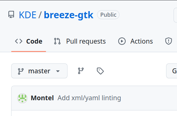
But wait, there's worse. There's actually a fifth implementation of the Breeze style, and that's the Breeze theme for GTK. This last one is a GTK theme which tries to resemble Breeze as much as possible, and it's sort of going unmaintained.
So, if anybody wanted to create a new KDE theme, it would probably take a good year of development to write it from scratch. Which is not ideal.
It's also an issue for us KDE developers. It means implementing new style changes multiple times over, and if we want to change something in the Application Style then we need to wait years - yes, years - until someone with a deep knowledge of how they work has some time to work on that.
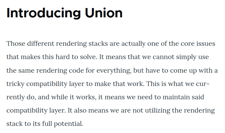
Union
Luckily, Arjen has the solution, and it's called Union.
The core idea is to have an abstraction over the types of style inputs and outputs. I could give Union a SVG theme, or maybe a CSS theme, or maybe a QML theme, or more; all of those input types would then be converted to the same abstract theme type. Union will then implement various theme outputs, such as QtWidgets and QtQuick, which would just read that abstract theme to know what to draw.
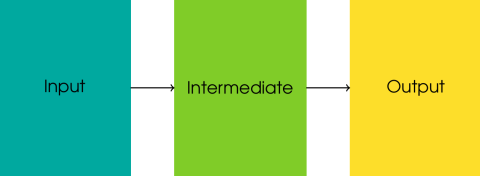
So, potentially you could write QtQuick theme using SVG, or a QtWidget one using CSS, or any other combination that you'd like. Any input can be converted to any output.
Of course, you wouldn't have the full range of SVG options, or CSS options; it would still be a subset of the functionalities of those markup languages, the subset that we can actually translate to the middle abstract layer.
So how do we do this?
And by "we", right now I mean Arjen, but it's soon going to be a more collaborative thing.
He decided to start off with just one input and just one output, understandably. He chose for SVG files to be used as inputs - since we have a lot of Plasma Themes already - and QtQuick to be used as outputs - since it's used by Plasma and many KDE applications.
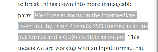
Union currently does not implement the full QtQuick Style, but it does style most of the basic controls, which allows application to run using it already.
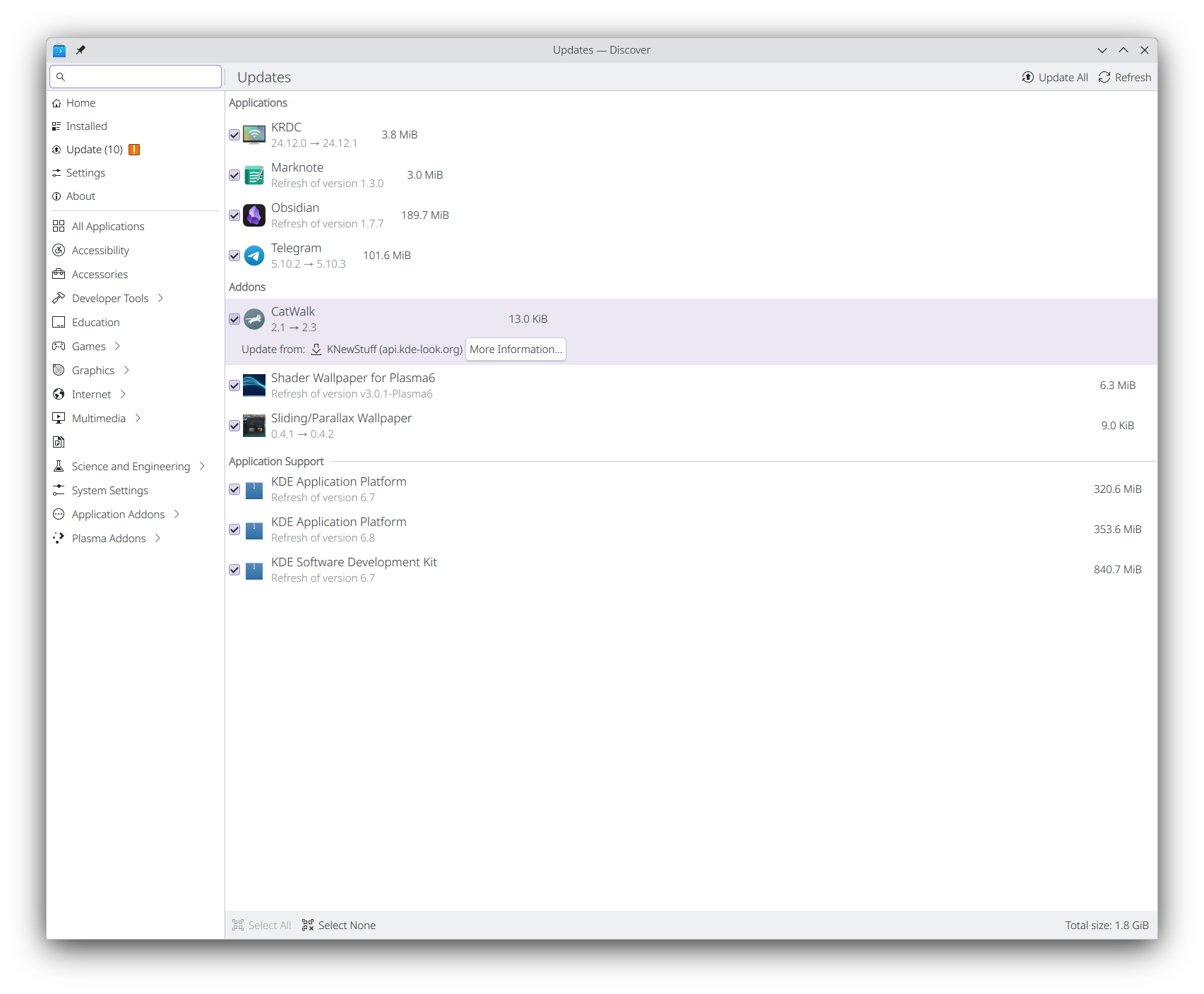
And here we have it. This is Discover styled using the current state of Union. It does not look exciting, but do remember that it uses a completely new theme engine to display … all of this. It is exciting.
The intermediate layer is made of a bunch of "Style Rules", which are created by the input layer (currently, only SVG). They're "which properties do apply to this element", they have a selector which determines the elements that the style rule is applied to. This is quite similar to CSS: you could have a style rule that says "my text should be red", and a selector that says "any focused button".
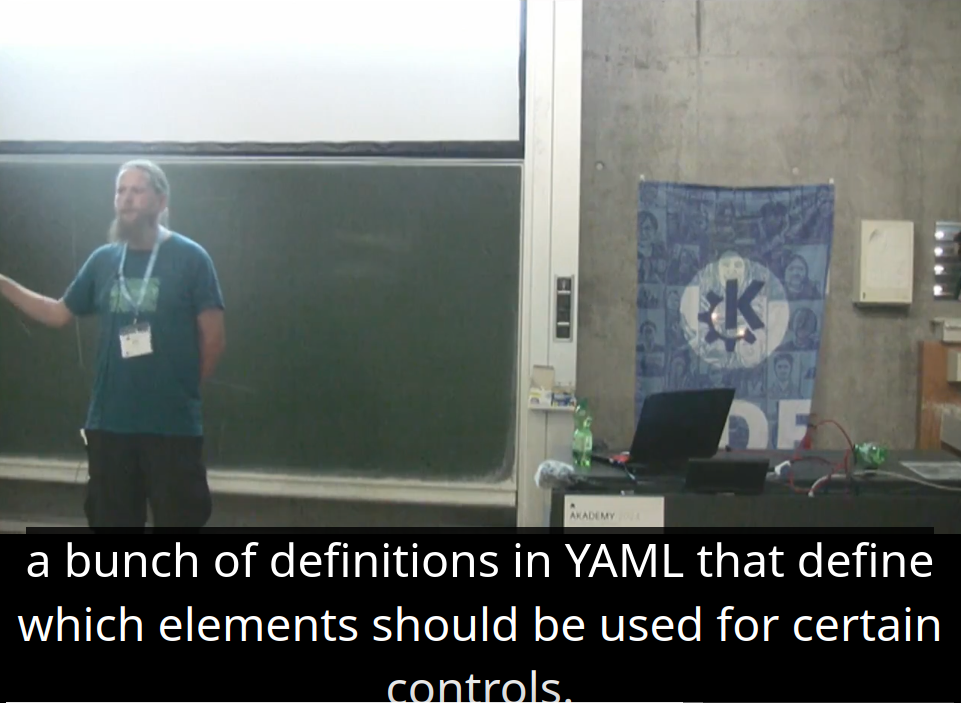
Oh and – as a Plasma developer, this would also solve my issue of the annoying SVG hint items, since the SVG input layer also accepts a YAML file that actually defines which element is used for which control and, most likely, we can also define things like flags and margins using that same file.
So, what's next?
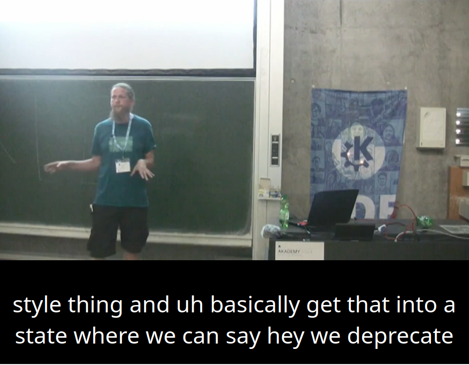
The current goal, according to Arjen, is to finish up the SVG-to-QtQuick workflow so that we can actually start using Union just for Plasmashell, deprecating the current Plasma Theme implementation; to the user, this should mean that nothing changes at all, but we would start getting real-word usage of Union.
Once we do have real world usage of Union, work could start to implement a QStyle that uses it, which - due to QStyle complexity - is going to be a tough task to handle.
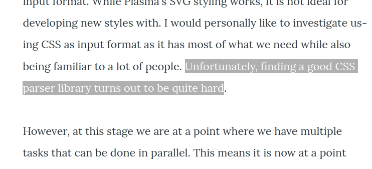
And then, one day it would be nice to have a CSS input, but there's a significant issue; to quote Arjen, "there's no good CSS parser on the internet". What we need here is one that is available as a C++ library and that returns a parsed tree of what's in the CSS file.
If this works, more outputs could slowly roll out; the GTK Breeze theme, which is currently a bunch of manually written CSS, could become just another Union output that we could use.
Even better, this would make it much easier for KDE designer to improve and maybe create new themes; which brings me to another major topic, which is an initiative - driven forward by Anditosan - called Plasma Next.
Plasma Next
Firstly, credit where it's due, you should all go watch Andy's youtube channel, which has frequent updates on his work to improve the KDE Design System. A lot of information on this section was taken from him, and links are in the video description, so go give him some love.
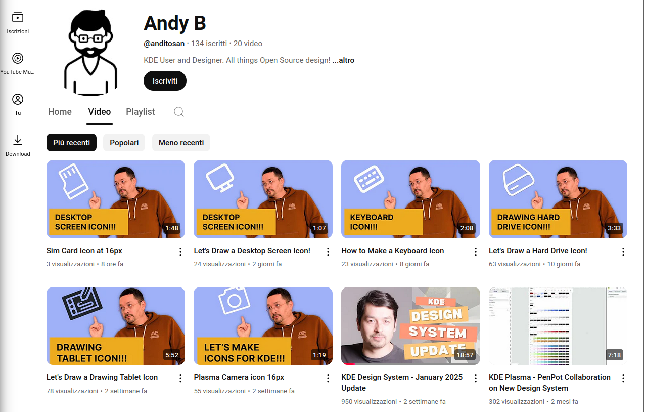
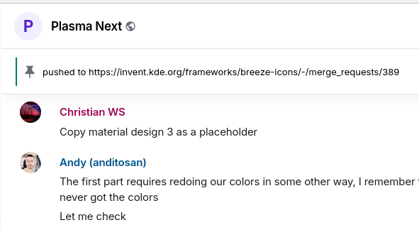
Andy is trying to completely revamp the KDE Design System, which does not necessarily mean a complete redesign of Breeze, but rather a new way to handle its design. He has formed a team and the name of this effort is Plasma Next.
Firstly, there's the question on what to use to do KDE design. So far, we've never had an agreed-upon preferred platform; some of us were doing mockups in Inkscape, but the real designers were just using Figma, which has its own issues… like being proprietary.
The free and open source alternative to Figma is called Penpot. We, the KDE Visual Design team, did watch this new tool be announced and grow, and we were sort-of waiting for it to be good enough for us to use. Penpot very kindly reached out to us, and asked what they could do to help us switch to them.
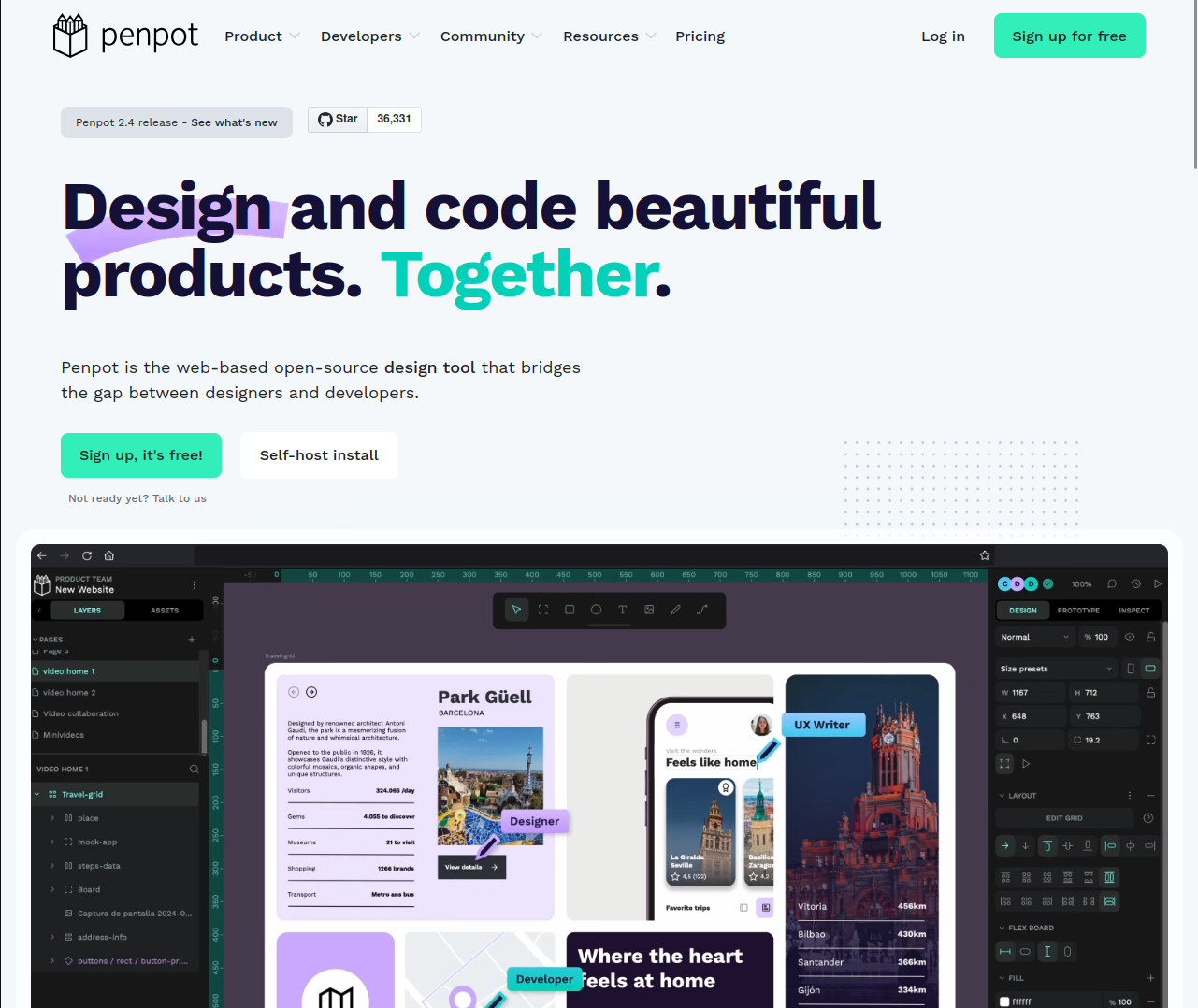
The design system should have icons, colors, typography, and re-usable assets of the common KDE components, all with the same consistent Breeze branding on them. Currently, Penpot does not support all of the features required for those elements (apparently, icons were already a bit of an issue), but the team has acknowledged that, and they are trying to work to improve those aspects.
Even better, according to Andy, Penpot has provided the Plasma Next team with free training on how to use the tool, and they've joined the Next chat to help out where they can, which is amazing; we really have to thank them for their effort here.
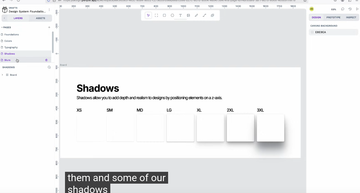
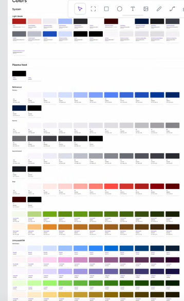
So far, the team has managed to port colors, shadows, typography, and blurs.
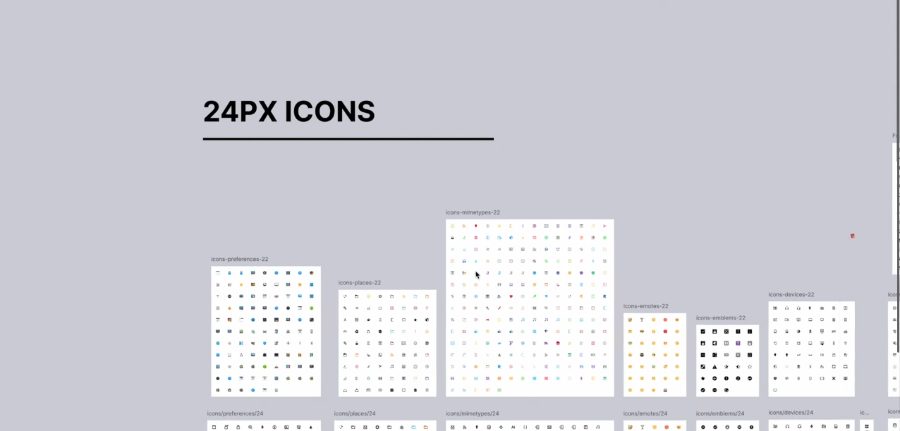
Until then, there's a lot of work undergoing to revamp KDE icons over Figma. There's a whole new set of 24px set, new weather icons, and more. There's now work to revamp the 16px icons as well to match the new 24px ones too.
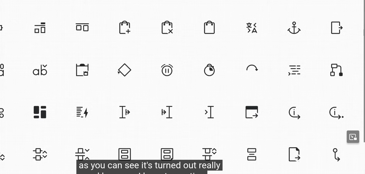
You can see that they're turning out really pretty, with nice rounded borders and a Breeze feel. Of course, since these are drawn at 16px, they won't look this good on an actual screen, but still. Pretty good.
And, as I mentioned above, in the past months a consistent set of Plasma colors was created, along with some standard shadows and blurs to use on any element. Apparently there's some sort of token mechanism to categorize the various colors, but really you should just read Andy's blogpost about it if you want to get technical.
Of course, this is not something that has an immediate payoff, and the same applies to Union. But it's great to see that we, as KDE, but not me specifically, other people, are able to address those long-term tasks that will make the project best-in-class over its design department.
GNOME 48: All About Digital Wellbeing!
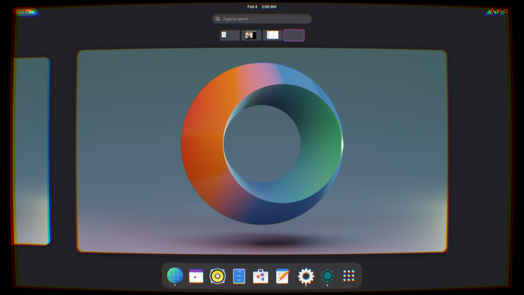
It's finally that time again! The UI and Feature freeze for GNOME 48 is in effect, the Beta images are being prepared, and we're just in time to check out what's new.
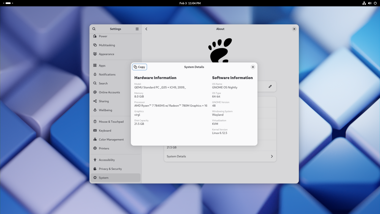
Subtle new features, invisible changes
Trying out GNOME 48 absolutely feels like your typical GNOME release, this time even more so than previous times: GNOME 47 finally brought us working fractional scaling, so it's pretty hard to compete with that. There are not many visual overhauls that stand out immediately but, as you use it, you will start to see and appreciate the subtle upgrades on offer. After you have used it for a while, you would never want to downgrade to the previous version - as small as they changes may be.
I like to think of GNOME upgrades as the bass line in a song: you're not going to be noticing it immediately while it's there, but you will instantly miss it when it's gone.
The Invisible Changes
Let's start with the stuff you won't directly see, but that goes to work on long-standing, important pain points.
On the compositor side of things now have support for the xdg-toplevel-drag-v1 Wayland protocol. This finally allows applications with multiple running windows, each with its own set of detachable tabs, to exchange tabs (or similar UI abstractions) easily, via drag and drop. Not everyone noticed, but this had been broken in Wayland for the longest time, but it should be a thing of the past now.
Work has also been done on frame synchronization, with support for the new Commit Timing Protocol and the FIFO protocol.
Finally, there is support for the Viewport protocol and some work on DRM leasing.
For what it's worth, support for the System Bell protocol has also been added, which means that any installed application - not just the terminal - will be able to use the system bell.
We are also seeing some promising efforts in improving the experience in GNOME Software. Loading updates is faster now, and the experience is better on Atomic distros with experimental support for systemd-sysupdate. That, and some improvements in the application pages: better support for review voting and more thorough reporting of permissions that applications truly get.
Speaking of Atomic or Immutable distros, GNOME now has support for systemd-sysext system extensions, which improves certain development workflows.
There are some improvements in color management, lower input latency for the cursor, and some performance improvements for hybrid GPU laptop setups where an external display is wired to the secondary GPU. Those setups used to suffer from very bad performance penalties, particularly in the form of stuttering and frame drops. A lot of work is being done upstream to improve the experience with NVidia drivers especially, so users with gaming laptops should begin to have some rest on GNOME 48. It's still not completely fixed, but it's better than it used to be.
Finally, the Orca screen reader is now more resilient and responsive when an application emits a large number of events, a use case that used to degrade performance on it.
In short, there's support for more protocols, a decent performance uplift, and better support for the Immutable distro experience, which is slowly going from niche to mainstream, partially thanks to the uBlue project and its high-quality purpose-built images, like Bazzite, Aurora and Bluefin. Users seem to love those - and that includes users who have never used Linux in the past. GNOME has embraced this advancement with open arms, and results are beginning to show.
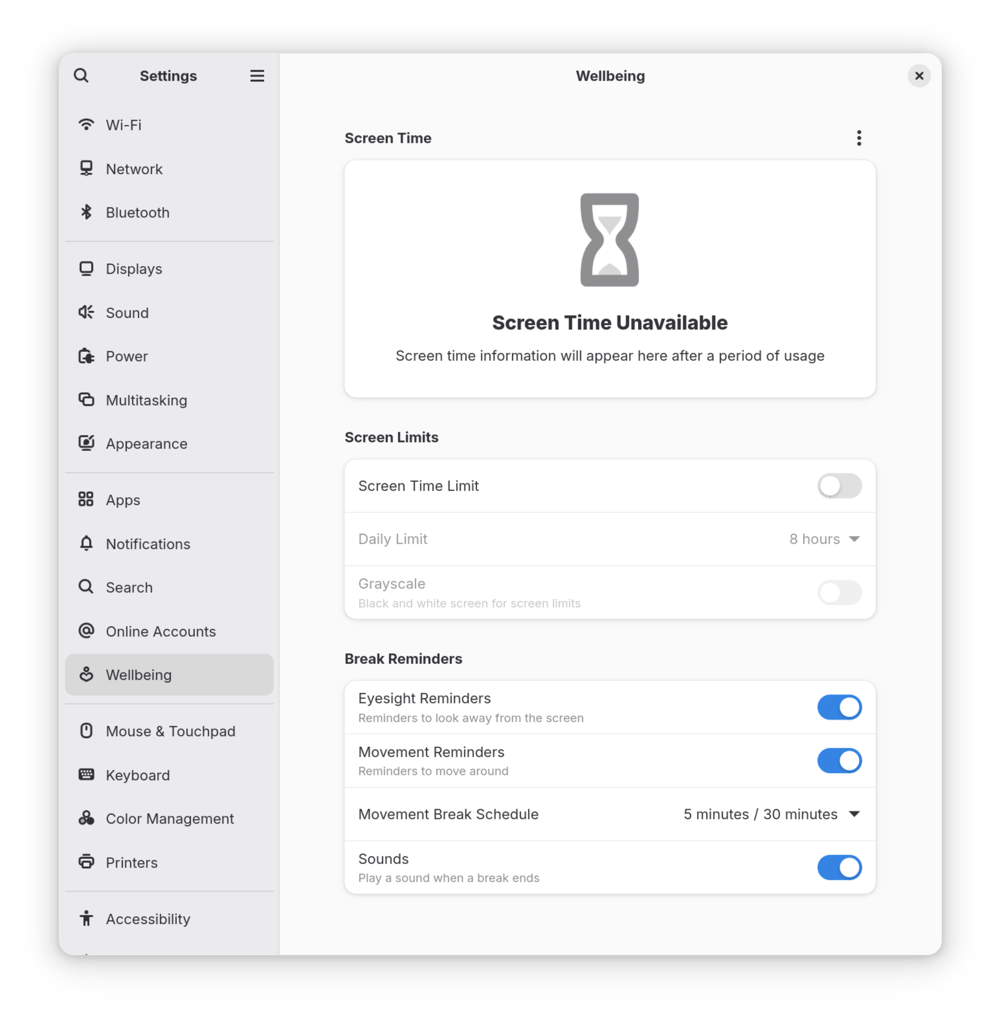
Wellbeing: don't let your computer affect your health
The biggest, most visible change in GNOME 48 is the inclusion of a full-fledged Digital Wellbeing functionality.
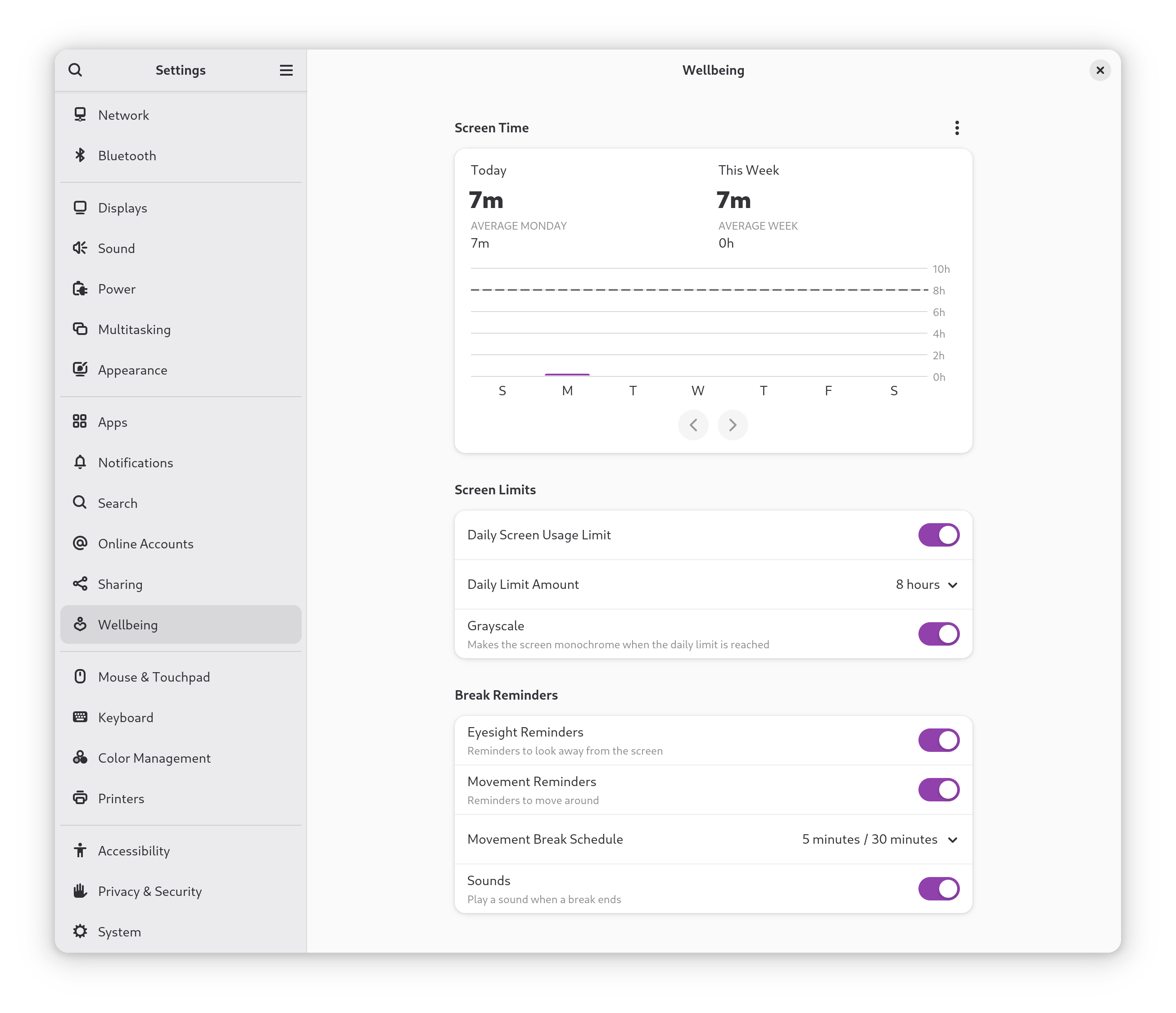
Digital health is one of the most discussed topics currently. As we are starting to realize there is a correlation between excessive screen times and adverse effects on our health - both mental and physical, more and more user-facing projects and operating systems are beginning to come up with practical ways to help us visualize just how much time we are spending on our screens and helping us set healthier boundaries. GNOME 48 brings its take on such a feature - and it's a joy to use. You can find it right in Settings - much like Android's Digital Wellbeing functionality, that this implementation seems to be pretty similar to.
A few basic configurations are enabled by default, but you can enable them all to gain the full benefits of this system. If you're not a fan, don't worry - all of this is completely optional.
Screen time control
By default, in fact, GNOME 48 will start tracking how much time you spend with your screen on. The first thing you see in Wellbeing is a graph, telling you very visually how much time you have spent on your screen today, comparing it to the rest of the week, as well as giving you insights on how that compares to a long-term average. If you care about your privacy, as you should, fear not: all of this tracking is fully local and it never gets sent over the network, there is not even an option to back it up. Of course, if you don't like it, you can still disable it pretty easily, which will also disable part of the Wellbeing functionality in general.
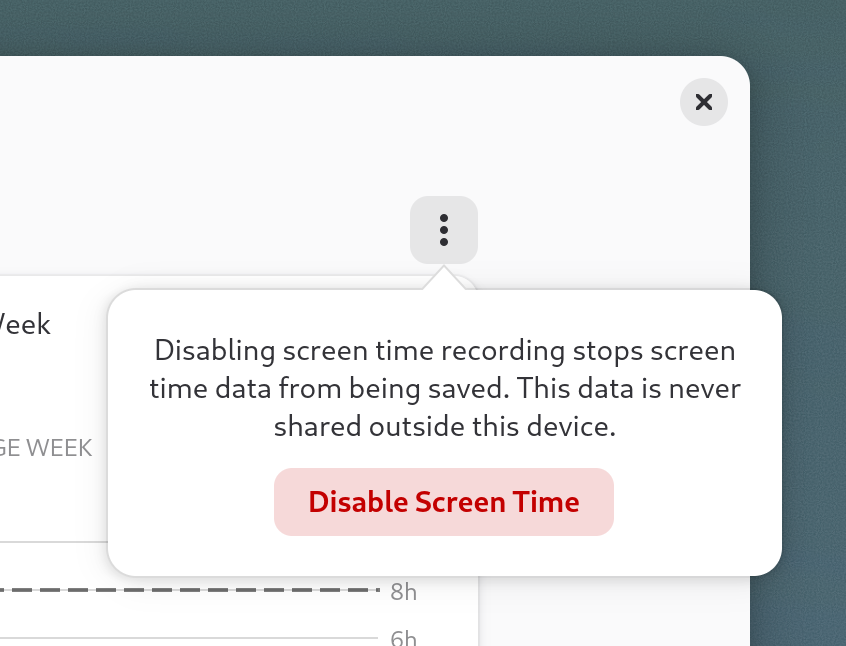
It doesn't end there, though. You can then go on to set a daily screen time limit - which will be 8 hours, by default - to get a reminder of when you have reached it, graph it as a horizontal line on the screen time graph, and optionally make it so your display will become monochrome upon reaching that, which is completely optional, but it is the most aggressive option available.
This is not too uncommon a sight. Digital Wellbeing, Android's implementation of the same feature, has also offered this option for years. The rationale is that it is believed that turning off the color in one's screen makes content consumption less desirable, making social media instantly less interesting, and removing a big part of one of the most popular techniques social media websites use to keep your attention and keep you hooked: a careful color choice. No, really. It has been known for a long time that color absolutely plays a role in marketing and influencing your decisions.
In particular, this is the reason why so many apps and websites use blue everywhere. For example, this option could help you maintain a more consistent sleep schedule if you tend to doom scroll on Reddit until it's far too late to get properly rested for the upcoming day or help you "switch off" after work when your work day is over. There is some data to show full-remote workers (and self-employed folks) in particular might benefit from this: in fact, according to the 2024 European Transparent IT Job Market Report, 37% of respondents who work remotely stated that unplugging after work is the biggest challenge associated with working from home.
Break reminders, work/break timers integration
Breaks are very important, both for your health and the quality of your work. It's easy to get so absorbed in your work to forget about it, however but for you that may be.
If you, like me, have been on the hunt for something a little bit simpler, more modern, and better integrated for workrave to manage your break reminders, there is now a great solution.
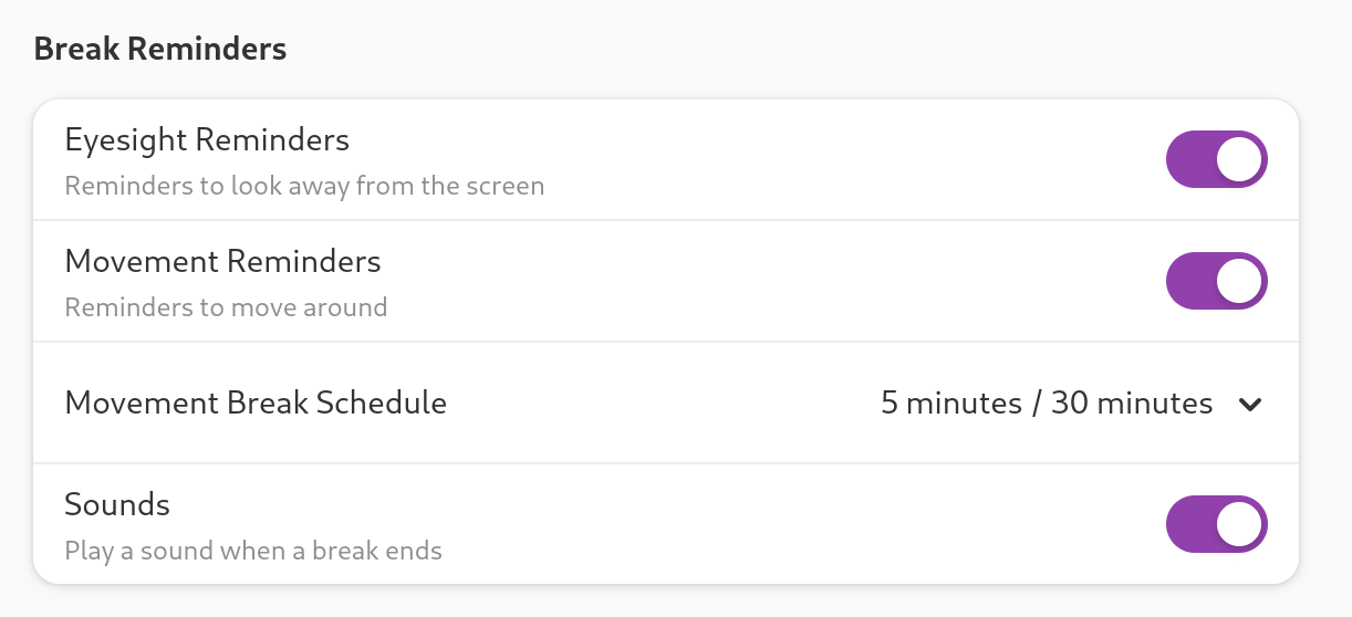
You can now choose to be reminded to take a break with a notification and a sound at every interval you choose, and even be notified when your break ends and it's time to get back to work. GNOME will also remind you to get moving and look away for the screen for a few minutes - two small gestures that have been scientifically proven to do wonders for your health if done consistently.
The Image Viewer just got a lot more useful!
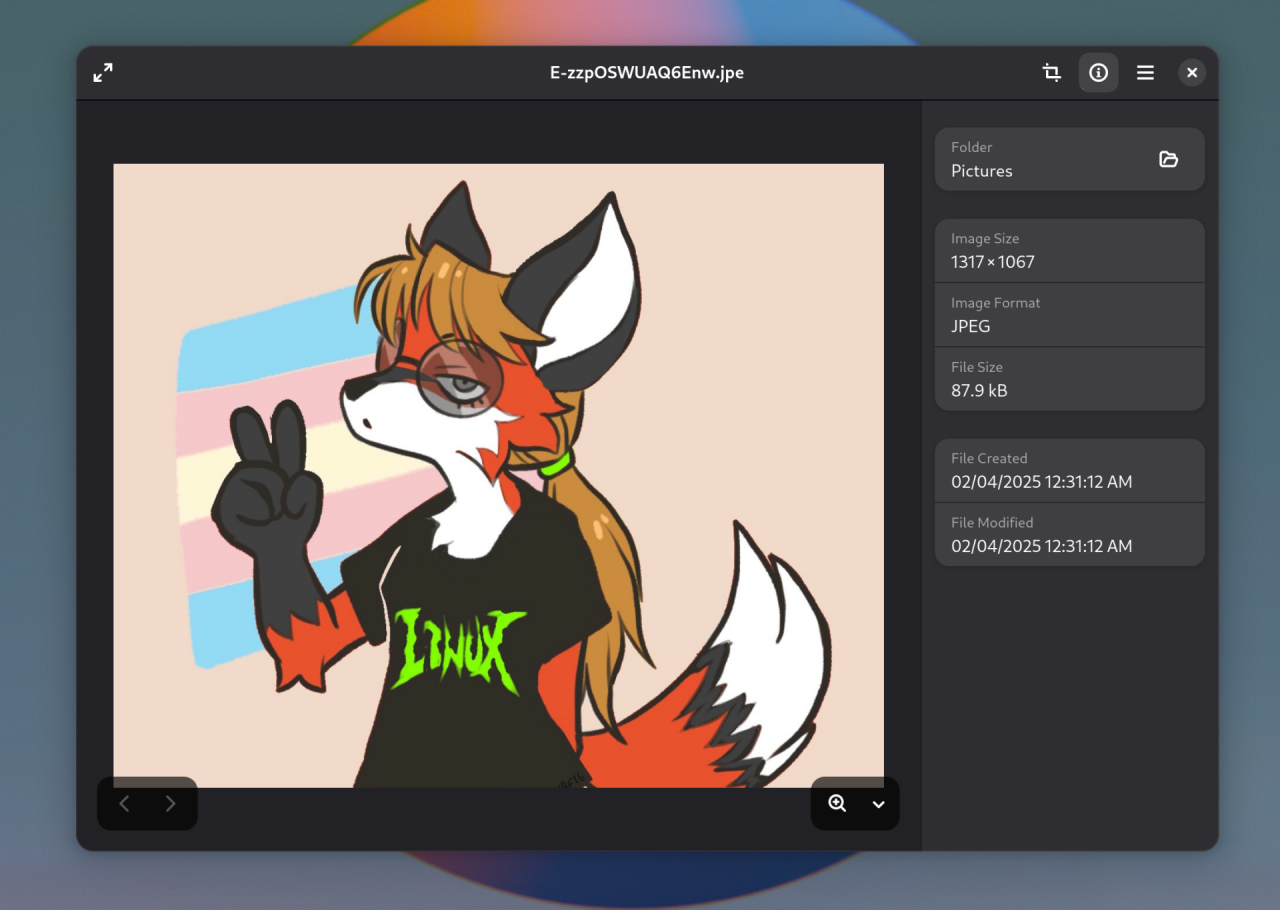

Another welcome change in GNOME 48 is that the image editor just got a lot more buffed.
While - in GNOME fashion - the default image editor is still not the tool for making complex edits to a picture, we now finally have the option to crop, resize, rotate, and flip a picture right from the editor! It's also pretty well-implemented, too.
The UX is as clean as you'd expect, and there is support for cropping horizontally or vertically from one of the most popular standard aspect ratios. This can be very useful, for example, when you are trying to make a desktop background from a high-res image that is larger than your screen resolution, but that just won't get aligned how you want it to because it is of a different aspect ratio.
Loupe can also display XMP metadata for JPEG images now, which is a small but welcome improvement, too.
(Art Credits: https://x.com/USBFIG/status/1435790274886787072/photo/1)
GNOME Maps supports public transport
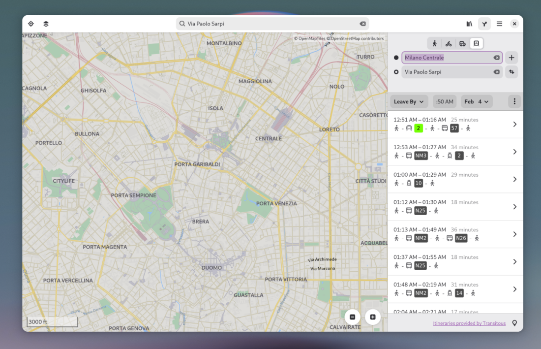
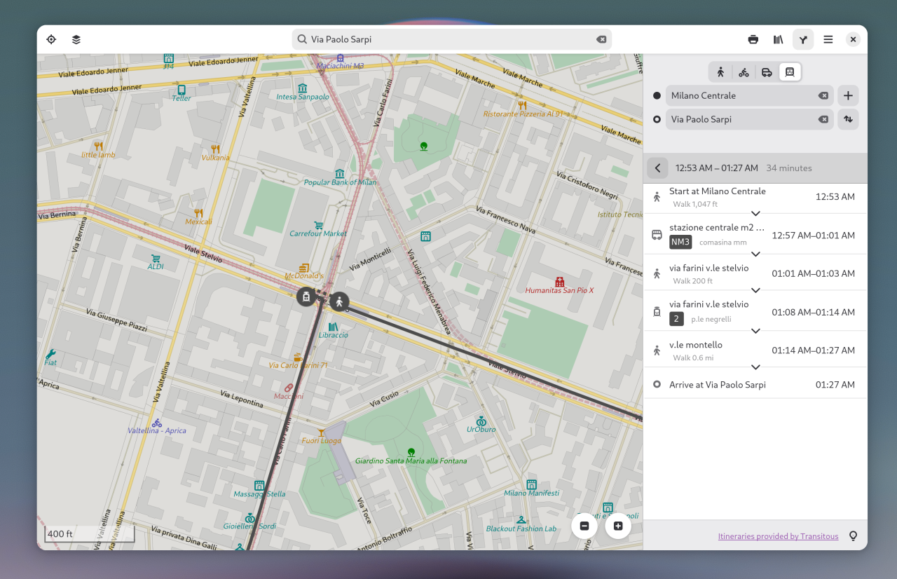
You know, the Maps app? It's probably you only opened it once to toy with it, maybe you even chucked it in a folder, away from sight, to leave the spot for some application you actually use. I don't blame you: for the longest time, whenever I needed to check something, I have always just used Google Maps. It's not perfect, it's proprietary software, and the map accuracy is not even close to being comparable to the OpenStreetMap backend GNOME Maps uses, but it gets the basics done well.
On GNOME 48, though, Maps has finally gained support for the Transitions API. You can now get directions from two different points and even look at possible public transport journeys to get there - with the ability to dig into as much detail as you want. Especially for being initial support, it looks pretty nice - and it also starts paving the way for the Linux Smartphone experience, for which it's crucial to have something comparable to Organic Maps available. GNOME Maps seems to be, slowly but surely, getting close.
An upcoming, major font overhaul!
While not completely finalized and present in the pre-release build that is being used at the time of writing, GNOME has been busy with fundamentally overhauling its font selection. The main reason for this decision was that Cantarell, the iconic GNOME font, has been unmaintained for a lot of time, making it inferior in features and text rendering to several more modern fonts. And yes, if you're wondering, this is a thing! Fonts are more complex than they seem. They are not regular images, but they contain code that needs to be executed to render them properly, and they may or may not support certain functionalities or manage some edge cases properly to improve font rendering.
The new font family is called Adwaita Fonts - and they look great.

Adwaita Sans, the main system interface font, is a slightly tweaked and improved version of Inter. This is a really solid choice: Inter has a solid and long track-record of being a stable in UI/UX design, offering high readability and low eye-strain, all while looking awesome. Cantarell is iconic and it will stay in our hearts for long, but seeing Adwaita Sans in action will leave you with no doubt this was the right call.
Adwaita Mono is what replaced Source Code Pro. It's a tweaked version of Iosevka, slightly modified to match Adwaita Sans. Once again, it relies on a solid foundation, being based on one of the best and most loved programming fonts on the street.
While these fonts may not be enabled by default right away, you can go ahead and test them out right away.
Battery charge limit support
GNOME 48 is all about health. You know what else can - and should - be kept healthy with just a few small precautions? Your laptop's battery! Lithium-ion batteries, in fact, are proven to last longer when they are not charged all the way.
If you are fortunate enough to offer one of those laptops that have upstreamed support for letting you change the battery charge limit from Linux, you can now do that right from the Power options of the Settings app.
It is generally considered useful to set the max charge limit to a value between 60% and 80% when your laptop is spending a lot of time plugged in to promote battery longevity, but it's also handy to be able to lift that limit on the fly, for those times when you are going to need a little bit more juice and would benefit from a full 100% charge.
Sadly, there is no guarantee your machine will support this functionality. This relies on a specific interface being exposed to the kernel, and only laptops that are meant to run on Linux officially tend to support the small details, like all these optional interfaces being exposed and ready. Still - there is no harm in trying. If the option is missing on your machine, it is not currently available. But who knows? Perhaps support for your hardware will be added to the tree sometime down the line, so you'll just have to wait patiently.
Decibels is now the default audio player!
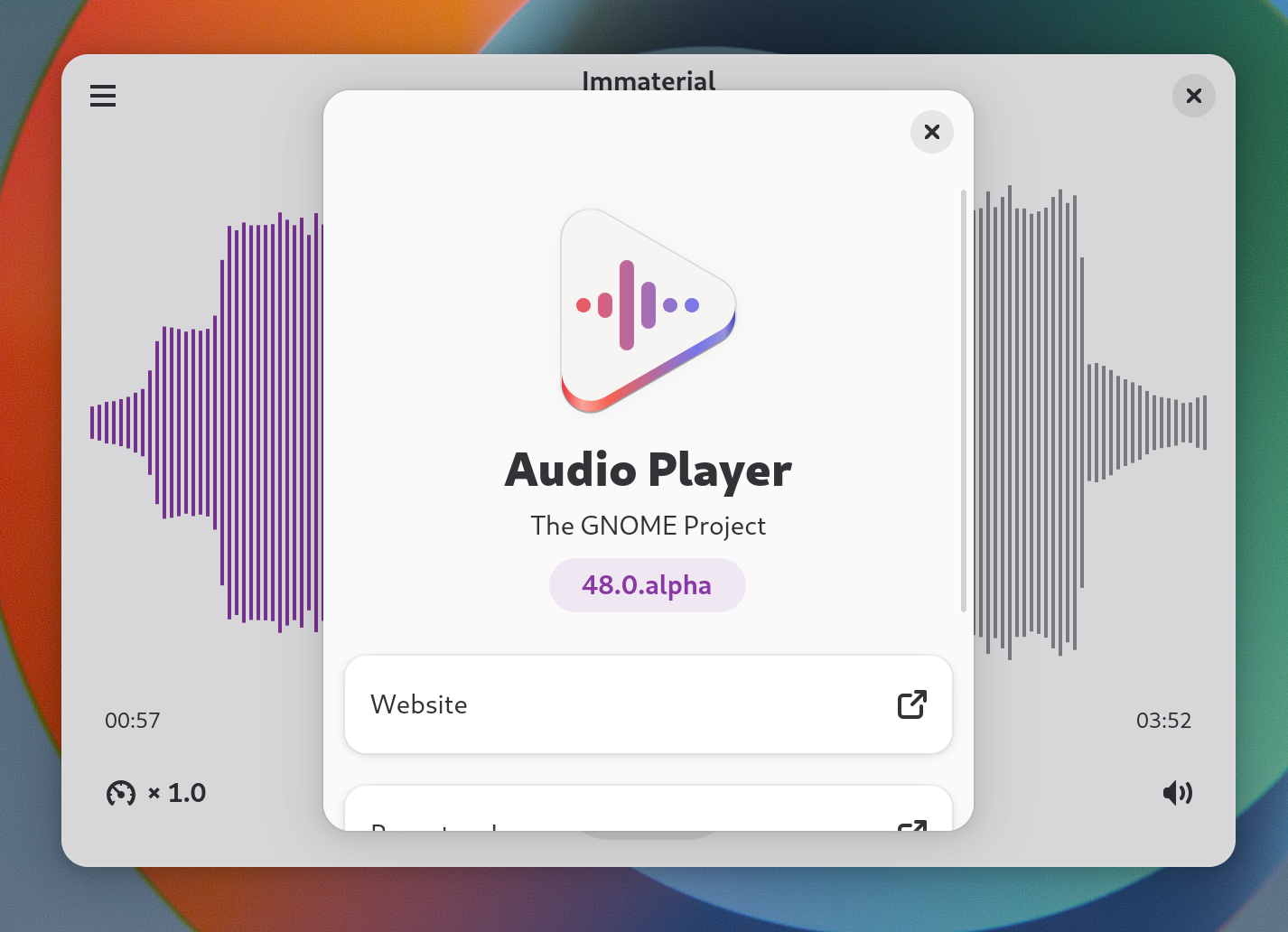
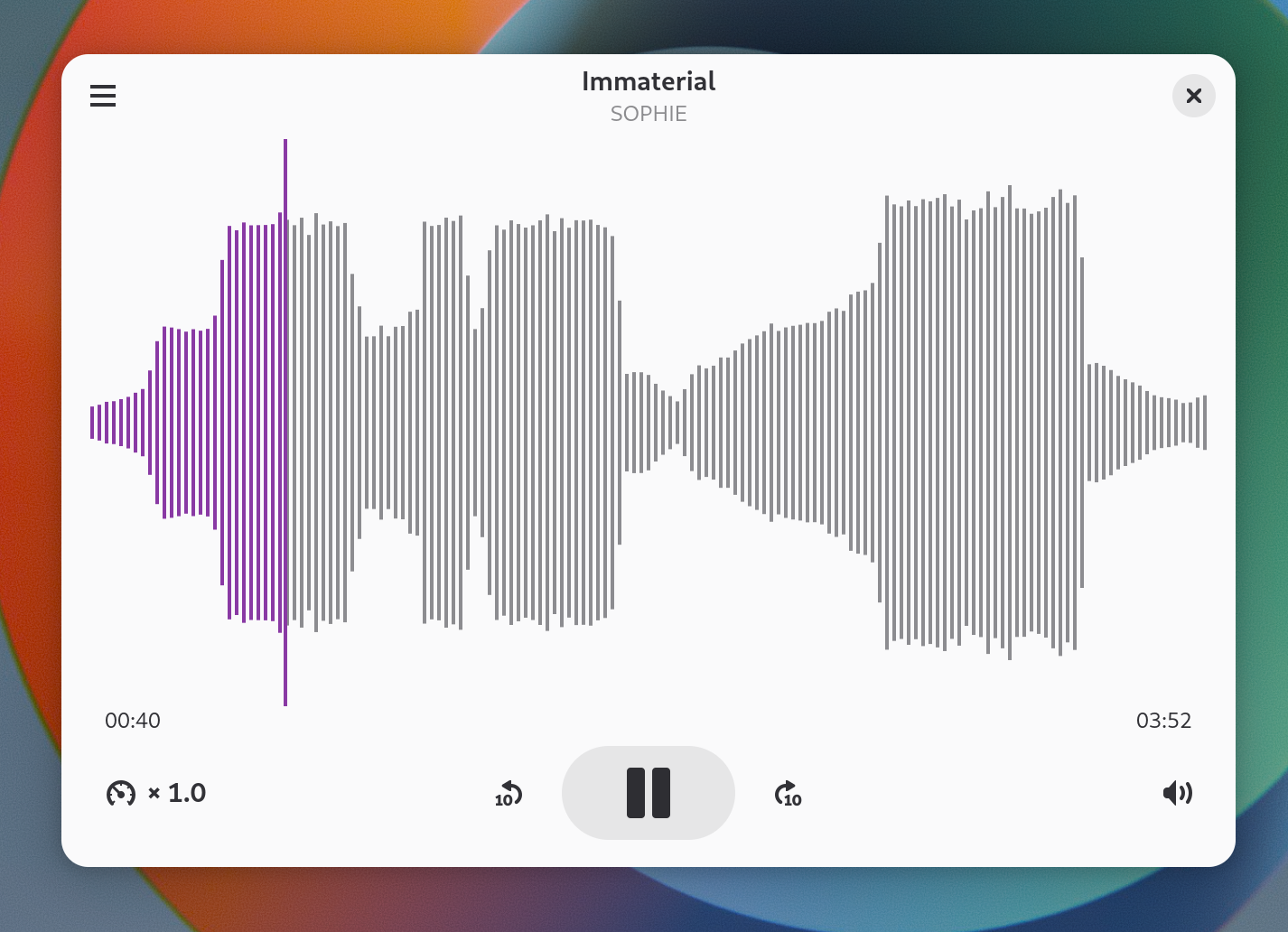
Do you remember Decibels, the neat and minimal GTK4 music player? In GNOME 48 it has finally become the official audio player, earning the name of... well, "Audio Player", and replacing GNOME Music.
Not only that, but Decibels has also received its own fair share of buffs, with support for multiple windows and shortcuts to change your playback speed.
Well done, Decibels contributors!
Headphones OSD is back!
Remember, many GNOME versions ago, when you would get a small configurations OSD when you plugged in your headphones, to let you correctly configure how you wanted to treat the audio output and microphone input? Apparently, that OSD is coming back to GNOME 48. Unfortunately, I was unable to test it due to virtualization not supporting this use case.
Slightly prettier little things
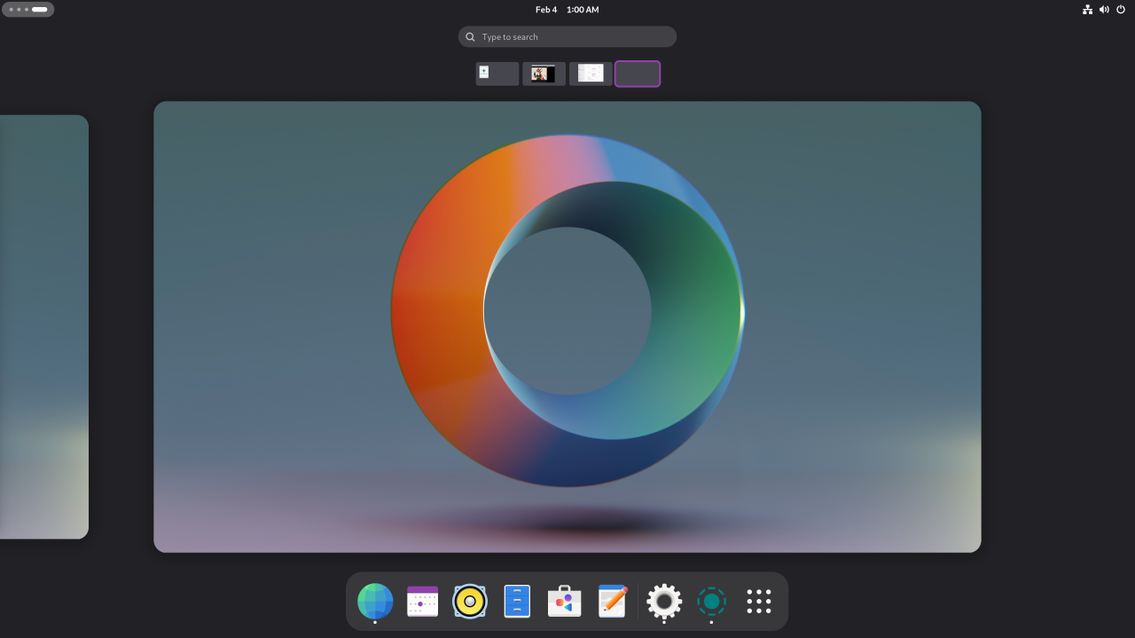

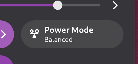
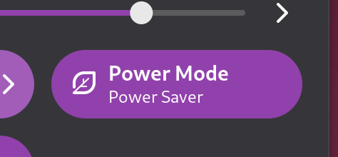
In this release, GNOME ships with a surprisingly pretty set of first-party, dynamic wallpapers. The various performance modes also got prettier icons, that are reminiscent of the KDE Plasma ones.
KDE Plasma 6.3: Panel Cloning, TimeZone Pickers, and more!
The release of the next major version of KDE Plasma, 6.3, is currently scheduled to happen nine days from now.
The beta version was released to the public already, to make sure that people tried it and found any bugs that were missed by the Plasma QA. You can help out right now by trying it out, maybe in a virtualbox or something.
Anyhow, I think this is a good time as any to start talking about all the cool features that are included in this release. If that's fine with you, since this is my channel, I would like to start off with a few things that I managed to implement, being a KDE Plasma developer, as you know.
Panel Cloning
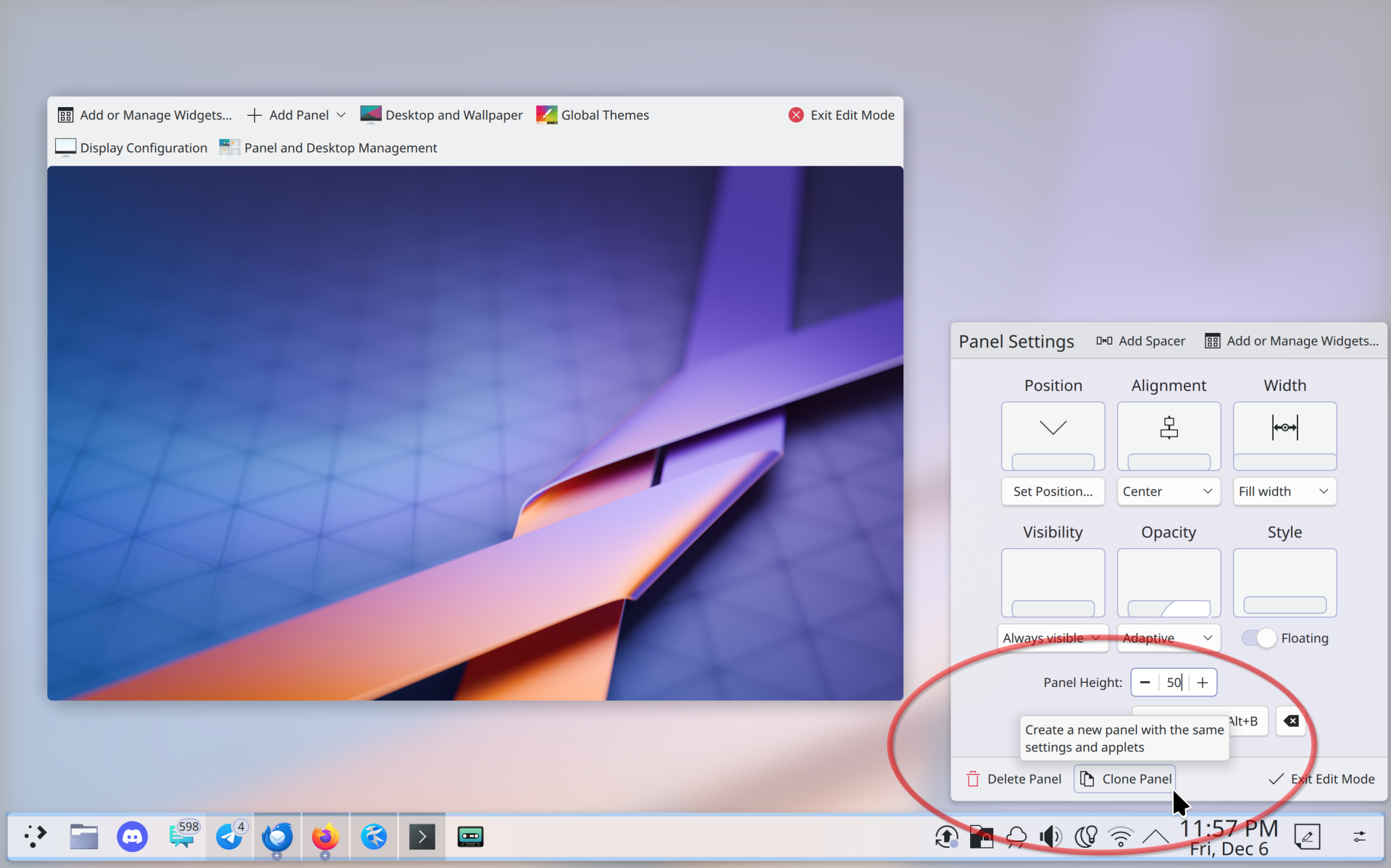
Let's start off with panel cloning. For the joy of many, you can now create a clone of a panel you have. The new panel will inherit all panel settings, applets, and the settings of the applets within.
The workflow is pretty simple: you get into panel settings, and then you press "Clone panel", and you select where to copy it to – that's all. This feature is simple enough that I don't know what else to say here.
A strong request from the community was to also implement some sort of panel mirroring, where two different panels - on different monitors - can use the same setting, and all changes to one of the two panels will automatically affect the other as well.
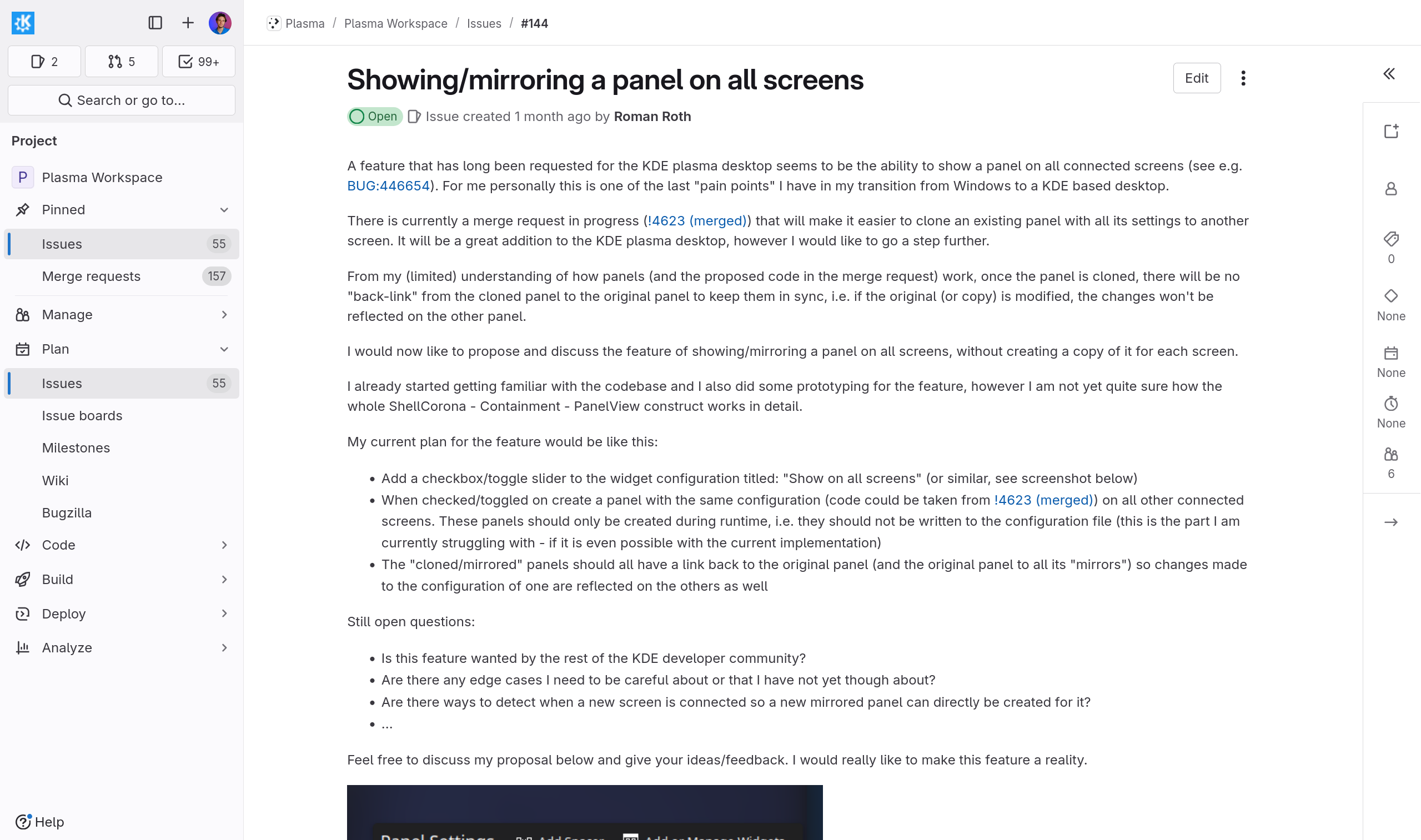
Though I do see the appeal in that, and many operating systems do implement such functionality, I have ultimately decided against it. My reasoning is that Plasma panels are so flexible and complex to handle that any mirroring feature would end up being very unstable. As an example, having the same panel on different monitors means that the panel will have a different length - monitors have different resolutions - which is going to affect how the panel is displayed. Maybe one panel will have enough space for a single row of the task manager, whereas the other one will require two. I currently don't think it's feasible to have a clean way to implement that.
Timezones
Then, there's timezones. This is not as exciting, but it actually took various months of development to correctly implement, so I'm pretty excited that it finally ships.
Previously, or timezone picker was just a list of all system timezones that you could scroll through. Not particularly exciting, I would say.
I have implemente a new timezone component that uses openstreetmap and timezone geo data to, you know, actually display all the timezones on a map. You can select any by just clicking on it, switch between them with ease,
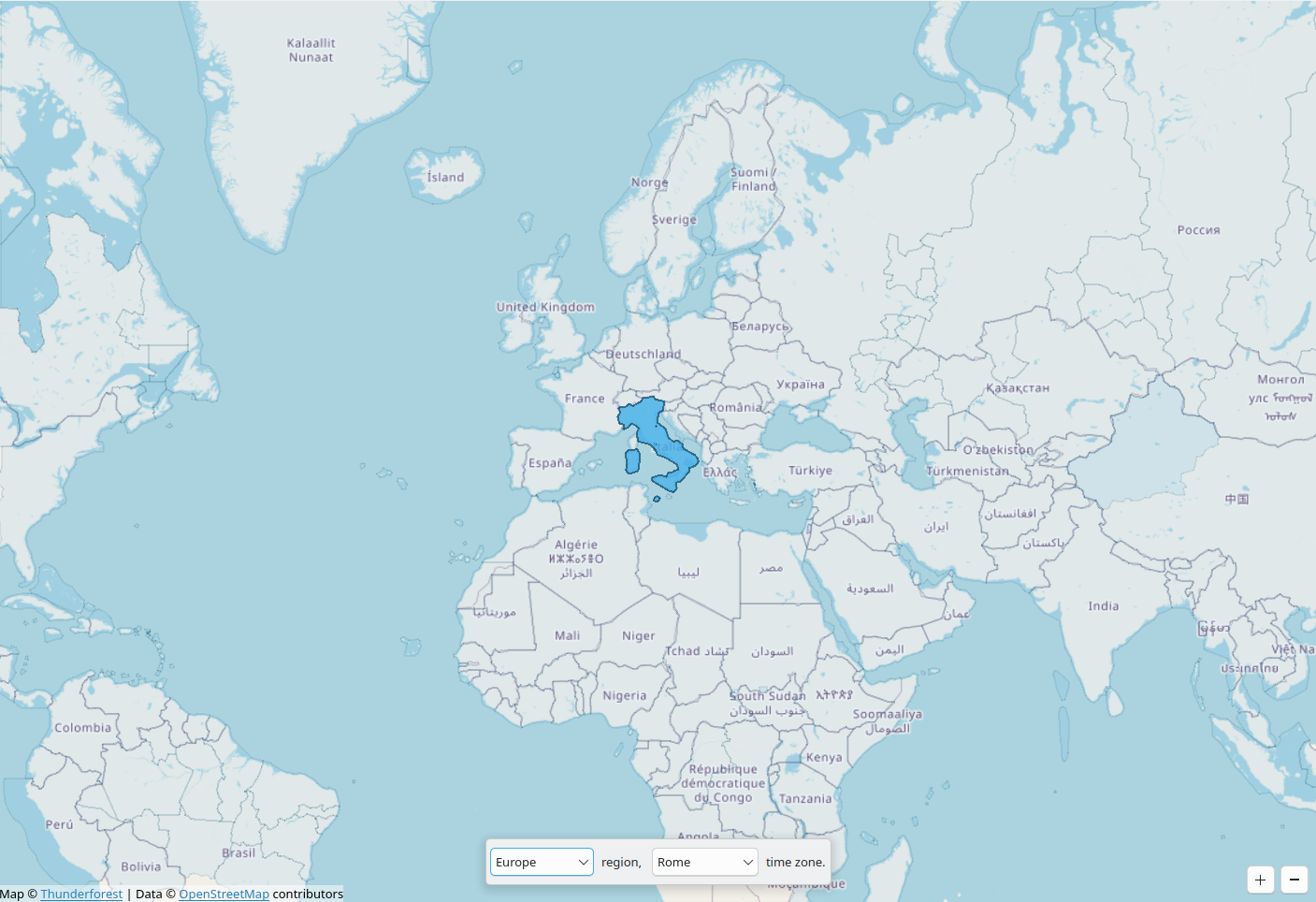
and there's even a combobox so that you can still select it manually if you don't find your timezone on the map – maybe you just forgot where you live, it happens.
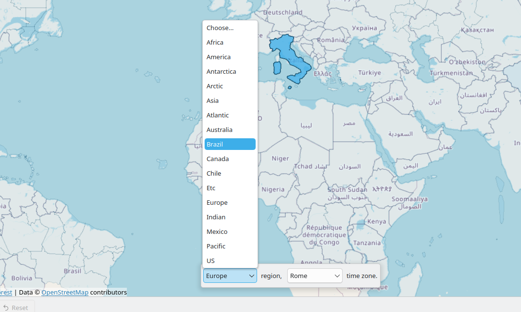
You can find this new selector in timezone settings, obviously, but it's actually a re-usable component; as an example, the very same UI is used in the digital clock applet when you go ahead and select the timezones to show the time of, in the applet.

Behind the scenes, there's also instruction to keep the timezone data updated, and even a script that automatically downloads that data and simplifies it enough to be used in the component. This last step is pretty important, since the raw data is, like, gigabytes.
Other
I've also spent a lot of time, sponsored by Valve - by the way - through Blue Systems, fixing and triaging bugs. One cool thing I've fixed is that, when panels switch between floating and not floating, there's now an animation for any applet that might be open at the same time, switching from floating, to attached to the panel. It's a nice touch, I think.
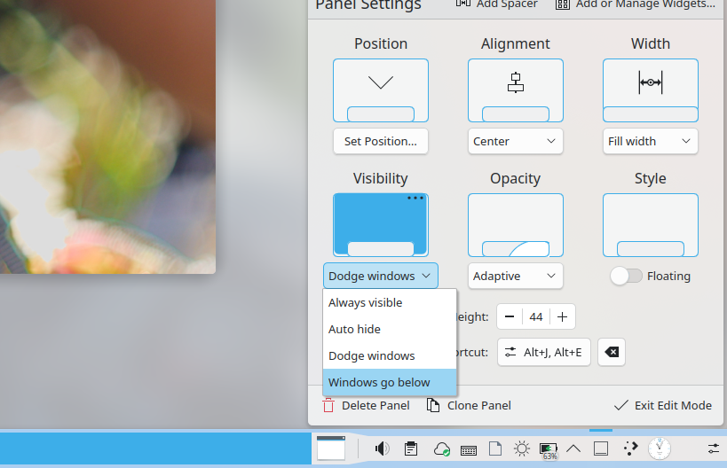
Still talking about animations - though this one landed in Plasma 6.4 - I've also re-worked the panel autohide settings so that all options now play an animation when you select them, as a static image wasn't very effective in explaining what each option did. In fact, I got confused myself at the meaning of "windows go below" during that merge request, and I had to be reminded of how it worked.
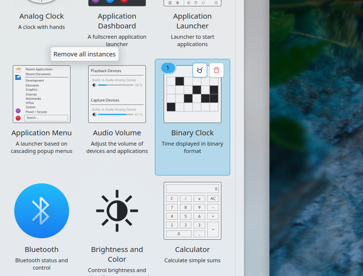
Finally, I added a button in the Widget Explorer, which is the sidebar with all the widgets, which allows you to remove all instances of a specific widget from anywhere. This is pretty nice if you've accidentally drag and dropped some thing around and you just want to get rid of all of them. A small feature, but nonetheless a quality of life improvement, I think.
It is now time to talk about everything else, but before I do that, do let me remind you of the sponsor of this video, which is nobody. In fact, if any, it's you. All the equipment that I use to record these videos was funded by your donations, and you can sponsor my video work through donations on patreon, liberapay, ko-fi, and other platforms.

But I will say that I'm currently launching a new website, currently under construction, called thelibre.news which will contain all of my videos in article format, plus some interview, plus some extra content; you can also subscribe over there, and I will also soon talk about the folks that host it and gave me some help setting it up. Cool stuff.
Anyhow, back to Plasma.
Settings
I've talked about the new Timezone setting page, but another that received a lot of love was the drawing tablet one. There are now three distinct tabs, "Display", "Pen" and "Pad".
"Display" allows you to select which area of the screen you want, well, displayed on your drawing tablet - if it has a screen at all. This comes with a very handy visualization that actually shows the mirroring extremely well, and I was particularly impressed with this page.
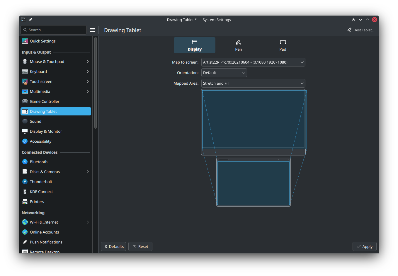
Pen has a graph for the pen pressure that you can edit, plus buttons to set specific actions for pen buttons, plus calibration. Plus, there's a help button that tells you how the pen pressure graph works, that is, you can actually customize it through drag and drop. Nice.
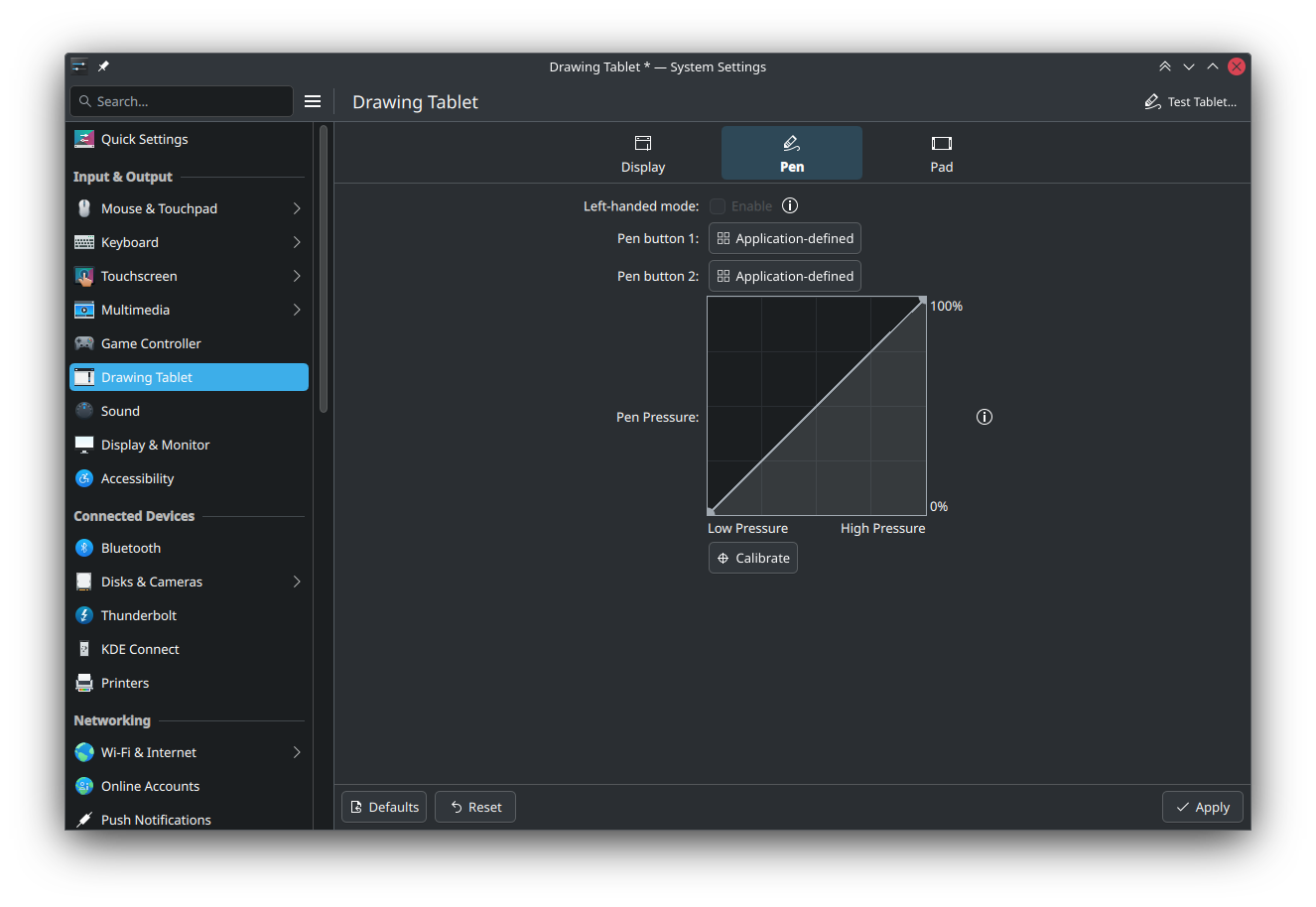
And, finally, Pad shows all the buttons available on the drawing tablet itself, and allows you also map those to specific actions. You can also decide to let the applications themselves handle the event instead of the system. And, if the drawing tablet does not feature any button, this section will not be displayed at all.

Finally, the battery settings will now display the cycle count of your battery, which is, well, useful information to have.
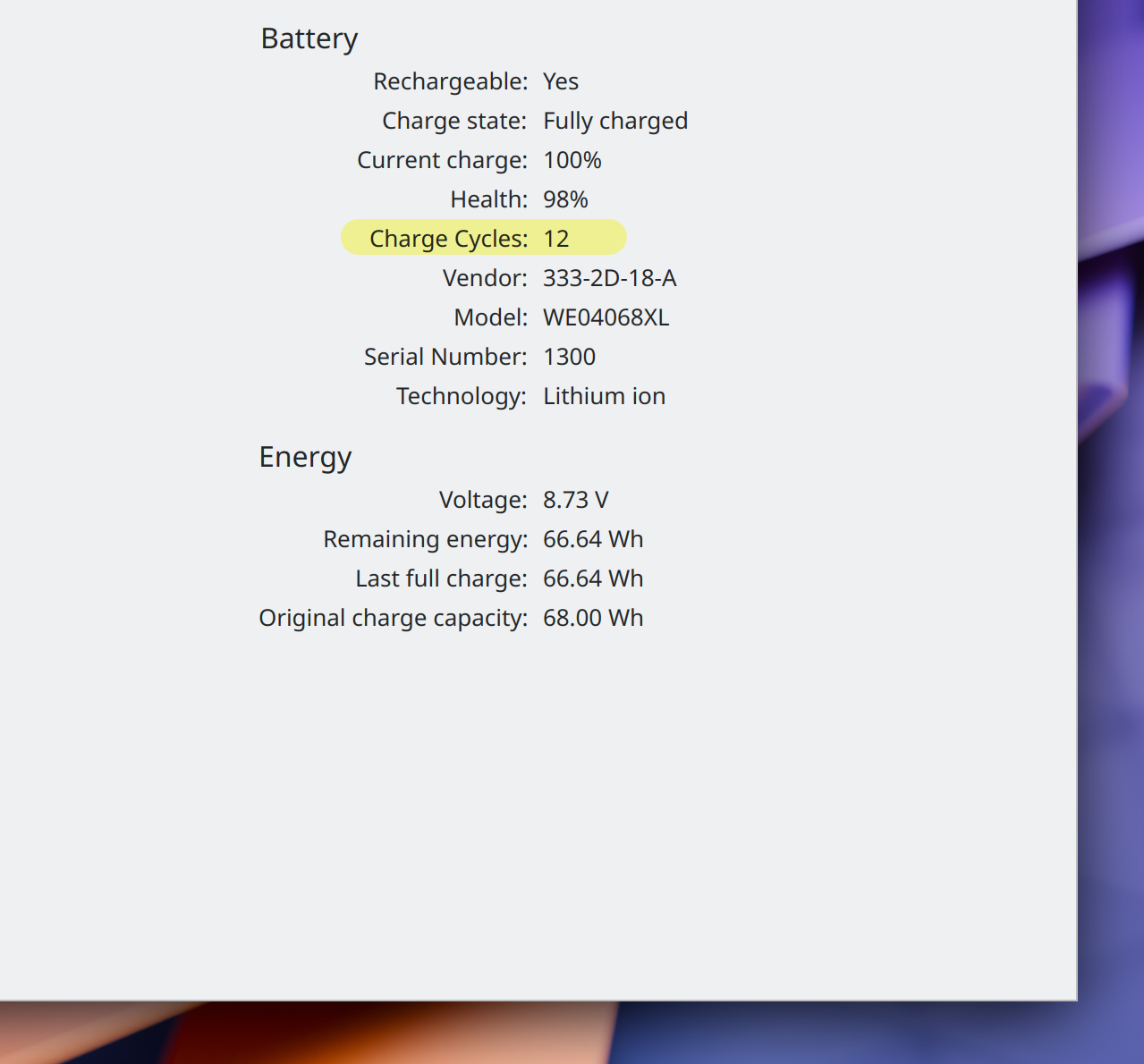
And, look at how pretty this is, the info center will also display all of GPUs with little indicators to tell you whether they are discrete or integrated.
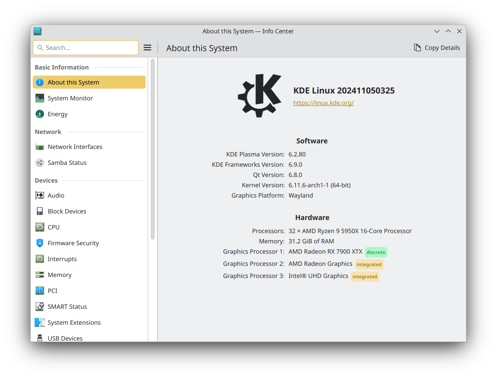
Applets
Well, let's now start talking about improvements in the applets themselves.
One nice feature of the Printer applet is that now you can display all printer jobs directly in the applet, without having to open settings. Previously, you could only display the most recent one. And, all jobs have a "cancel" button too.
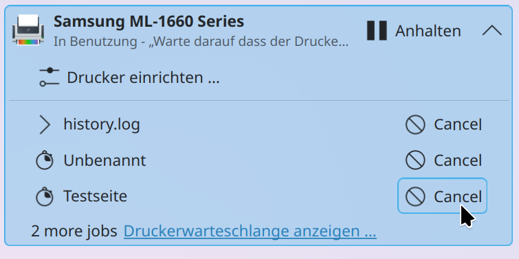
The notification applet also implemented a new ""isAddedDuringInhibition property under the hood that will make sure that if you receive a notification while you have do not disturb enabled, and then you disable it, that notification does not become immediately a popup. Previously disabling the DnD would mean receving a bunch of popups that were suppressed; now you can just see them in the applet, but they don't clutter your screen.
Finally, all applets on the desktop are now slightly blurry and transparent! I think this is a great look, and it's how things were meant to be. As a bit of a fun fact, I was actually tasked with implementing this, almost two years ago, but I never quite managed to fix it. But luckily, someone else did, I believe it was Marco?
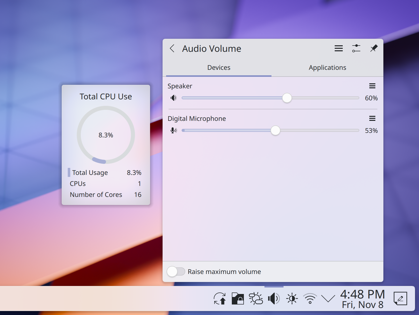
The task manager applet will also now display much better playback information and UI on hover. If you have multiple instances of an application, the playback will only be displayed for the instance actually playing the audio, and you will have all the info from… whatever you're watching.
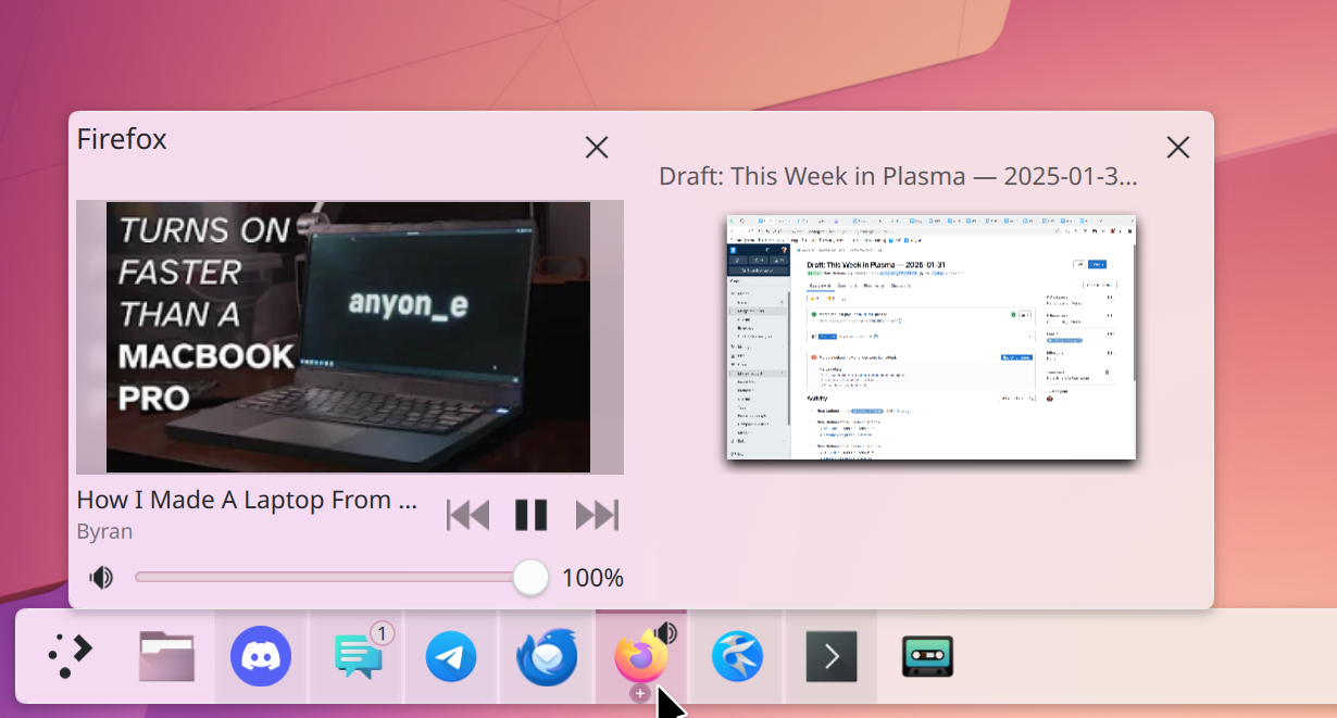
Window management
Let's now switch to window management stuff!
Firstly, hey, HDR is getting better and better on each release, thanks to the great work of Xaver. This time around, he has implemented HDR support for SDR screen, i.e., screens that don't support HDR. Apparently, how this works is that when a HDR content is displayed, the brightness goes to the max and pixel values for everything else is decreased in a way that keeps it constant, so that you only have that extra brightness on the content itself.
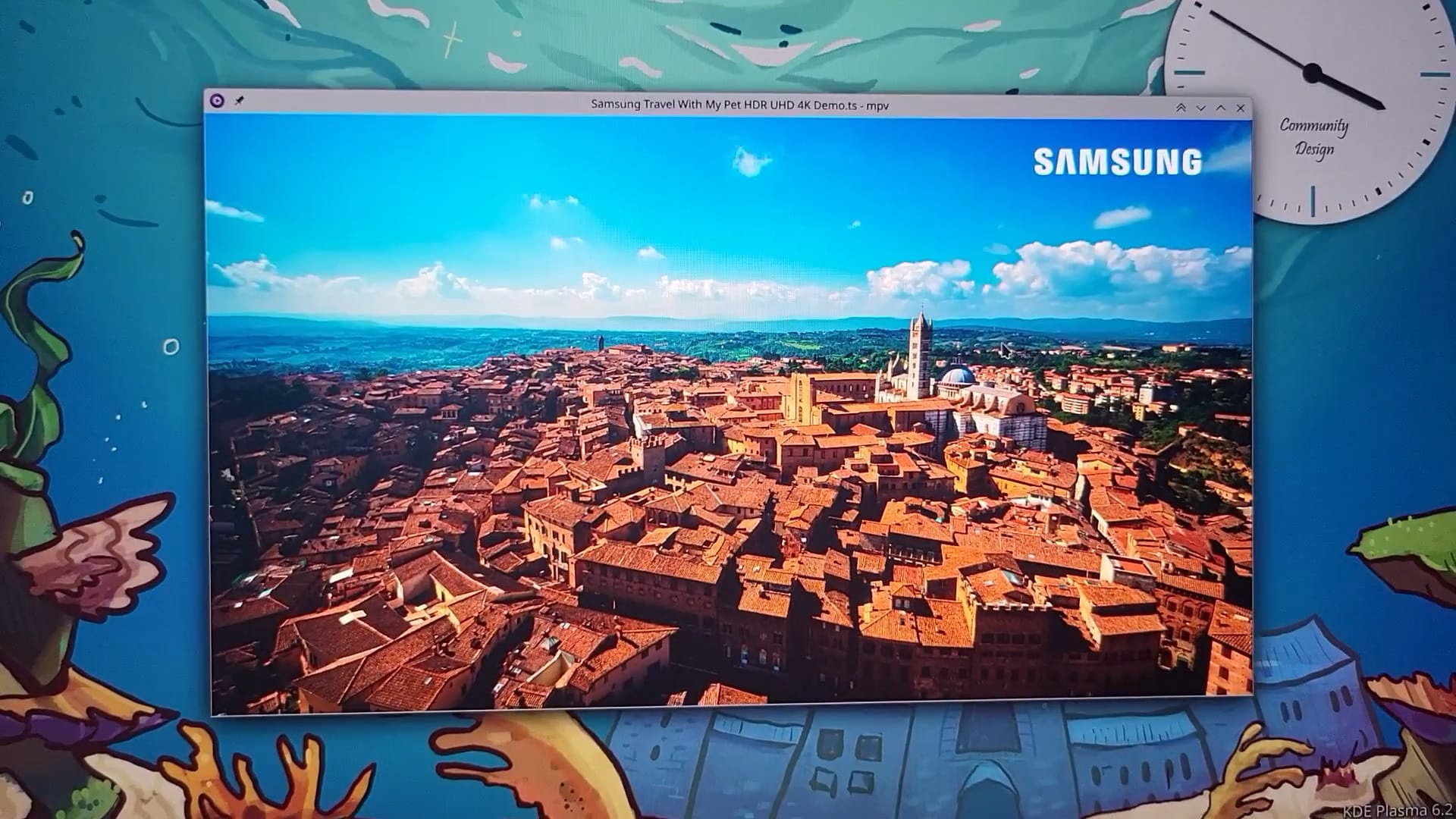
Moving on to tiling, you can now set shortcuts to move windows between tiles. That is, you can enter the tiling manager (through Meta and T), set up a certain amount of tiles around your screen, and then move the window between adjacent tiles by simply pressing a shortcut. So, if you have a very wide monitor where the default half-tiling doesn't really make sense, you can make your own tiling setup.
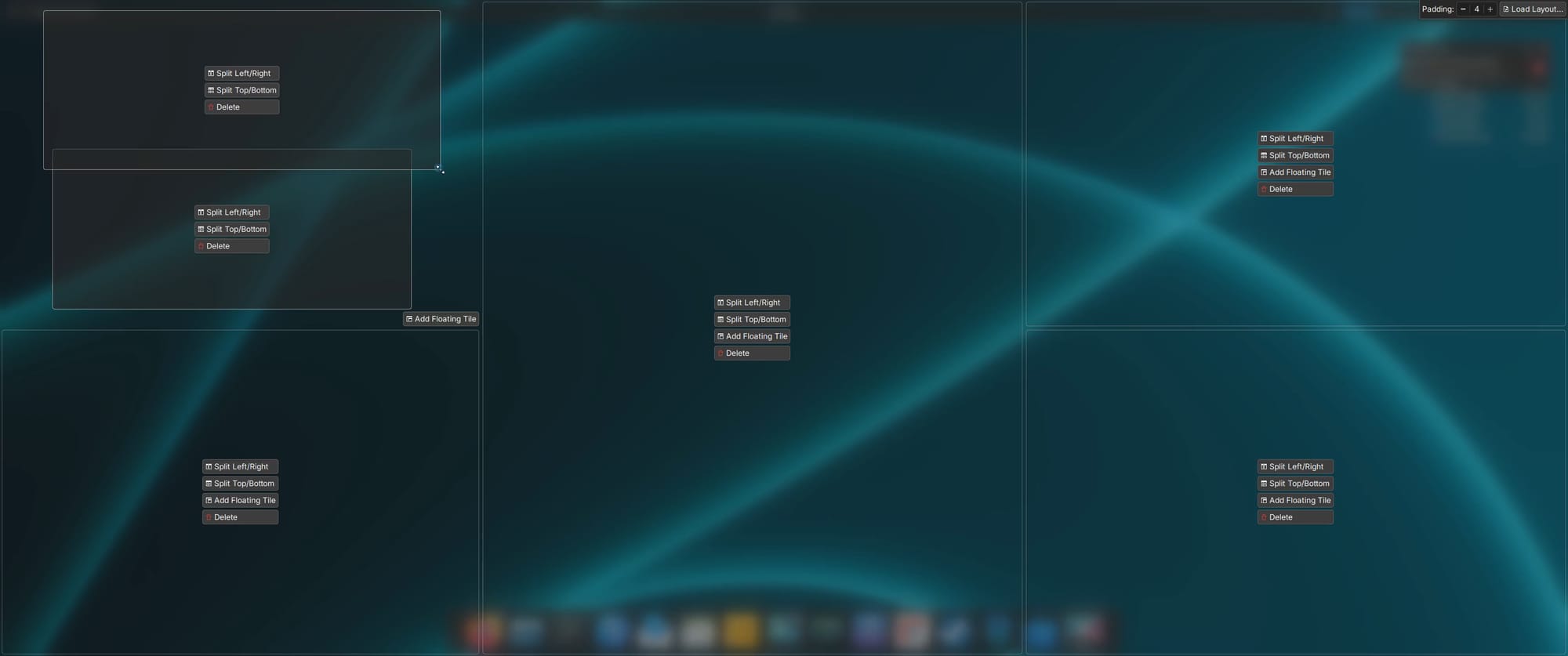
Even better, the tiling now remembers everything on a per-desktop basis, meaning that you can have different tiling setups on different desktops, or even monitors.
The zoom effect also got a nice feature: if you zoom really close to the screen, a pixel grid will appear. This might mean nothing to you, but to me, as a developer, it's awesome; it very often happens that I have to fix some single-pixel misalignments, and having a grid to rely on makes that much, much easier. I love it.
Let's now talk about a few more technical things that I don't have screenshots of.
One new feature is that, on Wayland, you can now start drag and drops from windows that are lower in the stack order, and that will not raise the window; this makes drag and drop significantly less annoying to deal with when you have multiple windows open.
Another noteworthy feature is that the handling of fractional scaling for window decorations was significantly improved, though I don't know exactly what that means, since it's a bit too technical for me. But hey, if you use fractional scaling, be happy.
You can also choose to have more accurate colors on your screen, though that comes at the expense of some system performance. Still, for artists, it might be a worthy tradeoff.
Other
Let's talk Discover, our favorite application about installing applications. A pretty significant imprevement is that there's now support for flatpak links. So, if you click on "install as a flatpak" somewhere, then Discover will automatically be opened with the page of that application. Yay.
Furthermore, when updating flatpaks, Discover will tell you about all the new permissions that an application might be requesting, allowing you to check that you are okay with giving the application more power over your system.
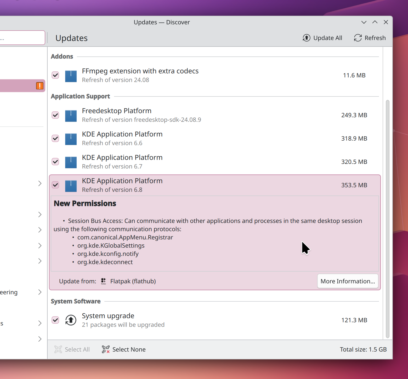
Safety-wise, applications now have a "verified" badge when they are packaged directly from the application developers themselves, or by a trusted third party.
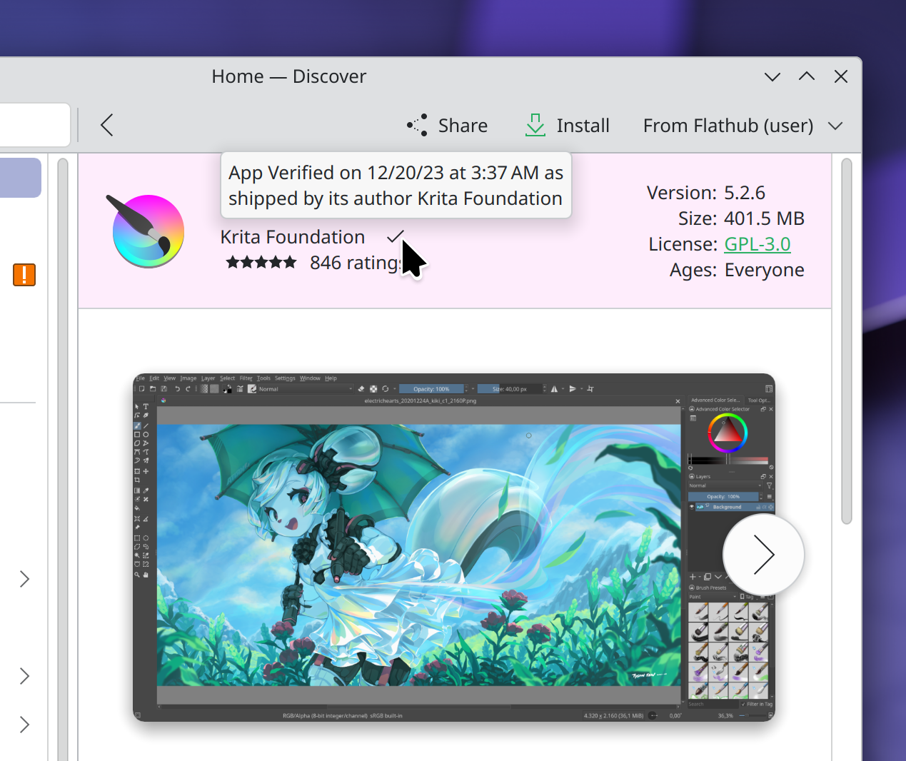
Colorwise, Breeze Dark has been made a bit darker. I actually prefer Breeze Light myself, but I do hope that you will love this new more obscure design.
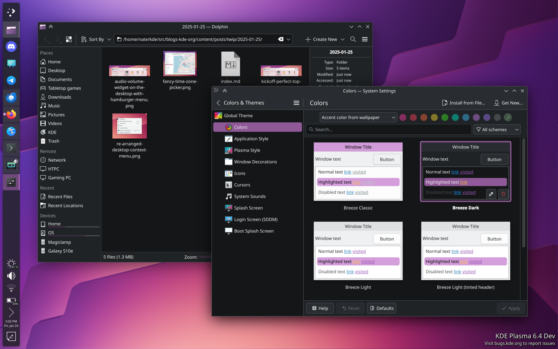
And, still design-wise, close buttons are also now consistent throughout the KDE interface, meaning that notifications lost their custom red icon to this prettier one.
And, finally, yes, there is a new wallpaper for Plasma 6.3.
And it looks like this. I think this is cool. By the way, work is ongoing to make sure that we also deliver ultra-wide versions of each wallpaper, on top of the light/dark variants, and desktop/phone ones that we currently implement. So, yeah, a lot of wallpapers.
Anyhow, I believe this was pretty much everything I had to tell you. Even though these last months I was heavily distracted by some personal life stuff going on, university and everything, it was lovely to see that even I can get surprised by the raw amount of new features in a new release of Plasma. I thought this was going to be a small release. It's not.
Help us break even
We only run on donations. We have a goal of reaching 300 subscriptions, which would allow us to hire staff.
If you subscribe, you'll gain access to a few members-only pieces, though we aim to keep most of our content free for all.
progress to 300 subs goal:no ads · no trackers · cancel whenever