Niccolò Venerandi
10 piecesBy this author
pages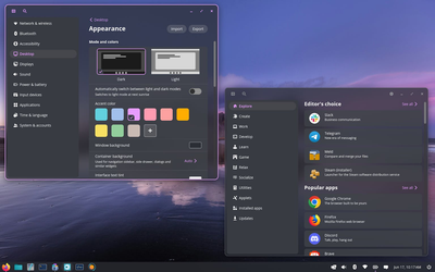
Is COSMIC DE mogging KDE Plasma?
Desktops · 12 min · p. —
Omarchy, the Omacom Foundation, and the Future of Linux
Linux · 8 min · p. —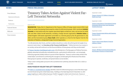
Autistici/Inventati and the Reach of U.S. Sanctions
Privacy · 5 min · p. —
Announcing Plasma Studio
Open Source World · 13 min · p. —Android prefers vibecoders over open-source developers
Allow me to compare and contrast two different choices taken by Android developers.
One. Google announced (at I/O) a new AI Studio application that will allow users to generate new applications by simply asking for specific functionalities, "all from your phone".
See https://blog.google/innovation-and-ai/technology/developers-tools/google-ai-studio-io-2026/
You're able to "share live deployments with your friends to gather feedback and collaborate". I'm not against this: I think AI is a good tool to quickly "create" barebone applications that do one specific task you need that might not be found in existing applications (we all have our niche requirement, after all).
The announcement also states:
Connect your Google Play Developer account in AI Studio to publish your app to Google Play's Internal Test Track with a single click.
The Internal Test Track is a way to privately share an application on the Play Store to test it out, with a limit of 100 registered users. This latter functionality seems to only be available on the desktop version of the AI Studio, but the general approach from Google seems to be to making it easier over time to share with friends or publicly a entirely vibe-coded application.
Two. In 96 days - at the time of writing - it will become significantly harder to sideload Android applications.
Currently, you can install Android applications from any source. Depending on your exact Android derivative, you will be prompted to allow the manual install from your specific source (are you sure you want to install this APK from "Firefox"?). This takes a few seconds.
In a few months, the same task will require the following (taken from Keep Android Open):
- Delve into System Settings, find Developer Options.
- Tap the build number seven times to enable Developer Mode.
- Dismiss scare screens about coercion.
- Enter your PIN.
- Restart the device.
- Wait 24 hours.
- Come back, dismiss more scare screens.
- Pick "allow temporarily" (7 days) or "allow indefinitely".
- Confirm, again, that you understand "the risks".
As Keep Android Open states: Nine steps. A mandatory 24-hour cooling-off period. For installing software on a device you own.
Allow me to express my frustration at this choice: this means that it will be significantly easier to try out a vibecoded app with an user that has no coding experience, compared to try out application from (mostly open-source!) skilled developers.
Forcing users to exclusively install applications from the Play Store means Google has the final pick over whether you can install a certain application or not on your software. Even better, making it so easy to vibecode an application allows Google for even more complete control over your software stack, as the app will directly be provided by them!
As an example, five years ago Google decided to remove an application by Alexei Navalny made to organize tactical voting. According to Reuters,
Russia demanded this month that Apple and Google remove the app from their stores, saying a refusal to do so would be treated as meddling in its parliamentary election.

Both Google and Apple decided to comply with this request. A more recent example was reported by 404 Media:
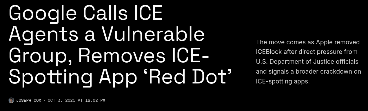
Both Google and Apple recently removed Red Dot, an app people can use to report sightings of ICE officials, from their respective app stores [...] Google told 404 Media it removed apps because they shared the location of what it describes as a vulnerable group that recently faced a violent act connected to these sorts of ICE-spotting apps—a veiled reference to ICE officials.
As long as users are required (or heavily incentivized) to only use the Play Store as their only app source, those same users will be forced to comply with Google political stances – or rather, the political stances of governments who are able to force the company to comply.
When moving towards heavier integration of tools like Gemini in their Android developer workflow, Google is pushing their influences in the development phase of an application, not just the deployment. I see no reason to think that those same governments wouldn't be able to also force Google to disallow Gemini from creating such applications, not just publishing them.
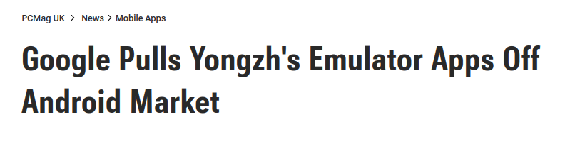
Generally speaking, Google is under very little scrutiny over its review process of applications. An older example is when they decided to pull an important Emulator application out of the store without providing any reason for it. Though it could be argued that the emulator was infringing trademark, these claims are hard to dispute and generally settled in court; here, Google was able to unilaterally decide on the application's future, and not much can be done about it.
Publishing on the Play Store also requires paperwork and a (small) fee. This is luckily trivial for somebody like me, but as the Keep Android Open project points out, it becomes a significant issues for developers from countries where Google does not allow developers to sign up from, or in regions with limited access to Google infrastructure, or in scenarios where quick deployment is required (e.g. for a local emergency response).
This will soon be required to even share your application with a few friends... unless, of course, you vibecode it! I hope you can see the absurdity in this.
Is there anything we can do? I don't think so.
Here's the options:
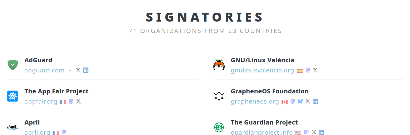
- There's an open letter that's been signed by most Free and Open Source organizations. This includes KDE, Nextcloud, the EFF, F-droid, FSFE, GNOME, VLC, TOR, Proton, and more.
- There's a change.org petition with ~160k signatures. I have to say, I highly doubt that this will have any significant consequence.
A more likely path would be the regulatory one. Americans love to make fun of Europe for their digital rights laws, such as USB-C as a standard and the Digital Markets Act, but so far those laws are the single biggest source of user-respecting software from these giant multinational corporations we've seen.
Apple now allows application sideloading, to some extent, and it has finally switched over to USB-C for their phones too. Users are now asked for their web browser and search engine of choice. Interoperability is coming to messaging applications, and so on. These are all important victories that make everyday software more user-respecting, the opposite of what, in my opinion, Google is trying to do here.
However, I don't think this approach will yield significant results here. I'm afraid that Google will still argue that, technically, you're still able to install applications from third party developers easily (as long as they registered with Google, as described above), or even unregistered developers (through the mentioned nine steps process). They're not effectively closing down the ecosystem, but they are making it significantly harder to avoid it.
Nonetheless, I'll ask my local MEP (Member of the European Parliament) about this the next time I see him. Who knows! (Sorry Brando, I have to try.)
I Made the "Next-Level" Camera and I love it
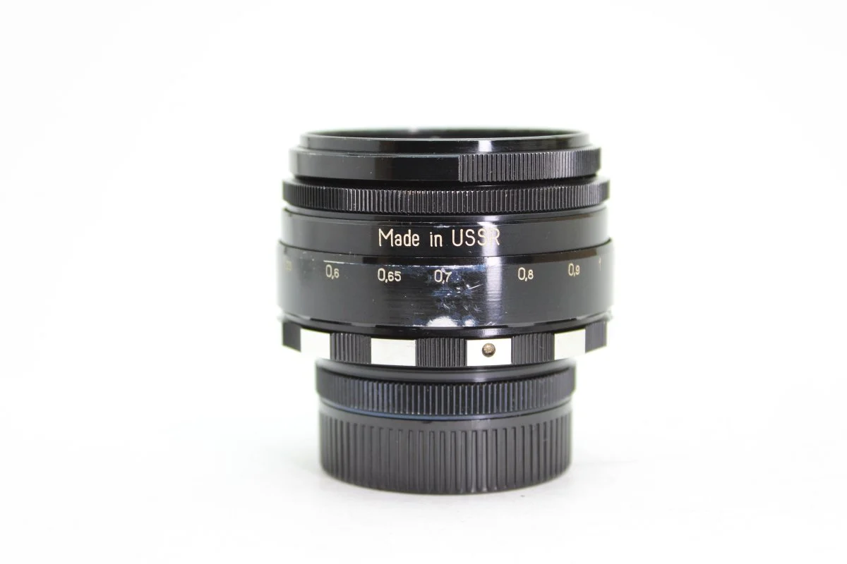
This is one of my favorite lenses: the Helios 44. It has an "aperture" of 29mm, meaning that if you look straight through it, the circle that you see has a diameter of 29 millimiters. Why do we care, you might ask?
You probably know that pictures can be out of focus. But why does "out of focus exist"?
Well, without getting too technical, the lens takes the rays of light emitted by an object and then converges them into a single point; if you place the camera sensor in that point, you'll be able to see the object. However, if you place the sensor closer or further away from where the rays of light intersect, then you'll get a circle and the image will be out of focus.
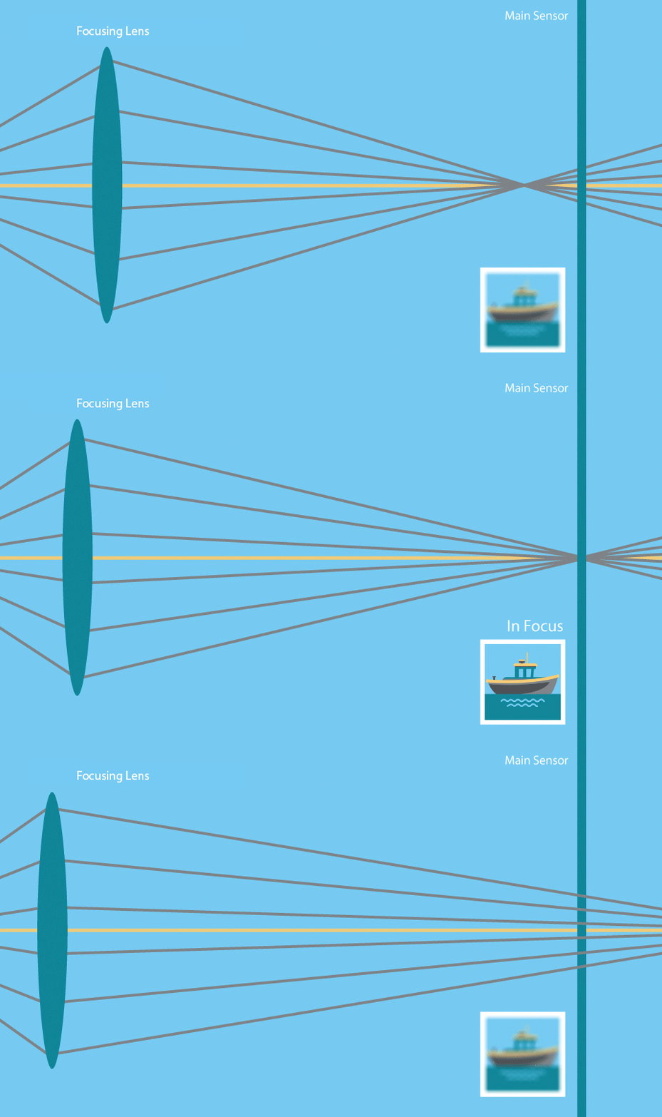
Now, here's the kicker: the bigger the focusing lens is, the larger the cone of light rays is, meaning the the out of focus parts of the image will be more out of focus:
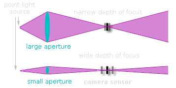
This is (partly) why phone cameras can't naturally reach the same levels of background-out-of-focus that camera can reach: they have such small lenses!
This is the camera lens that I do most of my work in. As you can see, this lens is much bigger; indeed, its (maximum) aperture is more than 53mm, almost double what the Helios can offer, which allows for a very strong separation between the subjects and the background.
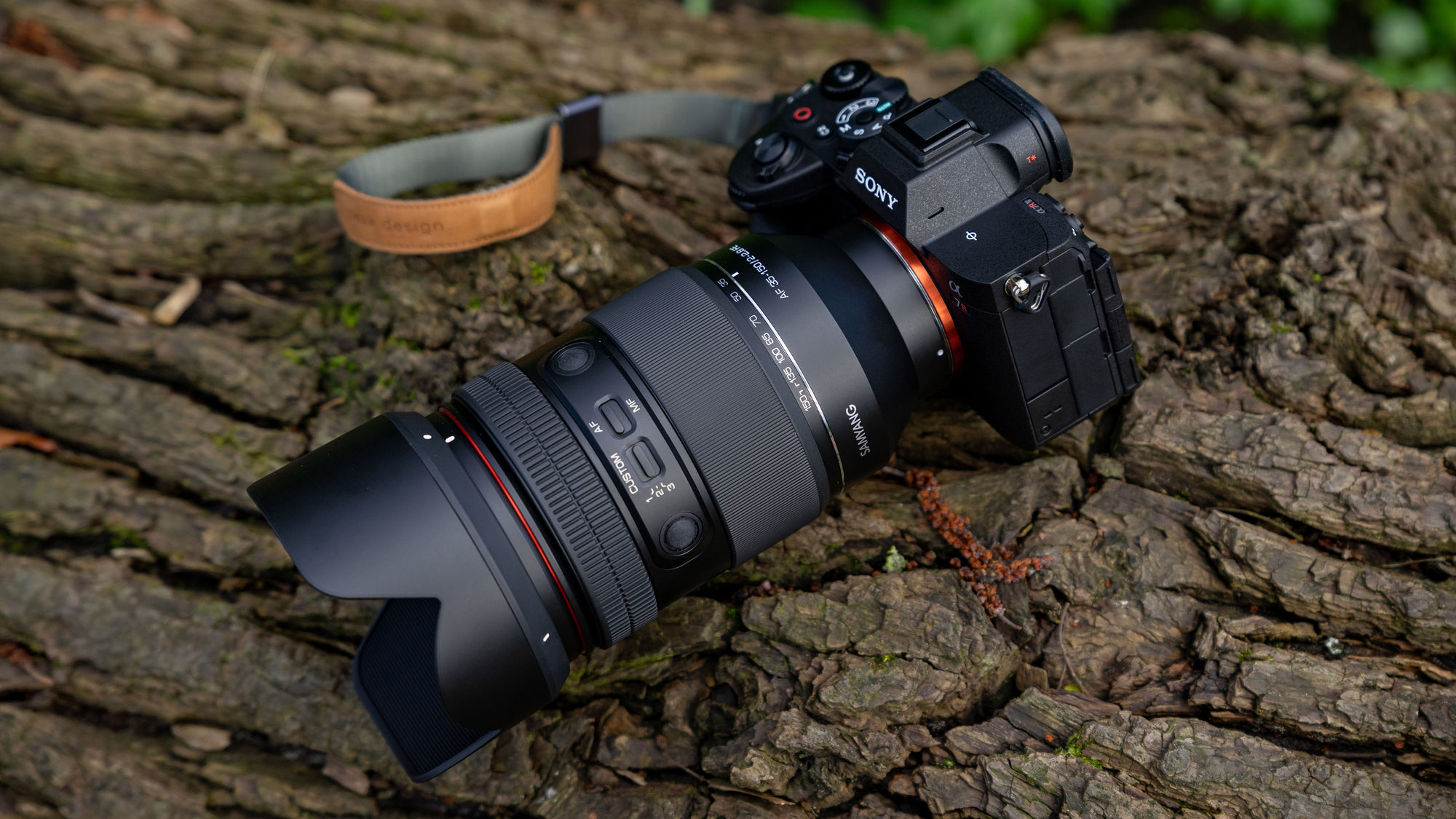
The question now is: how big can we go? How much blurriness can we get out of a lens?
Well, assuming we're okay with carrying around a lot of weight, we can go pretty big. As an example, take the Sigma 135mm f1.4; this lovely lens (which I sadly don't own, yet) has a majestic aperture of 96mm,
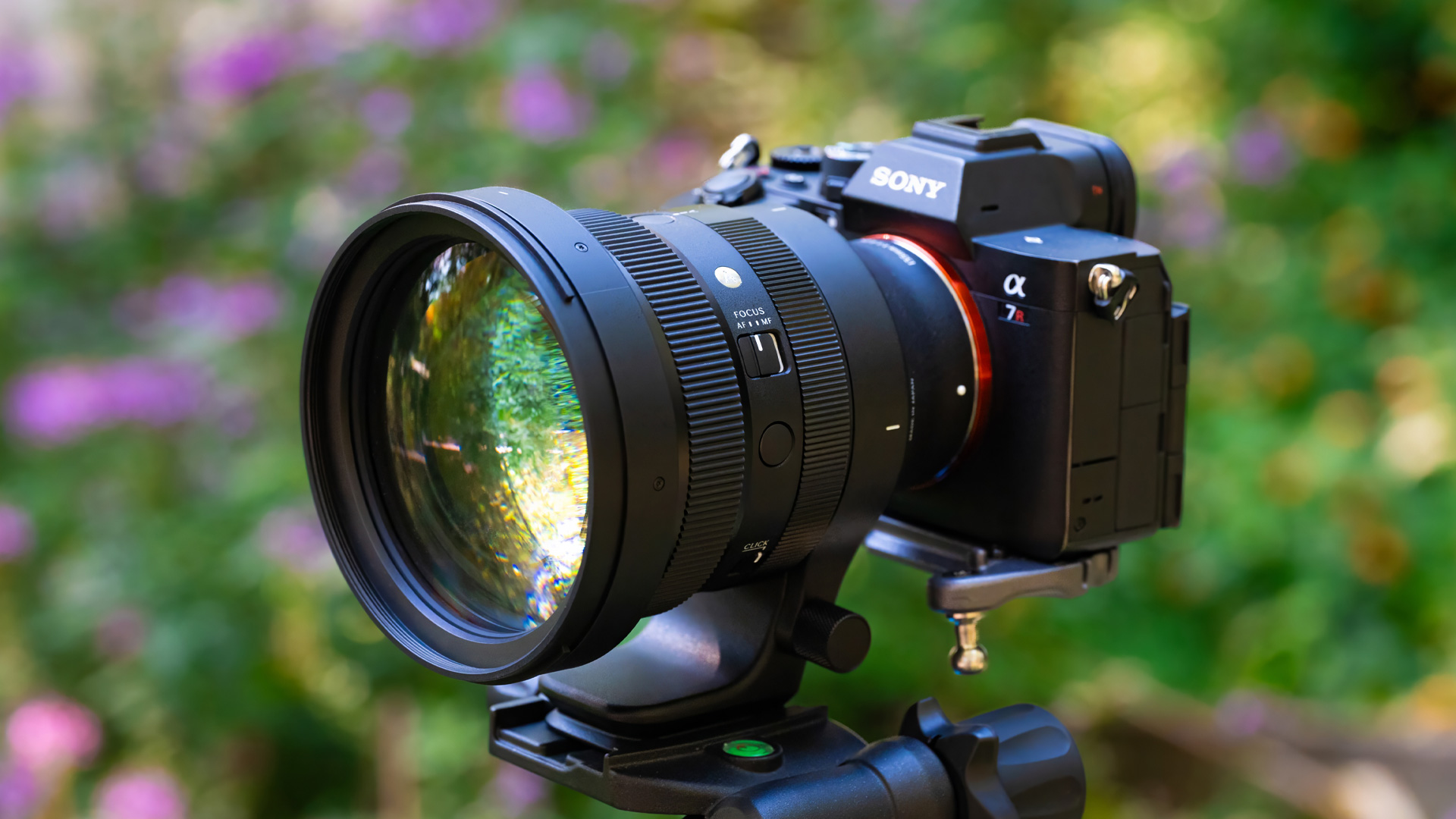
and it can deliver pictures like the following one. There's a catch, though: due to physical constraints, all of these large lenses are also always very "zoomed in"! Take your phone camera and set the zoom to 4x: that's roughly what you're going to get with this Sigma lens. This can be great for some scenarios (and it's my favorite focal length indeed) but what if we want to keep the same giant aperture but with a wider field of view too?

Well, we can't.
The reason is: remember the cone of light rays above? The bigger the lens is, the bigger the cone of light is too. But also: the wider the field of view of a lens, the bigger the cone of light too.
And, the combination of wide-angle-view and super-high-aperture would literally require light to pass through the metal of the camera in order to reach the sensor:
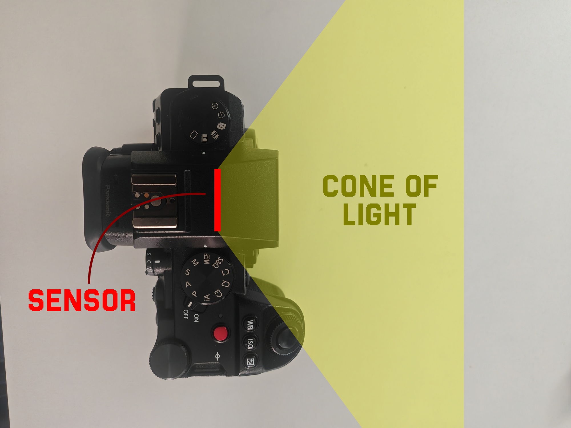
In order to work around this, you'd have to quite literally tear your camera apart in order to expose the sensor. Somebody has done it, namely some "Stanley Kubrik" guy, and - of course - the lovely folks at Media Division:
But even so, Kubrik only reached ~71mm of aperture, and that's still on a 50mm focal length lens, which is 2.7x wider than the 135mm mentioned above, but also not exactly a wide angle lens either. Media Division instead went for 136mm of aperture, but on a focal length of 100mm, awfully close to the 135mm. Also, I'm not taking my camera apart. And, finally, all of these solutions require these giant pieces of lenses that are extremely rare and pricey.
Luckily, there's a solution to all of these problems. Meet the Charles Beseler 18" Series III:
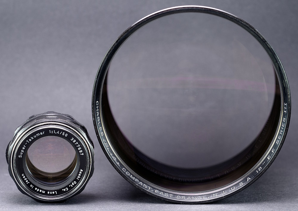
As you can see, it's absolutely huge. It's also really cheap to get: I bought to for around 200€, including shipping costs. These lenses were produced a lot of time ago and they were used as projector lenses, in machines like these:
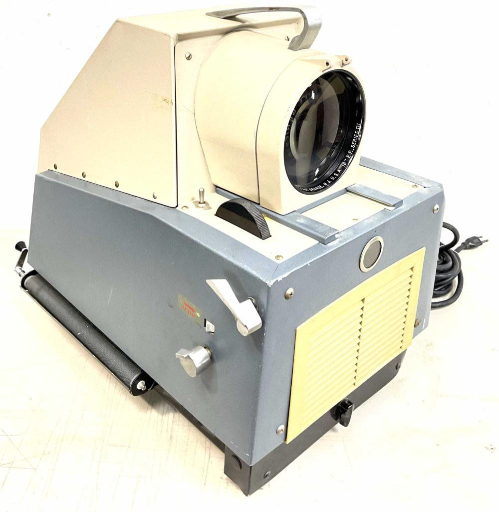
They are no longer used nowadays, and can be bought for cheap. And, as one can see by naked eye, they have a giant aperture. I can only provide an estimate for it, since there's no specs sheet for it, but it should be around 125mm.
So, you might ask, is this a wide angle lens? Well, the 18" in the name is telling us its focal length, and - converted to metric - that's ... 457mm. Which is roughly a 13x zoom in your normal camera, and so much more than we were looking for. Oh, no. Well, we knew it was physically impossible anyway.
Also, look how crazy of a contraption you have to build in order to connect this giant lens to a camera:
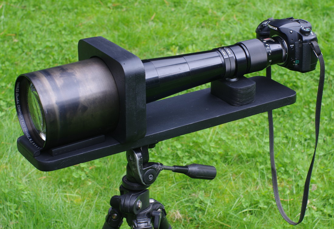
Though, it would produce some pictures, and indeed we can see a lot of out-of-focus (but also a lot of zoom...):

Fear not, though, the Charles gives us an extra tool to work with. So far, we've always assumed that we were working with a camera like mine, with a "standard"-sized sensor (it's called "full frame").
Suppose instead that we have a sensor that's double the size of mine. That would make for a pretty big camera, but still: a bigger sensor is able to capture a bigger image, effectively "zooming out": thus, our 457mm lens would become a 228mm lens. That's still not enough.
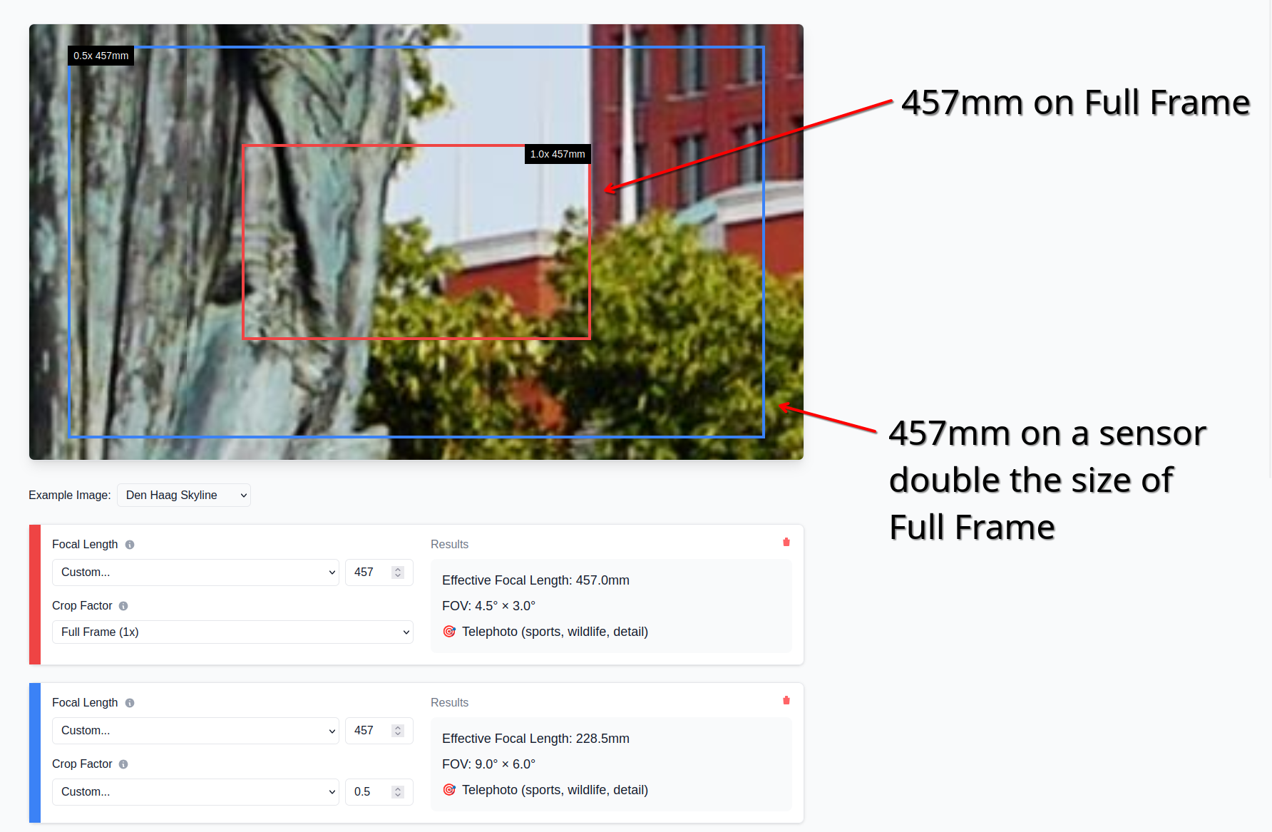
Let's double the size again. We're zooming out by a factor of 2 again, reaching a focal length of 114mm. That's still too much zoom. Let's double the size of the sensor again. We're now at 57mm. This is better already, though we should probably make the sensor just a bit bigger still, so that we can be around 40mm.
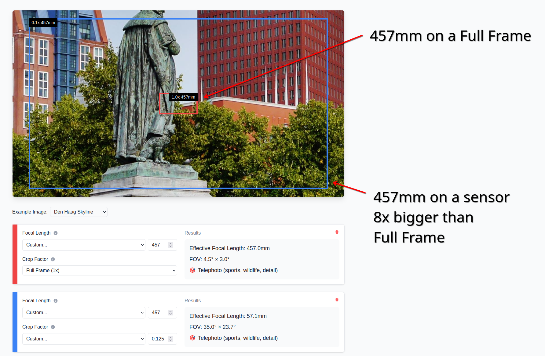
This means that the size of the sensor needs to be: the original size, times two, times two, times two, times one point five; that is, we need to increase the sensor size by a factor of 12.
My camera sensor size is 35mm by 24mm. Multiplied by 12, we get 420mm by 288mm. That's, uh, 42cm by 29cm. It's, like, pretty big. That's the size of a painting you'd hang on your wall. This gives us two issues:
Firstly, such a sensor simply doesn't exist. Films shot on IMAX use very big "sensor" (it's film) areas and we're talking about ~7cm by 5cm. It's not even "it's expensive" territory, it simply... does not exist.
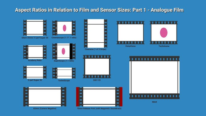
Secondly, lenses usually can't project an image big enough to cover such a large area. Most lenses are designed to be used with Full Frame sensors nowadays, or slightly bigger ones (such as "Medium Size" – look, I don't make the names).
The good news here is that the Charles was not built "nowadays". Maybe back then they didn't get the memo about future sensor sizes. How can we check how big of an area our lenses can cover?
It's thankfully pretty easy. If you simply put a lens near a white surface, you'll be able to see what the sensor would see. The Helios projects a rather small image on my white wall, but that's just enough to cover the similarly-small full frame sensor in my camera.
I do also have lenses that project bigger images. As an example, this weird lens that found in some used market gives us a pretty big image circle. It certainly covers a camera sensor, even a "Medium Size" one, but not a the 43cm by 29cm area we need.
The Charles produces a giant image. It's tough to see it exactly because the lens has to be very far from the wall now, thus the image is very faint, but it's there. I'm not sure how big it is, but it's bigger than 43cm by 29cm. This is it.
Now we have to deal with the incompetence of the human mind and quickly invent a new giant sensor, bigger than anyone has ever seen. It should only take a few minutes.
Jokes aside, what we need to make this work was invented a long time ago for camcorders. Back then, we were dealing with a similar problem: we had these consumer video cameras with very small sensor, and we had "pro" camera lenses that were designed to handle much bigger sensors. We needed some kind of "adapter" that would allow to connect the two.
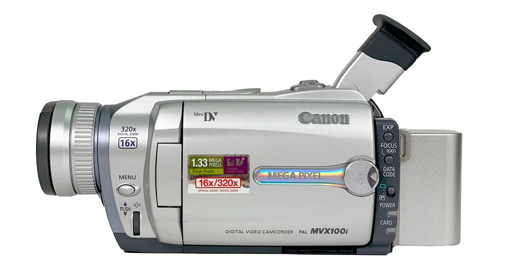
This adapter is called a Depth-of-field adapter, and here's how weird it looks.
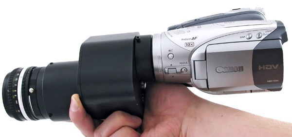
The idea is the following: we build a big "fake sensor" that's actually just semi-trasparent paper, and we focus the camera lens onto that "fake sensor". Of course paper by itself is not going to "capture" any image, but we can then go on the other side and take a picture of the resulting image, like this:
This is a rather weird two-step process, if you think about it. It needs to have a first lens that supports a bigger sensor area, then you project to a big "fake sensor", and then you need another (smaller) lens that captures the image coming out of the "fake sensor" onto the actual, real sensor of the camera.
All of this works because "semi-transparent paper", when lit by the lightrays coming out of a lens, will allow us to see exactly what a sensor would see if it was placed there. The reason is that the "semi-transparent paper" scatters light randomly, and so it deviates the lightrays from traveling straight to traveling towards our eyes (and all other parts of the room).
Let's see what's required to build this in our scenario.
Firstly, we have the Charles lens, which has to see the world on one side, but should be within a box or something on the other side, so that no there's no light messing with our image.
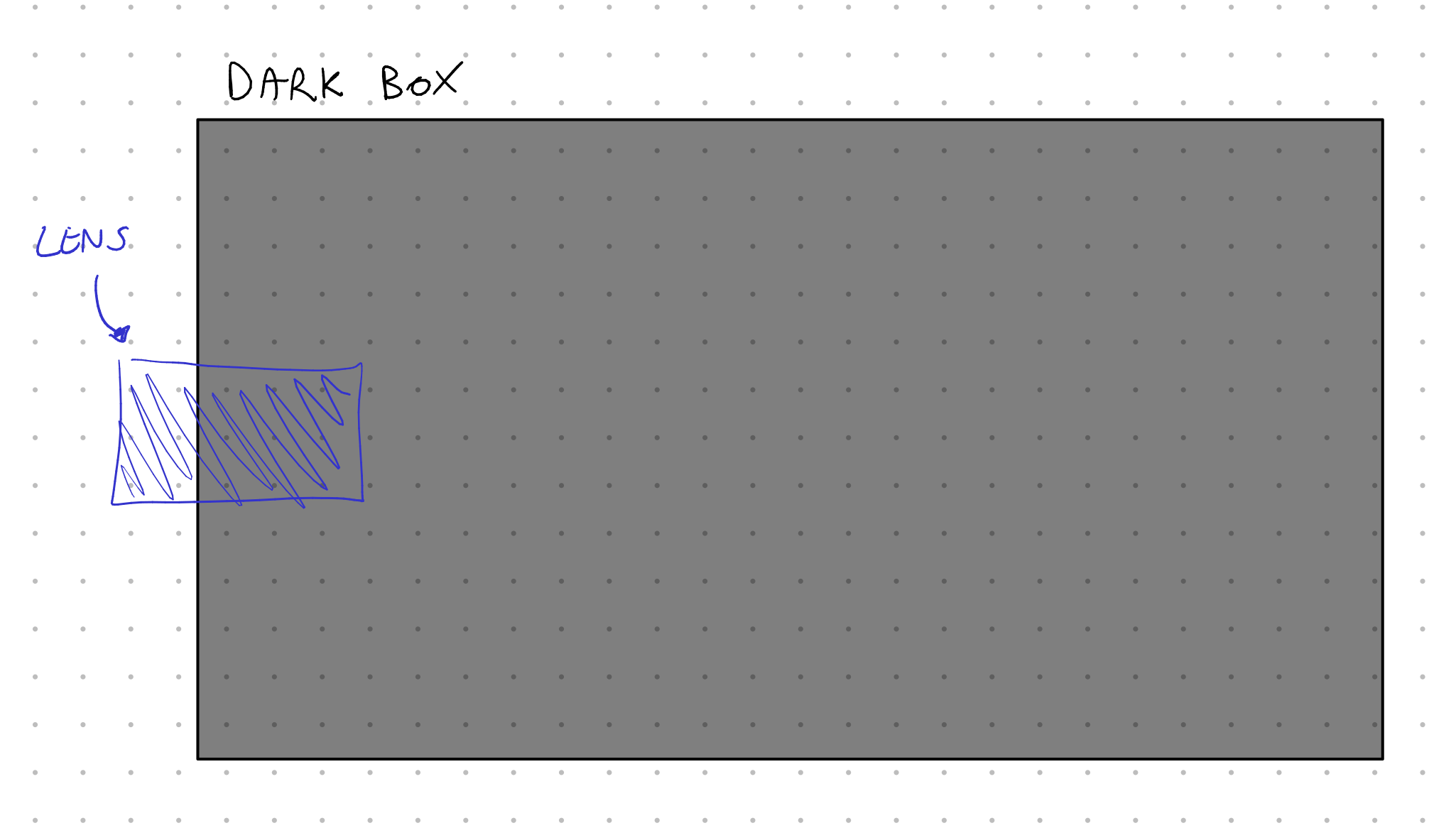
Then, within the box, there should be the 42cm by 29cm "fake sensor", and it should be made by some semitransparent material that scatters light without absorbing it. The Charles has a focal length 457mm, which tells us that the fake sensor should be at least 45cm away from the lens. Also, in order to focus the lens, this distance needs to be able to increase if necessary (even by ~2x!).
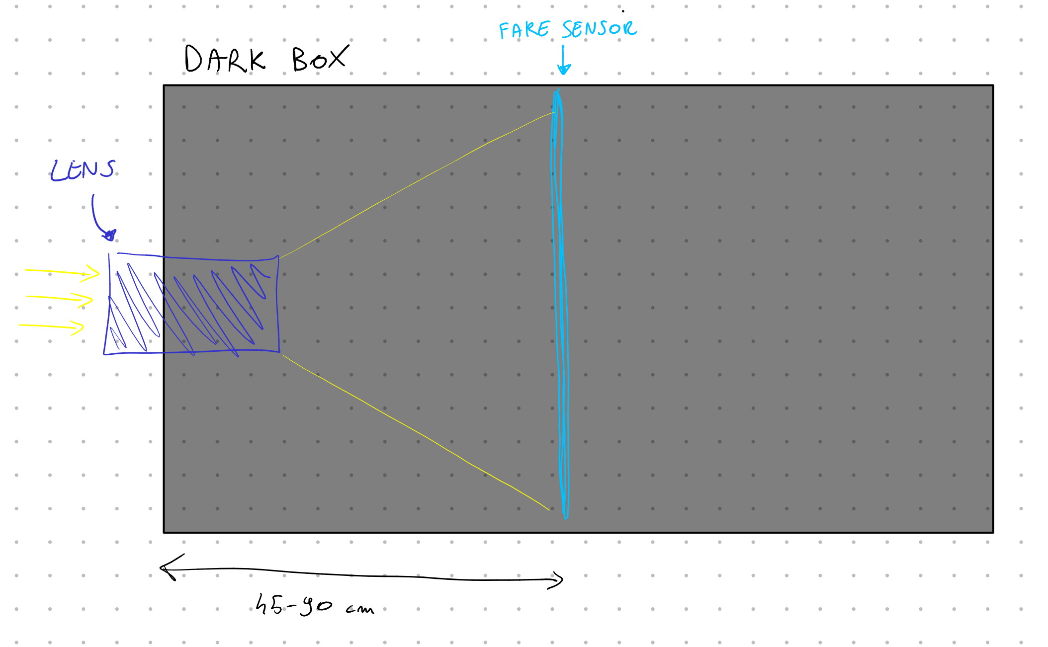
Then, beyond the fake sensor but still within the dark box (otherwise light will mess everything up), there needs to be an actual camera that takes a picture (or a video) of the fake sensor. The distance here depends on the exact camera and lens, but it's usually around 35cm.
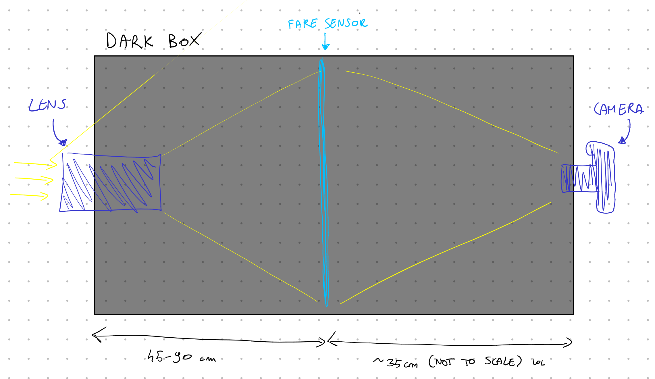
Great. Let's build this.
Since the distance between all components will need to be adjusted, and since all of these components weight quite a bit (the lens is around 3kg!), I decided to go with a metal sliding rail (more technically, a vslot 2080) for the base. Then, bought a few sliding plates for it, which have a variety of holes in them.
Let's start from the Charles lens; we need to hold this lens at a certain height and attach it to the base plate. My solution was to hold a second plate up through some long screws and nuts to adjust the height. Then, to hold the lens, I found a couple of telescope holders which have three axis adjustments and support lenses up to 15cm. They had holes in the bottom to screw them onto the plates. Then, I can just insert the lens within the telescope holder and tighten the adjustment screws all around.
Then, on the opposite side, I went with the same idea to hold my actual camera; however we didn't need any telescope holder here, as there's a ring holder for my specific lens which can be just as easily screwed on the base plate.
Onto the fake sensor, then. Firstly: what should it be made of? I tried the following.
Paper. This does not work, as it captures almost all light that it receives, and thus you cannot see through it.
Papier-mâché. This lets some light through, but still very little, and it adds a very heavy texture to it. Also not ideal.
Baking paper. A surprisingly good solution, but it still doesn't let much light through, and you can see a light texture. Still, this is great for quick prototypes, and I used quite a bit of it.
IKEA PUCKELFLY. This is a frosted window film, which does roughly what we want, since it lets light through but also scatters it. This worked pretty nicely and was a great option to me, but it also introduced some heavy texture to the image, as you can see the grains in the image.
Wax. This almost sounds like a joke, but if you're able to create a ~0.3mm thick layer of melted wax, this should act as a great scattering surface that still lets a lot of light through. I spent quite some time attempting this, but I was ultimately unable to create an uniform layer. I still have kilograms worth of wax and I'm not sure what to do with it.
Homemade frosted glass. There are a few ways to achieve homemade frosted glass, and the easiest is to use some fine grit material between two sheets of glass and rub them together. I had issues finding the right grit, and was ultimately put off by the amount of work that this option requires. However, it's also the option that should provide the best results.
Photographic diffusion film. Okay, context: when you have a small but bright light, this will cast a very hard shadow, like the sun. Sometimes, you instead want to turn this into a bright, large light, that casts softer shadows. The easy way to do that is to put a diffusion film in front of the light, which will diffract the light around and effectively act as a bigger, softer light. This layer should absorb little light by design, and it's available in most photography shops. It's also relatively cheap, I paid 10€ for it, it works well. The only issue is that there's plenty of options, and all of them have some texture to it.
After much experimentation, I went with a "Lee Filters - 251 - Quarter white diffusion", which provided the best results for me. Note that it needs to be kept between two layers of glass, since it's a sheet of film.
Next up, I need some component that keeps the layers of glass and attaches to the base plate. I decided to go with a 40x30cm picture frame. The benefits of this choice are that it's a standard size that's easy to find glass for, and there's plenty of frames too. There's also a drawback: cameras don't record in a 4:3 aspect ratio, but rather (in opengate) 3:2, a bit wider. Thus, I'll have to either record more area and crop, or only record part of the fake sensor. It's not a big deal.
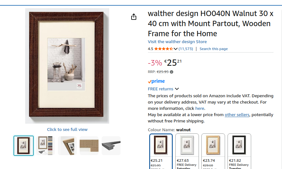
In order to secure the picture frame I simply used a few screws. It's more stable than you'd think. Note that, just like for all components here, I went through multiple iterations and the frame that you're seeing is, like, the 5th different picture frame I bought.
Now, we're finally able to position all components correctly! It sounds simple, but it took months just to get to this step. I had to receive most components from China and go through multiple iterations, but we got there. Now, for the hard part. We need bellows.
Camera bellows are these components that can change their size but remain rectangular in shape, allowing to change the distance between lens and sensor but without letting light in. They. Are. EXPENSIVE.
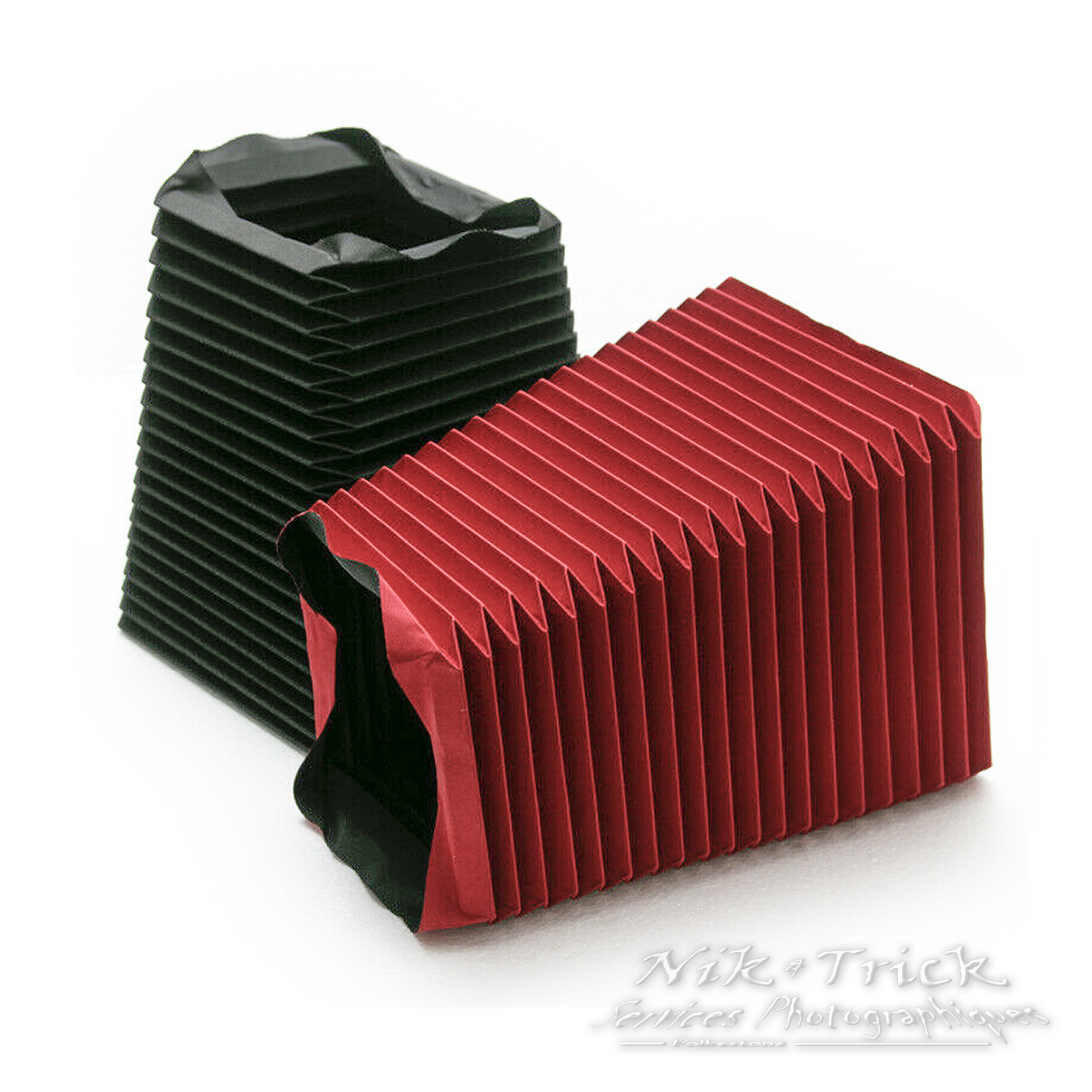
Luckily, it's easy to manufacture a small bellow. Sadly, we need an enormous one, and we still need to manufacture it ourself.
There are multiple ways to do it, (and I've tried them all!), but I'll keep the details light here. The general idea is that we need some materal that can bend (such as paper), but within it we need some places where it can't bend. Usually this is done by attaching precisely cut cardboard onto some paper.
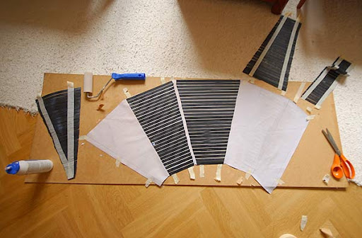
Then, you can bend specific parts to make the bellow. This is a rather time-consuming and fatiguing process, when the bellow is as large as I needed it to be! But, after much thought, I was able to come up with two tricks to simply it.
Firstly: all bellow images I've shown you so far were of bellows where the entrance rectangle is bigger than the other side, and thus they have this trapezoid look to them. This is appreciated, since we've got a 40x30cm sensor on one side, but the lens on the other side is much smaller. However, this makes them harder to manufacture, so I decided to go with a much simpler bellow that's 40x30cm on both sides.
Secondly: I used IKEA curtains. No, I'm not kidding. Meet the SCHOTTIS.
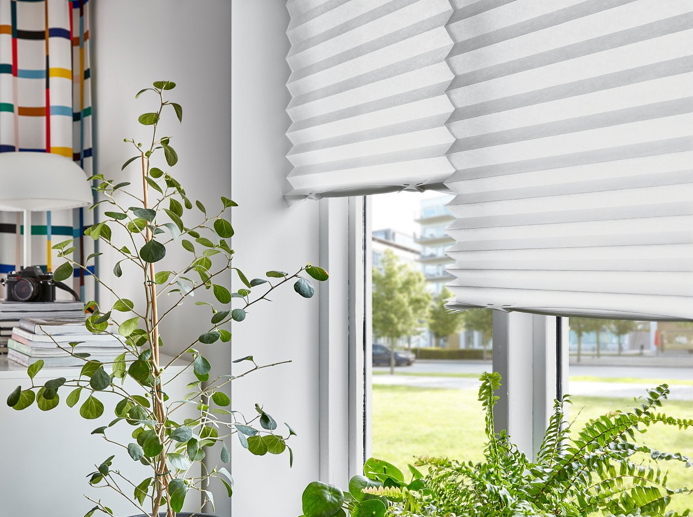
This curtain is provided folded in ~3.4cm stripes, and it's available in a black color. Since it's a curtain, it's also able to block light effectively, and since it's IKEA, one of the side is plasticized and thus tough to break or tear apart.
This makes our job much easier, as now it's just a matter of leaving the folds where IKEA intended them, cut the curtain into four different pieces, tape them together in a different direction, and re-fold the entire thing correctly. The final folds on the bellow are either the existing ones in the provided curtain (possibly in the opposite direction), or in the places where we cut the curtain, so everything else gets to remain more rigid.
This was still a multiple-hours-long process, especially since I had to manufacture a couple of bellows to test different properties. This year I decided to catch up with Severance and I'm not joking when I tell you that I watched the entirety of the first season whilst folding IKEA curtains, cutting them, and taping them together again.
Ultimately, I had my bellow. It doesn't look stylish but it works. On the lens side I placed another picture frame with cardboard inside and made a hole at the center, so that I had 40x30cm components on both sides.
Then, let's talk about the space between the fake sensor and the camera. There's no way that I'd make another bellow, but thankfully the distance here has to be fixed (depending on the taking lens). I measured the most convenient distance and made a cardboard element with the correct sizes. It's not as sexy as the bellow but it does the trick, and - if necessary - I can still insert the lens within the hole at various distances for small adjustments.
There's one final component to put in place. Right now everything works, but I get some heavy vignetting, i.e. the corners of the "fake sensor" are dark. This is expected: the frosted surface reflects some of the light, but most of it just goes through it and we don't see it.
There's an easy solution to this: before the "fake sensor", we can place a lens that will change the direction of the light from outwards to towards the sensor. This way, most light will still travel towards the camera after passing through the sensor.
However, you should see an issue coming up: a lens that's big enough to physically cover a 40x30cm sensor would require a diameter of 50cm. That's a gigantic lens: the Charles felt pretty big already and that was just 14cm. It would be extremely hard to manufacture and very pricey.
This is where lighthouses come to the rescue. Yes, you read that right.
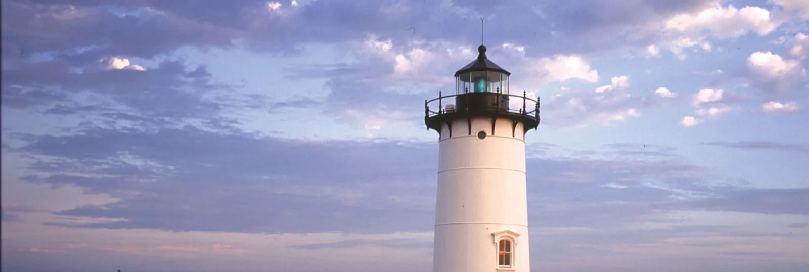
Each lighthouse has a big source of light; however, in order to make that light shine in the right direction and the maximum intensity, you also need to place one lens in front of it. However, a lighthouse light is even bigger than our fake sensor, and the required lens would have to be absolutely gigantic.
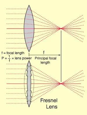
Because of this, a new type of lens was discovered! It's called a Fresnel lens, and it works similarly to a normal lens, but it's flat:
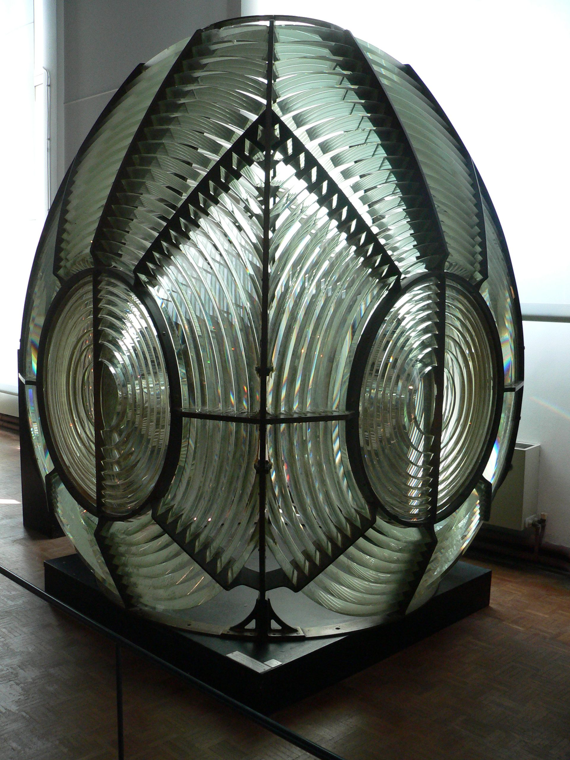
Thus, a lighthouse was able to use big flat lenses, which are much, much easier to manufacture, as they don't require huge chunks of glass:
Fun fact: you can actually see fresnel lenses in multiple places where a normal lens would be too big or expensive. As an example, my own building places fresnel lenses in front of exterior light to direct the light correctly!
Anyhow, the good news is that we can just use a fresnel lens without worrying about it affecting image quality, or being too expensive. They can be bought for cheap on Aliexpress. They come in various sizes, including (thankfully) 40x30cm.
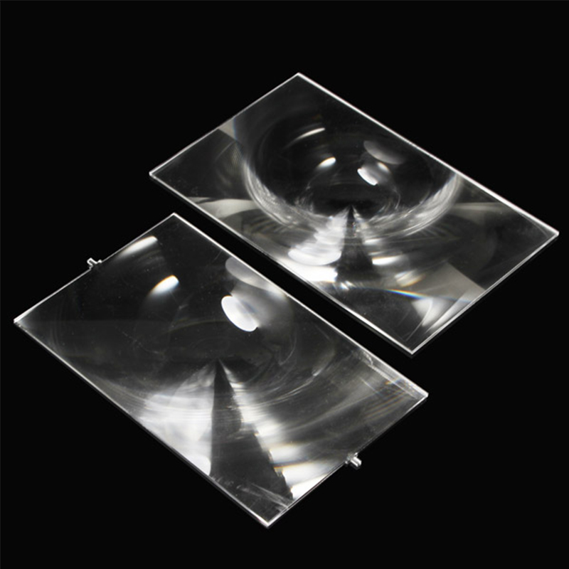
And that's everything really. Having placed the fresnel lens, we're not able to get an usable image on the whole 40x30cm sensor. The only thing that's left to do is, well, shoot some scenes with it!
The good news is that I had already planned to shoot a short film last month, so I brought this along and used it for multiple scenes that specifically required a very thin depth of field. I was genuinely shocked by how good the results were, and - amongst the many mistakes I've done in production - this was one of the few things I'm very proud of.
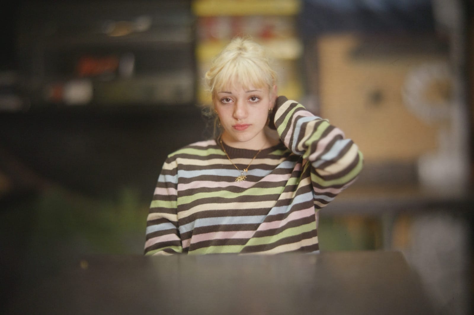
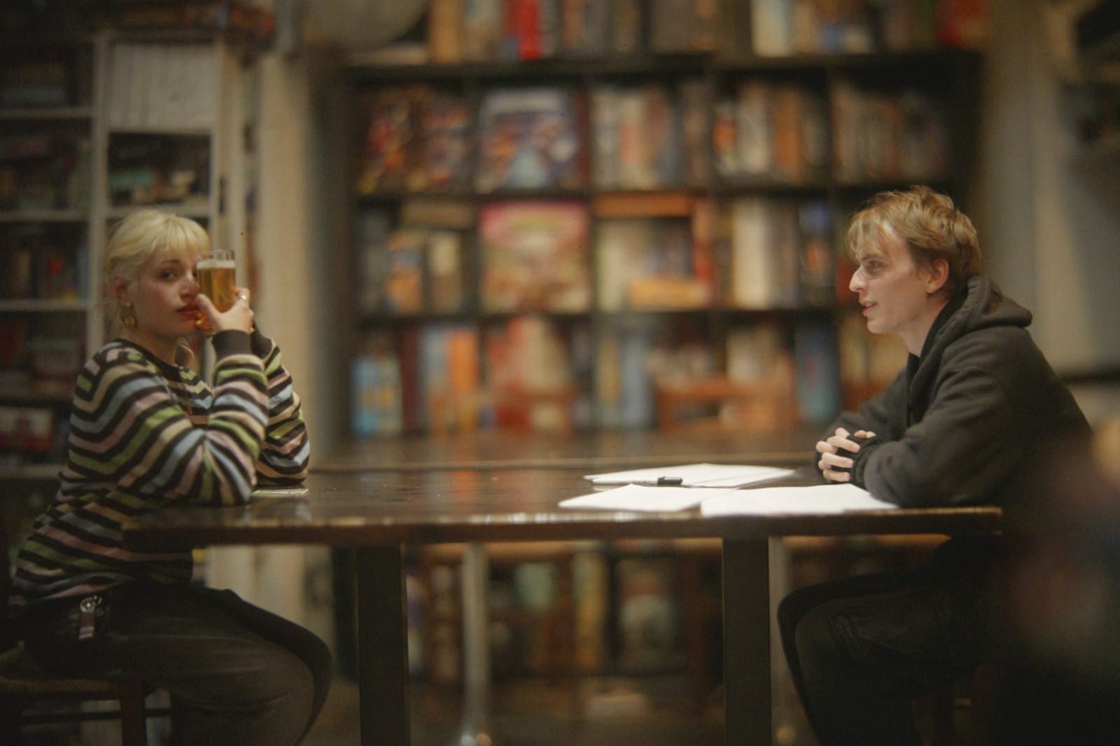
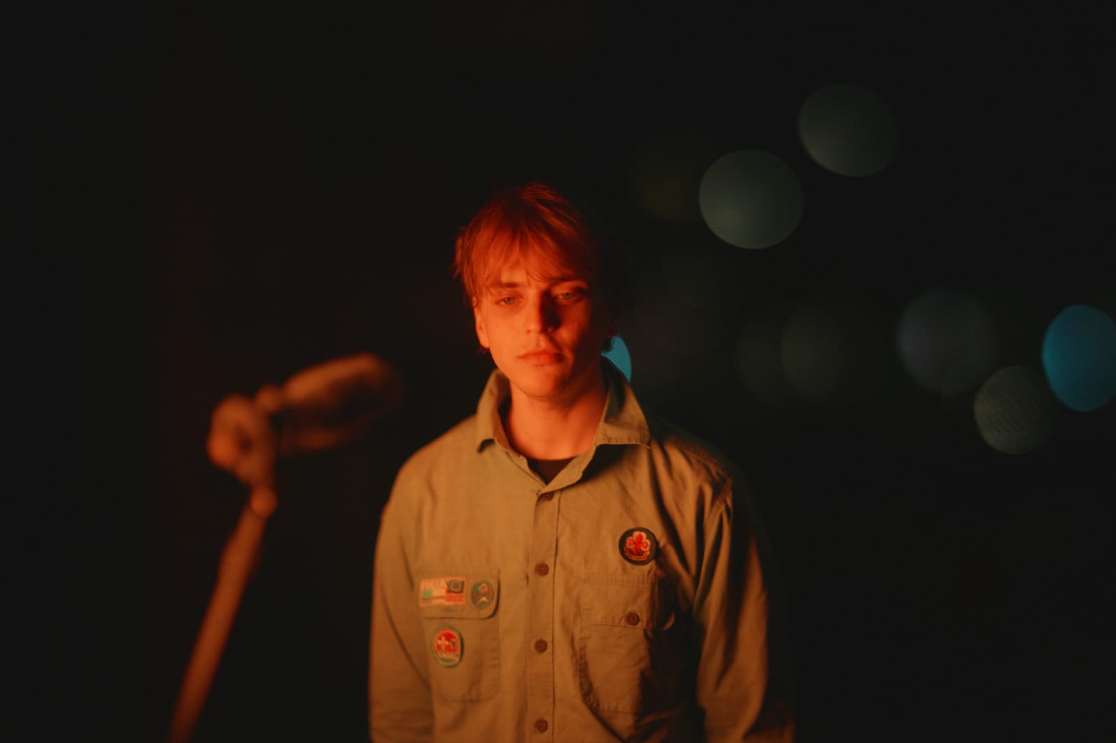
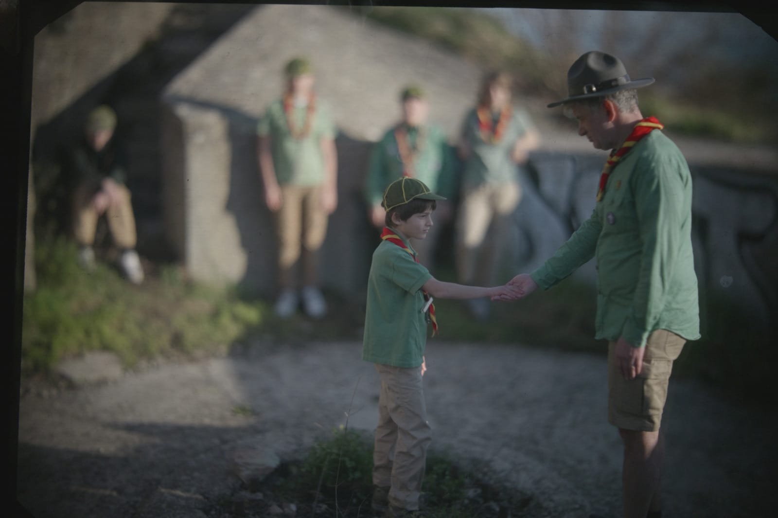
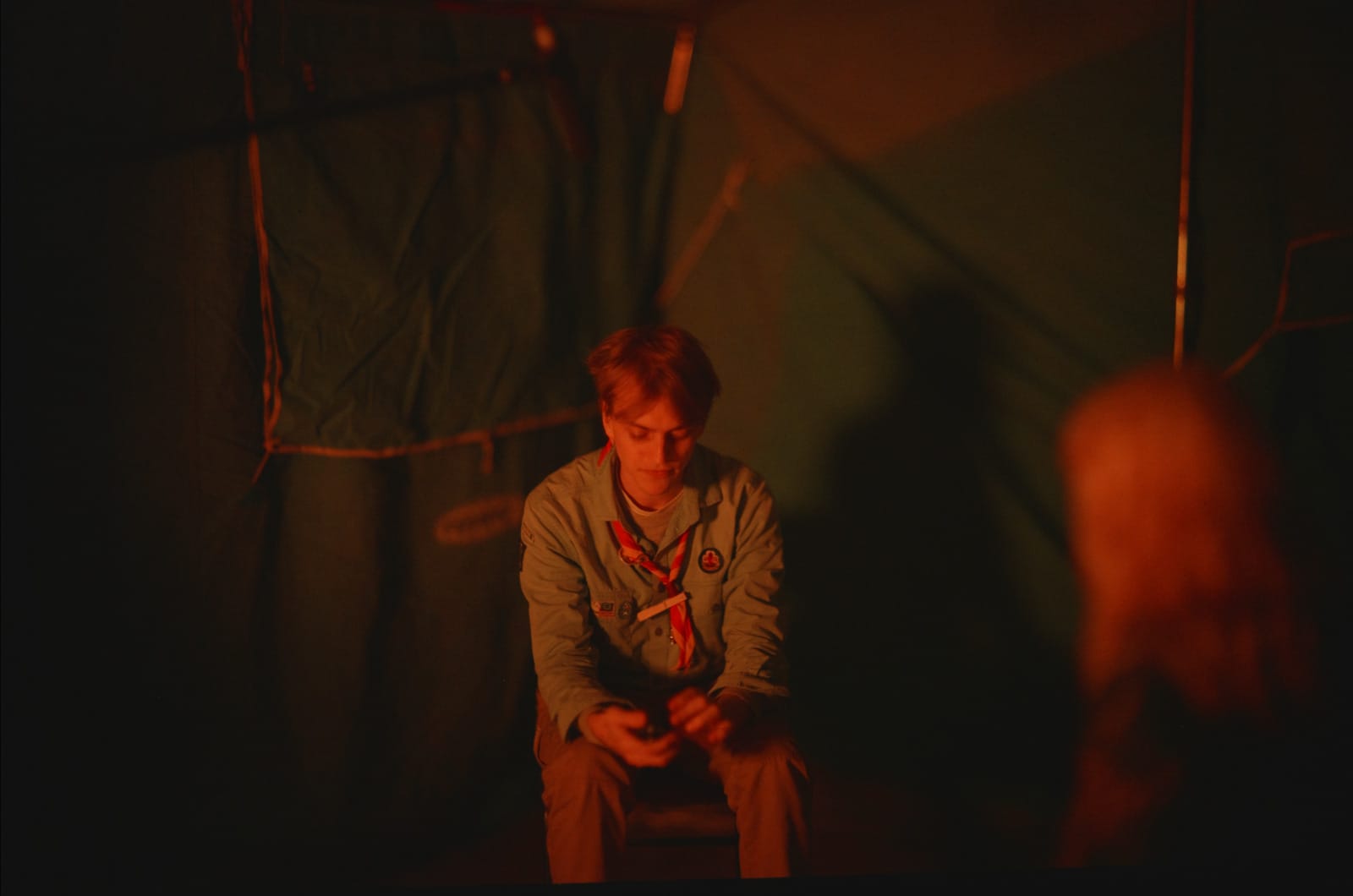
Here's some more pictures with an earlier prototype:
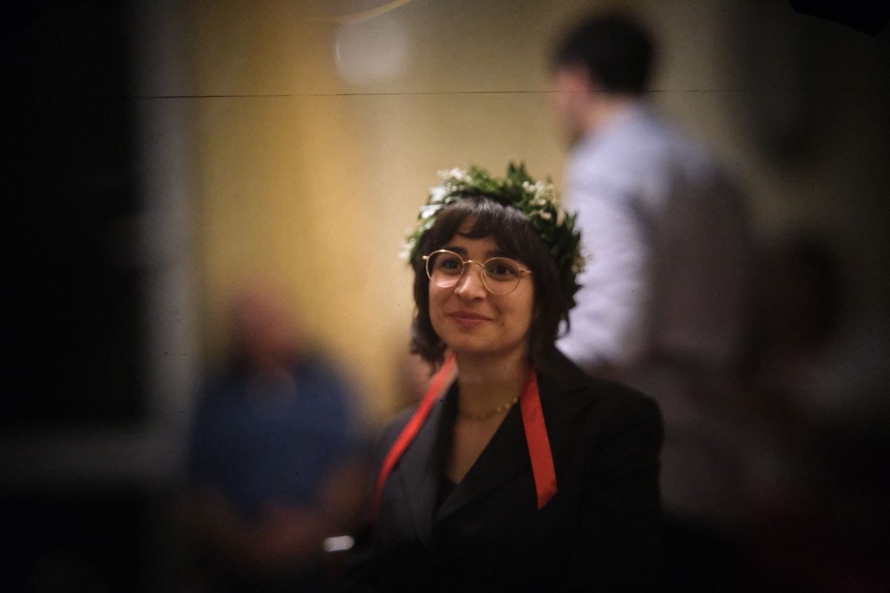
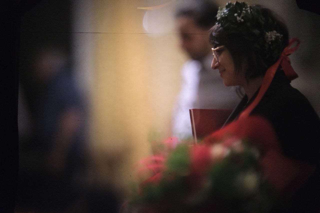
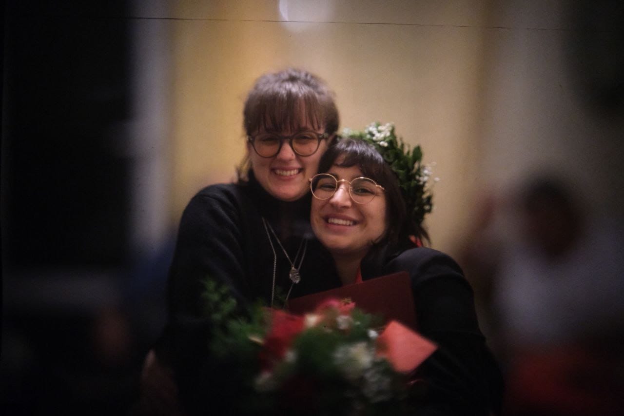
Now, there are a few details that should be improved in the next iteration of this system, which I've decided to call Lampone.
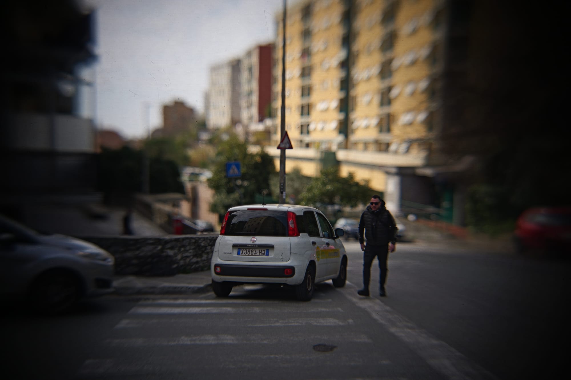
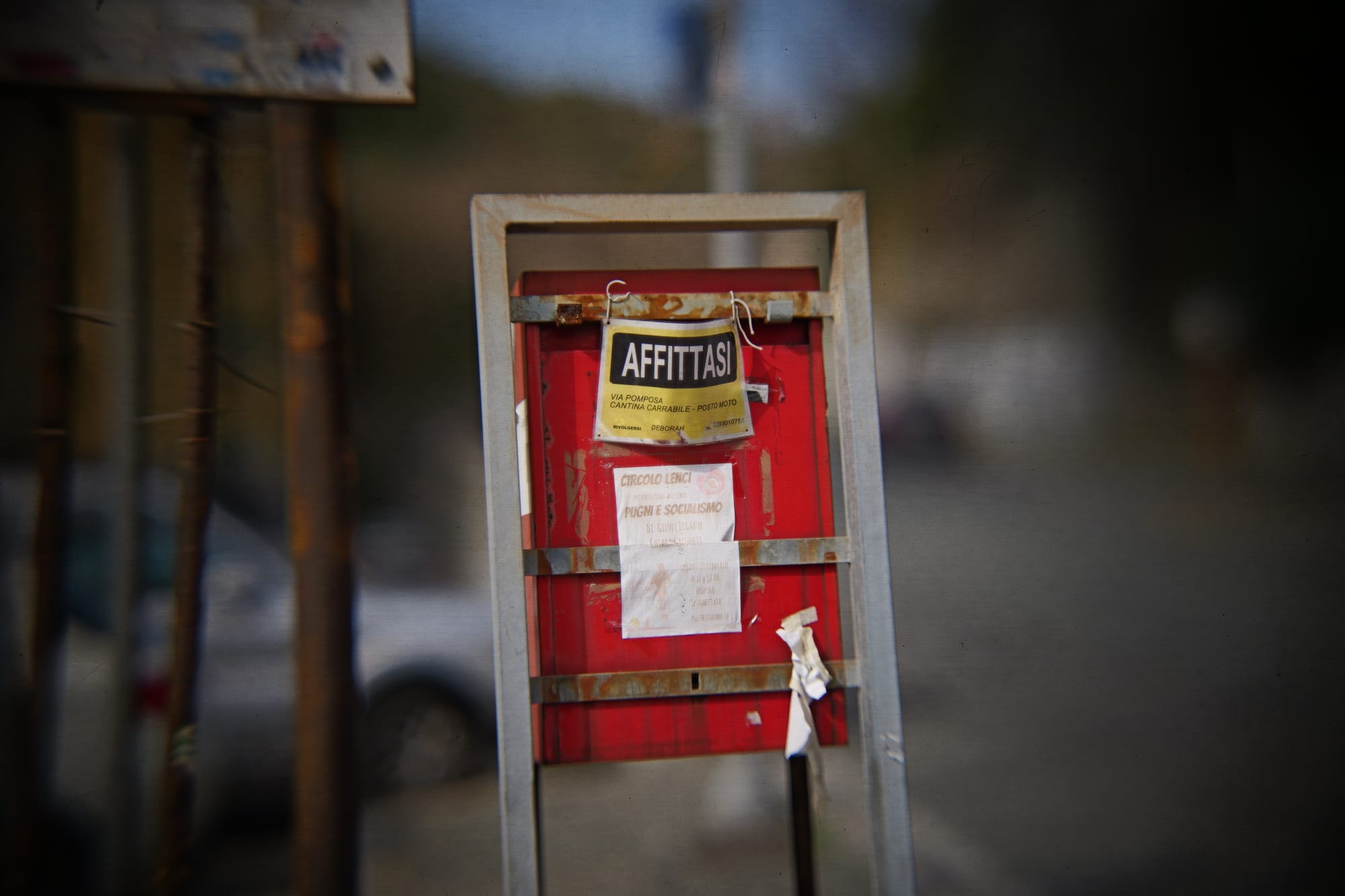
Firstly: I need to build a longer bellow and buy a longer rail. This would allow to keep the lens further away from the fake sensor, which would allow to focus on closer objects. Right now, the minimum focusing distance is awfully large.
Secondly: I should probably work on the structural integrity of it all. Any camera movement will generate weird wobblyness within the video too. Overall I thought it was reasonable and I've included a few pans in these scenes, but more stability would be beneficial.
Thirdly: you can definitively see the texture of the diffusion film, and even the pattern of the fresnel lens. You can fix the former by using better ground glass, and the latter by placing the fresnel lens further away from the diffusion film. There's also visible dirtness on the fake sensor; I didn't really care because I felt like it added to the image, but to get clean video you should be extremely careful when assembling this part.
Even if all of this was fixed, one remaining issue would be that this thing is huge. Not only it requires a large minimum focusing distance, but it's also 120cm long by itself, and it's pretty heavy too (my tripod could barely hold it). This is not a problem by itself, but it does mean that it's only possible to use it when there's enough room on set (and sometimes there just isn't).
Another intrinsic issue is that you are losing a lot of light by doing this. There's no way around it: scattering the light around in the fake sensor means less light reaching the actual camera lens. You should consider about a 3 stops light reduction compared to your taking lens, i.e. the lens that you use to photograph the fake sensor. That's a lot of light loss, sadly: scenes just have to be well lit.
Finally, I would like to thank the many people who posted details online about their builds. The video that inspired all of this is, of course, by DIY perks:
He named the build a "Next-Level Camera", so I decided to go with that name too. I think I went for a different enough approach that it justified its own video. There's also a great detailed video by Media Division:
I loved that they decided to include a second video for patrons with exact details for the components that they chose; it was really helpful when doing my design, though I eventually went with quite different takes.
And, finally, there's the F-Zero project too which tried to make this type of lens possible to be bought instead of just built at home:

I didn't quite have the budget for that, and I feel like I ended up with slightly better specs compared to the F-Zero, but the design by them is incredible and definitively an inspiration going forward.
Anyhow, I will be using this again, and I loved the experience. If you want to watch the short film: thanks! It's still in post-prod., but it should come out in a couple months. Feel free to subscribe to this website and I'll post an article when it is out. Also, if you need to shoot something with this camera or want to play with it a bit, feel free to reach out.
New Linux Hardware, France switches to Linux, and more!
 Liam Dawe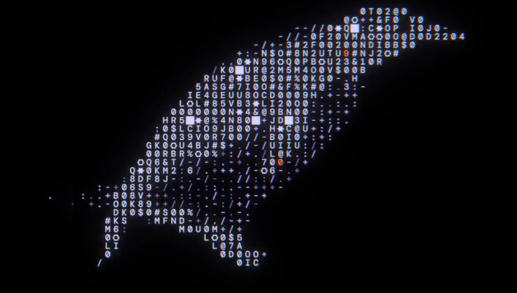
Framework is teasing new hardware, and this time around they seem to be particularly leaning into Linux support! That's a good trend, especially since Framework is also directly funding FOSS development. As an example, they've recently been announced to be a KDE Patron, which means they are actively donating money to KDE.
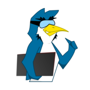
This upcoming event is happening on the 21th of April, one week from now. Along with the above-pictured white penguin that's prominently featured in their marketing of the event, there's also the following promotional video that makes heavy use of the "i use arch btw" meme, and showcases multiple distribution logos as well:
I'm so excited!
 Sourav Rudra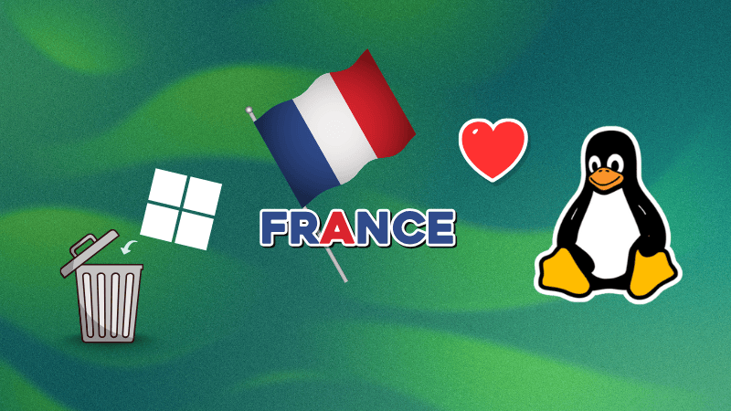
This is also great news, and probably a direct consequence of the current political situation. It seems that the French government wants to actively work towards digital sovereignty: the "national digital directorate" is migrating its workstations from Windows to Linux, the health insurance body is also working towards a transition to homegrown tools, and, according to It's FOSS,
Every French ministry, including public operators, will be required to submit its own non-European software reduction plan by Autumn 2026.
Of course, I'd be remiss here not to mention our fav 🇫🇷 Linux YouTuber covering this topic, though in a paid-only video. He claims that "The EU's move to Linux isn't for the right reasons, but it will still help"; I haven't had the chance to watch it, so I don't know whether I agree or not!
 Niccolò Venerandi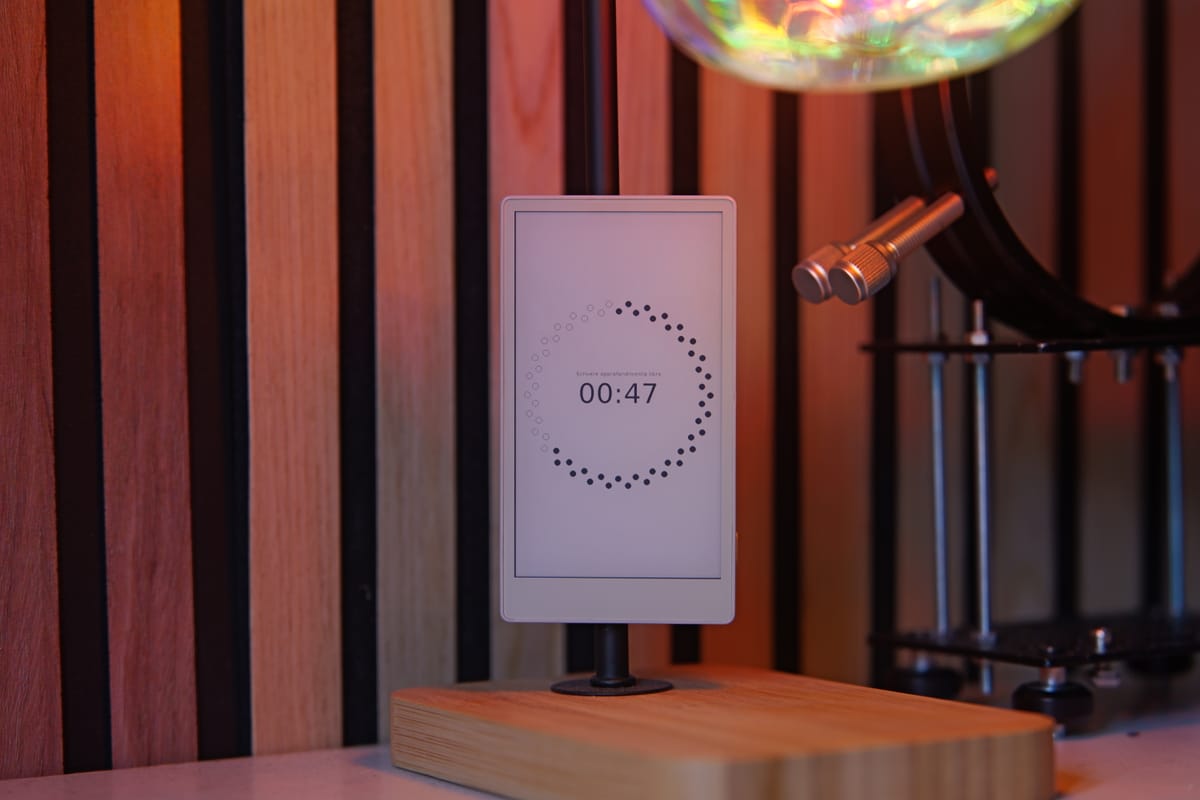
I'd like to briefly link last week's post by me if you haven't seen it! It talks about how I bought a e-ink devkit and built a tasks & events (& budgets) manager from scratch in MicroPython. It's something I wanted to talk about for months, as it's probably one of the best well-being projects I've worked on.
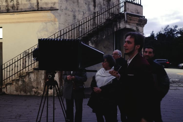
This week I'd also like to talk about another personal project of mine, which is however unrelated to FOSS tech. I won't spoil you the exact topic, but it's related to photography, and it's something I used when directing my last short film!
 Joey Sneddon
Linux 7.0 has been released. This sounds like a major update, but as OMG! Ubuntu mentions,
The shiny new version number does not, however, signify anything special. Linus has always been upfront that kernel version numbers tick up when the minor number gets a tad unwieldy, not because a ‘milestone’ has been reached.
In the above article you can read the improvements that it brings (better swap subsystem, faster NTFS3 and self-healing XFS filesystems, etc); I would like to detail them to you, but I do have a rule not to talk about things I do not understand at all myself, so you'll have to rely on the original reporting.
It's worth noting that this seems to be the first release where Rust support is no longer "experimental", which is an important step forward for the project which somehow offended the usual right-wing Linux folks.
Talking about the Linux kernel, there's also a quick update on my article/video about how Linux handles AI contributions.
 Sourav Rudra
As reported by It's FOSS, Linux 7.0 also brings the official AI Coding Assintant policy, which - amongst other things - states that
AI agents MUST NOT add Signed-off-by tags. Only humans can legally certify the Developer Certificate of Origin (DCO). The human submitter is responsible for: Reviewing all AI-generated code, Ensuring compliance with licensing requirements, Adding their own Signed-off-by tag to certify the DCO, Taking full responsibility for the contribution. [...] When AI tools contribute to kernel development, proper attribution helps track the evolving role of AI in the development process.
I personally quite like this policy and I think it's quite reasonable. Here's a last quote, still from the above article, that made me chuckle:
We covered this earlier in the week, but Greg Kroah-Hartman (GKH) seems to have had AI-assisted fuzzing running in his kernel tree for a while now, in a branch called "clanker."
 The Servo Project Developers
This is a very quick update because I like the Servo project and I think it deserves some publicity: the Servo team has released version v.0.1.0 which is the first release that can be used as a library thanks to a crates.io release. The announcement states:
the increased version number reflects our growing confidence in Servo’s embedding API and its ability to meet some users’ needs.
In case you're out of the loop, Servo aims to provide a web ending that can be embedded within applications; it was previously developed by Mozilla for Firefox, but now lives within the Linux Foundation.
 Stevie Bonifield
Another quick update: the Electronic Frontier Foundation decided to ditch Twitter. They will leave the platform, since - according to their analytics data - the views dropped by ~30 times: they were reaching 50 to 100 million impressions each month, and they now only reached 13 million in an entire year.
According to the EFF, it still makes sense to be on "bad" proprietary social network platforms (such as TikTok, Instagram, …) in order to reach a wider public:
Our presence on Facebook, Instagram, YouTube, and TikTok is not an endorsement. [...] We stay because the people on those platforms deserve access to information, too. We stay because some of our most-read posts are the ones criticizing the very platform we're posting on. We stay because the fewer steps between you and the resources you need to protect yourself, the better.
According to them, the reason they decided to ditch Twitter is simply because it "is no longer where the fight is happening". I was initially skeptical of this choice, but if indeed they don't have a reach anymore, keeping their X presence might only be a liability!
Community Shoutouts
I'd like to dedicate a section of this newsletter to showcasing some plugins and themes from the community! My favorite one this week is this lyrics tool for GNOME:
 Joey Sneddon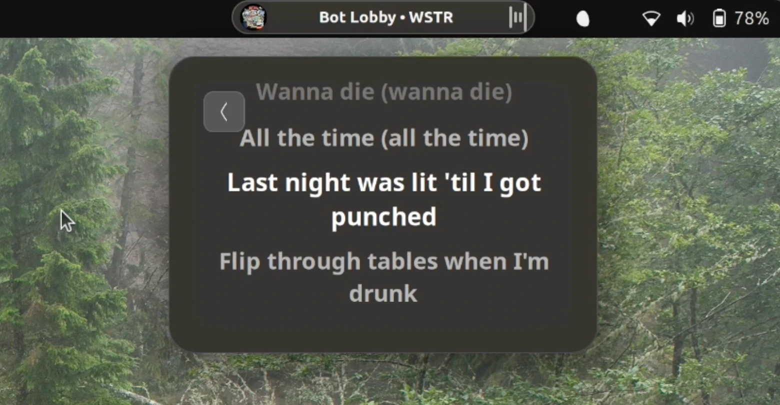
I'll admit I'm a bit envious of it, as a Plasma user. However, we do have this very cool productivity tool:
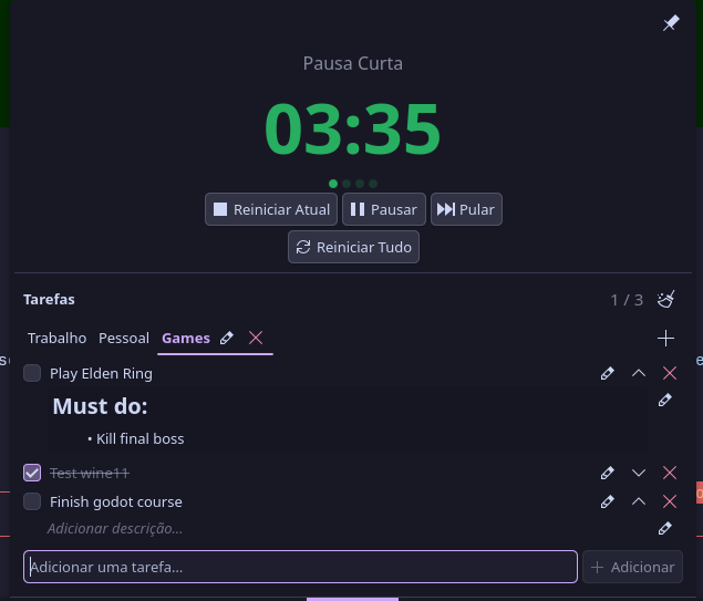
Which exposes both a pomodoro timer and a task manager within the same applet! Of course, I now have my own productivity stack, but hey, others might still find this useful!
If you're on the Plasma team, there's another couple of good news. Firstly, KDE Connect is now providing better integration between your phone and your desktop:
 Utopiah (Fabien Benetou)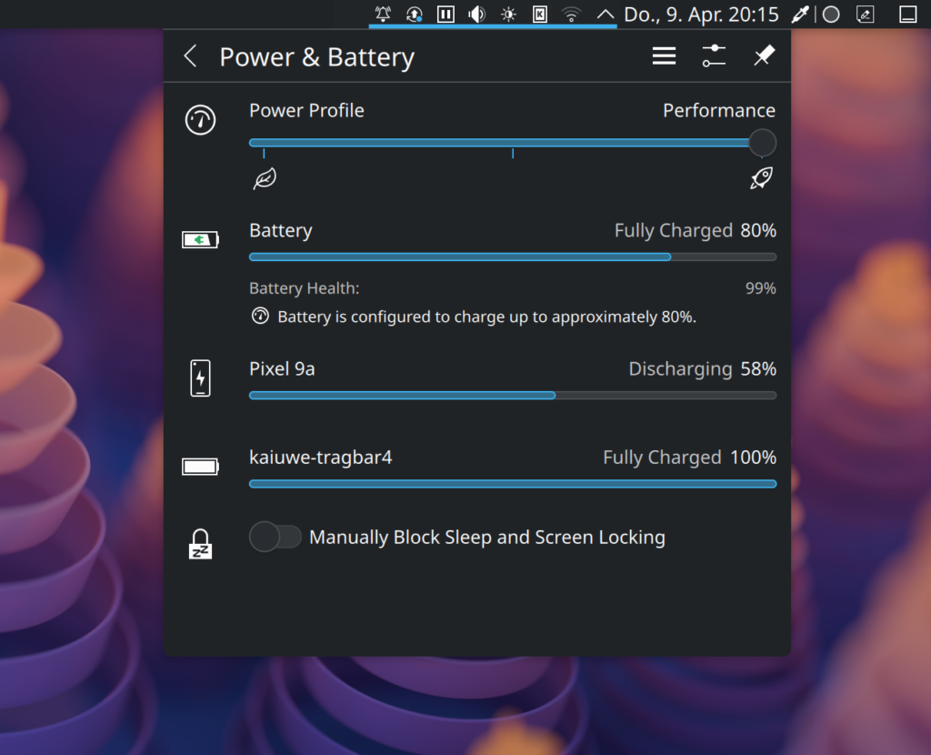
And, finally, there's a new release of Plasma Zones, implementing "Virtual screens", which "are a sub piece of the physical monitor's usable geometry (so minus panels)".
Thanks for reading, and see you next week!
I made the ultimate productivity device for less than 50 bucks
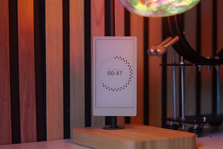
I do realize this website has gone a bit astray in the last few months, focusing more on hardware reviews than on FOSS news; however, as I slowly turn back to what my job should be, I would like to dedicate a few articles on some personal projects that I've developed in the past few months and that I'm particularly proud of.
Therefore, meet Mirtillo.
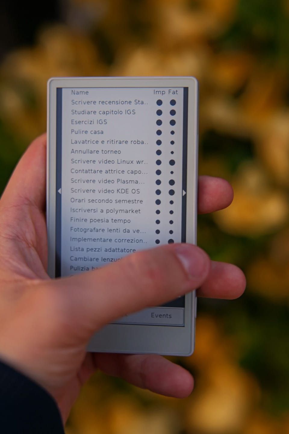
Simply put, Mirtillo is a digital agenda. It keeps track of what you're doing, your open tasks, events, it suggests you a schedule to follow, and it keeps track of your budgets. Its code is open-source and, well, I wrote it.
Let's take a step back. This story begun in January, when I realized I was still mostly unhappy with my events and tasks handling. My workflow was the following: I added everything I was meant to do and my events into TickTick, and at the end of each day I would take a few minutes to schedule all of my tasks on my calendar, and I checked whether I was able to do all the tasks that I had assigned to that given day.
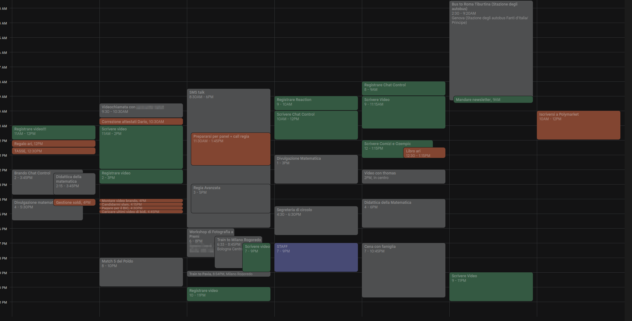
However, this made it quite easy to continuously postpone daunting tasks, and it was not particularly flexible: any unexpected event or delay in the day would make me much less willing to follow the schedule I had established. I'm the kind of person that heavily relies on these "productivity" systems to live my days, and I change them often; this year, I simply realized I had to go ahead and just build my own system instead of relying on apps that didn't truly understand me.
Initially, my goal was to build my own app. However, I don't know how to do that. It didn't make sense to me to learn the Android development kit from scratch to build a tool that was meant to better organize the plenty of tasks I already had to do. It had to be something that I could develop in a few days.
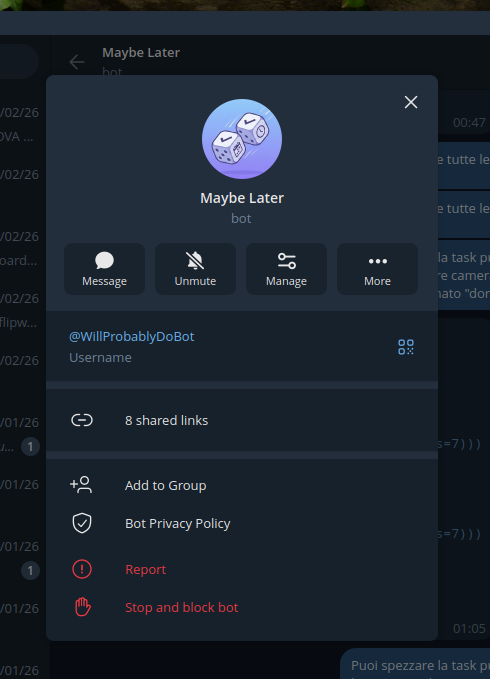
My backup plan was to build a Telegram bot. I spend much of my day on Telegram anyway, and there are an incredible amount of features available to bots there. I even made a solid mockup of how it would work, but I was mildly annoyed by the fact that there was no way to have some sort of "dashboard" on my home screen to see my current and future tasks.
This is when I started thinking of how cool it would be to have a dedicated, e-ink device that was entirely made for productivity. I don't know about you, but back in January my Twitter timeline was full of images of the X4 e-ink device, a little sexy thing that magnetically attaches to the back of your phone and has buttons to interact with it.
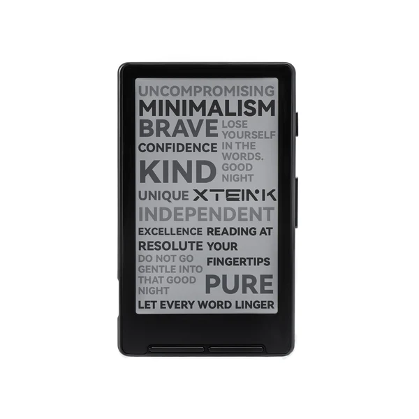
However, a few buttons would not fit my usecase. I needed more, and I needed to be able to write my own code. After some research, I found out just the perfect device to use.
This is a M5Stack Paper S3, a development unit that features a 4.7" e-ink touchscreen, a good 1800mAh battery, Wi-Fi and Bluetooth capabilities, a microSD card slot, a buzzer, and nothing else. It runs on a ESP-32 chip and costs less than 50€, shipping included. It's a steal! I immediately bought one.
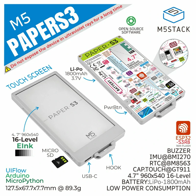
Oh, and the back is magnetic, so I can attach it to a great variety of metallic surfaces around me! This is a particularly great party trick, and the device as a whole is a good conversation starter (which, for an introvert like me, is a drawback!).
Developing applications for the PaperS3 is wonderfully easy. You can use MicroPython, which I was familiar with, and there's a half-decent documentation of the provided draw functions. The only drawback is that no high-level UI element was included out of the box, so I very much had to build the whole thing from scratch!
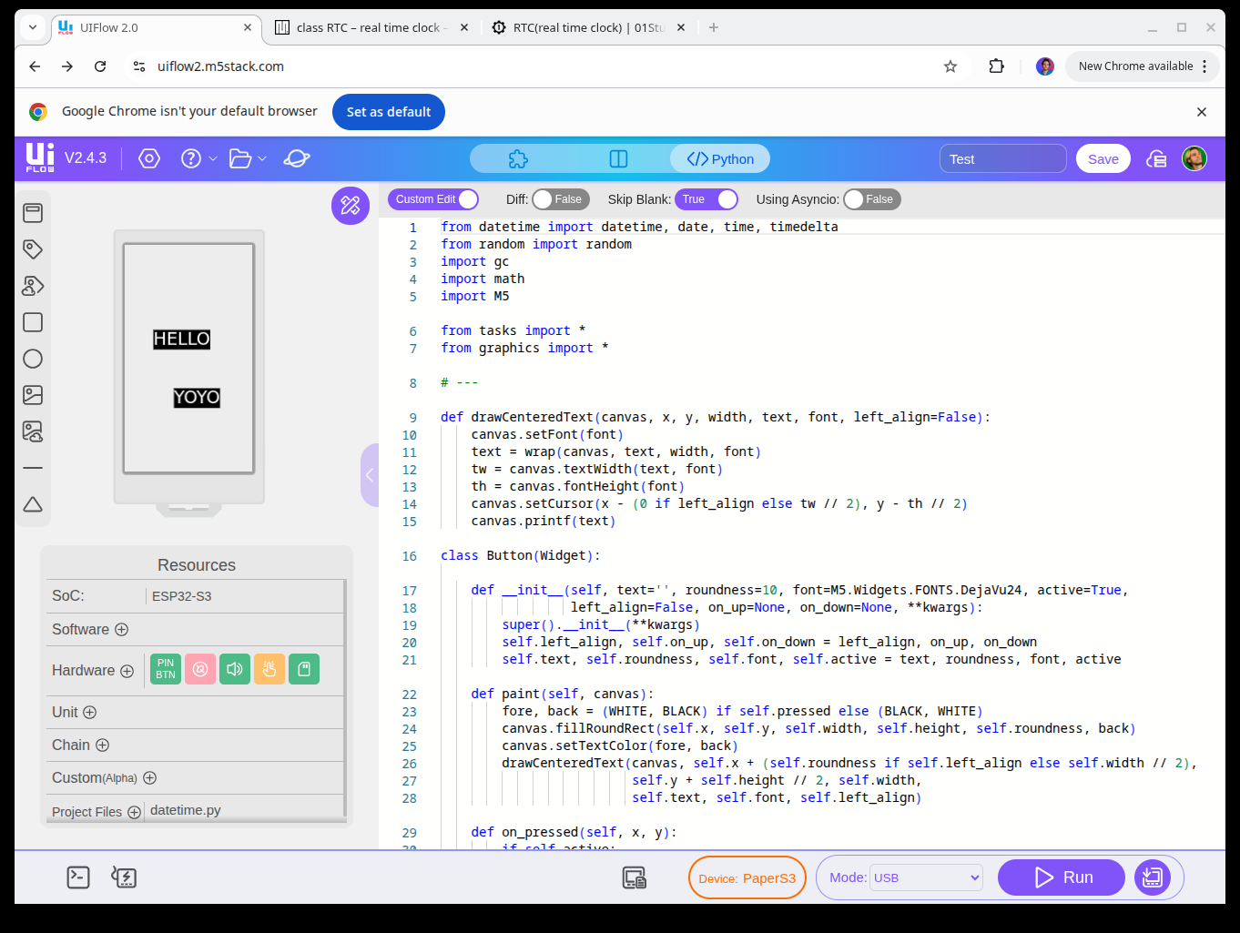
Luckily for me, the device was shipped right before my week-long vacation with my girlfriend. I brought my laptop with me and spent the whole vacation coding away, from each morning to each night. Surprisingly enough, my girlfriend never complained. I guess that after seven years of relationship she has sort-of given up on fixing this side of me.
That said: what exactly was I developing? It had to be something that implemented a specific workflow that was built on my specific needs and habits, as otherwise I could've just used any Android application. After much thought, I decided to go for what I'd like to call a "non-deterministic task manager". (The project was initially called Stochastic Tasks but my girlfriend didn't quite like the name so I changed it to Mirtillo, which means blueberry in Italian).
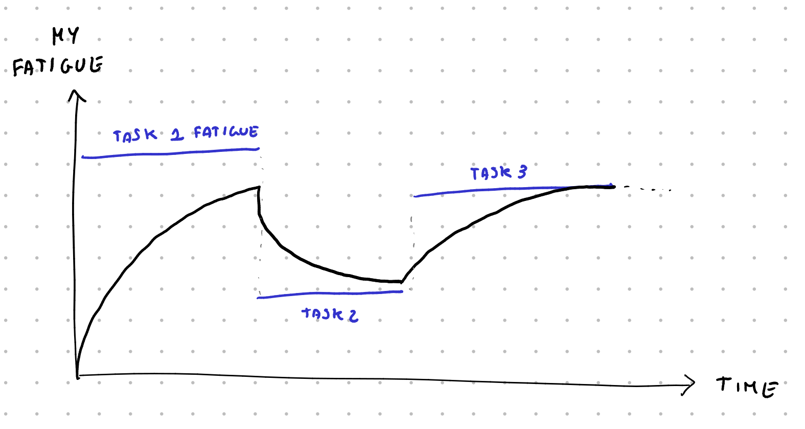
My model of myself was: I'm someone with a certain amount of events and tasks, both of which have a "fatigue" level (relaxing, low, medium, high). I also have a personal fatigue level, and doing tasks of a given fatigue will make my fatigue slowly match the one of the assigned task, depending on how long it is.
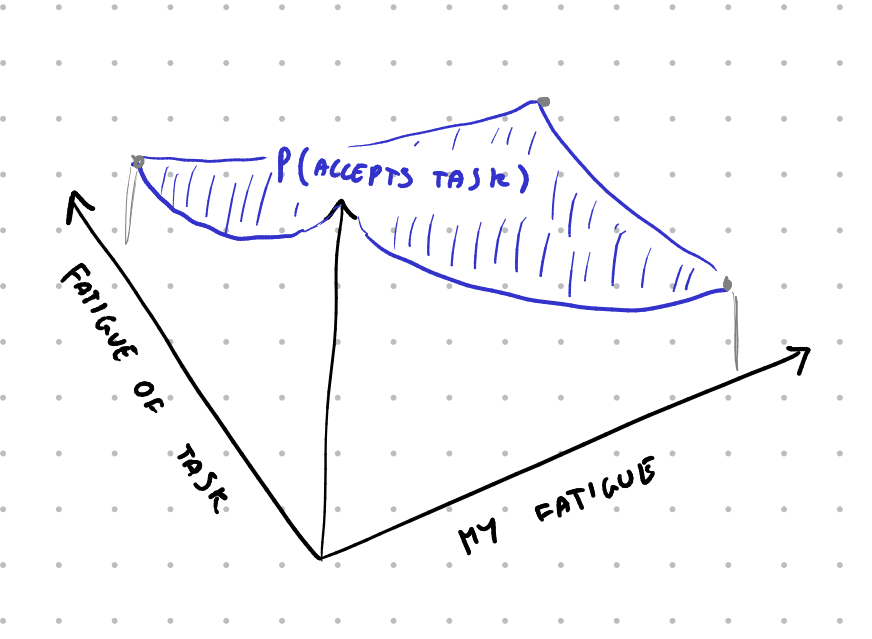
Now, Mirtillo can try to propose me tasks to do, but it knows that the less fatigued I am, the more likely I am to accept them. I initially wrote an hardcoded probability function here that depends on my fatigue and the fatigue of the proposed task, but the idea in the future is to track how often I actually decide to go for certain tasks and use actual probabilities.
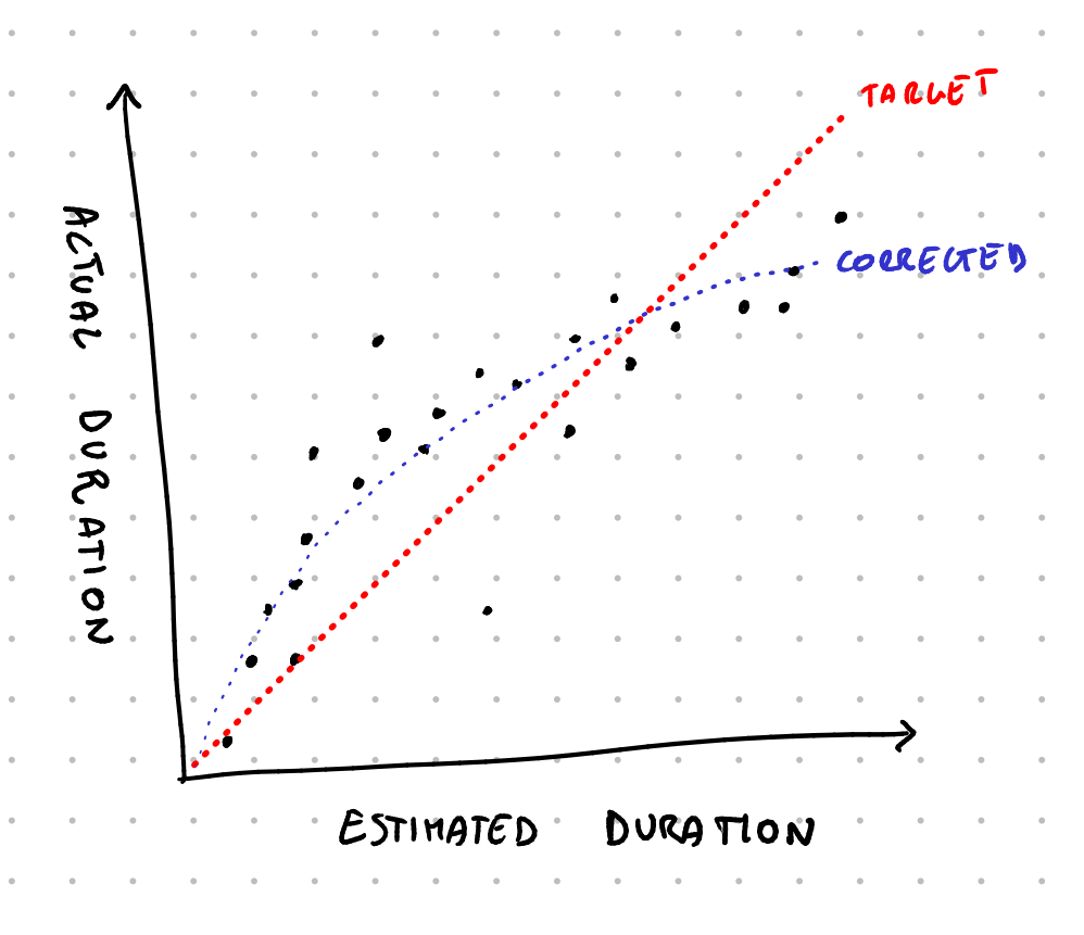
Furthermore, each task is assigned an estimated duration. Again, I'm initially blinding trusting my time estimation skills now, but the idea is to, over time, collect data on whether I over or underestimate the duration of tasks (and of specific recurring tasks) to have a probability curve of the actual duration of the task.
Finally, each task also has a value, which is based on how important it is (recreational, nice to have, normal, important, vital) and based on whether it has a deadline, a "best-by" date, and how long ago I created it. The goal then becomes: how can Mirtillo build my schedule around the given events by placing my tasks so that it maximized the expected value of the score of the next few days?

This is an extremely difficult task to solve in a deterministic way; instead, I decided to handle this as a one-player game with a very large branching factor (at each given moment I can do more than 20/30 different choices of tasks to do). And, as one naturally does in such a scenario, I went with montecarlo simulations.
The idea is: whenever Mirtillo has to pick a task to try to make me do, it simulates a random possible future by picking random tasks, collapsing the probability functions of tasks duration into a single value, and using the probability function of how likely I am to do the proposed tasks. It does this until the end of day, and then again, and then again, hundred of times. Then, it looks at the average score I got, and picks the top-level task that has the highest average score and suggests it to me.
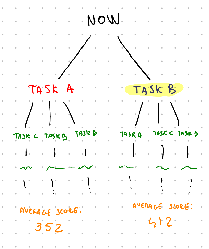
This has one big drawback: it's slow, especially on ESP32, so I can't run that many simulations. It also has may benefits, though: it means that I can collect data over time on how I actually perform and decide to do tasks, and that data will actually be usable to improve the simulations. It also means that, as an example, Mirtillo automatically suggests relaxing tasks in-between higher fatigue ones so that I'm more likely to actually stick to the suggested schedule.
So that's the idea behind the scenes. The user-facing implementation is much more simple, though. The application has four sections: Tasks, Clock, Budget and Events.
In the tasks section there's the list of all open tasks, with the importance and fatigue level of each, sorted by score. You add a new task or click on any existing one to see all of its information: effort, importance, duration, valid from, best by, deadline, repeats N times, and how often it repeats. As long as I maintain this list to be accurate, Mirtillo is going to do its best to propose me the best course of action at any given time.
The events section is almost identical: there's a list of tasks to do, with each having its start and duration. It looks horrible, I know, and I even know how to fix the UI using headers for the different days, but I haven't had time to actually work on it.
The clock section tells me the current task, how much time left it has, and the next event. I can tell it that I'm done, and it's going to ask me whether I want to generate a new item, start the next event early, or create a new event starting now. If I do choose to generate a new item to do, as an additional data point, I'm also asked how I'm feeling. In the future, this should also be used as a data point for the probability function of how likely I am to accept a given task.
The cool thing is that, since e-ink display keep showing information even when they're turned off, Mirtillo always shows the clock, even when I'm not using it. I made it so that it turns on every few minutes to update the number and then it turns off again. This way the battery lasts a few days, which is still not as good as I'd like it to be (it should be weeks... ) but it's a great start. Further power management optimizations are planned in the future.
Finally, there's the budget section. This is a somewhat recent addition: it's simply a list of values that I'm tracking and that increase at a given rate. As an example, I have a "small expenses" section value which increases at a rate of 17€/day, and I just subtract here all of my small daily expenses. This makes sure that I roughly spend around 500€/month of this category. There's a kcal tracker that works the same way: it slowly increases over time, and I subtract the estimate of the energy of each food I eat to check how much I'm eating.
This approach is extremely simple but powerful, I think. In the future I'd like to experiment with budgeting time in a similar manner: I could have a "minutes" counter that slowly increases over time, and each time I commit to some responsibility, I take off the amount of estimated minutes that it's going to take, to make sure I'm not over-committing my time.
And that's it. Mirtillo is a dedicated device that's the ultimate productivity tool for me, simply because it's built by me with myself in mind and it works exactly how I want it to work. Anytime I want to change some code I can just go ahead and change the code, and it only took a few days to develop. It certainly will require even more time to fully develop (the data collection part is still missing, and so is any kind of backup mechanism) but it has already helped my schedule the past three months.
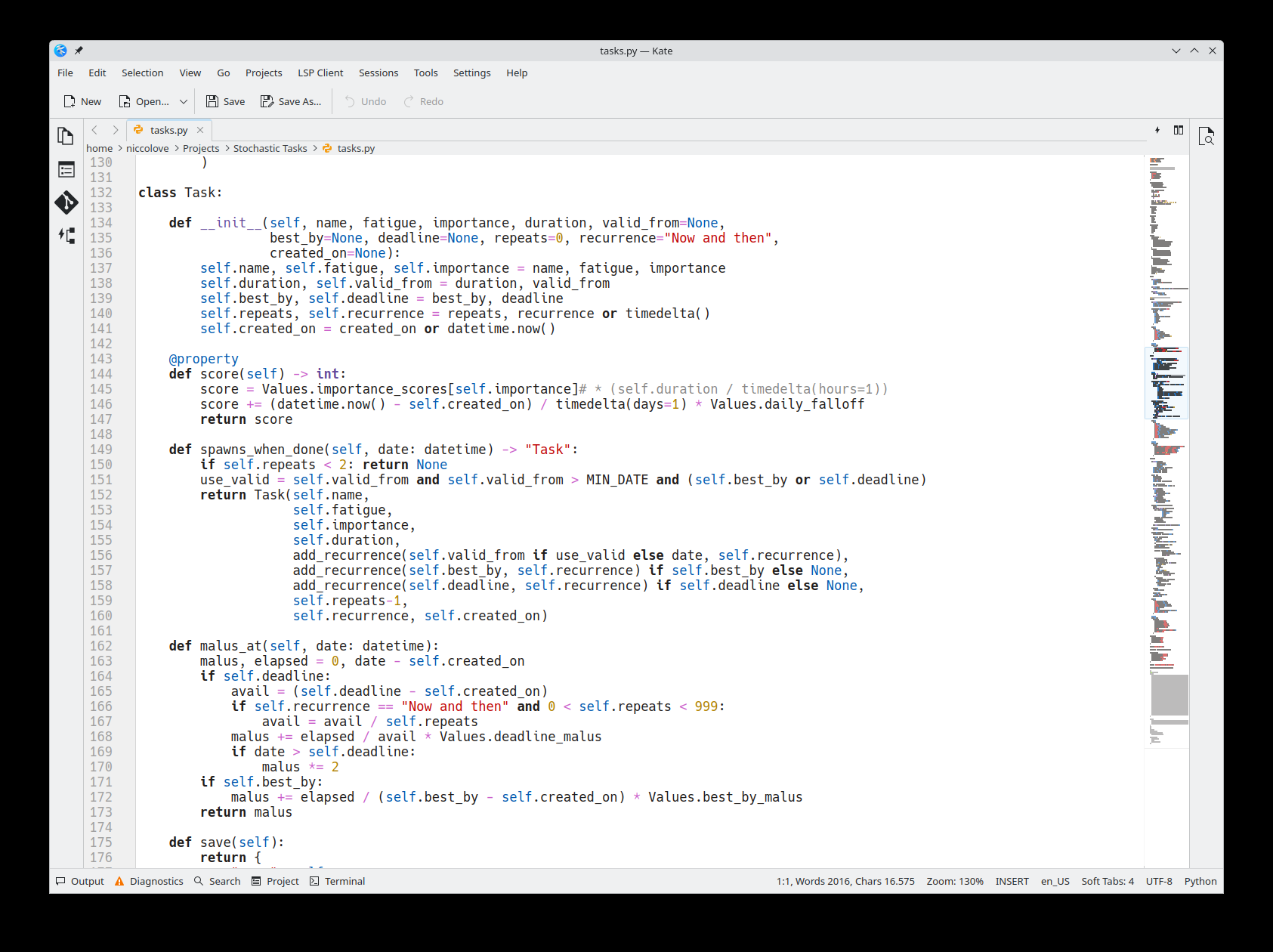
So, to recap: if you want to build your own productivity tool that works around your exact needs and wants, you can just do that. Sure, you do need to know a bit of Python, but honestly it doesn't get easier than that.
In next week's video I'll showcase the other cool new invention of mine, called Lampone (raspberry).
My childhood dream laptop
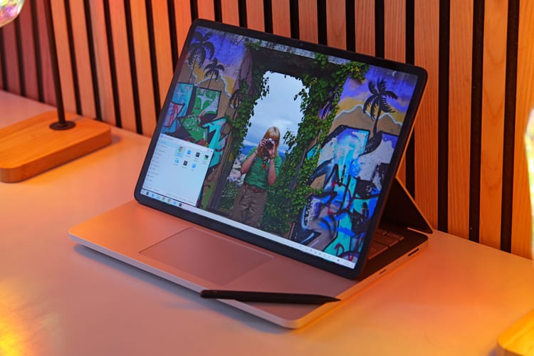
In my limited adult(-ish) life, I've only ever been genuinely excited for an hardware lineup once, and it was - surprisingly - Microsoft's Surface, between 2016 and 2022. However, I never had the luck to own any of their devices – until now; and yet, it's too late: Surfaces now only represent only a fraction of my childhood excitement around them, having discontinued and walked back on everything that made them unique.
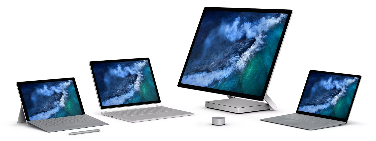
This article contains three important sections: firstly, I'll review the Surface laptop I have just bought - the Surface Studio 2 -, then I will tell you how Linux runs on it, and - finally - I'll tell the tale of the lost soul of the Surface laptops. (I'm an old man screaming at clouds at 24 years old already, ouch).
The Surface Laptop Studio 2
The Surface Laptop Studio 2 nails it. I love it.
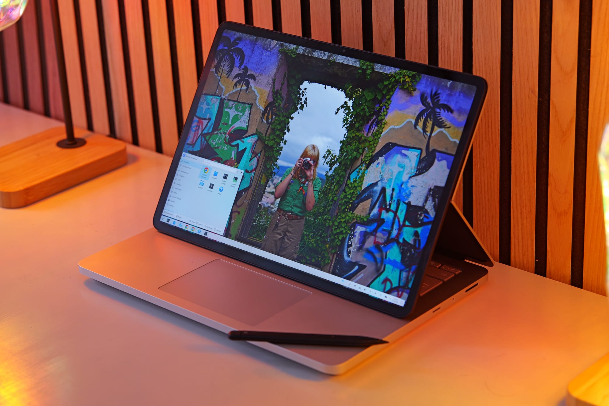
Let's start by its defining feature: the screen. By now, I have daily-driven both 360 degrees hinges and multiple detachable keyboard laptops.
Though I still love the form factor, they both have significant drawbacks: 360 degrees hinges require a full rotation to enter tablet mode, an action that's annoying enough that you'll hardly reach for it.
Detachable keyboards are easier to get into tablet mode (though, you'll still be left with an hanging keyboard) but are much worse as laptops, in the sense that they need a flat table to rest the kickstand on.
The Laptop Studio avoids both these issues by allowing you to "fold" the back of screen in half, letting the screen slide over the keyboard until it either rests above the touchpad, or lies down in a full tablet mode. This action is easy enough that it feels natural to do it whenever you want to be closer to the content you're watching and want to interact with it through the touchscreen, but it preserves the look and feel of a traditional laptop whenever your workflow doesn't require that.
Even better, you can even flip the screen entirely to lie on the back of the laptop lid. If you then rotate the laptop you enter a different tablet mode, where you get even closer to the screen (with no keyboard in-between). Or, you can use this to show the content of your screen to someone sitting across you.
This last example might sound stupid, but I actually had the chance to do exactly this: I was working with a colleague in a pub, and they had to verify that I had the correct video files to work on; instead of rotating the laptop so that they could see, it felt natural to me to just flip it.
The following day I was in the airport, doing some finishing touches on the project, when my gate was called for boarding. I did not want to close the laptop as the video was rendering, but all I had to do was to fold the screen on top of the keyboard, and grab it as if it was a tablet (with no detached keyboard to handle).
And even now, as I'm typing this review on a nightly transfer on a pullman with very little leg space, whenever I need to scroll some content to read through, it feels natural to me to just fold the screen enough to make it fit the available space.
None of this is groundbreaking: however, they keyword indeed is "natural", as if this laptop allow you to fold and open it as you need.
The screen is 120Hz and decently bright (it's meant to be HDR, but god knows if Linux handles that correctly). It's 3:2, which is the correct aspect ratio for a laptop. It's an LCD instead of an OLED, which saddens me, but considering that this laptop was released 4 years ago, I'll take it. We weren't ready.
It's a laptop that's built for productivity. It features two USB-C ports, a USB-A, headphone jack and micro-SD, which is all in all a great combo. In the few days I've used this as my work machine, I've used all of these ports plenty - except the headphone jack, and that's only because I forgot my wired headphones home and had to fallback to the higher-latency Bluetooth ones. My current work requires traveling, videomaking and video editing and the go, and this is the right hardware to do it with.
I've also had the chance to do some notetaking with it, and - through the Slim Pen 2- this laptop is up to it. I still don't think the feel of the pen is as good as it is on a e-ink device, but it was still an okay experience. The Slim Pen docks magnetically underneath the touchpad in a lovely way, and I have no complaints about it.
The keyboard is great. The touchpad is great, and haptic. I'll never be able to go back to a mechanical one. The whole build could be ever-so-slightly thinner (the bezels are quite big, the touchpad has empty space around it, …) but it's a nitpick.
This laptop has a Nvidia 4050 dedicated graphics card. How is it? Err, well, more on this later. Spoiler alert: it's probably one of my biggest regrets of this laptop.
Finally, battery life. This laptop is not good on battery life, but through some tweaking (including disabling the Nvidia card, hey, more on this later) I managed to get a decent battery life out of it. Browsing and light workloads will yield between 7 and 9 hours of battery life, and during intensive work - such as rendering videos - I'll get something like two, two and a half. It's half the battery life I'd be hoping for in a device like this, but ultimetly I need to surrender to the fact that the old power-hungry Intel chips are not it. I bought a 25000mAh powerbank that outputs at 100W and called it a (sad) day. More on this later, though.
Considering that I love its design and feel, I really think this is a great portable workstation. Which is probably why Microsoft decided to kill it two years ago, stopping its production without any successor. You're therefore able to find this laptop at a decent price on eBay, even though it was prohibitely expensive when it was first released.
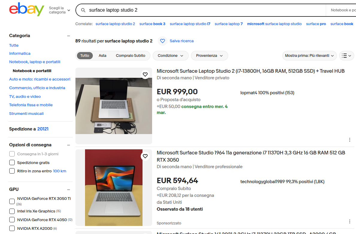
Now, before I move on: yes, there are multiple improvement areas for a laptop like this. The latest Phanter Lake chips would yield better or comparable performance at a much better battery life, the screen should have a tandem OLED option and smaller bezels, and the build should be overall thinner and lighter (this machine is thick!). Sadly, we'll probably never see any improved versions of comparable hardware: I'm not sure if there's any patent on the screen design, but no other company currently has this folding mechanism in any of their products, and nothing tells us that this will change anytime soon.
I'll have to move to a better laptop within a year (these new chips seem to be truly a step forward), but I'll probably keep this hardware on display to remind myself of what has been. More on this later.
Linux on the Studio 2
Making Linux work on Surface devices is as painful as you imagine it to be.
Firstly: I'm not running the standard Linux kernel, but rather the surface-linux fork that has some fixes for these machines. Switching over to this kernel allowed me to have touchpad and touchscreen working out of the box.
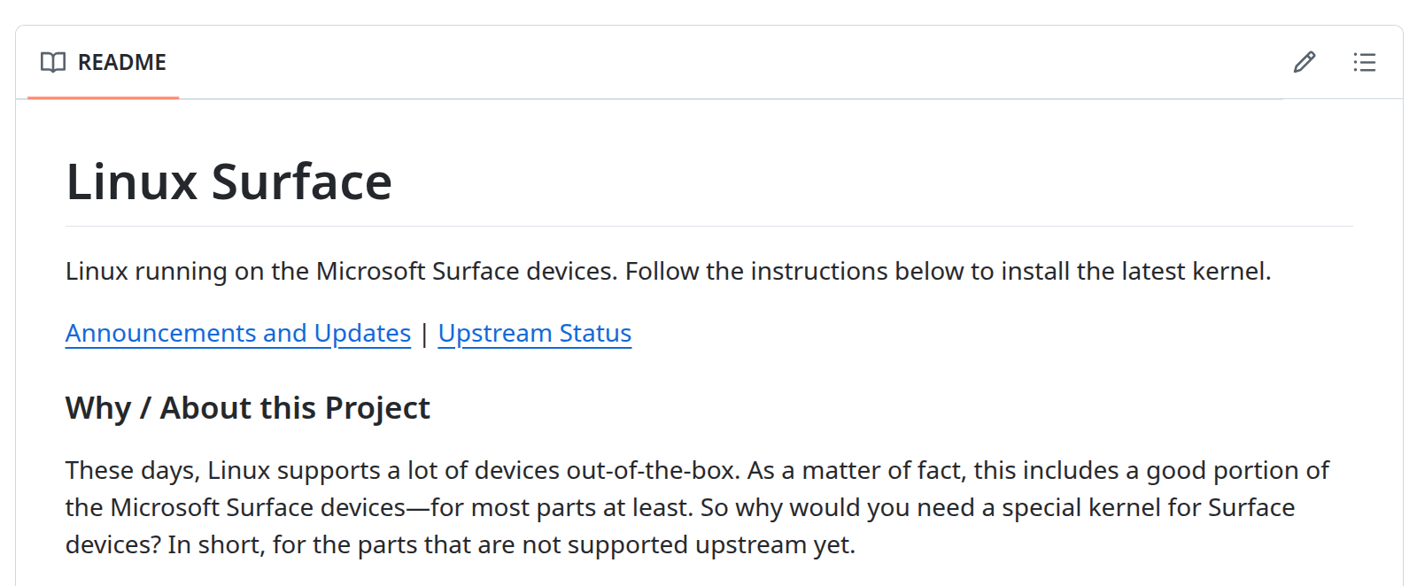
A surprising amount of components worked out of the box too: I had no issues with the webcam ((in)famously a pain points for Surface devices), or speakers, or ports. Wi-Fi and Bluetooth gave me no issues either, and (yay!) tablet mode was also detected. That's where the good news end.
Screen autorotation was missing out of the box; apparently, some sensor packages were missing. When I installed them, Ubuntu stopped booting. I had to remove the packages in a live boot. After some testing, I managed to get autorotation to work through the git versions of those packages. No idea what's up with that.
The touchpad randomly died during usage. This was particularly annoying, as I found no online references to this issue. Google Gemini suggested it might be due to the touchpad going to sleep and never waking up again; as a solution, it proposed a kernel flag to disallow components to sleep at all. That worked, and with some tweaking, I managed to make sure that battery life didn't take a hit.
Except it didn't fully work. Most of the times, the touchpad will not work when I boot the device for the first time in a long time; I'll always have to reboot the first time around. It's not a dealbreaker, but it's annoying.
Even worse, sleeping is currently all wrong. Letting aside the whole mess that Microsoft made by removing deep sleep (sigh), trying to close the lid will make the machine fire error messages non-stop to journald, keeping the CPU at 100% and draining the battery as fast as it can. Again, the Internet did not help me out, and Gemini was not able to handle this one either. So: I currently shutdown the device everytime I want to close its lid, which is obviously not ideal. Actually, it's a pain in the fucking ass.
There's also little issues here and there. Waking up from the little sleep that this machine gets with its lid closed takes a weirdly long amount of time. I also once got 15/20 seconds delays when booting for no reason, though I was mostly able to fix that (don't ask me how, though, I have no clue).
I'm confident that I'll be able to address most of these issues over time, but it's obvious that it will take effort and time; effort and time that would probably be better spent, as an example, by doing videos for you, and not by debugging this weird adolescence that this laptop is going through. Sigh.
One final issue is that, when the screen is detached and sitting on top of the touchpad… the touchpad should still working! I'm not sure if this is KWin disabling all input hardware when tablet mode is enabled or what, but I've found to way to override this behavior, and thus I'm left with a touchpad that's again useless even though it's right in front of me. Again: Sigh.
It's also time to talk about the GPU. Even though it's a Nvidia, it thankfully gave me no big issues on that side. However! This is my first time having a dedicated GPU, and I thought it would be nice to have one, given that my work is now all around video editing, raw images editing, OBS recording and such.
However, it turns out that my preferred video editor, kdenlive, does not support hardware accelerated rendering; the only task that can be handled by the GPU is the encoding part, which is not the bottleneck on my machine and yields no extra performance. It turns out that very few video editors are able to really take advantage of the GPU, the most famous of which is Premiere (which is proprietary! Not a big fan). A possible alternative is Shotcut, which allows for GPU accelerated effects through the movit package; I haven't had the time to test that out, but I'm also not exactly excited to switch to a new video editor (especially Shotcut, as I really don't like its interface - sorry!).
However, as great as Kdenlive is to edit program (it's feature-packed and easy to use, in my humble opinion), I'm having issues dealing with its performances. Even ignoring its speed (it sometimes lags when editing over proxy clips…), it uses an incredible amount of RAM, which is often higher than all of its project files disk size combined. Sadly I only managed to get the 16Gb version of this device (yep, that's on me) and it's soldered (that's on Microsoft, though). In order to edit a video without crashes, I had to set up 64Gb of SWAP on my SSD. It seems to work, but I fear that will create an additional burden on performances. Given that speed is a big constraint of this work I'm doing, I'm getting anxious enough that I'm now rendering projects by calling melt on the command line instead of using kdenlive's built-in render button. And, hey, it uses less RAM, I think!
And, of course, my raw image editors don't seem to benefit from running on the GPU either. Which makes me ask: as somebody who has a dedicated device to play games on, why on earth did I just buy a dedicated GPU!? The only task I seem to hardware-accelerate is OBS recording, which is the one thing that my CPU was handling just fine. I've even been wondering if I could open the device, remove the GPU and replace it with additional battery (obviously, I can't!).
Overall, I am left wondering how should I change my workflow to best address my quick turnaround on video project needs. I'm open to suggestions, and please do explain to me how I did not waste money on a dedicated GPU. Right now, I've just disabled it, and that has gave me some extra battery life. Maybe I should sell it for a quick buck. (Just kidding – I'm well aware it's soldered).
The Lost Tale of Surfaces
Now, I'm not going to keep using this laptop for too much time, I'm afraid. The latest Intel chip is such a generational leap forward that I'll probably switch to it as soon as some company I like (read: Framework) will ship with it.
However, I actually bought this device for a different reason: a (somewhat expensive) form of collecting. A few years ago, the Surface line was genuinely exciting, with many innovative ideas throughout their line of devices. Now, all of that excitement has been killed of and replaced with empty Copilot+ stickers.
I've spent a lot of time talking about the unique form factor of the Laptop Studio, but let me introduce you to the Studio itself.
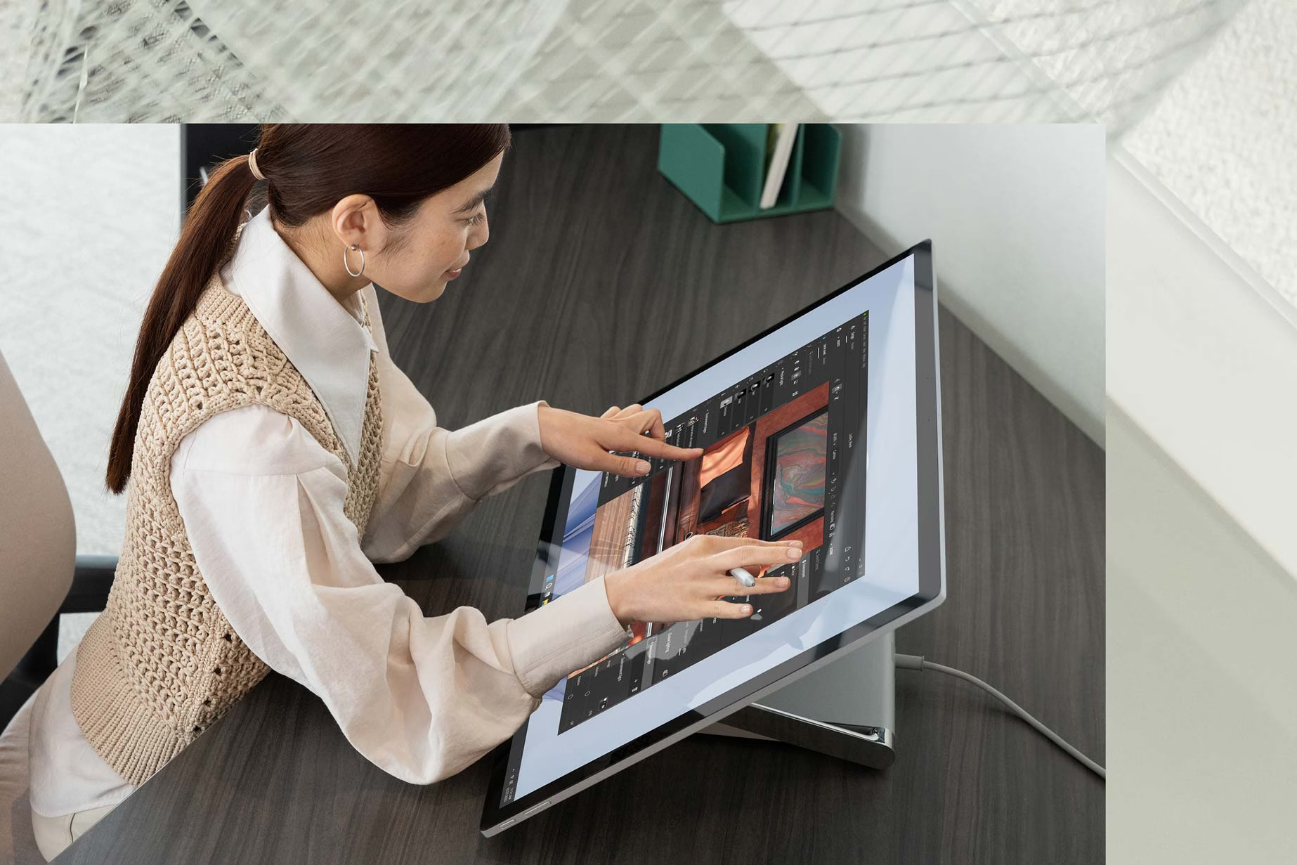
It's an all-in-one computer featuring a 28" touchscreen display that folds towards the user. This means directly interacting with the content, and as it supports the pen too, potentially drawing or taking notes directly on the giant screen. The design is sleek and the latest version was quite powerful, featuring 11th-gen Intel and dedicated NVIDIA cards. As someone who works on photos and graphics, this feels so exciting! (It was discontinued a year and a half ago).
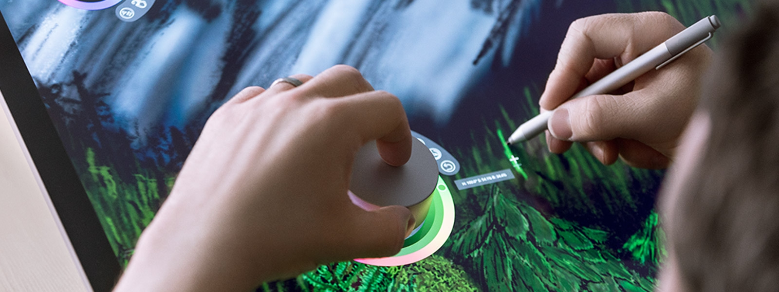
As an additional way to interact with the screen, Microsoft also offered a "Dial" that would rest on the screen, and allow for extra input. It could be used to change the color of the pen, rotate the canvas, and more. Also discontinued a couple of years ago.
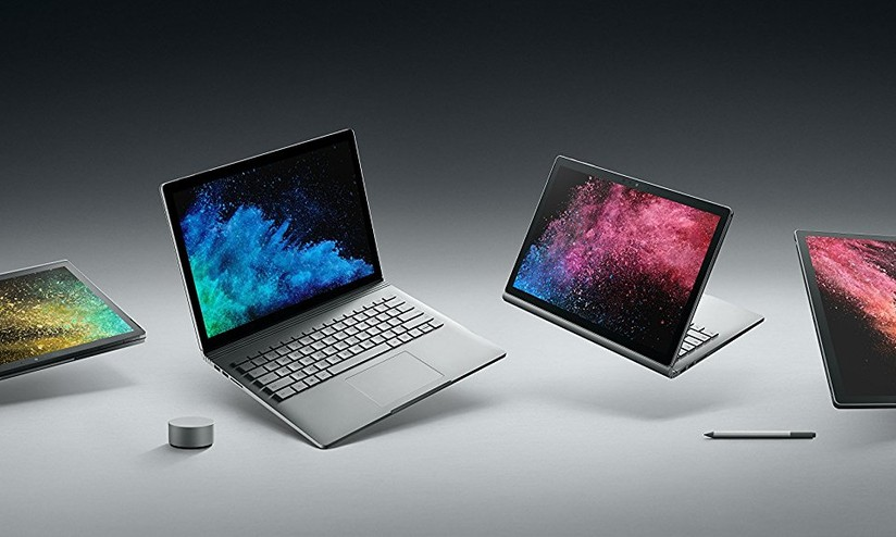
Before the Laptop Studio, we even had the Surface Book, which was yet another attempt at a new 2-in-1 form factor for high-powered machines. This was a detachable device, but the keyboard featured additional battery and a dedicated NVIDIA graphics card, plus a hinge that would fold flat on the table to make sure that you could use this as a traditional laptop without any use of stands.
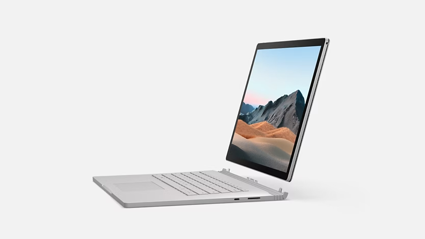
You could even rotate the screen around and re-attach it, using the keyboard base as a stand for the tablet part of the device. And, of course, it was again touchscreen and supported both pen and dial inputs. It wasn't necessarily a good idea - again, I think the folding display on the Laptop Studio was just a better idea - but at least it was an unseen one.
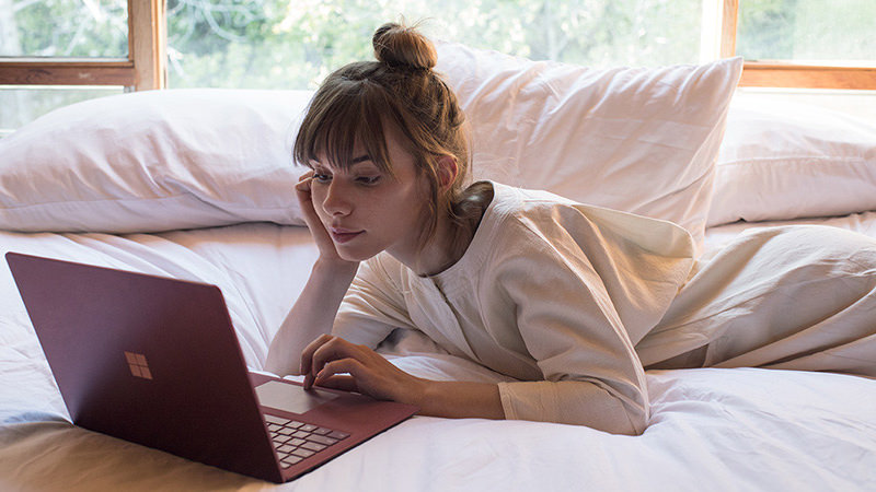
And, even when the traditional Surface Laptop was announced in 2017 (I watched the stream live, I still remember it!), it featured some vibrant colors, a sleek design and —
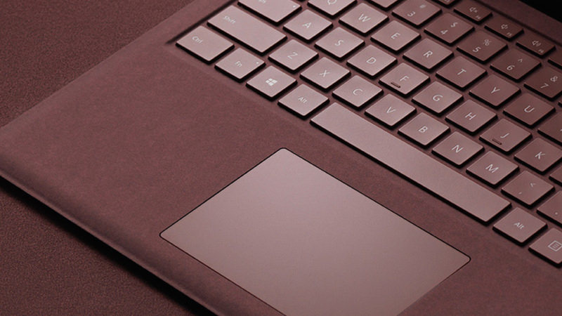
The infamous Alcantara texture on the keyboard! This had some durability issues over time, but it still feels miles ahead compared to the metal plates that we are handed nowadays; the design made the laptop feel super-thin when on a surface, and the same material was used for the Surface Pro line as well. Ah, of course, this was still all touchscreen and pen-enabled, which is sometimes useful for quick annotations.
Finally, of course, the Surface Pro line was (and still is) the reference implementation on how to do a detachable keyboard device! It features an integrated kickstand (instead of a bulky magnetic one), a pen that hides within the keyboard, a keyboard that does not lay flat on the table, great screen-to-body ratio, slim and light design, the Alcantara texture instead of rubber…
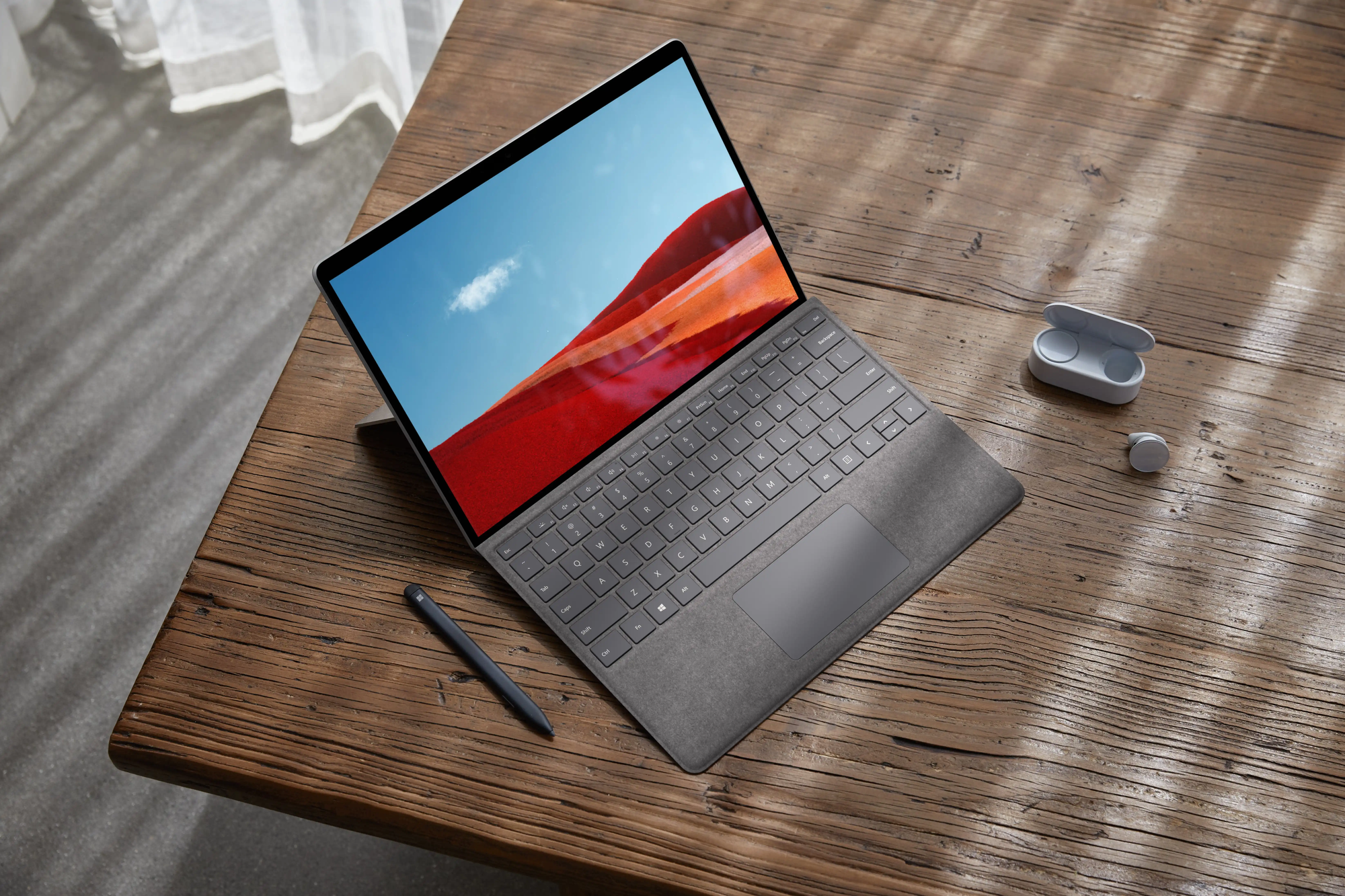
Even its little brother, the Surface Go, shared most of these good features, and was objectively a little cute thing! (Now discontinued).
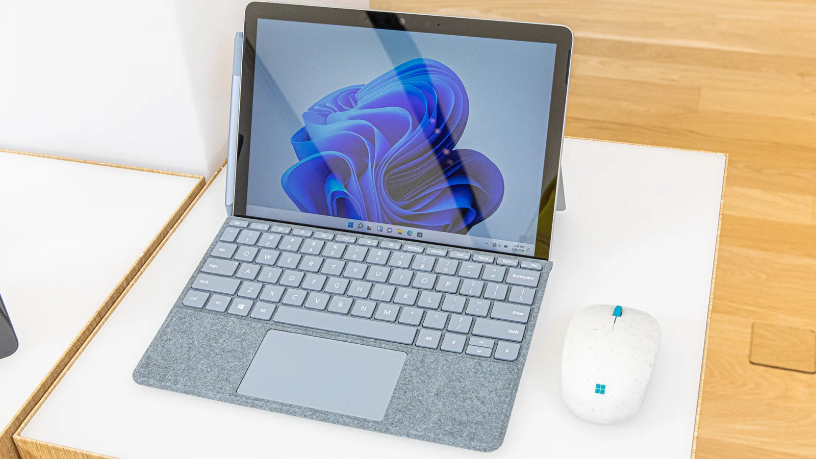
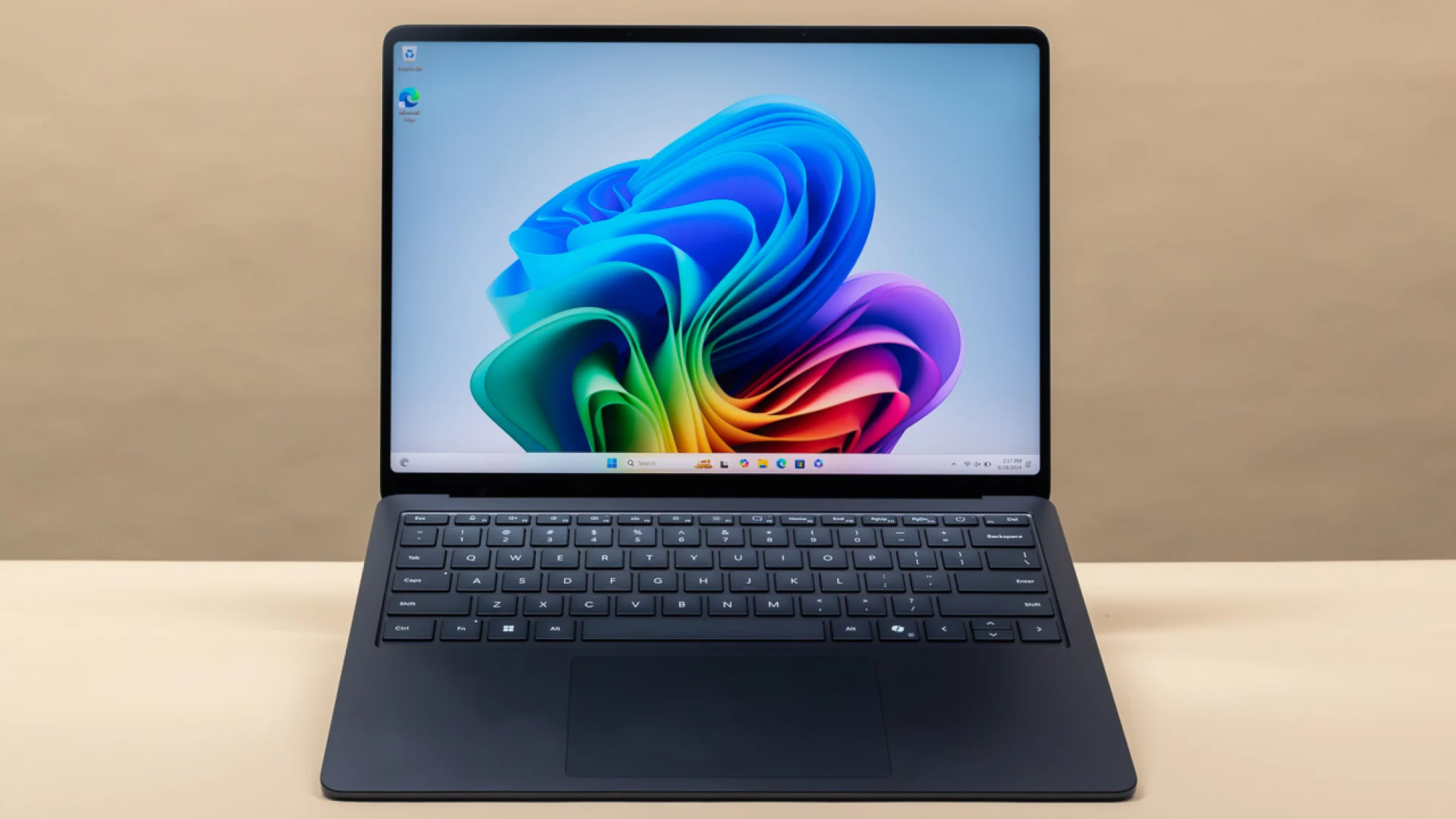
Compare all of this to the current lineup. We've got a rather boring-looking, all-metallic Laptop 7 (which ships with an ARM chip that still pales in comparison to Apple Silicon):
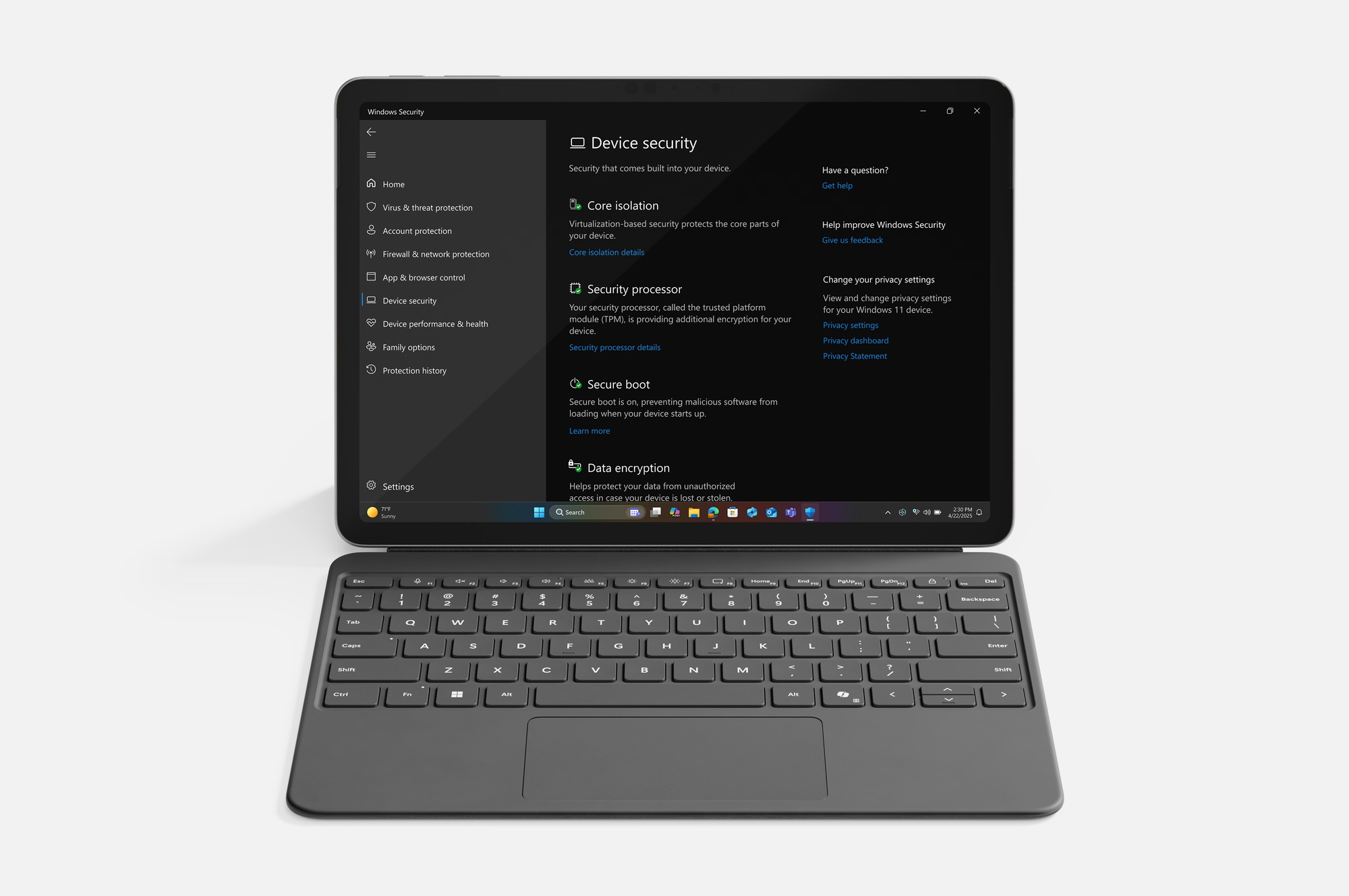
And, the Surface Go was replaced with a lil' Surface Pro 12, which features a keyboard laying flat on the table and a rubbery keyboard, both design decisions that feel to me like clear step backs:
Everything else has been discontinued, except for the Surface Pro, which stands as the only still-exciting device of the lineup.
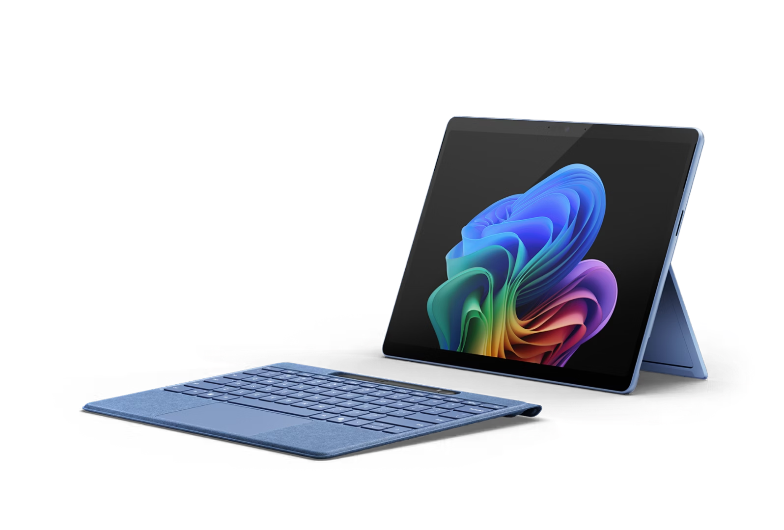
Overall, it's impressive how quickly Microsoft turned its hardware department from a place to push for the limits of Windows devices into a good but rather boring set of laptops. My hope is now to go ahead and try to collect as many of these little machines as possible, picking up defective units on eBay to display in some display window somewhere in my house. And why not start with the Laptop Studio?
We need devices like the StarLite
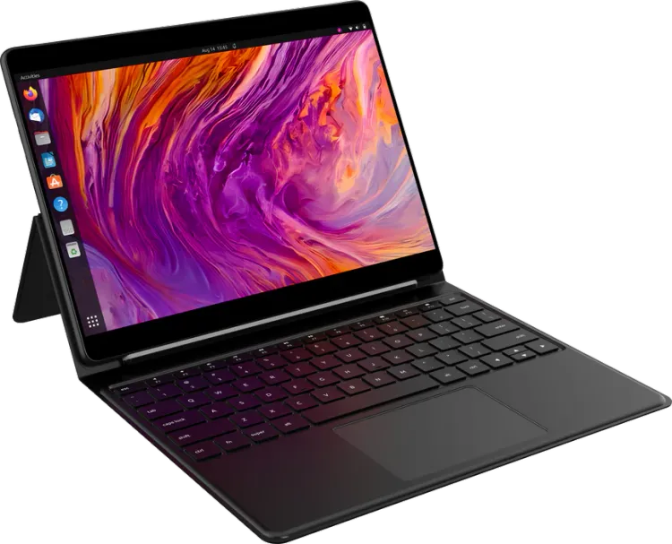
My name is Niccolò Venerandi, and my job is to review 2-in-1 detachable screen devices. I've made a video about my currently favorite one, the Lenovo Duet 5, one on the FydeTab Duo, a couple on the old JingPad A1, I daily drive the Minisforum v3, and more.
This simply is my form-factor. And thus, when StarLabs asked me which one of their devices I'd be happy to review, I went right away with their 2-in-1, detachable screen, StarLite. I've had it for a few months now; so, did I like it?
Let's start with the hardware quality and design, which budget 2-in-1s often get wrong. We have a unique (as far as my collection goes) type of keyboard cover, where the kickstand is attached to the keyboard. As a result, you are unable to use the kickstand when in tablet-only mode, which saddens me. Most other devices at this price range have a magnetic kickstand that's a component on its own, which works better on a day-to-day basis. Sadly, there's still no device that comes close to the Surface Pro, with an integrated kickstand; I often wonder whether that's due to some patents.
The material for the whole cover is a very rubbery plastic; in fact, this is the most rubbery device I've typed on. It feels very comfortable to hold and rest my palms on, though I've heard of people who consider this to be a dealbreaker, though I do not understand why myself.
The back of the device itself is also made with an aluminum alloy, and though it does not feel cheap to me, I do prefer the construction that I've found on the other devices I've reviewed, including one at a much lower price point (the Duet 5). That said, I do appreciate the StarLabs logo, which reflects light well and is very sleek.
My final point on the design is that the keyboard lies flat on the table. This is the behavior of most 2-in-1 devices (like the Duet 5 and the FydeTab). I still highly prefer when the keyboard attaches to the bottom of the screen, like on the Surface Pro and the Minisforum, but both of those have much higher price points, so it's understandable.
All in all, I don't feel like I can award any bonus points for the StarLite's design, which feels rather generic. On the other hand, there's nothing inherently wrong with it, and it's the same design shared by many other devices.
I can however award points for the port selection. Usually, these kinds of devices feature one USB-C, or two if we're lucky. Indeed, we are lucky here with two, but we also get a micro SD card reader, an audio jack, and micro-HDMI. This is a better port selection than some "premium" laptops such as my old Dell XPS, though it will still be beaten by most heavier devices.
There are a few annoyances here, too: the USB-C ports are both on the same side, and they're towards the top of the device, which makes charging a bit awkward.
Compare this ot the Duet 5, which also has two USB-C ports, but has them on both sides and towards the bottom: that's much better!
The micro SD reader is phone-like, which requires a pin to open. This might be done to protect the circuits inside, though I would've preferred a plug-and-play solution. The micro-HDMI is very admirable at this price point and device type, though!
(I hate micro-HDMI myself, as their connectors broke on me multiple times, but I still love having it as an option, and a full-size HDMI would not have fit here!)
We get a volume rocker that works out of the box; you'd think this is obvious, but a couple of devices did not support that in Linux without some significant tweaking. We also get a power button that's within a dent to make it easier to find, which I appreciate: it's good design! (Though, it also looks off-center (it isn't!), which is not good design.)
I also appreciate the screen being 2160x1440, which, in my opinion, looks great on a 12.5" device. Though anything else is, again, very standard: the refresh rate is 60Hz, it has some chunky bezels for the year 2026, and it's LCD. There's a slight yellow-ish tint compared to other devices, but you can adjust that. The brightness falls off rather quickly as the viewing angle increases; the coating doesn't fight reflections much, but they generate weird circular rainbow patterns on reflected light. Though none of this will be noticeable in most day-to-day work within your studio, it becomes more annoying when using the device outside, under the sun.
On top of the screen, there's the touch digitizer, which works great. Touch input is correctly registered, and we get touchscreen gestures out of the box (if implemented by the desktop, of course); I only have praise here.
And, like many 2-in-1s, this device also supports pen input; I love that! One great benefit of the StarLite is that, throughout my use, it has never given me any palm rejection issues. When the pen gets closer to the screen, the touchscreen is disabled as it should, and even if it's on, resting my palm on the screen will not trigger weird events. It's definitely the best implementation I've seen on a device I've reviewed so far.
However, the pen itself leaves me unsatisfied. For some reason, the tip slightly retracts when it touches a surface; that, on top of the standard glass thickness of the screen, leaves a weird feeling when writing notes. I'm assuming this is related to pressure levels (which we do have here!), but no other implementation felt this tacky to me. This might be different if you draw art instead of taking notes, but for the latter task, I did not feel like I could rely on this device.
The pen attaches to the keyboard, though not magnetically, which makes it difficult to carry around when in tablet mode. On a broader note, most 2-in-1 devices seem to have issues with handling the pen; the worst offender here is the Duet 5, where the pen holder is not included with the device and you have to purchase it separately, and it simply holds the pen at the back of the device in an awkward manner.
The keyboard I love. They nailed it here. The keys are big, easy to press, and very satisfying. I achieved 90 words per minute out of the box, even though the key sizes are different compared to my daily device. This entire review was typed on the StarLite, and it has been a pleasure. On top of that, we get retro illumination (yay!), there's no Windows key, and no Copilot key either. This is the best keyboard I've tried so far on a 2-in-1, and seeing it on the side of the Duet makes it particularly obvious.
The keyboard lays flat on the table normally, so the flex is not an issue.
The touchpad is big and also feels high-quality to the touch, but it's impossible to click at the top of the touchpad. This is the standard on more lower-end devices, but it makes it a bit more annoying to work with, and it does create a contrast with such a great keyboard. The acceleration curve also felt a bit slow out of the box on two different desktops I've tried, but increasing the speed in the settings seemed to fix that, which is great.
Next up: audio. I was pleasantly surprised at both the quality and the volume, knowing that this is an affordable 2-in-1, which usually compromises on the audio quality. You are not going to use the StarLite as a speaker at a party, but for personal use, it's fine, and the limited space within the tablet would not allow for more volume or bass.
And, talking about intrinsic hardware limitation, the webcam is a laptop camera as we have sadly expected them to become, with their tiny sensors: it's bad. Out of the box, it looks slightly better than the more expensive Minisforum, but it still has a lot of noise even in decently lit rooms and lacks contrast.
The same applies to the rear camera: it's going to be good enough to take a couple of pictures of documents, and that's all it's intended to be, really.
A small usability complaint I have here is that both cameras expose the same name to the user ("USB 2.0 Camera", at least on the desktop on which I tested the device), so it's impossible to distinguish them when, e.g., the browser asks you which camera to use for a website. Though I don't know how internal components are named in Linux, I'm not sure if this is something that can be blamed on StarLite. My unit did not have any pre-installed OS, so it might work out of the box if you use one of their tailored images.
I have kept the biggest praise and the biggest criticism for last. Let's start with the criticism.
Let's talk battery. The specs for the StarLite claim up to 12 hours of usage. However, this does not make any sense: even at idle usage, the CPU drains enough power to only reach around 8 hours of usage, and that's being optimistic. I'm not sure what settings were used to reach the claimed 12 hours, but they are not representative of daily usage.
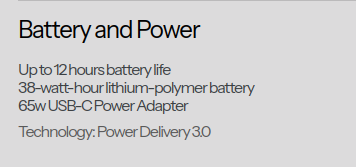
In my own testing, with a couple of tabs open on the browser and nothing else, 80% brightness, I got around 3 hours and a half hours of battery life, maybe slightly more. There's a Reddit poll on the StarLabs subreddit amongst owners of the devices, and the most selected option is 5 hours of battery life, and the average answer is even lower than that.
There seems to be some significant idle battery drain, too.
And, honestly, this is all to be expected: as great as Intel Alder Lake chips can be, powering a 1440p with a battery that fits inside a 12.5" chassis is only going to get you so far. The only way to get good battery life here would be to ditch Intel entirely – ditch x86 entirely, and go for some Snapdragon-like chip. As we will see later, this was not an option for the StarLite, and battery life was a worthy tradeoff; I'm fine with that. However, I'm not fine with them promoting a number that's more than double what most people report as their daily battery life, and almost four times as much as I'm getting in low-power tasks!
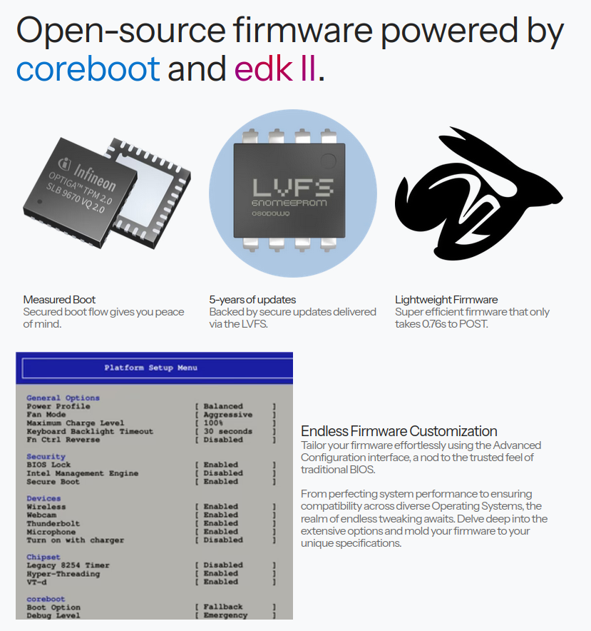
Speaking of the biggest advantage, that has to be the out-of-the-box FOSS software support. Not only can you get this shipped with Linux, but it features open-source firmware based on coreboot and EDK II. I've often compared the device with the Duet or the Minisforum, which are some of my favorite laptops/tablets, but neither of those comes with desktop Linux out of the box.
And, indeed, installing it is painful on both devices. The Duet is a Chromebook (and it's even out of production), and requires multiple steps to boot Linux; I would love to show you some b-roll of that, but sadly, it broke over time, and I don't have the time to fix it. The Minisforum has a broken volume system on Linux, which is constantly stuck on 100%, and the volume rocker requires a third-party script to work. It's not a great experience.
And, even if you put in the effort to make Linux run smoothly on them, as I tend to do, they're still going to run on top of proprietary firmware. Even worse, ARM devices like the Duet 5 require work on each device in order to boot Linux, and most of them won't run it, ever. As big a fan as I can be of the new Surface Pro devices, I've been waiting years for Linux support, and they might just never get it.
As laptop manufacturers slowly transition towards "Copilot+" devices, I'm getting increasingly anxious and paranoid that it's going to get harder and harder to boot Linux on devices that ship with Windows (or ChromeOS/Android) out of the box, and I fear that desktop Linux marketshare will take a hit as a consequence.
Thus, it's hard for me not to review the StarLite without thinking that these kind of devices, thought from the get-to with open-source support in mind, might just be what we will desperately need in a few years; and, in order to have great and affordable devices like this in the future, I believe that we need to make some compromises today. The StarLite certainly makes those compromises, and though - let's be honest - might be able to get an alternative with better specs at the same price, if you are a Linux fan, that might be enough to make the StarLite a good recommendation for you.
This review has entirely been written on the StarLite.
Help us break even
We only run on donations. We have a goal of reaching 300 subscriptions, which would allow us to hire staff.
If you subscribe, you'll gain access to a few members-only pieces, though we aim to keep most of our content free for all.
no ads · no trackers · cancel whenever